Wednesday, August 31, 2022

The Animated Map of the Berlin Subway

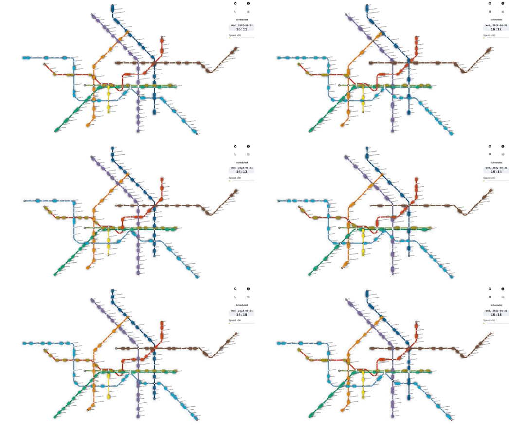
Ubähnchen is a fantastic new transit map which simulates the movement of trains on the Berlin subway network based on the scheduled timetable.

There have been a number of very impressive 3D animated transit maps released in the last few years. These include Moving Hamburg, an impressive 3D animated public transport map of Hamburg and Mini Tokyo 3D, the live real-time map of Tokyo's public transit system.

The Hamburg and Tokyo 3D maps are fantastic toys for anybody who's ever dreamed of owning a virtual train set. However my inner Fat Controller loves the transit map style used by Ubähnchen. Ubähnchen also comes with an option to switch to a more geographically accurate map. This map also allows you to view S-Bahn trains in real-time.

Trainspotters may also be interested in the Ubähnchen Statistics section, which includes lots of data from the Berlin subway network, including the avarage daily train activity per line and the number of daily stops at each station on the network.

Tuesday, August 30, 2022

Mapping the Safest Route to School

With the school year about to start many parents are beginning to worry about the dangers their children face traveling to and from school. For many the biggest potential danger is the one posed by cars and other road traffic.

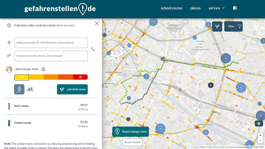
If you live in Germany you can now use a new routing service to help discover the safest route to school. Gefahrenstellen.de is an interactive map which can help you find the route to school with the least traffic and risk. Enter your home address and the address of your school into Gefahrenstellen.de and it will calculate and suggest the fastest and safest route for the journey.

In calculating the safest routes the map takes into consideration a number of different factors. These include traffic volumes and police accident data. Calculated safe routes also take into account the locations of user submitted reports on dangerous hot-spots. By clicking on the 'Gefahrenstelle melden' button users of the map can report a possible dangerous location, which may be related to bad road conditions or misconduct by car drivers or other road users.

Via: Heidelberg Institute for Geoinformation Technology

Monday, August 29, 2022

Where Should You Live?

MoveMap is an interactive map which can help you decide the best place to live based on your own preferences and tastes. Tell Movemap what kind of weather you prefer, what kind of environment you would prefer to live in and the amount you wish to spend on a property and Movemap will show you the best places to live in the United States which match your preferences. 

MoveMap uses property price data from Zillow, average weather data from NOAA, and data from the American Community Survey to determine which counties you should move to. The easiest way to discover the best place to live is to take the MoveMap Quiz. The quiz asks you to select options from a number of statements about your preferred climate and environment and then shows you where you should live based on your replies. You can get a more nuanced response by also using the filter controls in the map sidebar to refine your preferences.

After you have told MoveMap your requirements it highlights the best counties which match your preferences on an interactive map. The counties are color-coded based on the average home price. If you select any of the suggested counties you can click-through to learn more about the cost of property in the county and the biggest cities and towns. You can also learn more about the climate, the state tax burden, the median age, and the risks from earthquakes, hurricanes and tornadoes.


Before deciding to move to a county suggested by MoveMap you might want to consider how much it costs to live there. HowMuch's True cost of living in the United States interactive map can tell you how much it costs to live in American neighborhoods based on your own personal needs. Using the map you can discover where you can (and cannot) afford to live in America's major towns and cities.

Enter a city into HowMuch's cost of living interactive and you can view a map visualizing how much it costs to live in each of the city's neighborhoods. Your personal cost of living will obviously depend on factors such as the size of your family, your income, occupation, and even your food preferences. The cost of living map therefore includes a number of filters which allows you to customize the neighborhood cost-of-living ratings to match your own circumstances.

After you have entered your income (and other cost-of-living factors) the map will color neighborhoods based on whether you can afford to live there or not. The areas colored red on the map are neighborhoods where you would have to increase your income in order to be able to afford to live. You can hover over individual neighborhoods on the map to view exactly how much more you would have to earn to be able to afford to live there or (if you are lucky) how much money you will have left living in the neighborhood after your costs of living have been deducted.

Saturday, August 27, 2022

Swiss Glaciers Have Shrunk by 50%

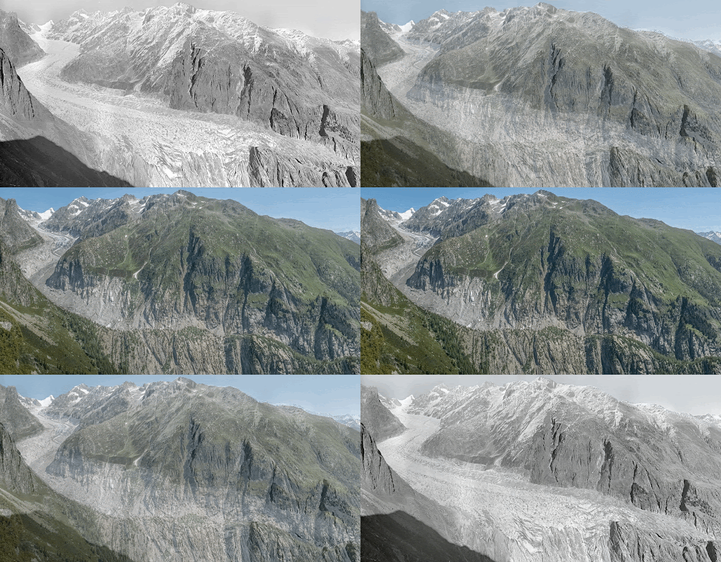
View of the Fieschergletscher in 1928 and 2021 (Photo: swisstopo and VAW / ETH Zurich)

New research by the Swiss Federal Institute for Forest, Snow and Landscape Research (WSL) and the ETH Zurich University has discovered that the volume of glaciers in Switzerland shrunk by 50% between 1931 and 2016.

The Swiss research, presented in A historical perspective on glacial retreat, used photogrammetry to analyse over 21,000 photographs of glaciers taken between 1916 and 1947. They used these historical photographs to measure the surface volume of Swiss glaciers at different points in time. From this analysis they have calculated that there has been a drastic reduction in glacier volume in Switzerland over the last 90 years.
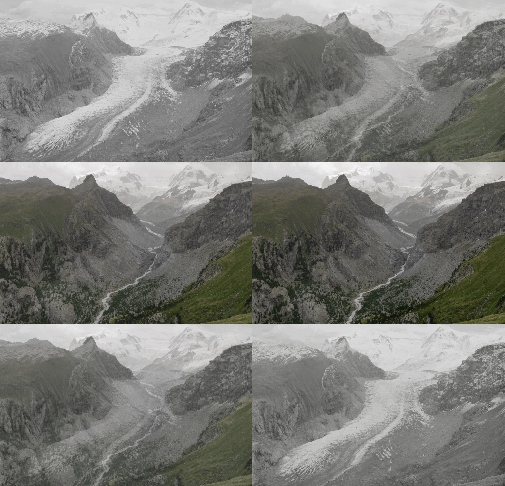
The Gorner Glacier in 1930 and 2022. (Photo: swisstopo und VAW / ETH Zurich)

The study also discovered that not all glaciers are shrinking at the same rate. The level to which glaciers have retreated depends on three main factors, the altitude of the glacier, the slope of the glacier snout, and the amount of debris on the glacier.

You can explore more visualizations showing the extent of glacial retreat around the world in the post Melting Glaciers

Friday, August 26, 2022

Persepolis in 3D

500 years before the birth of Christ the city of Persepolis served as the capital of the largest empire in the world. Today what is left of the city is mostly architectural ruins. It is therefore now hard to imagine the magnificence and splendor of what was once one of the most awe-inspiring cities on Earth.

Luckily you now don't have to imagine what Persoplis used to look like because the Getty Museum can show you exactly how the ancient city looked at the height of its power (c500 BC). Persepolis Reimagined is an amazing 3D reconstruction of the ancient Persian city. Enter into Persepolis Reimagined and you are taken on an impressive guided tour of a digital 3D reconstruction of the Gate of All Nations, the Apadana audience hall, the Palace of Xerxes, the Southeastern Palace, the Royal Treasury, and the Hall of 100 Colums.

As you scroll through this amazing guided 3D tour of Persepolis, interactive markers and hotspots allow you to learn more about the functions and purpose of individual buildings and even see how some of these important landmarks look today. 

Hot-Tip: Click on the 'settings' icon and turn on 'dragging interactions'. This allows you to directly interact with the 3D model of Persepolis, giving you the full 360 degree experience. 

Thursday, August 25, 2022

How Far Can You Commute in One Hour?

If you have ever wondered how far you can commute using public transport then you will love the commutometer interactive map. Just click on your home on the commutometer interactive map and it will show you how far you can travel in 5 minute intervals by subway, train, bus, tram or ferry.

Drag the green marker to your home address on commutometer and you can view an isochrone map visualizing how far you can travel on public transport in incremental journey times. Obviously how far you can travel by public transport in one hour can depend on the time when you wish to travel. Commutometer accounts for changes in the public transport timetable by allowing you to enter the day and time of when you want to travel.

As well as providing an overall isochrone layer commutometer also allows you to query the journey times for individual destinations. After the isochrone layer has loaded you can click on any address within the isochrone layer to view the exact journey time from your defined origin. 

Commutometer doesn't work everywhere in the world. If you zoom out the areas where the map doesn't work are shown using an opaque mask. These areas are also labeled 'no data' to show that the map can't access public transportation data at these locations.   

You can explore more journey travel time maps using the Maps Mania isochrone label. This includes the very popular How Far Can You Go By Train in 5h?, an interactive map which shows you how far you can travel from any European rail station in less than five hours.

Wednesday, August 24, 2022

Mapping the Extreme Heat Belt

Last Monday the First Street Foundation released data from its analysis of how current and future extreme heat events will impact American neighborhoods. Enter your zip-code into the First Street Foundation website and you can view the risk that your home faces over the next thirty years from extreme heat (and also the risk to your home from wildfire and flooding). The First Street Foundation hyperlocal extreme heat data has also been used by the Washinton Post and Axios to map the growing dangers of extreme heat across the United States.

Axios has used the extreme heat data to map an Extreme Heat Belt that they say will soon emerge in the USA. The Axios map shows the counties in America where the heat index could reach 125°F at least one day a year by 2053. According to Axios an 'extreme heat belt' will exist in 30 years time, stretching from Texas to Illinois, where people can expect at least once a year to experience deadly temperatures.

Currently only 8 million Americans are exposed to extreme heat days each year. Thanks to global heating by 2053 that number is expected to rise to 107 million. If you hover over a county on the Axios map you can find out if that county currently experiences extreme heat days and whether it will in 30 years time.

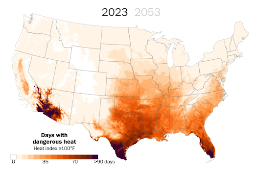
The Washington Post has also used the First Foundation data to map out the number of dangerous heat days that you can expect where you live by 2053. If you think that this summer was too hot then I've got some bad news for you. Thanks to global heating it is going to get much hotter. According to the Washington Post map by 2053 "two-thirds of Americans will experience perilous heat waves, with some regions in the South expected to endure more than 70 consecutive days over 100 degrees."

In More dangerous heat waves are on the way: See the impact by Zip code you can find out how many days of dangerous heat you can expect each year where you live in thirty years time. Just enter your zip-code into the Post's map to discover how many days of dangerous heat you currently experience on average every year and how many days you can expect in 2053. The Washington Post defines 'dangerous heat' as temperatures over 100 degrees.

Tuesday, August 23, 2022

The Terrifying Sound of Sea Monsters

Olaus Magnus's Carta Marina is the first derailed map of the Nordic countries to include place-name labels. The map also includes a number of fantastical sea creatures. Olaus Magnus described most of the sea monsters depicted on his map at length in his book 'A Description of the Northern Peoples'. Unfortunately Magnus never made any audio recordings of these monsters. We can therefore only imagine what terrifying sounds were made by these monstrous creatures.

This is exactly what I have done with my Sounds of Sea Monsters interactive map. Click on any of the sea monsters depicted on this interactive version of the Carta Marina and you can listen to an (imagined) recording of the monster's terrifying screams, growls and roars. You can also read the 'real' description of the monster that Olaus Magnus provided in his encyclopedic volume 'A Description of the Northern Peoples'. My map also includes some other interesting information provided by Magnus on the customs and lives of these Northern Peoples. 

Sounds of Sea Monsters was created using the Leaflet mapping platform. The map also wouldn't be possible without two wonderful Leaflet plug-in libraries - leaflet-IIIF and leaflet-hash

Museums and art galleries around the world are increasingly using the iiif format to display vintage maps as zoomable images. The leaflet-iiif plugin allows you to use these iiif manifests with the Leaflet mapping platform. This means that you can create a Leaflet map from any image which has a iiif manifest.

In order to add interactive elements to a iiif image displayed in a Leaflet map it is necessary to apply a coordinate system to the map. Leaflet-hash adds a latitude and longitude to the URL of a Leaflet map. It can therefore be used to grab the coordinates of any location on the map. I used the leaflet-hash plug-in order to create the clickable polygon shapes on my Sounds of Sea Monsters map. 

Monday, August 22, 2022

How to Make Your Own Pretty Map Posters

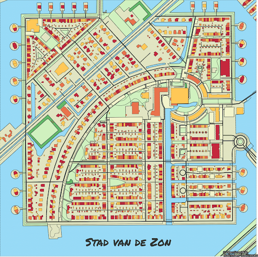
I made the map poster above using a new map poster creation tool called prettymaps. prettymapp is a web app which you can use to create pretty map images for any location on Earth.

Prettymapp is an online interactive version of @marceloprates' pretty maps project. The original 'pretty maps' project is a Python library to draw customized maps from OpenStreetMap data. The new prettymapp app uses this library to create an actual online tool for making your very own pretty map images.

Prettymapp is very simple to use. Simply enter an address and press the 'submit' button and prettymapp will automatically create a map poster centered on your location (you can type in a latitude,longitue instead of an address to give a precise location). The tool includes a number of options for changing the design of your final map. These allow you to choose your own colors for individual map features, such as the color of water, grassland and roads. There are also options for customizing the size and placement of the title of your map. 


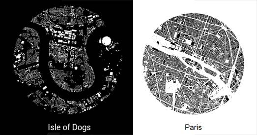
Hans Hacks' Figureground Posters is another fun tool for creating map posters from OpenStreetMap data. To create your poster simply click on the Figureground Posters interactive map to select the location that you wish to work with. You can then select a size for the area that you want to map. 

Figureground Posters creates circular maps so just choose the radius size that you wish to map (up to 2000 meters). When you are happy with your chosen location and radius size click 'Make Poster'. Figureground Posters will then create a simple map of your selected area using the building footprint data from OpenStreetMap.

Street Patterns is another great tool for making map posters. The tool also uses data from OpenStreetMap to create small circular images consisting of just the street data of your chosen location. Street Patterns doesn't only help you create your own map posters it also explains the whole process it uses in creating these Street Pattern maps. Therefore while using Street Patterns to create your own map poster you can also learn a little about how to use Overpass Turbo and Turf.js to download and use OSM map data.

Saturday, August 20, 2022

The Migatory Map of the White-Tailed Eagle

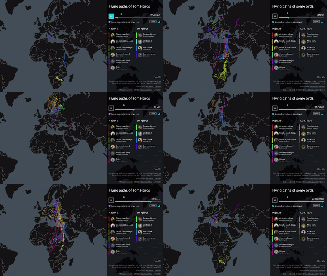
Benjamin Becquet has used data from the Global Biodiversity Information Facility to create a mesmerizing animated map visualizing the annual migration patterns of ten different bird species. His Bird Tracking Map uses time-stamped GPS data to reveal the annual migratory journeys of ten different species traveling between Africa and Europe. 

Press the play button on Benjamin's map and you can watch how these different bird species journey back and forth between northern Europe and southern Europe/Africa over the course of a single year. As the map animates through the year the Spring and Autumn migratory patterns of each species of bird becomes apparent on the map.  

The map can be filtered to show only the migratory journey of any single species of bird or any combination from the ten different species. The map also includes a speed button which controls the speed that the time-stamped GPS data is animated on the map. 

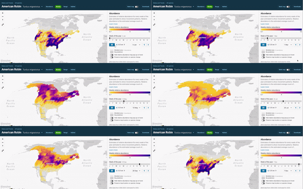
If you are interested in the migratory journeys of birds then you might also enjoy eBird's maps of individual bird species migrations. The eBird Status and Trends webpage allows you to view animated maps which show the migratory journeys undertaken every year by thousands of individual species of bird.