Live 2 Years Longer with Better Air Quality
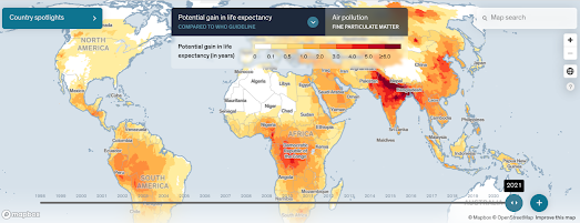
Around the world life expectancy could be raised on average by 2 years and 3 months if air quality was improved to meet the World Health Organization guideline. In countries with really high levels of fine particulate pollution (such as India & Bangladesh) life expectancy could be increased by over 5 years.
The Air Quality Life Index looks at air quality levels around the world and calculates how that impacts local life expectancy. Using the AQLI interactive map you can view for yourself how air pollution impacts your family's life expectancy and how it affects the length of people's lives around the world. On the map the potential gain in life expectancy if "fine particulate pollution were reduced to meet the WHO guideline" is shown in red and yellow. The more red a location is shown on the map then the bigger the potential increase in life expectancy.
According to the Index in the USA air pollution shortens the average American’s life expectancy by 3.6 months. If the WHO guideline was met the average American could expect to increase their life expectancy by 2 months. However air quality obviously varies across the US and in the worst affected counties (such as Plumas County, California) life expectancy could be improved by over 2 years by improving the local air quality.

Today The Guardian has reported that 98% of people living in Europe are breathing 'highly damaging polluted air'. The newspaper reports that 75% of Germans are breathing air which is twice the WHO recommended guideline. Nearly half of Spaniards are also breathing air twice the WHO guideline and 37% of French people live in areas with over twice the safe level. In the UK 75% of the population have air pollution which is over the recommended safe level.
If you live in Europe you can discover the fine particulate levels of the air you breathe on The Guardian's interactive map Europe's pollution divide: see how your area compares. The map uses data from the Expanse project. The modeled air pollution levels are calculated by Expanse using a number of different sources and variables. You can learn more about these on The Guardian's methodology page for the map.
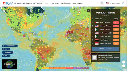
With the number of active wildfires recorded around the world this year air quality has become an even hotter topic than usual. You can view near real-time air quality around the world on IQAir's Live Animated Air Quality Map. The map uses data from government monitoring stations and IQAir's own monitors to create a real-time picture of air pollution levels around the world.
For example the map shows that at the moment the air quality in San Francisco is 9 times the WHO guideline value. The current dangerous levels of air pollution in San Francisco are a result of smoke from a cluster of wildfires on the California-Oregon border.


Comments