The Global Migration Explorer
In both American and European politics immigration has become one of the most centrally contested issues. However, according to the authors of World’s human migration patterns in 2000–2019 "a global-scale, high-resolution quantification of migration and its major drivers for the recent decades (has) remained missing" from this political debate. They have therefore created their own global dataset of annual net migration for the years 2000 to 2019.
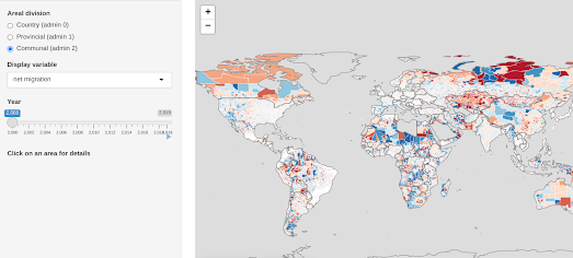
The Net Migration Explorer is an interactive map which visualizes this global net migration data at three administrative levels. The map also allows you to view population change, and birth & death levels at three different admin levels around the world.
Using the map you can explore which locations around the world have experienced net migration loss and gain for every year from 2000-2019. Many patterns of migration are clearly apparent on the map but I think the data is crying out for someone to create a guided story-map of some of the migration stories revealed by this data (although you can obviously read the authors' paper to learn more about their interpretation of the data).
If you do want to create your own data visualization of global migration then you can download the data from Zenodo. The code for the interactive map (a Shiny R app) is available on GitHub. Both the data and the map are available under Creative Commons licences.


Comments