The Unknown Pleasures of Population Density

This ridgeline plot map visualizes the population density of Germany. The map was made using Baryon's Population Density Ridgeline Plots for Every Country in the World. Type your county name into this app and you can see your country's population density visualized as a ridgeline plot.
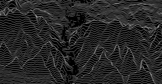
The most famous Ridgeline plot (or joy-plot - as they are sometimes called) appears on Joy Division's famous album cover for Unknown Pleasures. Peter Saville's cover for Unknown Pleasures was inspired by a visualization of the radio waves emitted by a pulsar, which was published in the Cambridge Encyclopaedia of Astronomy.
Baryon's population density ridgeline plots use NASA's Gridded Population of the World data to show the density of population along lines of latitude. The result is that areas with high density in a country appear as peaks on the map.
You can also create ridgeline plots for any location on Earth using Peak Map. Peak Map is a fantastic interactive map which can create an elevation ridgeline plot map for anywhere in the world. To create your own joy-plot map you just need to center Peak Map on your chosen location and a very artistic elevation profile will be generated automatically.
Peak Map includes a number of options which allow you to change the appearance of your generated joy-plot. The automatic setting draws black lines on a white background but you can choose your own background and line colors (my example above flips the default to show white lines on a black background). You can also change the height scale and smoothness of the elevation lines on your joy plot map and even reduce the joy plot map's opacity to reveal a labelled map beneath.

Comments
Try Monaco!