Land doesn't vote, people do!
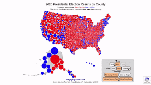
Engaging Data has updated its US County Electoral Map – Land Area vs Population map so that you can now zoom in and explore the election results in each state. The map allows you to see the 2020 Presidential Election election results at the county level based on land area or population size.
If you select the 'Population' button on the map then the colored proportional circles change size to represent the county population size. Switching between the Land and Population buttons provides a dramatic illustration of how the same data can be visualized in radically different ways.
As Kenneth Field recently explained to Wired "People see maps of any type, and particularly election maps, as the result, the outcome, but there are so many different types of maps available that can portray results in shades of the truth." The Wired article Is the US Leaning Red or Blue? It All Depends on Your Map explores a number of different mapped visualizations of the 2016 Presidential Election to help illustrate how different map methodologies can tell very different stories. You can explore most of these maps in closer detail at Thematic maps of the 2016 Presidential election.


Comments