Mapping Fire & Flood Risk

Both the Washington Post and NPR have released new interactive maps which allow you to view the risk of wildfire to your home. Climate change means that the chances of extreme weather conditions are increasing for everyone. These extreme weather conditions bring with them increasing risks of wildfire and in some locations increased flooding risk.
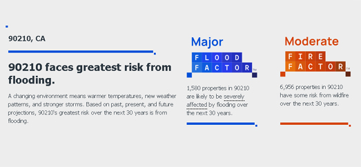
The First Street Foundation has analyzed the wildfire and flood risks for over 145 million properties in the United States. You can check your home's risk from both wildfire and flooding on the foundation's new Risk Factor tool. Enter your address or postcode into Risk Factor and you can view an assessment of your home's wildfire and flood risk based on 'past, present, and future projections'.

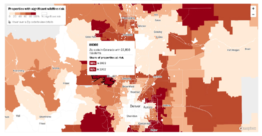
The Washington Post has used the wildfire risk data from Risk Factor to create their own interactive map visualizing the risk from wildfire across the United States. The Post's Wildfire Risk Map shows the percentage of properties with 'significant' wildfire risk in each zipcode area in the United States. You can enter your zipcode into the map to zoom to your home. If you hover over a zipcode area on the map you can view how many people live in the area, the percentage of properties currently with a significant wildfire risk, and the percentage of properties which will have a significant risk of wildfire in 2052.

NPR has used the same wildfire risk data from the Risk Factor to create an interactive map which visualizes Where Wildfire Risk is on the Rise. This interactive map shows where the risk from wildfires is likely to increase in the next 30 years at the county level. Because this map shows "the Percent increase in burn probability between 2022–2052" it doesn't actually reveal your wildfire risk. It shows you where in the country wildfire risks are likely to increase or stay the same over the next three decades. It is particularly useful in showing where homeowners have to be aware of the likelihood of significantly rising risks from wildfire.


Comments