America's Drunkest Counties
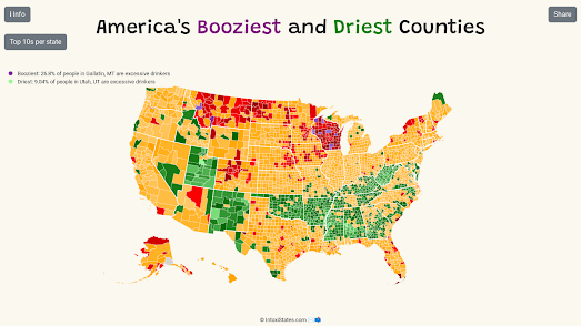
America's Booziest and Driest Counties is a choropleth map which shows the percentage of the population in each US county who are excessive drinkers. The map is based on data from the Centers for Disease Control and Prevention (CDC), which defines excessive drinking as either binge drinking (men 5 drinks in a single session, women 4 drinks in a single session) or heavy drinking (men drinking more than 15 drinks in a week, women drinking 8 drinks in a week).
The map shows that many of the driest counties are also some of the most religious. For example Utah, whose population is over 50% Mormon, is one the direst states on the map. Consequently Utah has some of the most restrictive laws related to the buying and selling of alcohol. Much of the bible belt also seem to have some of the driest counties in the USA.
At the other end of the scale most counties in Wisconsin have a very high percentage of excessive drinkers. The reason for this may be partly cultural and partly due to the state alcohol laws (in Wisconsin people under the legal drinking age may be served, possess, or consume alcohol if they are with a parent, legal guardian, or spouse who is of legal drinking age).
Kentucky and West Virginia both have a large number of very dry counties. I read an interesting theory last week (I can't remember where so unfortunately I can't credit this) that this may be related to the heavy use of opiates in these states (West Virginia has the highest rate of deaths from drug overdose of all states).
The CDC has also mapped out the percentage of excessive drinking by state. The CDC ranks each state based on the percentage of the population who reported binge or heavy drinking. Utah, Kentucky and Alabama respectively top the rankings with the least percentage of heavy drinkers. North Dakota (50), Montana (49) and Iowa (48) have the highest number of excessive drinkers (Wisconsin comes in at 47th).


Comments