Saturday, September 14, 2024

Scrambled Maps on Toast

a map of Wyoming with all the map tiles mixed up

I have a new favorite daily breakfast map game. Everyday my espresso and avocado toast is now served with a side dish of Scrambled Maps.

Scrambled Maps is a new daily map challenge. Everyday Scambled Maps presents you with a map of a different city of the world. The only problem is that all the map tiles on this city map have been mixed up. Your task is simply to drag the tiles back into the correct order. Restore the map to its original state and you win the game.

I'm still working on making the game responsive to different screen sizes. For now you might need to avoid playing the game on a mobile screen and instead use a computer or tablet. You might also find it helps to click on the full-screen button in the top-left corner of the game.

Scrambled Maps is the latest in a series of map games from TripGeo. You might also like Guess This City, Backdrop and TripGeo Trivia.

Friday, September 13, 2024

Create an AI Poster for Your Location

a map of London next to an AI generated poster for London, featuring red buses, phone boxes and Big Ben

The Global Culture Map is a fun little tool which uses AI to create a poster for any location chosen on an interactive. Simply click on the Global Culture Map and it will use a generative AI to design a poster based on that location.

Currently I would say that the Global Culture Map is an interesting fun experiment rather than a completed, fully-realized AI poster creation tool. At the moment the map poster creation tool doesn't have an 'about' page so I don't know for sure which AI is being used to create the posters but the text errors in some of the 'Recently Generated Images' suggest that Midjourney is the generative AI creating the completed posters.

The text errors on some of the created posters are one example of why you probably won't want to actually print out a Global Culture Map completed poster and hang it on your wall (I think the text errors could be overcome fairly easily by allowing users to add their own text on top of the AI generated posters). As the Global Culture Map is using an AI to create posters it also makes sense to allow users to choose their own 'style' prompts for the AI generated posters so that users aren't restricted to the generic 'poster' style prompt currently being used by the tool.

Despite these quibbles I think the Global Culture Map has a lot of potential to become an impressive location based poster creation tool. One that could be easily monetized by allowing users to order prints of their poster designs (see Mapiful as an example)

If you want to create an actual map poster (featuring actual maps of your location) then you might also like these other map poster tools:

Prettymapp
Figureground Posters
Street Patterns

Thursday, September 12, 2024

The EJAtlas: A Map for Environmental Justice

Around the world the ever demanding quest for economic growth and profit is having an impact on natural environments. The result is that local communities and groups are often forced into fighting governments and multinational companies in order to try to save their local environments from the eternal forces of 'progress'.

The Environmental Justice Atlas has set itself the task of documenting and mapping these social conflicts centered around environmental issues. The EJAtlas interactive map highlights the struggles of different communities around the world for environmental justice. It aims to make these protests more visible and amplify the voices of those affected, ensuring their stories reach a global audience. By doing so, it seeks to foster greater awareness and understanding of the injustices faced by marginalized communities, build solidarity among those fighting for their rights, and promote accountability from corporations and governments responsible for environmental harm.

Environmental conflicts are shown on the map using colored map markers. The colors of the markers reflect  different categories of conflict, including nuclear, water management and mineral extraction. The map also features a number of filters which enable you to adjust the environmental conflicts displayed on the map by category, population, type of project, type of protest and environmental impact.

The Featured Maps section of the EJAtlas showcases a number of interactive maps focused on specific thematic or regional maps concerned with particular environmental justice issues, conflicts, or regions. These maps are curated to showcase selected cases or topics that deserve special attention due to their significance, scale, or urgency.

Wednesday, September 11, 2024

The Map to the White House

NBC has launched the 2024 edition of its Road to 270 interactive electoral college map. The map visualizes the current likely, possible and fantastical outcomes of the 2024 U.S. Presidential race. Last night Kamala Harris and Donald Trump went head-to-head in their first presidential debate. The Philadelphia debate was a hugely significant opportunity for both Harris and Trump to present their case for the presidency.

Following the debate you can now use ABC's map to predict the result of November's election. You can click on individual states on the map to predict whether you think they will swing for either Harris or Trump. The map will then automatically assign that state's electors to the chosen candidate and tally the total number of votes of each candidate. A candidate needs at least 270 electoral votes to win the 2024 presidential election.

As well as allowing readers to predict their own electoral map NBC has also mapped out a number of possible outcomes. Steve Kornacki's 'electoral tie' map outlines a theoretical drawn outcome where both candidates receive 269 electoral votes (in which case the deadlock would be broken by the House of Representatives). Kornacki has also mapped out Trump and Harris' most likely direct path to the White House, while Kristen Welker has mapped out scenarios for 'Trump's Dream Path' and 'Harris' Dream Path' to the Presidency.

If you want to know how last night's debate has affected the possible results of the election then you can also refer to 538's Who Is Favored To Win The 2024 Presidential Election? (although at the time of writing 538 has yet to update with the results of the post-debate polls - but I am sure it will update soon). 

If you click on a state on the 538 map you can discover how many electoral votes are up for grabs in the state and which candidate is most likely to win those votes based on the polls and 538's election simulations. 538's simulations are based on extensive polling, economic and demographic data, 

Tuesday, September 10, 2024

Tracking Russia's 'Dark' Shadow Ships

Asya Energy's AIS track places it in the Norwegian Sea, at the same time satellite imagery shows it at the ALNG2 plant

In response to Russia's invasion of Ukraine the West has imposed sanctions on the sale of Russian oil. In an attempt to avoid these sanctions Russia has been operating a shadow fleet of covert oil tankers. The West has been working on strengthening international cooperation to try to limit the use of these covert oil tankers.

SynMax claims that Russia is also developing a 'shadow' fleet of Liquefied Natural Gas (LNG) tankers. In The Inception of Russia’s LNG Ghost Fleet SynMax maps out how a number of LNG tankers have been using AIS spoofing tactics in order to conceal their visits to Russia's Arctic-2 LNG Export Plant. (ALNG2)

At the same time as their spoofed AIS tracks show them supposedly in the Norwegian Sea a number of LNG tankers have been spotted on satellite imagery by SynMax actually at the ALNG2 plant 800 miles away. These ships are part of a dark fleet assembled by Russia’s Novatek to avoid sanctions imposed on transporting cargoes from ALNG2.

Alongside the AIS spoofing activity mapped by SynMax these ships also show a common pattern of frequent changes in ownership, vessel names and country registrations. All common tactics used by tankers trying to avoid sanctions on the sale of Russian oil and LNG. At least one ship has also been tracked taking the perilous sea route south through the Red Sea. SynMax speculates that "Russia may have negotiated a deal with Yemen’s Houthis ... allowing for “safe passage” through the Bab el Mandeb Strait". 

Monday, September 09, 2024

AI Search of San Francisco

AI and machine learning are revolutionizing the field of remote sensing. The ability of machine learning algorithms to automatically detect and identify objects in satellite images has enhanced our abilities to monitor deforestation, identify illegal fishing, track wildlife, and more quickly implement disaster response.

Thanks to AI it is now also possible to see who owns a Tesla car in San Francisco. Bluesight.ai has released a new interactive map to demonstrate how objects can be identified in aerial imagery of San Francisco. Using natural language searches it is possible to explore the Blue Explorer map for things like Tesla cars, dry patches, boats, and tennis courts. Just type your search criteria into the Blue Explorer search box and the AI will automatically search the aerial imagery of San Francisco and show the results highlighted on the interactive map.

Some other recent examples of machine learning being used to search aerial imagery include OneSoil (which uses AI to detect where different the types of crops are being grown), Земляна проказа (identifying illegal amber mines) and Curio Canopy (identifying tree canopy cover in European cities).

Robin Wilson also recently  released an impressive Aerial Image Search Demo which allows you to explore an AI image search of aerial imagery in the UK port town of Southampton. Clay Explore is another impressive interactive AI map demo, allowing you to search aerial imagery of Southern California, Seoul and Puerto Rico using machine learning.

Saturday, September 07, 2024

China vs America - World Influence Map

The Global Influence Index (GII) shows the influence of the United States and China on 191 countries around the world based on 28 different economic, security, and political criteria. Using the GII's new 3D globe you can tell at a glance where in the world either the U.S. or China has the greatest influence.

Individual countries on the GII globe are colored to show whether they are aligned more with China or the U.S. (green being U.S. aligned and red being aligned with China). If you select the 'stories' button you can view a number of guided tours of the influence that China and the United States hold in different regions of the world (including Africa, the Middle East, Europe, Latin America and the Indo-Pacific).

According to the GII currently the United States holds sway in Europe. This is based partly on the strong historical ties between Europe and the U.S. but also on Europe's growing concerns over the strategic threat posed by China. In many other regions of the world, for example in Africa, the U.S. is losing the influence battle to China. According to the GII China has pursued 'sustained and deliberate engagement with nations throughout Africa', which is reflected in its growing influence in the region.

According to the GII the 'Indo-Pacific is the epicenter of strategic competition between the United States and China'. Australia, India, South Korea and Japan retain very strong economic and strategic ties with the United States. However many other countries in the region are developing very strong ties with China.

A full breakdown of the variables and methodology used to determine the influence scores of each individual county are available on the about section of the GII website.

Friday, September 06, 2024

2024 Fall Foliage Map

animated map of the usa showing the spread of Fall Colors in 2024


Autumn is nearly upon us. Although the Autumn Equinox is not until the 22rd September the 2024 Smoky Mountain Fall Foliage Map shows that the most northern counties of the United States will already have begun to notice the colors of the leaves changing.

Every year Smoky Mountain releases an interactive Fall Foliage Map, which plots the annual progress of when and where leaves change their colors across the United States. According to the map some northern states will already have begun to notice a change in the colors of leaves. 

The Fall Foliage Map uses historical weather records from all 48 continental states to predict the arrival of Fall at the county level across the contiguous United States. The map includes a date control which allows you to view the leaf color you can expect for any date from the beginning of September through to the end of November.

Thursday, September 05, 2024

The Book Banning Map of America

choropleth map showing the number of books attempted to be banned in each US state

The American Library Association (ALA) reports that attempts to ban books "surged 65% in 2023 compared to 2022 numbers, reaching the highest level ever documented by ALA." Nearly half of the books targeted for banning were related to issues of LGBTQ+ communities or race.

Now the ALA has partnered with Little Free Library and PEN America to release an interactive map which shows the number of books which have been targeted for bans in every US state and county. The map also shows the locations of Little Free Library’s book-sharing boxes.

The Little Free Library is a nonprofit dedicated to encouraging the free exchange of books through small, community-run book-sharing boxes. These book-sharing boxes can be placed by anybody in any accessible location, like a neighborhood park or outside a local store. Using the boxes people can take and leave books, encouraging reading, and making books freely available to everyone.

The Book Ban Map has now been released to show "the areas hit hardest by book bans and the nearest Little Free Library book-sharing box locations". The burger menu on the map allows you to switch between viewing the number of books which were attempted to be banned at either the state or county level. The county data is from PEN America’s 2022- 2023 Index of Book Bans (which is a compilation of attempted book bans reported in schools). The state data is from ALA’s Book Ban Data (which lists attempted book bans in public schools and libraries across the United States.

The blue markers on the map show the locations of Little Free Library boxes across America. Click on these markers and you can view the library's charter number, which can also be used with the Little Free Library World Map.

Wednesday, September 04, 2024

Write Your Name in Landsat

the word love spelled from Landsat images that look like letters
the word 'love' in Landsat images

Soon after the emergence of Google Maps, a short while after getting bored zooming in on their house in satellite view, some people began searching for satellite images of Earth forms and patterns which resembled letters of the alphabet - when viewed from above.

The first pareidolia sufferer that I can remember becoming hooked on discovering typefaces in nature is Rhett Dashwood. In 2009 Rhett published his Google Maps Typography, a collection of 'land formations or buildings resembling letter forms' all found on Google Maps from the satellite images of Victoria, Australia.

a digital clock made from satellite images which resemble numbers

A couple of years later Che-Wei Wang and Taylor Levy, by now bored of looking for letters, began searching for numbers in satellite imagery. Having found the 10 decimal digits (0-9) they took the next logical step and created the Earth Clock. The Earth Clock (previously the Google Earth Clock) is an online digital clock which uses satellite imagery resembling numbers to display the current time where you live.

Now NASA, having become bored staring into the vast void of space, has also turned its attention towards searching for satellite views of Earth which resemble letters. Landsat satellites have been observing Earth from space for over 50 years. During that time NASA has found a number of locations around the world which, when viewed from space, resemble letters.

Using these locations NASA has created Your Name in Landsat. Type a name into Your Name in Landsat and you can observe your name spelled out in Earth features found in Landsat images.  You can even download an image of your name spelled out in massive Earth letters by simply pressing the download button. Hover over the individual satellite images spelling your name and you can discover where in the world each giant letter can be found.

Tuesday, September 03, 2024

Mapping Moving Borders in Real-Time

3D map of Mt. Similaun, Italy

The international border between Italy and Switzerland & Austria in the Alps largely follows the path of the watershed line. Unfortunately due to global heating and shrinking glaciers the Alpine watershed line keeps on moving. The result is that the border between Italy and its Alpine neighbors is also constantly moving.

In 2016 the Italian Limes project attempted to track the movement of the Italy-Austrian border in real-time. In order to do this it installed 25 sensors on top of a glacier at Mt. Similaun. Every two hours these sensors recorded and transmitted their positions. This allowed the moving border between Italy and Austria to be updated and mapped in near real-time.

map of the 25 sensors on Mt. Similaun
3D map showing the position of the Italy-Austria border in 1920 and 2016 and the position of 25 border sensors

The Italian Limes project is beautifully illustrated using a 3D map of Mt. Similaun. On top of this map you can view the Italy-Austrian border in 1920 and the border's position in 2016. The map also shows the location of the 5x5 grid of GPS units which were used to track the glacier's movements in three dimensions in near real-time.

Via: The Visualising Data Newsletter

Monday, September 02, 2024

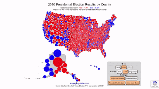
Land doesn't vote, people do!

map of 2020 Presidential Election election results at county level

Engaging Data has updated its US County Electoral Map – Land Area vs Population map so that you can now zoom in and explore the election results in each state. The map allows you to see the 2020 Presidential Election election results at the county level based on land area or population size.

If you select the 'Population' button on the map then the colored proportional circles change size to represent the county population size. Switching between the Land and Population buttons provides a dramatic illustration of how the same data can be visualized in radically different ways.

As Kenneth Field recently explained to Wired "People see maps of any type, and particularly election maps, as the result, the outcome, but there are so many different types of maps available that can portray results in shades of the truth." The Wired article Is the US Leaning Red or Blue? It All Depends on Your Map explores a number of different mapped visualizations of the 2016 Presidential Election to help illustrate how different map methodologies can tell very different stories. You can explore most of these maps in closer detail at Thematic maps of the 2016 Presidential election.

2024 UK Election cartogram map
After the recent UK election nearly every election map I saw in the media included a cartogram view of the results. Similar to the US (and many, many other countries) in the UK sparsely populated rural areas tend to vote more right-wing, while more densely populated urban areas vote in greater numbers for parties of the left. 

To overcome the problem of showing most of the country dominated by the blue of the losing right-wing Conservative Party most maps of the 2024 UK General Election included a cartogram view which represented each electoral area as an equal-sized hexagon. As you can see in the example above an equal sized hexagon map does a very good job in reflecting the actual number of winning candidates for each of the UK's political parties. The compromise of course is that a cartogram is not as geographically accurate as many other methods of mapping election results.