Friday, February 11, 2022

Redlined for Ever

FiveThirtyEight has released a new data visualization tool which allows you to see the lasting effects of redlining on American towns & cities. In the 1930s, under President Franklin D. Roosevelt's New Deal, black homeowners across the United States were discriminated against through the creation of redlining maps. These maps identified areas with significant black populations and labeled them as too high risk for mortgage support. Black homeowners living in these areas were therefore very unlikely to be successful when trying to refinance home mortgages from the government sponsored Home Owners' Loan Corporation.

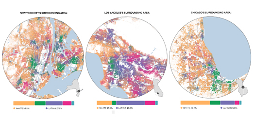
It is now over eighty years since neighborhoods in American towns & cities were designated by the HOLC as 'best', 'desirable', 'declining' or 'hazardous'. Despite this long passage of time the effects of redlining are still apparent in the continuing segregation of American cities. In The Lasting Legacy of Redlining FiveThirtyEight allows you to explore maps which show the racial segregation of American cities based on data from the 2020 U.S. decennial census. 

For each city you can select to view maps of the HOLC zones ('best', 'desirable', 'declining' or 'hazardous') alongside a breakdown of the percentage of each racial group now living in each of these zones. For example the map of Cleveland shows that 59.5% of the population of the city's 'hazardous' designated zones is black. While the city's 'best' zones have a 68.7% white population. 


It is clear that the racial discriminatory mortgage assessments of the 1930s have had a lasting legacy on American cities. A legacy which can still be felt in the United States today. Neighborhoods which were redlined as too high risk for mortgage lending in the 1930s have suffered from decades of under-investment in critical infrastructure. This historical under-investment means that anyone living in a once redlined neighborhood today is still likely to have less access to health care, be more at risk from extreme summer heat and is even at more risk of flooding than people living in neighborhoods which weren't redlined under Roosevelt's New Deal.  

Bloomberg's Redlined, Now Flooding compares historical redlining maps with modern flood risk maps. This comparison reveals that in cities across the United States there is a greater risk of flooding in formerly redlined neighborhoods than in more affluent neighborhoods in the same city.

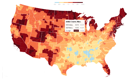
Redlined neighborhoods don't just face a greater risk of flooding. Since the New Deal's racially discriminated mortgage lending assessments of American cities redlined neighborhoods have continued to face under investment in infrastructure compared to their more wealthy greenlined neighborhoods. In How Decades of Racist Housing Policy Left Neighborhoods Sweltering the NYT shows how across the United States neighborhoods which were redlined are now more likely to suffer from the urban heat island effect than neighborhoods which weren't redlined.

The legacy of the Home Owners' Loan Corporation (HOLC) redlining maps can also still be seen in the health inequality in cities today. The Digital Scholarship Lab and the National Community Reinvestment Coalition has used maps to show how redlined neighborhoods suffer severe health disparities in the 21st Century compared to more wealthy neighborhoods.Not Even Past: Social Vulnerability and the Legacy of Redlining allows you to directly compare redlining maps with modern maps which visualize the modern health disparities in U.S. cities. 

Of course one of the biggest lasting legacies of redlining has been the continuing racial segregation seen in many American cities. Wenfei Xu's Redlining Mapvisualization (like FiveThirtyEight's) allows you to explore for yourself if the HOLC redlining maps have had a lasting impact on segregation in your city. Using modern census data alongside the HOLC redlining maps you can see for yourself which neighborhoods  have a high percentage of black, white or Hispanic people and see if these areas correlate with areas which were deemed at risk or safe for lending purposes in the 1930's.

Thursday, February 10, 2022

Worldle

A couple of week's ago I released Worlde, a Wordle type game which requires you to guess the names of countries and major global cities rather than words from the dictionary. Now comes Worldle, an even better Wordle inspired geography game.

Worldle is a fantastic game which requires you to name a country from just its map outline. Like the original Wordle game you have six goes in which to get the right answer. And, like Wordle, there is only one game to play every day.

Where Worldle differs a lot from Wordle is in the clues given after each answer. Instead of green and yellow squares Worldle uses arrows and percentages to help you get to the correct answer from your incorrect guesses. After each guess, you are told the distance you were from the correct country, the direction you need to move on a map and the proximity of your guess to the target country. With just these clues it should be possible to work out the correct answer within the permitted six guesses (particularly if like me you cheat and use a world map).

Worldle is the inspired creation of @teuteuf.

Wednesday, February 09, 2022

Isochrone Maps by Time of Travel

An isochrone map shows the area that you can travel to from one point within a certain time. For example it can show you how far you can drive from your home in one hour. Ironically, despite being a visualization of time, most isochrone maps actually completely ignore the actual time of day when you wish to travel. For example they mostly ignore the fact that the distance you can drive during rush hour is likely to be a tiny fraction of the distance that you could drive at 2am in the morning. 

TravelTime has being working on visualizing how the time of day can affect how far you can travel within a set period of time. In Visualising How Far You Can Travel from New York’s Grand Central Station by Time of Day TravelTime has created an animated isochrone map which shows the distance you can travel by train in one hour throughout a 24 hour period. The map uses the TravelTime API to calculate travel times based on the scheduled timetable. 

The animated map shown at the top of this post concentrates just on the evening rush hour period between 6pm and 7pm. You can view the YouTube video of this map here. Both of the animated maps assume that the traveler must first walk into Grand Central station and walk to the train platform, wait for a scheduled connection and have enough time to exit the station on the other side. You can check the routes shown on the map yourself using the TravelTime interactive travel time map. 

You can view many more travel time maps by checking out the isochrone label on Maps Mania.

Tuesday, February 08, 2022

Population Density Around the World

Tom Forth has released a new interactive map which allows you to explore how many people are living within a set distance from any point on Earth. The Population Around a Point tool is a great way to explore and compare the population density of different cities around the world. 

The map includes a distance slider control which allows you to select any distance from 3 to 50 km. Once you have chosen a distance you can then click on the map to discover how many people live in the selected area. For example in the screenshot above I clicked on a point in Barcelona and discovered that there were over a million people living within 5 km of that point.

If you are interested in population density then you might want to read Alasdair Rae analysis of population density around the world (with a focus mainly on Europe). In Think your country is crowded? These maps reveal the truth about population density across Europe Rae has mapped Eurostat’s population density grid data for 2011. This map visualizes the population density in each square kilometer in Europe.

Alasdair has also created a table which shows the population density of each European country. This table includes a column showing how many people in each country live in the the most densely populated one square kilometer of that country. By comparing this figure for each country you can see where the most densely populated square kilometers are in Europe. In Barcelona more than 53,000 people inhabit a single 1km². This is the most densely populated area in Europe. Paris has the second most densely populated km², with a 1km² containing more than 50,000 people. Alasdair's article includes a brief discussion of some of the most densely populated areas outside of Europe.


These aren't the only maps which allows you to explore population density around the world. Duncan Smith's interactive map World Population Density uses data from the Global Human Settlement Layer (GHSL) to visualize the number of people living in each square kilometer of Earth. 

Another interactive map which visualizes worldwide population data is the SEDAC Population Estimator (GPWv4). This interactive map uses NASA's Earth Observing System Data and Information System (EOSDIS) data to show where the world's population lives. The SEDAC Population Estimator map includes a tool to draw an area on the map to see an estimate of the population that live there. You can therefore draw a square kilometer on the map to make your own comparisons of population density. For example, I drew a square kilometer at random in Dhaka, Bangladesh and the map gave me a population estimate of 107,804. This is over twice as many people as the 52,000 people living in Europe's most densely populated 1km² in Barcelona. 

Monday, February 07, 2022

Here Be Climate Change

It is shocking how quickly climate scientists are pivoting from visualizing the future impact of climate change to visualizations showing the impact that climate change is having right now

Interactive maps such as Climate Central's Coastal Risk Screening Tool (projected sea level rise) and the Analog Atlas (global heating) allow us to see how climate change is likely to impact us directly in the future. These are maps which rely on climate change models to show future climate projections. Unfortunately we no longer need to rely on visualizations of future climate change. In fact climate scientists are already increasingly releasing data visualizations which show the impact that climate change is already making on our climate and on our lives. 

Yesterday The Guardian published an interactive map which visualizes how much temperatures have risen in every US county over the last 125 years. The map in A third of Americans are already facing above-average warming allows you to see how much the average annual temperature has already risen in every single county in the contiguous United States. Shockingly at least 499 counties have already seen temperature increases of over 1.5C.

You can also see how much average annual temperatures have increased where you live via a powerful 'warming stripes' visualization. In 2018 Ed Hawkins, a climate scientist at the National Centre for Atmospheric Science at the University of Reading, released a powerful data visualization to illustrate how temperatures have risen around the globe over the last century. His warming stripes visualization shows the average yearly temperature for every year over 100+ years.

You can get your own warming stripes for different regions and countries around the world (and for individual U.S. states). Select a region and then a country from the drop-down menu on #ShowYourStripes and you can view and download an image showing how temperatures have risen over the last 100+ years at your selected location.


Other publications have begun to examine the direct effect that climate change is having on people's lives. In Who Damages the Climate the Most and Who Bears the Consequences, the German newspaper Tagesspiegel looked at the effects that climate change is already having on many African countries. 

CrisisGroup's interactive map How Climate Change Fuels Deadly Conflict shows where in the world climate issues, like water scarcity and climatic volatility are already leading to conflicts between different communities and countries. You can also explore the impact that climate change is already having on people across the world on the Communities in Crisis interactive map. Communities in Crisis is an online book which looks at the impact that climate change is having on communities around the globe. The book consists of 12 chapters, each of which deals with a specific threat from climate change, including threats such as rising sea levels, drought, extreme heat waves and food and water insecurity.

Saturday, February 05, 2022

The Age of Disappearing Glaciers

Last year The Guardian published a shocking map which visualizes the amount of ice that glaciers around the world are losing every year. The map uses profile plots to show the amount of ice lost (or in very rare occurrences gained) by glaciers around the world in a single year. 

The Guardian's map in Speed at which world’s glaciers are melting has doubled in 20 years uses data from the paper Accelerated global glacier mass loss in the early twenty-first century to help show how glacial melt is driving sea level rise. Between 2000 and 2019, as a direct result of global heating, glaciers lost 267 gigatonnes (Gt) of ice per year. This contributed to around one fifth of the rise in sea levels over that time.


You can see for yourself how much Svalbard's glaciers have shrunk in the last 80 odd years on Yoni Nachmay's interactive map Svalbard 1936/1938. Yoni's map compares historical aerial imagery of Svalbard's glaciers (captured in the 1930's) to the modern aerial imagery of the same glaciers captured by Maxar Technologies. 

In 1936 and 1938 Adolf Hoel used a scout plane to capture aerial imagery of much of Svalbard archipelago. Yoni's Svalbard 1936/1938 map places the vintage photographs of Svalbard's glaciers (taken by Adolf Hoel) side-by-side with modern aerial imagery to clearly show the dramatic extent which these glaciers have shrunk. The result is that you can see for yourself just much these glaciers have melted over the last 80-90 years. 

You can explore other powerful interactive visualizations of glacial melt in the Maps Mania post Melting Glaciers

Friday, February 04, 2022

Enhanced Zoom & Multiple Map Views

John Nelson and Jinnan Zhang have released a simple Esri experimental map which shows multiple scales of the same location at the same time. Their interactive map Optica shows three different map views of the same place but at three different zoom levels. 

The map includes a number of options which allow you to switch the number of map views shown and to switch between having the maps display vertically or horizontally. You can also switch between a number of different map layers (including satellite, terrain and road maps). There is even the option to add your own map layers by adding a link to an ArcGIS online 2D web map.

The Optica map does allow you to get some very interesting map views of locations around the world and it can be very interesting to explore a place with a number of different zoom levels appearing on the same map (for example this view of Bryce Canyon). However Optica isn't the only interactive map which allows you to explore locations using different map views.

Map Channel's Quad View Maps allows you to view locations using Google Maps Street View alongside four different synchronized satellite views. If you use the Map Channels Geocoder map you can quickly find locations anywhere in the world and then click the Quad View Map link to view the searched location on Street View and from four different oblique aerial views.

Thursday, February 03, 2022

The Interactive Map Jigsaw Puzzle

MapPuzzle.xyz is a fun interactive map game which requires you to fit the outlines of geographical areas onto their correct locations on a blank global map. The game is a little bit like a map jigsaw in that it requires you to place shapes (in this case geographical/political areas) into their correct positions.

Each MapPuzzle round starts with a list of geographical areas which you have to fit onto a blank map. This list of puzzle pieces can be countries, states or cities (depending on the game you are playing). Each map puzzle piece in the list is shown with an illustration. When you click on a puzzle piece on this list this shape will start to follow your mouse. All you have to do now is to drag it to its correct position on the blank map (in the screenshot above you can see me dragging the outline of California onto a map of the United States).

The game includes a running counter which tells you how many pieces you have correctly placed on the map and how many pieces you have remaining. This counter also includes a timer. Your goal is therefore to finish the game in the quickest time possible. 


If you enjoy map jigsaws then you should like Jigsaw Explorer. You can make and play your very own online map jigsaws using the Jigsaw Explorer website. The Jigsaw Explorer interface allows you to create interactive online jigsaws from any image. Which means that you can make your very interactive jigsaw maps just from the image on any map.

Here are some interactive jigsaws that I've created from maps in the David Rumsey Map Collection:


If you don't want to make your own interactive map jigsaws then you can play some already created by Esri.

GeoJigsaw is a fun to play interactive map jigsaw game. The game allows you to select jumbled up map jigsaws from any location in the world. All you have to do is to put all the jigsaw pieces back together to complete the map.

You can select map jigsaw puzzles to play by location or by difficulty level. If you can't find a map that you like don't worry. You can just zoom in on any location in the world and automatically generate a map jigsaw puzzle for the location that you have selected.

Wednesday, February 02, 2022

The Sexist Streets of Budapest

Last week I published in The Sexist Streets of the World what I thought was a fairly comprehensive list of interactive maps visualizing the sexist traditions of street naming in cities around the globe. That post includes interactive maps which show how in city after city there are more streets named for men than there are streets named for women. However that list wasn't quite as comprehensive as I thought, as I omitted the very impressive 'Names & Spaces: Budapest'.

Names & Spaces: Budapest is a fascinating mapped analysis of the street names (& other public spaces) of Budapest.This map reveals that in Budapest 90% of streets which have been named for people have been named for men. Only 10% of the city's roads named for people have been named for famous females. This is almost exactly the same percentage (9%) of streets that has been named for fictional characters. In Budapest 208 public spaces have been named after fictional characters and only 224 public spaces have been named for  women.Of the 224 public spaces which have been given female names only 123 are named after real women.Therefore there are more streets in Budapest named for fictional characters than there are streets named after real women.

Names & Spaces: Budapest also looks at the number of streets named for Hungarians (1,816) and the number named for foreigners (206). The map also breaks down the city streets named for people by occupation. Of the different occupations recognized in Budapest's street names writers & poets have the most city streets. The next most recognized occupational group is statesmen & politicians. Soldiers and artists are among some of the other occupations which feature prominently in Budapest street names. 

Further analysis explores the periods of history with the most people represented in Budapest's street names. This analysis also looks at the history of renaming streets and public spaces. For example after the country's transition to democracy in 1989 many public spaces were renamed to replace streets and squares named for communist heroes. 

Via: The Data Vis Dispatch

Tuesday, February 01, 2022

Distances to Abortion Providers


Forty nine years ago the Supreme Court ruled that the government could not excessively restrict a woman's freedom to choose to have an abortion. That right to choose is now under threat. This means that women in the United States may soon have to travel over a thousand miles to their nearest abortion provider.

Axios has created an interactive map which compares the distances that women currently have to travel to their nearest abortion provider to the distances they would have to travel if the Supreme Court overturns Roe vs Wade.

It appears likely that the Supreme Court will flout the clear public support for abortion rights in the USA by overturning or significantly weakening the 1973 landmark abortion ruling, Roe v. Wade. Currently the average distance to an abortion provider in the United States is 25 miles. According to a new interactive map from Axios if the Supreme Court overturns Roe v. Wade, the average distance to an abortion provider will be around 125 miles. Of course some women will have to travel a lot further.

The interactive map provided in Abortions could require 200-mile trips if Roe is overturned uses the Myers Abortion Facility Database to show the current average distance to the nearest abortion provider for each county. It also allows you to view the projected distances to the nearest abortion provider if the Supreme Court overturns Roe vs Wade (using a report from the Center for Reproductive Rights which names those states which are "highly likely" to ban abortion).

You can hover over any county on the Axios map to view the current and projected distances to an abortion provider in that county. For example, if you hover over Cameron County in Texas the map reveals that currently the distance to the nearest abortion provide is just over 50 miles by road. If Texas succeeds in banning a woman's right to choose the distance will be over 832 miles. This means that women in Cameron County will face a round-trip of over 1,600 miles to their nearest abortion provider.