Monday, November 07, 2022

When to Expect the Midterm Election Results

FiveThirtyEight has released an interactive map which provides information on when you can expect each state to count and announce the results of today's election. When Will We Know 2022 Midterm Election Results? includes a cartogram map which allows you to select a U.S. state in order to find out when the polls close in that state, the races to watch in the state and when you can expect the results to be declared.

Each state has different rules on when and how votes are counted. Therefore some states are much quicker at releasing election results than others. According to FiveThirtyEight some states "like Arizona, Nevada and Pennsylvania ... could take multiple days to count all their votes."

The FiveThirtyEight map includes a slide control which allows you to adjust the date and time. This allows you to see which states are expected to have reported results for a selected date and time over the coming days. For example the screenshot above shows (in yellow) all the states who FiveThirtyEight expect to have announced election results by 12 am tomorrow (Nov 9th).

The FiveThirtyEight predictions for state election returns are based on each state's 2020 primary election counting, data received from state election officials and analysis from Edison Research.

Currently the Democratic Party has a very slim majority in the House of Representatives and the Republicans only need to make a net gain of five seats on November 8th.

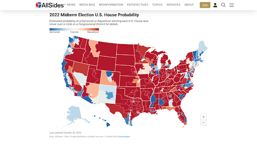
According to AllSides "Republicans have a 77% chance of taking the U.S. House ... (and the) Democrats have a 52% chance of keeping the U.S. Senate".  In Who Will Control the House and Senate? AllSides has created two interactive maps to show the probable party winner in each electoral district in both the Senate and House elections.

On each AllSides map electoral districts are colored to reflect the party most likely to win in the midterm elections. You can hover over individual electoral districts on either map to see the latest odds based on the AllSides Election Forecast Model. This model "takes into account polls on individual races, national sentiment towards each party, history of past midterm elections ... to estimate the vote share of candidates in a race and the probability that they will win".

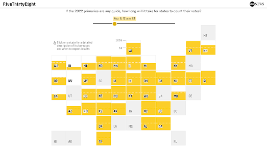
FiveThirtyEight suggests that the Republicans have a 7 in 10 chance of regaining the lower chamber. In The Seats Republicans Could Flip To Win The House FiveThirtyEight maps out the districts which are most likely to switch hands in November. Using a hexagonal cartogram, with districts organised by state, they have highligted in red and blue those districts most likely to flip (with the reddest seats most likely to flip to Republicans and the bluest seats most likely to flip to Democrats).

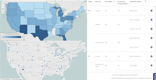
One thing that makes the 2022 midterm elections unique is the unprecedented number of anti-democratic far-right candidates standing for office. According to Political Research Associates there are 274 candidates in the 2022 midterm election cycle who "represent a definable Electoral Far Right". They identify far-right candidates by support for such issues as racial/ethnic nationalism and election denial.

In Mapping The Electoral Far Right in the 2022 Elections Political Reasearch Associates has published both a choropleth and dot map showing where these 274 far-right candidates are standing for office. According to these maps Arizona, Texas and Florida are the states where the most far-right candidates are standing for office.

See A Satellite Tonight

James Darpinian's See a Satellite Tonight can tell you at what time tonight satellites will fly over your house. It can also show you exactly where to look in the night sky if you want to see a satellite passing overhead. 

Share your location with See a Satellite Tonight and you can view an interactive 3D Cesium Earth map, showing your current location highlighted on the globe. The globe also features an animation of any satellites passing over your home tonight. The map menu (running down the left-hand side) tells you at what time a satellite will be flying overhead. It also includes, in chronological order, options to view any other satellite passes over your house tonight and on subsequent nights.

The real magic of See a Satellite Tonight is that you can also view an animation of the satellite flying over your house on Google Maps Street View. This shows you exactly where to look in the night sky if you want to see the passing satellite and at what time. 

When I first wrote about See A Satellite Tonight back in 2019 James Darpinian's interactive map only showed the location of the International Space Station. Since then the map has introduced a few new features. Now as well as telling you where to find the International Space Station See A Satellite Tonight can tell you how to spot the Starlink constellation of satellites and the Russian launched SL-16 RB.

The Street View animated map showing you exactly where to look now also shows you where you can find the constellations and major planets in the night sky. For example, tonight in the UK, if I look eastwards, I should be able to view Jupiter and Saturn fairly low in the night sky.

Saturday, November 05, 2022

Find Your Neighborhood Twins

If you live in California you can find out which other neighborhoods in California are most similar to your neighborhood using the new MixMap tool. MixMap is a 'place-based semantic similarity platform'. Or, in more simple terms, it is an interactive map that can help you find census tracts which have very similar census data results. 

To use the map simply click on any census tract in California. The map will then color all other census tracts based on their socio-economic and demographic similarities to your selected tract. A table beneath the map will list the top 5 census tracts in California most similar to the tract you have chosen (you can click on any of these listed tracts to see their locations highlighted on the map). 

The socio-economic & demographic census data being used to calculate the tract similarity are age, race, income, education, commute and proximity. In the map sidebar you can adjust the weighting given to each of these individual metrics when calculating the similarities. For example if you just want to find the census tracts with the most similar age range distributions you can adjust the age mixer to 100 and set all the other metric mixers to zero.

You can also adjust the 'map type' in the map sidebar. The default view is a choropleth map which colors each tract based on similarity. You can adjust this to the 'Most/Least' view which changes the map to show just the most and least similar tracts - colored blue and red on the map.

The Luftwaffe Map of Kiev

Before the Battle of Kiev (when the Germans captured the city of Kiev in WWII in 1941) the Luftwaffe created a large photographic map of Kiev. To create the map the Luftwaffe made a number of reconnaissance flights to take aerial photographs of the city. These photos were then edited and photographically printed at the local Wehrmacht headquarters, near Kiev, by the German Army ‘Motorized Surveying & Map Detachment’.

The Photographic Map of Kiev also includes a number of placename labels which the Germans added to the map to identify the locations of important infrastructure which were targets for the invading army. These included the harbour, railways stations, bridges and the citadel. Major roads and railway lines were also labeled on the map to indicate the neighboring towns that they led to. 

On my Photographic Map of Kiev I have added English translations for the German labels. My map was created using my Leaflet-IIIF-GeoJSON utility tool to add the manifest of the map, to highlight areas on the map and to save the created GeoJSON data. If you are interested in annotating historical vintage maps yourself then you might find these instructions for using Leaflet-IIIF-GeoJSON and Leaflet-IIIF-Annotation helpful.

The Photographic Map of Kiev is owned by the David Rumsey Collection. You can learn more about how the map was made and what it shows on the David Rumsey Map Collection website.

Friday, November 04, 2022

The Real-Time Train Map

The Signalbox Live Train Map shows the location of trains in the UK in real-time on an interactive map. Zoom-in on the Live Train Map and you can watch the trains actually moving on the map to show the trains' real-time, real world locations. 

Trains on the map are indicated by colored arrows. The arrows show the direction of travel of the train and the color indicates whether the train is delayed or running on time (green = on time, yellow = 1-10 min delay, & red = over 10 min delay). Click on an individual train marker and you can lock onto that train to track it as it moves on the map. If you select the 'view stops' option you can also see a train's entire schedule and when it is timetabled to arrive at each station on its route.

The Signalbox Live Train Map also includes a number of filtering tools. These allow you to filter the map to show only trains from a specific train company or to only show trains traveling to or from a named station. 

If you are a fan of live real-time maps of train networks then you might also like:

Travic - animated maps of over 700 transit systems around the world
OSM Tchoutchou - shows real-time trains in France, Ireland, Denmark and Finland
Train Map - a live map of the Belgium rail network
Réseau SNCF en Temps Réel - the live position of all SNCF's trains throughout France
Swiss Railways Network - the original real-time map of Swiss trains
Trafimage - the entire public transit network of Switzerland in real-time
Mini Tokyo 3D - a live real-time map of Tokyo's public transit system (in 3D)
Zugverfolgung - real-time train tracking in Germany, Austria, Switzerland, Belgium and the Netherlands.

Thursday, November 03, 2022

Do You Live in a 10 Minute City?

The concept of the 15 Minute City was first developed by Professor Carlos Moreno of the Sorbonne. The idea of the 15 Minute City is to make urban living more liveable and sustainable by ensuring that all the essential needs of individuals can be accessed without having to get in a car or use public transport. 

A 15 Minute City is an urban environment which promotes a sustainable future by ensuring that all the essential needs of individuals can be accessed within a short distance of travel. These essential needs include such things as grocery stores, health care facilities, cultural attractions, transit stops, educational facilities and leisure activities. Individuals living in a 15 Minute City should be able to access all these essential health, educational, retail and leisure needs within a short fifteen minute walk or bike ride.

If you live in New Zealand you can now find out if you actually live in a 10 Minute City. Urban Intelligence's new X Minute City interactive map allows you to discover how far you have to travel in New Zealand's major cities in order to access education, healthcare, greenspace/recreation, food, and other essential services.

Select a city on the map and then choose one of the Amenities / Services from the drop-down menu and you can view a choropleth map of the city showing how long it takes to walk to that service from each city block. The map sidebar tells you on average how long it takes to walk to the chosen amenity / service in the whole city and a bar graph reveals the percentage of the population living within 5, 10, 15, 20 & 20+ minutes from the chosen amenity.

If you live elsewhere in the world then you can find out if you live in a 15 minute city using the CityAccessMap. This new interactive map from Delft University of Technology visualizes how accessible essential services are to the local population in cities around the world (the map should work for any city with a population over 100,000). The map uses OpenStreetMap data to assess the distribution of city infrastructure and population data from the European Commission's Global Human Settlement Layer to work out where people actually live.

If you zoom in on a city on the CityAccessMap a heatmap layer shows you where accessibility to services is high or low in the city. If you hover over a location on the map you can also view a graph showing the local levels of accessibility to a number of essential services and how this compares to the city average. 

If you zoom out on the map a distribution graph will also appear on the map ordering the world's cities from least accessible to most accessible. According to CityAccessMap Orlando, Florida is one of the least accessible cities in the United States (and the world). In Orlando only 7% of residents have access to services within a 15 minute walk of their home. In comparison - in New York 76% of residents can access essential infrastructure within a 15 minute walk (in Paris it is 95%).

Mapping the World's Flora & Fauna

The popular Pla@ntnet website can help you identify the species of any plant just by submitting a photograph of the plant. Pla@ntnet has now also released a new interactive mapping tool which can list all the different species of plants that can be found in any chosen area.

GeoPl@netNet is a simple tool which allows you to draw an area on an interactive map to discover which species of plants can be seen in that area. You can draw any sized rectangle on the map and GeoPl@netNet will then list all the plant species which can be found there. 

The map uses AI to determine the potential plant species in an area based on climatic variables, soil-types, and data from the Global Biodiversity Information Facility (GBIF). When GeoPl@netNet lists the species which can be found in an area it returns the number of known occurrences of each species recorded by GBIF.

If you are interested in finding out more about the different types of flora and fauna which exist in your neighborhood you can also use the iNaturalist Explore tool. Enter a location into iNaturalist Explore and you can view a list of all the species of animal and plants which have been observed in the area by users of the iNaturalist app.

This app is used by citizen science naturalists around the world to identify and record observations of plants and animals. Using the iNaturalist Explore tool you can discover what observations have been recorded near where you live. You can also search individual species of plant or animal to view a global distribution map of that species' natural habitat. 

Wednesday, November 02, 2022

Mapping Car Parking Spaces in Berlin

There are 1.24 million cars in Berlin. If the average size of a car is 8.74 square meters then cars take up roughly 10,837,600 square meters of Berlin. In order to facilitate all those cars Berlin's streets need a lot of designated parking spaces. 

Tagesspiegel has mapped out the percentage of parking spaces on Berlin's streets by neighborhood. Their Berlin Parking Lots map colors each of the city's neighborhoods to show what percentage of road space in the neighborhood is dedicated to car parking spaces. If you hover over a neighborhood on the map you can also find out what percentage of the whole neighborhood is taken up by car lots and how that compares to the percentage of land taken up by playgrounds and green spaces. 

For example 26.8% of street space in the Wissmannstrasse neighborhood in south-east Berlin is dedicated to car parking. 2.8% of the whole area is dedicated to parked cars, while only 1.7% of the neighborhood is dedicated to playgrounds. 

If you don't live in Berlin you can find out how much of your neighborhood is dedicated to parking lots using the Parkulator interactive map. Parkulator is an interactive mapping tool which allows you to discover how much of your town is dedicated to parking lots, golf courses, brownfield sites, solar generators or parks.

If you draw an area on the Parkulator map you can choose to find out how much of that area's real-estate is claimed by parking lots (or golf courses, brownfield sites, solar generators or parks). Parkulator will also tell you how much housing or how many parks could be built instead on that same sized area of land.

Mapping A Rainy Day in Paris

For day 2 of the #30DayMapChallenge I've created an animated Map of A Rainy Day in Paris. Obviously this one isn't a map but it does use the Leaflet mapping library, GeoJSON and uses animated polylines. 

What you can see in my 'map' is a partial recreation of the painting Paris Street; Rainy Day by Gustave Caillebotte. You can see the painting itself on this instance of my Leaflet-IIIF-GeoJSON tool. Using the IIIF manifest of the painting from the Art Institute of Chicago I loaded the painting into Leaflet-IIIF-GeoJSON. I then simply used the drawing tools to trace over the painting and saved the results as a GeoJSON file.

I then animated the traced polylines in Leaflet using Ivan Sanchez's SnakeAnim plug-in. SnakeAnim is a utility which allows you to animate polylines on a Leaflet map. If you look at the code in my Map of A Rainy Day in Paris you will see that it is very messy. This is mainly because I simply cannibalized a previous map I had made with Leaflet and SnakeAnim. That cannibalized map was the First 50 Years of the London Underground, which uses SnakeAnim to replay the building of the first lines built on the London Underground network. 

If you are wondering why my map is back-to-front compared to the original drawing that has to do with the fact that Leaflet transposes the Latitude and Longitude coordinates from GeoJSON (this means that the drawing in my map is turned on its size). There is actually a simple fix to this (if you read the documentation). Unfortunately I couldn't remember what it was this morning so I cheated and simply flipped my map by 90 degrees (which causes some ugly problems if you try to pan around on a Map of A Rainy Day in Paris). 

Tuesday, November 01, 2022

The 1911 Train Travel Map

Chronotrains was one of my favorite interactive maps of this summer. This interactive map shows you how far you can travel from any European rail station in less than five hours. Hover over any location on Chronotrains (within the highlighted area in Europe) and you can view an isochrone layer which shows you how far you can travel by train in hourly increments.

Now Benjamin, the developer of Chronotrains, has released Chronotrains 1911. This new interactive isochrone maps uses train travel times from 1911 to show you how far you could travel by train in five hours from any French station in the second decade of the 20th Century.

The animated GIF above shows Chronotrains and Chronotrains 1911 side-by-side, with the modern train times on the left and the 1911 train times on the right. In 2022 France has a lot of high speed rail lines which hadn't yet been constructed in 1911. However the map on the right shows that in 1911 France actually had a denser rail network with a lot more local stations than it does now.

The data for the 1911 map comes from Cambridge Universtiy's Communes project, which has digitised the French rail network from 1832 to 2015.