Wednesday, April 12, 2023

Did Spring Come Early This Year?

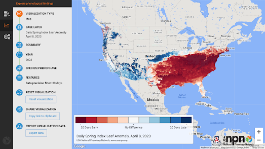
The USA National Phenology Network collects data on the effect of the seasons and the climate on animal and plant life. It observes and studies how seasonal and interannual variations in the climate affect biological life cycles. As part of this work it has created an interactive map showing where Spring in the United States has arrived early and where it has arrived later than usual.

The NPN interactive map Spring Leaf Anomalies shows where in the country Spring leaves appeared earlier or later than normal compared to the average from 1991-2020. The red areas on the map show where Spring arrived early this year and the blue areas show where Spring has arrived later than usual. 

This year low pressure in the west of the United States meant that Winter was colder and wetter than usual. Conversely a ridge of high atmospheric pressure kept the east relatively warm. These conditions have fed into the late arrival of Spring in the west and its early arrival in the east.

Tuesday, April 11, 2023

Mapsaws - Jigsaws Made from Maps

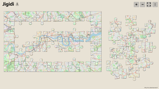
Jigidi is a free online jigsaw game. On Jigiidi you can choose to play thousands of online interactive jigsaw puzzles. If you join Jigidi you can also create your own interactive jigsaw puzzles. Many members of Jigidi have of course already made some fun jigsaw puzzles out of maps.

Here are three OpenStreetMap jigsaw puzzles for you to try created by Karlos. These include a 330 piece jigsaw of a map of the world, an easy 54 piece jigsaw map of London, and a much harder 600 piece jigsaw map puzzle of London. All three puzzles use OpenStreetMap maps.

You can find a few more map jigsaw puzzles on Jigidi by searching 'OSM'


If you enjoy map jigsaws then you should also like Jigsaw Explorer. Another website where you can make and play your very own online map jigsaws. The Jigsaw Explorer interface allows you to create interactive online jigsaws from any image. Which means that you can make your very own interactive jigsaw maps from the image of any map.

Here are some interactive jigsaws that I've created from maps in the David Rumsey Map Collection:

Monday, April 10, 2023

Mapping Global Water Shortages

During this century the combination of a rising global population and the increasing effects of climate change are very likely to lead to severe shortages of many natural resources. Already the demand for water in many locations around the world exceeds the supply from groundwater and rivers. 

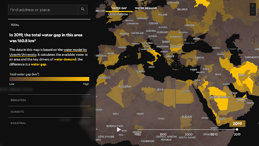
The National Geographic has created the World Water Map in order to help visualize where water gaps exist and explain why they arise. The map is based on a global model developed by Utrecht University, Netherlands.

The World Water Map shows the demand for water around the world and how big the gap is between that demand and an area's renewable water supply. The areas on the map are defined by individual watersheds and smaller sub-basins. As well as showing the total water gap in locations around the world the map can also visualize sub-sets of water gaps for irrigation, domestic water use, and industrial water use in the same regions.

National Geographic's map is accompanied by an explanation of what a water gap is and a closer look at some of the major water gap hotspots around the world.

Saturday, April 08, 2023

Caltech's New Map of Mars

Caltech's Bruce Murray Laboratory for Planetary Visualization has unveiled a new online interactive map of Mars. The map has been created using a 5.7 terapixel global image of Mars created from 110,000 individual images. Images which were captured by the Context Camera (CTX) aboard NASA's Mars Reconnaissance Orbiter (MRO).

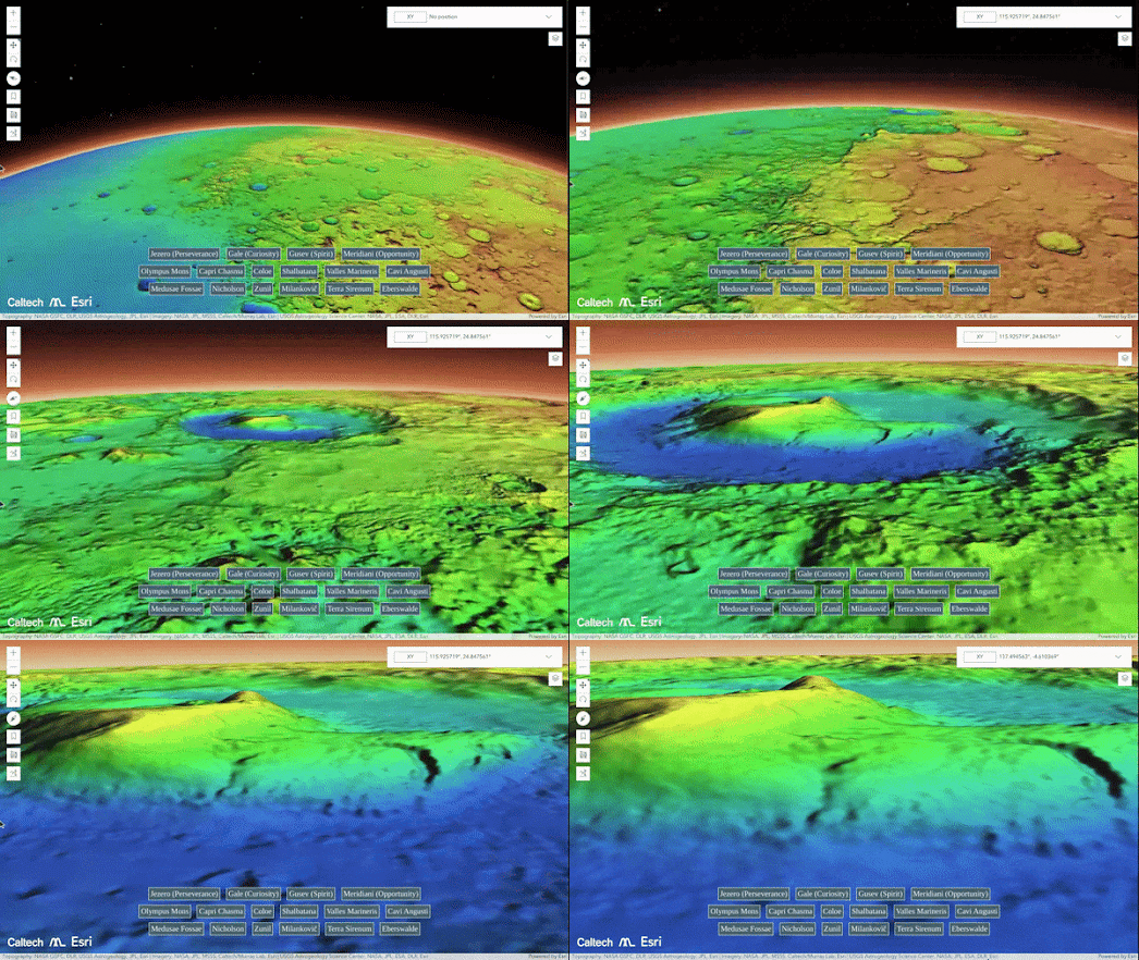
The Global CTX Mosaic of Mars interactive map contains a number of handy links to help inter-planetary explorers avoid becoming lost on the red planet. Clicking on the provided links will automatically pan and zoom the map to some of the planet's most memorable topographic features and to some of the locations on Mars which have been traversed by NASA's Curiosity and Perseverance Rovers.

Caltech's map uses Esri's SceneView interface. This enables the new imagery to be viewed on an elevation model of Mars. It is therefore possible to use the Global CTX Mosaic of Mars to explore the planet's mountains and craters in 3D. For example using the map you can pan around Olympus Mons, the tallest volcano in our solar system. Alternatively you can dive into the huge Jazero or Gale craters on this high resolution map of Mars.

According to NASA the new map is "the highest-resolution global image of the Red Planet ever created". NASA's Mars Reconnaissance Orbiter has been capturing imagery of Mars since 2006. This new mosaic of this imagery provides a resolution of around 25 square meters per pixel. The highest resolution at a global scale was previously 100 meters per pixel. The new map therefore represents a 20-fold increase in resolution from previous interactive maps of Mars.

Friday, April 07, 2023

Artificial Maps

I began my Easter vacation this morning, so I've handed today's post over to my two artificial assistants, DALL-E and Bard. All the maps on this page were created from prompts given to DALL-E and their descriptions are curtesy of Bard.


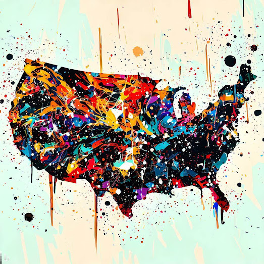
Jackson Pollock's USA

A map of the United States painted by Jackson Pollock which is a chaotic and abstract work of art. The map is covered in thick layers of paint, with no clear borders or landmarks. The colors are vibrant and swirling, and the overall effect is one of movement and energy.

Pollock was a famous American painter who was known for his "drip paintings." In these paintings, Pollock would drip and splatter paint onto a canvas, creating a work of art that was both beautiful and chaotic. 

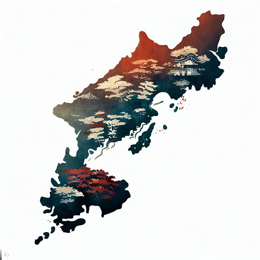
Ukiyo-e Japan


A map of Japan in the Ukiyo-e style. The map is decorated with intricate patterns and designs, giving it a truly unique and Japanese look and feel. The Ukiyo-e style is a type of Japanese woodblock printing that was popular in the Edo period (1603-1868). Ukiyo-e prints often depict scenes of everyday life in Japan, such as people going about their daily business, festivals, and landscapes. The style is known for its use of vibrant colors and bold lines.

Aboriginal Australia

A map of Australia painted in the style of Indigenous Australian art representing the land, the people, and the stories of Australia's Indigenous people. The colors are vibrant and earthy, and the overall effect is of beauty, power, and connection to the land. 

Indigenous Australian art is a diverse and rich tradition that has been passed down for generations. The art is often used to tell stories about the land, the people, and the Dreaming. The Dreaming is the belief that the world was created by ancestral beings who traveled across the land, creating the features of the landscape and giving life to the plants and animals.


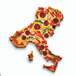
Pizza Italia

A map of Italy made out of pizza is a delicious and visually appealing work of art. The map is made from one slice of pizza, arranged in the shape of Italy. The overall effect is one of color, flavor, and creativity.

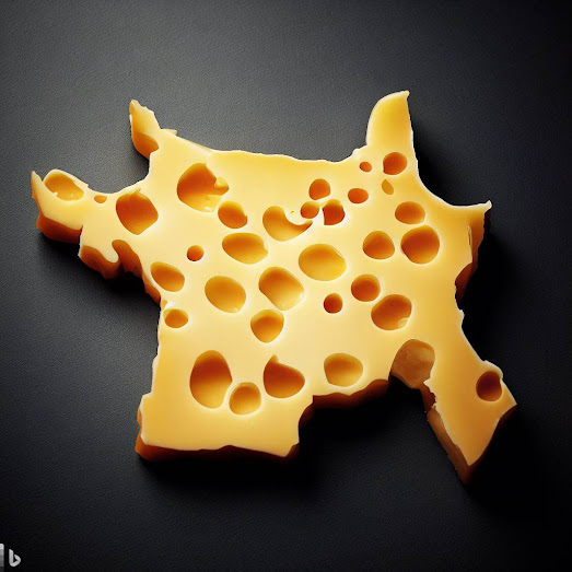
Fromage France

A piece of cheese arranged in the shape of France. A better map would be made up of individual pieces of cheese, each of which would be shaped like a different region of France; Camembert for Normandy, Brie for Île-de-France, Roquefort for Occitanie, Époisses for Bourgogne.

Thursday, April 06, 2023

Dot Maps of the Chicago Mayoral Race

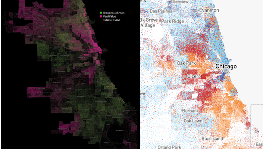
Brandon Johnson is set to become the new mayor of Chicago. Johnson beat Paul Vallas in Tuesday's runoff election with 51.44% of the vote. You can see where people voted for each of the candidates at the neighborhood level thanks to two different dot density maps created from the results of the Chicago Mayoral election.

CBS in Breakdown of Chicago mayor vote by precinct has created a combined dot density map which uses different colors to show where votes were cast for each of the two candidates. In this map (pictured at the top of this post) Brandon Johnson votes are shown with green dots and Paul Vallas votes are shown in pink. As you can see from the map Paul Vallas did well in many northern and south-western electoral precincts. Brandon Johnson performed better in the West Side and in many of the southern neighborhoods.

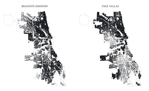
Forest Gregg has also created two dot density maps of the mayoral election. His Observable maps 2023 Mayoral Election Runoff, Dot density maps use black dots to represent 10 votes cast for each candidate. Forest has created a separate dot density map for each candidate. With the two maps placed side-by-side it is easy to see where in Chicago each candidate performed best 

If you want to know exactly how many votes were cast for each candidate then you can view this 2023 Chicago Mayoral Runoff map. This map colors each precinct to show which candidate won the most votes. You can hover over the individual precincts on the map to view how many votes were cast for each candidate.

It is always interesting to compare election maps with maps of other metrics. CNN's Racial Dot Map of the U.S. provides a neat visualization of the racial demographics of Chicago neighborhoods. The image above shows CBS's dot density map of the mayoral election side-by-side with the racial dot density map of Chicago. On this later map light blue dots are white, orange dots represent Black citizens and red dots indicate Hispanic residents. 

A very rough comparison of the two maps suggests to me that Black majority neighborhoods tended to vote for Brandon Johnson, while many of the white majority neighborhoods voted for Paul Vallas.

Wednesday, April 05, 2023

The Drug Map of Europe

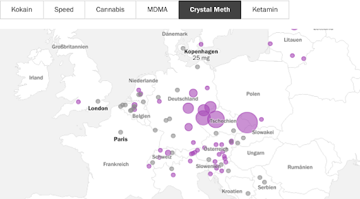
According to German newspaper Tagesspiegel drug use in Europe is on the rise again after a brief lull during the Covid pandemic. The paper has used data from the European Monitoring Center for Drugs and Drug Addiction (EMCDDA) to map evidence of the levels of drug use in 104 cities across Europe. You can view the results in the paper's article Drug Analysis in 104 Cities

Tagesspiegel's map shows the levels of different drug residues found in the sewage wastewater in each of the sampled cities. The EMCDDA analysis tested for six different types of recreational drug residues: cocaine, crystal meth, MDMA, cannabis, amphetamines and ketamine. The map allows you to observe the levels of residues found for each drug in each of the 104 European cities.

The map reveals that crystal meth is a growing problem in east Germany and the Czech Republic (if you click on a map marker you can view graphs showing the measured levels of each drug in that city over time). Across Europe cocaine use seems to rising, while use of MDMA is falling.

As well as the interactive map Tagesspiegel has created an interactive chart which allows you to view which cities recorded the largest and smallest levels of each drug. Amsterdam had the highest levels of MDMA residues found in its wastewater. Barcelona appears to be the ketamine capital of Europe. Cannabis was highest in Geneva. Antwerp had the highest recorded levels of cocaine. Gävle in Sweden had the highest levels of amphetamines, and Ostrava in the Czech Republic is the city with the largest crystal meth use.

Tuesday, April 04, 2023

Is Ukraine's War our War?

The Dutch broadcaster VPRO argues that for many Dutch people the war in Ukraine feels like 'our' war. This therefore raises the question of who 'we' are. VPRO suggests that living in the Netherlands means you are Dutch, European, a member of NATO and a member of the 'free West'. All of which could make the Russian invasion of Ukraine feel more like 'our' war. 

However identity is a very personal matter and VPRO wanted to know exactly where Dutch people feel the border between 'us' and 'them' exists. The broadcaster therefore asked its readers to draw where they think the border between us and them is located on an interactive map.

In Us Against Them you can draw an outline on an interactive map to show exactly where you think this us and them border exists. Once you have drawn on the map you can see the results of all the other responses by VPRO's readers. As you can see from the screenshot above a lot of respondents seem to have drawn a rough border around Europe. Many other respondents have drawn a rough border around the Netherlands and (if you zoom out you can see) a reasonably large number of respondents have drawn a border around all the countries of the world. 

If you want to carry out your own map survey similar to VPRO's Us Against Them you can remix my Where is Texas map on Glitch. Just click on the fish icon on this map and select the 'Remix' option. You can then create your own version of the map  (although you do need a Mapbox access token).

Monday, April 03, 2023

Who has the Best Cellular Data Speeds?

A brand new cellular coverage map can help you choose which cellular network operators has the best coverage where you live. All of the cellular network operators provide their own coverage map, showing where they have coverage, but these are notoriously inaccurate.

CoverageMap.com aims to overcome the inaccuracies of the network's own maps by creating a coverage map which includes user submitted data. The map allows cell phone users to compare the data speeds and signal strength of the different cellular networks operating where they live to find out which ones offer the best download and upload speeds.

Using CoverageMap's filter controls you can choose between Verizon, AT&T, T-Mobile, Dish Wireless and US Cellular to view their coverage across all areas of the United States. When you select a carrier their data speeds are then visualized on the map using different colored hexagons. Click on a hexagon and you can view the average download and upload speeds of the carrier in that area. You can then use the filter control to discover the average download and upload speeds of all the other network operators in the same area.

If you live outside the United States then you can check OpenSignal instead. OpenSignal provides cellular coverage maps for many countries around the world (including the USA). The OpenSignal coverage maps are based on data speeds provided by OpenSignal app users around the world. 

Saturday, April 01, 2023

The 100 Most Boring People in America

Who is the most unnotable person in your town?

I asked ChatGPT to find me the most unnotable people in America's biggest towns and cities. The results can be seen on my Unnotable People map. On this map the placename labels of the 100 largest towns and cities in the USA have been replaced with each town's most insignificant person.

Using ChatGPT to find each town's most unnotable person means that the map may contain errors. Because the people who are featured on this map have achieved very little in life it was difficult to confirm their existence. It was even more difficult to find out what each of these people had achieved in life (mostly very little).

If you want to know your town's most notable person then you should also check out Topi Tjukanov's Notable People map, or The Pudding's A People Map of the USA.