Wednesday, March 16, 2016

The Street View Castle Tour


Expedia has created a really nice Street View tour of Malmö Castle in Sweden. The present castle was built in the 1530's by King Christian III of Denmark.

The Malmöhus Castle - Virtual Tour seems to have been made from custom Street View imagery captured by Expedia themselves. As you explore the castle in Street View you can click on the map markers to learn more about the castle and the historic paintings and objects it holds.

As you travel around the castle you can also listen to some audio recordings explaining the function of some of the castle's historic rooms.

If you feel inspired by Expedia's custom Street View tour then you might want to explore the Custom Street View section of the Google Maps API and the Street View Publish guide to submitting Street View imagery to Google Maps.

TeleGeography's 2016 Undersea Cable Map


Every year TeleGeography creates a new global undersea cable map. TeleGeography's Submarine Cable Map 2015 was a particularly wonderful map. The 2015 map was inspired by medieval and renaissance cartography and featured some wonderful map border illustrations and even a number of beautifully drawn sea monsters.

For the 2016 edition of its Submarine Cable Map TeleGeography has designed a much more modern looking and information rich map. The main map shows 321 undersea cable systems around the world, while a number of smaller inset maps depict some of the world's busiest landing stations.

Countries on the map are colored to show how many submarine cable system links are connected to each country. Infographics along the bottom of the map provide additional information on the capacity of the major global cable routes around the world.

The Submarine Cable Map 2016 is certainly not as much fun as the 2015 edition. However TeleGeography's latest map does provide a lot more information about the world's submarine cable networks and is consequently a lot more informative.

Tuesday, March 15, 2016

The Art of the Satellite View


You don't see many developers experimenting with the Google Maps API these days. This is a shame, as you can create some amazing visual effects using the satellite imagery from Google Maps  - as these experiments will hopefully demonstrate/

Urban Collage allows you to view an animated collage of a number of the same satellite views, seen at different zoom levels. To create your collage you just need to enter two locations (they need to be locations that you can drive between). The application then uses your two locations to slowly pan through the driving route between those two cities. Essentially you are presented with an urban collage of the route as seen at different zoom levels in Google Maps aerial view.


One of the first applications to experiment with cutting up Google Maps satellite views was #
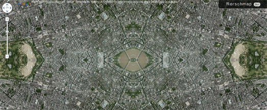
rorschmap. #rorschmap uses the Google Maps API to create a kaleidoscope for any location on the Earth.

The application displays the Google Maps satellite view of any location in the world and, using the same principle of multiple reflection that you find in kaleidoscopes, creates an animated Rorschach test effect.


Displayce is another series of visual map experiments created using the Google Maps API. Each of the experimental views in Displayce uses a number of Google Map instances on one page to create an experimental map pattern.

For example, 'foci' (pictured above) overlays a number of Google Maps aerial views on top of each other. Each map instance shows a view of the same location but each map has a consecutively lower zoom level.

Displayce includes four different map experiments all creating a different visual effect by stitching together different map instances to create different patterns. You can enter any location in the world into each of the experiments and, if you like the resulting experimental map, you can grab the URL for the view and share it with your friends.


Of course Google Maps aerial views are often works of art in their own right. The Earth is a beautiful place and that beauty can be found in many Google Maps satellite images.

Chuchichechocha is a Google Maps satellite view slideshow, developed by David Schmidt, which showcases some of the most beautiful views found on Google Maps. The slideshow automatically animates through a large number of beautiful images found in Google Maps.

The application includes controls to pause or to manually navigate through the images. Each image also comes with a unique URL so you can share your favorite views with your friends.

The World Driving Times Map


Last year Empty Pipes made a series of beautiful looking isochrone maps showing public transit travel times from major European cities. Now Empty Pipes is back with Isochrone Driving Maps of the World.

Using OpenStreetMap mapping data and the Graphopper open source routing library Empty Pipes has created a series of maps for towns and cites around the world. The map visualize the driving times when starting from the center of each of the mapped cities.

Empty Pipes also makes a number of interesting observations based on his ischrone maps of driving times. For example he notices how many of the driving time maps for cities in the US have a distinctive pyramid shape. One result of the grid patterns of many American cities is that it takes much longer to drive 'along the diagonal than to travel straight north and south'.

Elsewhere geographical features can be seen to have a huge impact on driving times. For example in Santiago, Chile the Andes mountains have a clear impact on anyone driving east of the city.

Mapping Global Diplomacy


The Lowly Institute has mapped the diplomatic networks of all G20 and OECD nations in order to visualize the gaps and concentrations in international diplomacy.

The Global Diplomacy Index map includes two main layers. The yellow dots on the map show cities around the world where G20 or OECD nations have diplomatic posts. Click on a city's dot and lines connect to the city showing every G20 or OECD country with a diplomatic post in the city.

The large blue circles on each G20 or OECD nation represents the size of each country's diplomatic network. Select a country's blue circle on the map and lines connect to every other country in the world where it has a diplomatic post.

For the purposes of the Global Diplomacy Index map diplomatic posts include; embassies and high commissions. consulates, permanent missions, and representative offices or delegations. You can read more about the posts included and excluded from the Index on the map's 'about' page.

Monday, March 14, 2016

The First Languages Map of Australia


The Gambay - Languages Map is an interactive map of the languages spoken by Australia's indigenous people. The map currently lists 795 languages across Australia.

The languages displayed on the map are color coded by language family. If you zoom in on the map the colored dots become labels indicating the different first languages.  The labels with the little head icons indicate languages which include videos. These markers feature videos of first language speakers discussing the importance of first languages to indigenous communities.

The Gambay - Languages Map has been partly designed with school students in mind and includes teacher notes and curriculum links for a number of different school subjects.


If you are interested in Australia's indigenous people you might also like Monash University's Indigenous Dot Map of Australia.

Indigenous Australians make up 3% of the total Australian population. Every dot on this map shows an indigenous person counted in the 2011 Australian census. The map shows the spatial distribution of the 699,990 indigenous Australians counted in the census.

Looking at the map indigenous Australians seem to make up a larger proportion of the population in the north of the country. Apparently the Northern Territory has the largest proportion (30%) of its population who are indigenous, which appears to be borne out by the map.

Mapping the Conflict in Syria


Territorial control in Syria is constantly changing. Since 2012 the Carter Center has mapped over 40,000 conflict events in Syria in order to provide an as up-to-date as possible overview of the ever changing political and military landscape.

Tracking the front Line in Syria analyzes open source information to map these conflict events in Syria. The map provides a near real-time view of the areas of control throughout Syria. Colored markers show the areas currently controlled by the government, the opposition, ISIS, and YPG & allies.

The map includes a timeline control which allows you to see how territorial control in Syria has changed over time over the last year. You can use the timeline to view the areas of territorial control for any month since January 2015.


The @deSyracuse Syria Civil War map is another fairly regularly updated map of developments in war torn Syria.

The map doesn't claim to be '100% accurate' but it does provide an overview of the position inside Syria and the reactions of its immediate neighbors. The map includes a number of overlays which attempt to show government controlled areas, areas controlled by Isis and areas controlled by the Kurdish People's Protection Units.

A number of map markers also provide updates on recent major events in the country. The markers in the neighboring countries provide a general overview of whether the country's government is in support of the Syrian government or supporting the rebels.

When & Where Your Name Was Most Popular


A few weeks ago we featured a map, called named, which allowed you to view the spatial distribution of surnames in the UK. If you live in the US you can see where and when your forename has been most popular on the Census Names Explorer Map.

Enter a forename into the Census Names Explorer and you can view a choropleth map showing how many people had that name in each state for each decade since 1910. The initial map view shows how popular the name was in each US state in 1910. A line graph also shows how popular the name has been from 1910-2014.

Press play on the map and you can watch the map animate through the twentieth century showing the rise and fall of the name's popularity over time.

Mapping Every Person in Scotland


I've seen quite a few dot density maps lately. I particularly like this one of Every Person in Scotland.

Most dot density maps we've featured on Maps Mania use census data to show the spatial distribution of people on an interactive map. To do this these maps randomize the dots within a postcode area based on the number of people registered living in the area in the census.

The Every Person in Scotland map also randomizes the number of people in each postcode area but actually uses residential building footprints to ensure each dot is placed within a building. The result is that not only does the map provide a great visualization of population density when zoomed out it also works effectively when zoomed in on individual locations.


Around 70% of Scotland's population lives in the Central Lowlands. When you are zoomed out on the map you can clearly see that many more people live in the Central Lowlands and the east coast than in the more sparsely populated highlands of Scotland. Zoom in on an urban area on the map and you can also clearly make out the densely populated residential areas in towns and cities.

Mapping the World's Nuclear Power Plants


The 2011 nuclear meltdown at the Fukushima power plant in Japan doesn't seem to have slowed the growth of nuclear power around the world. In fact right now there are 66 new nuclear reactors under construction across the globe.

Five years after the Fukushima nuclear disaster Carbon Brief has released an interactive map of the world's 667 nuclear power stations. The map shows the location, operating status and the generating capacity of every nuclear reactor in the world.

The World's Nuclear Power Plants shows where the 66 new nuclear reactors are being built. It also shows where the world's operating, shut-down and mothballed nuclear reactors are located.


The Nuclear Power Plant & Earthquakes map also shows the locations of the world's nuclear power plants. This map however includes a layer which shows global earthquake activity since 1973.

The Nuclear Power Plant & Earthquakes map is five years old now, therefore the data is a little out of date. However the map still provides an interesting overview of how many nuclear reactors have been built in areas which see a lot of seismic activity.