Thursday, November 02, 2023

135,000 Years of Changing Sea Levels

The Sea Level Map is an interactive globe which visualizes global sea level and ice sheet interactions over the past 135,000 years. Using the map you can discover in which eras of Earth's history your home might have been under water.

The date control at the bottom of the map allows you to adjust the sea level and ice sheets displayed by date. Using this control you can adjust the date shown on the map in increments of 5,000 BP (before present). You can adjust the map to show any period in Earth's history back to 135,000 years ago.

On the animated GIF of the map shown above you can see the rise and fall of Doggerland. 13,000 years ago Doogerland connected Britain to continental Europe. Now submerged beneath the North Sea, Doggerland was flooded by rising sea levels around 6500–6200 BCE.

If you open the map sidebar you can view an explanation of the current period visualized on the map.The sidebar also includes a graph showing global sea levels over the course of the whole 135,000 years displayed on the map.

Dinosaur Pictures has also created an interactive 3d globe which allows you to view how planet Earth has changed throughout the entire history of life on this planet. The Ancient Earth Globe travels back 600 million years to the dawn of multi-cellular life on Earth. 

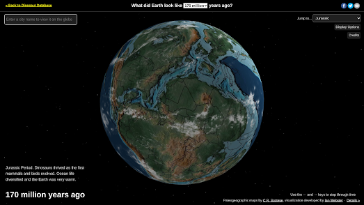
You can use the provided menus to change the era visualized on the globe. For example, you can travel back a 170 million years, to view the Earth as it looked during the Jurassic era, when dinosaurs roamed the Earth. Fast forward a little more and you can view how the planet looked when humans first began to roam the Earth around 20 million years ago.

Wednesday, November 01, 2023

Mapping the Oct 7 Hamas Attacks

Over the last three weeks news organizations around the world have produced many maps in their efforts to help explain the 2023 Israel-Hamas war. Many of these have been curated in the Data Vis Dispatch. Unfortunately the paywalls of many of the major news websites make a lot of these maps inaccessible to many.

The current attacks on the Palestinian people by Israel are in response to the events of 7 October 2023, when a Hamas attack on southern Israel killed 1,400 Israelis. Mapping the Massacres is an attempt to create a 'comprehensive representation' of all the atrocities committed by Hamas on the 7th October.

Each dot on the Mapping the Massacres map represents a person, killed or kidnapped by Hamas on 7th October. The red dots show the locations of Israelis killed by Hamas, the black dots indicate people who were kidnapped and the grey dots indicate people who are missing. When zoomed out the marker clusters show some of the major Hamas attack locations. Some of these sites, which witnessed the worst atrocities, are labelled on the map.

If you use the 'next' and 'previous' arrows (in the map sidebar) you can learn more about the attacks carried out by Hamas on each of the labelled locations. The creators of Mapping the Massacres have said that during the early stages of this project there may be some inaccuracies and omissions. The map includes contact details for anyone who can help Mapping the Massacres improve the accuracy and comprehensiveness of the project's representation of the Oct 7th Hamas attacks.

Tuesday, October 31, 2023

The Spookiest Places in the USA

The United States is a very scary country. The Scariest Place Names in the US is an interactive map which plots some of the most frightening sounding locations across America. You've probably already heard of the towns of Hell in Michigan and Tombstone, Arizona. But have you heard of Transylvania, Louisiana and Slaughter Beach, Delaware.

You can find many, many more spooky sounding locations on the Scariest Place Names in the US. On this map thousands of different scary sounding places have been identified using colored map markers. So if you zoom in on your home you should be able to quickly find the scariest sounding locations nearby.

You can find even more spooky-sounding locations to spend this Halloween on the 13 Spooky Halloween Haunts interactive map. This map plots the locations of some of America's most frightening place-names. It also explains how these particular locations earned their spooky sounding names. 

For example there is a Dead Women Crossing in Oklahoma, which was named for the headless corpse of a young schoolteacher who was found there in 1904. If that isn't scary enough for you then why not spend Halloween night at Murder Creek, Alabama, named for the party of loyalists robbed and murdered there during the Revolutionary War.

Monday, October 30, 2023

Halloween's Most Haunted Places

There are many haunted locations that you might want to visit (or avoid) on this All Hallows' Eve. Mashed World has released an interactive map which maps haunted locations across the world identified by the ChatGPT AI.

Haunted Locations plots 37 locations in countries around the globe. These haunted locations include the Tower of London (the site of many historical executions), Bran Castle (perhaps more commonly known as Dracula's Castle) and the White House (haunted by many suspicious characters over the years).

The UK Haunted Locations Database actually has an interactive map of over 5,000 haunted places in the UK. Zoom-in on your home on this map and you can discover the haunts of your nearest local ghosts. Mine is the ghost of the Theatre Royal, Stratford East. It is said that the theatre's creator Freddy Fredericks regularly haunts the building, checking to see that his initials are still painted on an archway (if they are removed it is said that the theatre will soon fail).

Mashed World has also used its AI Search Map tool to create a number of other Spooky Maps. These include maps created by ChatGPT showing the locations of the Scariest Places in the World, Horror Movie Filming Locations, Halloween Festivals and many more.

The Little Free Library World Map

I shall be eternally grateful to my local community's book sharing box. As an avid reader being able to borrow and read secondhand books during lock-down kept me from becoming completely stir crazy. Since lock-down my nearest book-sharing box has almost fallen into disuse. Which is why I'm delighted to have found the Little Free Library World Map.

The Little Free Library World Map is an interactive map showing the locations of book-exchange boxes around the world. The map was created by the Little Free Library non-profit of Minnesota and has now mapped over 150,000 libraries in 120 different countries. 

Share your location with the Little Free Library World Map and you can find the nearest book-exchange boxes to your home. The locations of individual free libraries are displayed on the map using red map markers. If you click on a marker you can view the library's exact address and information on exactly where you can find this book-exchange box.

I'm lucky enough to have two boxes within walking distance of my home. If there are none near you there is no need to despair. Instead you can set up your very own Little Free Library. All you really need to start a free library is a weather-proof container in which people can leave books they wish to share. If you need help creating such a container then you can check out the Start a Little Free Library web page.

If you live in London or Brighton then you might also be interested in the Library of Things, which allows you to borrow/rent tools (such as drills, sewing machines etc).


Saturday, October 28, 2023

The World Map of Podcasts

MapsFM is an interactive map which can help you find and listen to podcasts produced around the world. Listening to location based podcasts could be a great way to learn more about a planned travel destination or even to learn more about your local neighborhood or town. Now you can easily find and listen to location based podcasts by using the MapsFM map of the podcast world.

Simply share your location with MapsFM or use the search option to enter an address and you can then view all the podcasts about that place marked on a local map. You can view the title of each podcast simply by hovering over a podcast's marker on the map. Click on the marker and you can then listen to the selected podcast directly from the map sidebar. 

For some reason all the podcasts about my area of East London seem to be about cocktail bars - which is incredibly boring. However by searching a little further afield I was able to discover some local history and art based podcasts that are definitely more up my street.

The first interactive map I ever made was a mashup of Google Maps and YouTube. Ever since then I've believed that interactive maps can be a great way to search for localized media. Some other great examples of localized media maps are: 

The Poetry Atlas - an interactive map of poems written about specific places around the globe
The Watercolour World - an interactive map geo-locating the locations depicted in paintings
Historypin - an interactive map of historical and vintage photographs

Over the years I have reviewed many geo-located book and video maps as well. Most of these however seem to have joined the dead-pool.

Via: this was yet another map which I discovered via the wonderful Webcurios newsletter.

Friday, October 27, 2023

3D Middle-earth

You can now explore the fantasy world of J.R.R Tolkein on a three dimensional globe. The Middle-earth 3D Map is a wonderful interactive map of the lands of the Shire, Mordor, Rohan and Gondor. A map that allows you to soar over the Misty Mountains, gaze upon the White City of Minas Tirith, and wander through the ancient forests of Lothlórien in a way that has never been possible before.

Unlike every other interactive map of Middle-earth that I have reviewed the Middle-Earth 3D Map includes elevation data. This means that you are able to explore the mountains of Middle-earth, such as Mount Doom and Erebor, from the perspective of a small Hobbit looking up at a distant summit disappearing into the clouds.

The 3D Middle-earth Map also includes a search engine. This means that you can create your own fly-throughs of Bilbo and Frodo's journeys. For example if you center the map on Hobbiton and enter Mount Doom you can watch as the map flies over Middle-earth before centering on Sauron's lair. This should give you a pretty good perspective of the distance and terrain that Frodo traversed in the six months of his adventure.

If you are a fan of Tolkien's novels then you will also love the interactive maps created by the LOTR Project. These include interactive maps of both Beleriand and Middle-earth. The LOTR Project interactive maps include place-name labels and lots of optional layers which allow you to overlay time-lines, route and events from Tolkein's novels directly on top of some wonderfully drawn interactive maps.

Thursday, October 26, 2023

Why the Spanish Like Vertical Living

Spaniards like living in apartments. In fact Spain has one of the highest percentages of apartment dwellers in the world. Only in South Korea do more people live in collective dwellings. There are historical reasons why so many Spaniards live in apartment buildings.

You can learn more about the historical causes of Spain's vertical living in El Diario's story map Spain lives in flats: why we have built our cities vertically. This map uses colored 3D buildings to visualize the height of buildings in Spanish cities (green buildings have the fewest floors and pink buildings are the tallest). As you scroll through the map El Diario takes you on an historical tour of Spain's residential building trends, explaining the historical reasons behind the construction of such a high number of apartment blocks in Spain.

As a huge supporter of vertical living, particularly in highly populated cities, I'm not exactly pleased to learn that one of the main historical reasons for Spain's high percentage of apartment living is the fascist dictator Franco. Apparently "between 1950 and 1975, thousands of Spaniards migrated from the countryside to the city". In order to accommodate the growing urban population Franco's government built high-rise housing estates.

At the end of 'Spain Lives in Flats' El Diario links to another of their interactive maps. This No. de Plantas Sobre Rasante map allows you to explore the differences in building heights that can be found in different Spanish cities. The El Diario article introducing this map, The map of the heights of all the buildings in Spain, includes a fascinating analysis of the urban landscapes found in ten Spanish cities. For example the map of Toledo reveals that the medieval center of the city is dominated by historical buildings and that all the modern buildings have been restricted to a similar height.

Wednesday, October 25, 2023

How to Avoid a Train Wreck

A very simple chart designed by a French railway engineer in the 19th Century has helped save millions of lives. Charles Ibry's train schedule, originally developed to timetable and schedule trains on the Paris - Le Havre line, is an extremely effective tool for timetabling and visualizing train traffic on a railway line. Perhaps most importantly it provides railway companies with a powerful visual aid to avoid potential crashes between trains traveling on the same line.

Chemins de Fer de Paris à Rouen et au Havre is a small scrollytelling presentation of how Charles Ibry's chart for timetabling trains is used and how it helps to avoid train companies scheduling potential train wrecks. As you scroll through the presentation the map sidebar and image annotations provide a walk-through of Ibry's chart and explain how the chart is used by railway companies to schedule trains.

Chemins de Fer de Paris à Rouen et au Havre uses a IIIF image of Ibry's chart from the Bibliothèque nationale de France. I have been able to use this image with the Leaflet.js mapping library thanks to Jack Reed's Leaflet-IIIF plug-in. I created the annotations using my own Leaflet-IIIF-GeoJSON tool. The annotation arrows used in the presentation use Webkid's leaflet-swoopy plug-in.

The Chemins de Fer can also be viewed in detail on the Bibliothèque nationale de France website. If you are interested then you can also view a completed chart of the Paris to Boulogne line on the bibliothèque's website. 

Charles Ibry's timetabling graph is also discussed on Hannah Fry's BBC Podcast This Train has Been Delayed (Part of Hannah Fry's Uncharted series). This Train is Delayed discusses how Ibry's graph recently helped Singapore's transit network finally discover a glitch which was causing their driver-less trains to seemingly stop at random between stations (when they weren't meant to be stopping).

Monday, October 23, 2023

Mapping the Brussels Terrorist Attack

On the evening of Monday October 16, a man drew a gun and opened fire on Swedish football fans in the streets of Brussels. The terrorist attack left two people dead and one injured. The suspect, Abdesalem Lassoued, fled the scene. Soon after the shooting a video was posted on social media in which Abdesalem claimed responsibility for the attack. The next morning the terrorist was tracked down, shot and killed by the police.

The broadcaster RTBF has created a storytelling map which uses photographs, video footage and an interactive map to retrace Abdesalem Lassoued's movements on the night of October 16th-17th. As you scroll through Here is the path taken by the October 16 terrorist minute by minute you can follow the movements of the murderous Abdesalem as he drives around Brussels on a scooter shooting at cars and people. You can then follow the murderer's movements after these attacks, based on the discovery of his vehicle and the police's interception of Abdesalem near his Brussels apartment.

RTBF were able to retrace the terrorist's movements on the evening of October 16th mainly using location data detected from photographs and videos. This location analysis was the result of a collaboration between the RTBF Décrypte team, Knack and on-line volunteers specializing in Open Source Intelligence