Saturday, August 31, 2024

Anime Pilgrimage Maps

Apparently many enthusiastic fans of anime like to go on anime pilgrimages, in order to visit the real-world locations that have featured in their favorite shows. Fans of anime, manga, or other animated media often embark on these pilgrimages to connect with the stories they love and to experience the places that inspired their favorite characters and scenes.

A number of interactive mapping websites cater to anime fans who like to explore the real-world locations which feature in animated shows. Even if you can't visit these locations in person these animation pilgrimage maps are a fantastic resource for discovering the locations used in your favorite shows and also allow you to explore these locations virtually.

Animation Pilgrimage (anitabi)

The Animation Pilgrimage interactive map features thousands of locations which have been used in an ever growing number of animes. If you click on one of the larger 'character' markers on the map then this opens a map sidebar displaying screenshots of locations used in the selected show (shown in chronological order of when the location was featured in the series). You can click on these screenshots from the show to view their real-world locations on the map. Each screenshot marker on the map when clicked reveals a link to view the real-world location on Google Maps.


Another popular anime interactive map has been created by AnimeNavi. Currently the map features the locations featured in three anime series, Heya Camp, Kimi no Na wa and Yuru Camp.

If you ignore the map and navigate to the dedicated page for each anime you can view individual episode breakdowns for each series of a show. On these episode pages individual locations featured in each episode are listed with links to OpenStreetMap and Google Maps. Follow the Google Maps link and you can then compare the actual anime depiction of the location with the real location on Google Maps Street View.


Anime Pilgrimage (the only one of the three sites which is in English) features individual location maps for lots of different anime series. If you search for your favorite anime you can view a dedicated interactive map featuring the real-world locations used as settings for the animation. 

Under each anime map you can view a number of stills from the anime shown side-by-side with the same location as seen on Google Maps Street View. Click on the 'View Map' link and you can explore the location (virtually) for yourself using the interactive Street View imagery on Google Maps.

Friday, August 30, 2024

245 Russian Military Targets at Risk

map showing possible military targets inside Russian

The Institute for the Study of War (ISW) and Critical Threats have identified hundreds of Russian military sites that are in range of Ukrainian ATACMS. Currently the United States will not allow Ukraine to use US supplied tactical ballistic missiles for long-range deep strikes into Russia. According to the ISW its new map shows "the extent to which US restrictions on Ukraine's use of ATACMS constrain Ukraine's ability to strike important military infrastructure."

The map Known Russian Military and Paramilitary Objects in Range of Ukrainian ATACMS plots the locations of 245 different military sites, including Russian military installations, and regimental, brigade & division headquarters. The map also visualizes the ranges of Ukraine's ATACMS and HIMARS missiles inside Russian territory.

According to CNN this week Ukraine will present the US government with a list of Russian military targets which they believe are important in trying to stop Russia's continuing invasion of Ukraine. They hope that this list of targets will help to persuade the US to lift its current restrictions on Ukraine using American supplied missiles for long-range attacks on Russia.

The ISW also provides daily campaign assessments of the ongoing war in Ukraine. The Ukraine Conflict Updates includes daily static control-of-terrain maps and a regularly updated interactive map, Russia's Invasion of Ukraine, showing the extent of territory currently controlled by Ukraine and Russia. 

Thursday, August 29, 2024

The Money Mountains of Los Angeles

Map of L.A. with average household income represented by height

Nick Underwood has visualized the average median household income in each Los Angeles neighborhood using the analogy of elevation. On his The Topography of Wealth in L.A. map city each neighborhood is displaced 'vertically based on median annual household income'. 

The map uses census data to show the average household income in each Los Angeles neighborhood as a 3D tower. Sea level on the map is set at the median US income of $59,000 per year. The map reveals that a number of L.A. neighborhoods, particularly in Beverley Hills and East Pasadena, soar above the median US income. However many of these wealthy neighborhoods ' lie immediately adjacent to others with income well below the poverty line.'

According to Nick the map actually underestimates the huge disparities in income between many neighborhoods in Los Angeles. The U.S. census caps household income at $250,000+ so it is probable that some L.A. neighborhood towers should actually be a lot taller.

map of L.A. using 3d towers to show the popolation levels in each neighborhood

Using the analogy of elevation to visualize economic and demographic data can be an effective way to present a dataset geographically. For example The Pudding's Human Terrain interactive map shows the world's population density using 3D population towers. On this map the taller a block then the larger the population. 

As you might expect the Human Terrain map shows that some of the most densely populated neighborhoods in LA are in Central Los Angeles, such as Pico-Union and Angeling Heights. These areas seem to be among the 'valleys' of the Topography of Wealth map, suggesting that the most densely populated areas of Los Angeles are also among some of the poorest neighborhoods in the city.

Wednesday, August 28, 2024

Text Search for Street View

screenshot of New York Street View images containing the word donut

all text for nyc (brooklyn) is a very impressive search engine which allows you to search Google Maps Street View imagery for any word. In the words of its developer it is "a unique digital archive of Brooklyn's typography. Users can search and visualize every sign, notice, and street art captured in street images".

Enter any word (or combination of words) into 'all text for nyc' and it will return interactive Google Maps Street View images from Brooklyn which contain your entered text. The 'about' section of 'all text for nyc' does not go into any detail about how the search engine was built, beyond stating it was made 'Using optical character recognition on street level imagery'. I'm guessing a pipeline was established using the Street View Static API to download all of Brooklyn's Street View imagery and then use machine learning to scan and extract all instances of words in those images.

all text for nyc is such an innovative idea that all its possible uses have not been fully explored or realized yet. I am sure that its ability to read street signs and also store names would be a fantastic resource for human-centric landmark-oriented directions (eg turn right at 'Jerk Chicken', go past the 'liquor store' and turn left at 'Danny's Donuts'. I am sure that 'all text for nyc' also has lots of possible uses which I wouldn't even come close to thinking of.

Also See - Text on Maps

Last year the David Rumsey Map Collection unveiled its Text on Maps feature which allows users to search one of the world's largest collections of digitized maps by text. The David Rumsey Map Collection contains over 57,000 geo-referenced vintage maps. Using the Text on Maps feature you can search these 57,000 historic maps for any word or combination of words (eg gold mine).

Tuesday, August 27, 2024

WorldGuessr on Street View

animated GIF of identifying a street view location on WorldGussr

My seemingly endless quest to find an alternative to GeoGuessr may be finally over. GeoGuessr is (rightly) by far the most popular Google Maps game on the internet. Unfortunately GeoGuessr's subscription charges mean I can't afford to play it very often. Which means I'm always on the look-out for free alternatives.

GeoGuessr is an online geography game that challenges players to identify locations around the world based on their Google Street View images. Using the visual clues (such as the language used on road signs or the architectural styles of buildings) players have to identify the location where they have been dropped in Google's panoramic Street View imagery.

This is also exactly the same game play used in WorldGuessr. I have played a lot of GeuGuessr type games and I think WorldGuessr comes closest to the purest form of the original GeoGuessr game. I am a little worried however that WorldGuessr might not remain free for long. The Google Maps API charges are not cheap - which is why GeoGuessr now requires paid membership. 

At the moment if you identify a Street View within a correct country on WorldGuessr then you extend your 'country streak'. Get a country wrong and WorldGuessr asks if you want to watch an advert to keep your 'country streak' going. Currently you don't have to watch the adverts if you don't want to extend your country streak. This makes me think that WorldGuessr might struggle to keep the game free based on this model.

Just in case WorldGuessr is also forced to introduce a subscription only model you might also want to check out the games in this Six Free Alternatives to Geoguessr post.

Monday, August 26, 2024

How Smooth is the Earth?

One of the most interesting facts that I learned from the BBC TV series QI was that the Earth is smoother than a billiard ball. Unfortunately, like nearly every other fact I've remembered from that show, it is a load of bull (or should that be balls).

Shri Khalpada has created a three.js powered 3D globe of the Earth which allows you to view the Earth's elevation profile to scale (and when exaggerated). If you compare the 'to scale' globe in How Smooth is the Earth? to the exaggerated profile you immediately get a sense of how smooth the world actually is.

animated globe showing Earth's elevation rpfile to scale and exaggerated
However, despite its relative smoothness, the Earth is not a smooth as a billiard ball. Alongside his visualization of the Earth's elevation profile Shri Khalpada links to Dr David Alcitore's paper Is a Pool Ball Smoother Than the Earth? (PDF) which concludes that "the Earth would make a terrible pool ball ... (the) Earth ball would ... be terribly non round compared to high-quality pool balls."

If you don't want to read a scientific paper comparing the Earth's smoothness to a billiard ball then XKCD's Bowling Ball does a very good job at explaining why the Earth is also not as smooth as a bowling ball. 

Saturday, August 24, 2024

Have You Earned Your Air Pollution Stripes?

a series of colored stripes showing air pollution levels in each year since 1850 in Delhi

Ed Hawkins' Climate Stripes visualization of global heating has quickly become a data visualization classic. Climate Stripes (sometimes known as Warming Stripes) are a visual representation of the long-term increase in global temperatures due to climate change. Ed's striking Climate Stripes visualizations consist of colored vertical stripes, with each stripe representing a single year and the colors indicating the temperature anomaly for each year relative to a baseline period.

Inspired by Climate Stripes Edinburgh University has created Air Quality Stripes visualizations for a number of global cities. Air Quality Stripes use colored stripes to indicate average yearly air pollution levels in cities since 1850. Like Ed Hawkins' Climate Stripes these Air Quality Stripes are effective in providing a simple and easily comprehensible visualization of historical trends in a given dataset.

a bar graph showing air pollution levels in Delhi since 1850

Each city's Air Quality Stripes can instantly convey the history of air quality in a city. For example, as Edinburgh University notes, the stripes demonstrate "the air in many cities in Europe is much cleaner now than it was 100 years ago." In contrast (as you can see in the screenshots above) the air quality in many Indian cities has become dangerously worse in the 21st Century.

Edinburgh University actually provides four different types of yearly air pollution levels for each city. Despite the effectiveness of the air pollution stripes visualization of the data I actually prefer the more traditional bar graph visualizations of the same data. These bar chart visualizations of yearly PM2.5  concentrations include reference lines to show the WHO Guideline (a target of a concentration of 5 micrograms om PM2.5 per cubic meter) and Edinburgh University's own 'Very Poor Air Quality' level. Alongside the use of color the height of each year's bar provides an additional guide to the average levels of air pollution.

Friday, August 23, 2024

200 Years of Irish Maps

1846 Ordnance Survey map of the northern Irish coast

The first ever large-scale survey of an entire country was started nearly 200 years ago. From 1825 to 1846 the Irish Ordnance Survey undertook a highly detailed survey of the whole of Ireland in order to create maps primarily at the 6 inch scale.

To celebrate 200 years of Irish mapping the University of Limerick and Queen’s University Belfast has created OS200. The OS200 website is a digital archive of Ireland's Ordnance Survey which allows anyone to browse and explore the Ordnance Survey's First Edition Six-Inch Maps, the OS Memoirs, Letters and Name Books.

The maps themselves are exquisitely detailed and beautifully drawn. Thanks to the digitization work by the OS200 project you can now explore these original Ordnance Survey maps of Ireland in the closest detail as interactive maps. If you are Irish, or have ever visited Ireland, you can have hours of fun exploring places you know on the OS maps, as they looked 200 years ago. You can have just as much fun browsing the Ordnance survey Name Books.

As well as spending years scientifically surveying Ireland the Ordnance Survey sent out agents of the Topographical Department to collect and compile lists of the historical forms of place-names to determine the correct place-name labels to be used on the maps. These Name Books list place-names (with English translations and alternate spellings) but also provide details on the people who live at each place, the people's religions, who owns the land, and who leases the land. It also lists information on the types of crops grown and the condition of the soil. These non-etymological details hint at one of the original purposes of the map -to help the British government levy local taxes.

The broader governmental aims for creating a national map of Ireland are also apparent in the Memoirs. As well as the geographical surveys and place-name collections the Ordnance Survey staff were required to gather additional information "on social and economic conditions, ... the landscape, topography, nature, geology, historical monuments and antiquities, estates, mills, infrastructure, people and culture ..., communications and (provide) 'suggestions for improvement'". These memoirs provide a fascinating glimpse into local life in Ireland in the early 19th Century.

Thursday, August 22, 2024

Population Flags

a Dorling cartogram showing each country's population using a relatively sized proportinal circular flag

World Population Flags is a Dorling cartogram in which country flags are sized by population. The cartogram is used to visualize where people live around the world and the relative size of each country's population.

A Dorling cartogram is a thematic map that is used to visualize quantitative data. On a Dorling cartogram areas are represented by circles rather than their actual geographic boundaries. The size of each circle is proportional to the variable being represented. In the case of World Population Flags the variable being represented by the circles is country populations.

Dorling cartograms are particularly useful for making it easy to compare values across regions, especially when the actual geographic area sizes are misleading or irrelevant to the data being displayed. For example in World Population Flags the world's biggest country in land area, Russia, appears to be roughly the same size as Bangladesh (which is much smaller in terms of geographic area) because both countries share a similar population size.

The Dorling cartogram in Word Population Flags is used in a scrollytelling presentation to take a closer look at population trends in the world's populated continents. As you scroll through World Population Flags the map zooms and pans automatically to illustrate the relative size of each continent's population. At the end of the presentation you can explore the cartogram for yourself, and hover over individual circles to view each country's population.

You can explore two other methods of visualizing population data on maps in the Maps Mania post If the Romans did Data Visualization.

Wednesday, August 21, 2024

One Million Screenshots. One Map!

screenshot of a map of website screenshots
Over the years a number of people have used the popular Leaflet.js mapping library to map image datasets. For example Nathan Rooy's Visual Book Recommender uses Leaflet to map the images of 51,847 book covers. The Pudding has also mapped images of 5,000 book covers on its 11 Years of Top-Selling Book Covers, Arranged by Visual Similarity

Mapping libraries have also been used in the past to visually map the internet. For example the Internet Map (which appears to be now dead) used the Google Maps API to visualize the 350,000 largest websites in the world. On this map different sized circles were used to represent individual websites on the Internet. The sizes of the circles were determined by the amount of traffic to each website - the larger the amount of traffic, the bigger the circle. The location of websites on the map was determined by the active hyperlinks between the sites.

Now One Million Websites has created a map which visualizes screenshots of the top one million websites in the world. One Million Screenshots is an interactive Leaflet map which allows you to pan and zoom around the screenshots of the top 1 million websites. To make the map Urlbox took screenshots of the top 1,048,576 ranked websites by Common Crawl Web Graph

Usually on maps of large image datasets some attempt is made to map the images so that related images appear near to each other. Whatever category One Million Screenshots has used to map their images doesn't appear to have worked very well. For example the screenshot of the New York Times on the map is flanked on one side by the website of the Municipality of Pictou County and on the other by Websunday (a Japanese manga magazine). I struggle to understand how these three website screenshots come to be mapped so closely together.

It isn't even as if Urlbox hasn't spent time trying to categorize similar sites. If you click on a screenshot on the map and go to a website's dedicated page you can view a number of different categories of 'similar sites'. If you select the 'similar description' option here you can find a lot of websites which do appear to be closely related. The 'similar description' metric looks to me to be the one that Urlbox should have used to determine the position of each website screenshot on the One Million Screenshots map.

Via: Data Vis Dispatch

Tuesday, August 20, 2024

How to Make Your Own Map Jigsaw Puzzle

I've been having a lot of fun over the last few days playing the map puzzles created by the Map Puzzle Factory. However I have been a little frustrated by the Japanese place-names used in the puzzles. I therefore decided to try to create my own map jigsaw puzzle using a map in which the place-names are displayed in English.

My Scrambled City game is a simple map of the City of London. Press the 'Scramble' button and all the map-tiles will be scrambled. All you have to do then is re-arrange the map-tiles and put them back in their correct positions.

If you want to create your own version of the map you just need to remix the Glitch page of my Scrambled City game and change the 25 map-tile URLs to the OSM map-tiles for the part of the world which you wish to map.

My map consists of 25 scrambled OpenStreetMap map-tiles. To download the URLs automatically for an area I wrote a little Python script to grab the map-tile image addresses from OpenStreetMap:

def generate_tile_urls(x_start, y_start, z, num_tiles=5):
    base_url = "https://tile.openstreetmap.org/{z}/{x}/{y}.png"
    urls = []

    for x in range(x_start, x_start + num_tiles):
        for y in range(y_start, y_start + num_tiles):
            url = base_url.format(z=z, x=x, y=y)
            urls.append(url)

    return urls

x_start = 32748 # starting x-coordinate
y_start = 21787 # starting y-coordinate
z = 16 # zoom level

tile_urls = generate_tile_urls(x_start, y_start, z)
for url in tile_urls:
    print(url)
If you want to create your own map you can adjust the x_start and y-start coordinates in this Python script. This will allow you to download the map-tile URLs for a 5x5 grid starting at your preferred position.

The image URL of an OpenStreetMap map-tile is in the format of:
https://tile.openstreetmap.org/{z}/{x}/{y}.png
You can get the OpenStreetMap x,y coordinates for a location using Geofabrik's Tile Calculator. The map menu of the Tile Calculator has a 'Tile coordinates' option. You need to select this option to view the tile coordinates for each map-tile image overlain on the map. You can then simply select the map-tile where you wish to start your 5x5 map grid (the top-left corner of your map) and change the x,y coordinates in the Python script to the x.y coordinates displayed on Geofabrik's Tile Calculator (you can also adjust the zoom level).

Monday, August 19, 2024

Piecing the World Back Together

world map puzzle with a few squares still missing

The world is fractured and divided like never before. Your mission, if you choose to accept it, is to put the Earth back together.

The Map Puzzle Factory is a huge collection of map puzzles. Each puzzle is a map of a part of the world which has been divided into a collection of small squares. You simply have to drag the squares into their correct position on the map. In other words - each game is a map jigsaw which you have to piece together to make the completed map.

The puzzles are really fun to play - and a lot more challenging than they appear at first. So far I have only managed to complete the map of France (although I am on the verge of completing the world map). There are lots of puzzles listed on the Map Puzzle Factory home page, categorized by difficulty (level) and type (world, country or city map). Here are a few direct links to a few of the puzzles:

Note:

The Map Puzzle Factory is in Japanese but using Chrome's automatic translations I was able to easily navigate the site and play the individual puzzles. Each game however does seem to have a weird bug. The first time I press the 'start' or 'continue reading' button on a puzzle the game redirects to an error page. However I have found that refreshing the page and pressing 'continue reading' seems to let you play the game.

Via: WeeklyOSM

Saturday, August 17, 2024

Turning Gaza to Rubble

prism map showing the levels of debris across Gaza

This week the Gaza health ministry reported that 40,000 Palestinians have been killed in Gaza since Israel started attacking the territory in October. Over a third of those killed have been children. Much of Gaza itself has also been turned to rubble.

According to Bloomberg Israeli air strikes on Gaza have created 42 million tonnes of debris in the Strip. That is "enough rubble to fill a line of dump trucks stretching from New York to Singapore." The extent and the massive scale of the damage caused to Gaza is superbly illustrated in How Will Gaza be Rebuilt using a prism map, in which 3D towers are used to visualize the level of debris across the Strip.

One disadvantage of using prism maps is that taller prisms can obscure smaller ones, making it challenging to compare values in certain areas. This is mostly overcome in the Bloomberg article by rotating and tilting the map as different areas are covered in the article. The map also uses callout lines (to provide guidance as to the number of tonnes of debris represented by a prism's height) and place-name labels (for geographical accuracy).

The depiction of Gaza's debris using a prism map is a highly effective way to convey the devastation inflicted on the strip by Israel and to illustrate the immense effort that will be required to clear the debris before the territory can be made habitable again.

Friday, August 16, 2024

How the World Powers Itself

map of coal power station locations around the world

You can learn a lot about how the world powers itself from the Global Energy Monitor's Power Tracker. This interactive map shows the locations of nearly 18,000 power stations in 200 countries around the world, categorized by power sector.

Using the map's filter controls it is possible to explore where different types of power stations are distributed around the world. This allows you, for example, to investigate which countries are still most reliant on thermal power (coal, oil, gas, nuclear, geothermal, bioenergy) and which have shifted most successfully to renewables (solar, wind, hydro).

If you use the filter controls to view the locations of operational and planned coal power stations, you can see how western Europe has almost completely moved away from dirty coal power - except for Germany which is still hugely reliant on its coal fired power stations. Change the filters to view nuclear power stations and you can see one of the reasons why Germany is still so reliant on coal (the last three nuclear power plants in Germany were shut down last year).

map of wind power stations in Europe
Wind power stations in Europe

The distribution of wind power stations in Europe also reveals an interesting picture. For some reason the Alps and the Pyrenees are almost completely empty of wind power. My guess is that valley locations are not great for wind power stations because wind conditions are too variable and that placing wind power stations at the highest altitudes is too costly (in terms of construction and connecting to power grids). 

There may also be some aesthetic considerations why wind turbines are not stuck on the top of mountains. Wind turbines may be seen as anathema to the natural beauty of mountain regions. There may also be some zoning difficulties in that the Alps and Pyrenees have a lot of environmentally protected areas and national parks. Although these considerations don't seem to affect the construction of hydro-power stations. Check out the location of hydro-power on the Power Tracker map and you can see that a number of hydro-power stations have been built in both the Alps and the Pyrenees.

I am also intrigued by the locations of nuclear power stations around the world. Despite having large coastlines France and the United States place a lot of their nuclear power stations inland. In much of the rest of the world, where countries have large coastlines (for example China and Japan) nuclear power stations tend to be sited almost exclusively next to the sea (oceans offer a reliable and abundant source of cooling water to dissipate the heat generated during the nuclear fission process).

Thursday, August 15, 2024

Virtual Indian Independence Day

animated fly-through of a 3d map showing the Indian flag on top of the Red Fort in Delhi

Today is Indian Independence Day. On this day India celebrates its independence from the United Kingdom. On 15 August 1947 Jawaharlal Nehru, the first Prime Minister of India, raised the Indian flag above the Lahori Gate of the Red Fort in Delhi. Since then every year on Independence Day the incumbent Prime Minister repeats the ceremony by raising the flag over the Red Fort and by addressing the nation. Earlier today Prime Minister Narendra Modi hoisted the Indian flag for the 11th time and delivered a speech to the nation from the Red Fort. 

Don't worry if you missed today's unfurling of the Indian national flag over the Red Fort in Delhi because you can now view the scene virtually on Mappls' Celebrate Independence Day in 3D. On this interactive map you can view the Indian flag proudly flying in 3D over a 3D model of the Red Fort. Of course on Independence Day the national flag is raised over many, many buildings in India. The Celebrate Independence Day in 3D map also includes virtual scenes visualizing the Indian flag unfurled above buildings in Mumbai, Chennai, Lucknow, Hyderabad and many other Indian cities.

Wednesday, August 14, 2024

Mapping Train Connections

map of Europe showing the train route from London to Paola, Italy

For ecological reasons I haven't taken a flight in over 30 years. Consequently I have probably spent many, many hours traveling across Europe by train. One of my retirement plans is to spend winters in Southern Italy. I have begun therefore to research how best to travel by train to southern Italy.

According to TrainConnections the best plan is probably to break the journey into two - to take one day to travel from London to Milan, spend the night in Milan, and then spend a second day traveling down to southern Italy. In total the journey takes nearly 25 hours on four different trains, so it makes sense to split the journey up into at least two different days.

TrainConnections is an interactive map which searches thousands of train routes to help you find and plan a European train journey. Enter your starting point and your desired destination and the map will calculate and visualize the best train route for your journey. It also provides a detailed itinerary for the journey outlining the length of each train, required station transfers, and the total journey time.

Direct Train Connections is another very useful map if you are planning a train journey in Europe. This interactive map can show you all the locations you can reach by direct train from any station in Europe, which is fantastic if you want to plan a journey which only involves one train. Select a train station on the Direct Train Connections map and you can instantly view all the other stations in Europe which you can reach without having to change trains.

map of Europe's night-train routes

This week I fancy getting out of London to escape the city heat. By selecting Stratford Station on Direct Train Connections I can see all the stations that I can reach by direct train from East London. These include a number of possible seaside destinations on the Kent and Essex coast. There is also a direct train to the Norfolk city of Norwich, which appears to be the longest journey I can take from Stratford without having to change trains. 

When taking very long train journeys across Europe I often prefer to take a night-train. When planning a romantic sleeper train you can refer to the Good Morning Europe, Night Train Map to discover which night-train routes are currently in operation across Europe. 

Büro des Präsidenten's interactive map is based on their own renowned night-train poster of Europe. Major cities on this map are marked with numbered night-train routes. If you hover over these numbers on the interactive map then the selected route is highlighted on the map, allowing you to quickly see where you can travel to in Europe by sleeper train from that city

Tuesday, August 13, 2024

Russia's Secret Nuclear Targets in China

The Financial Times has obtained secret Russian military files which detail how Russian forces train to use tactical nuclear weapons against both NATO and China.

A story-map in the article Russian navy trained to target sites inside Europe with nuclear-capable missiles (paywalled) shows a number of target locations in Europe and the Pacific for Russian conventional and nuclear missiles. In the Pacific these targets include cities in both China and North Korea, who are normally seen as allies of Russia.

Targets in Europe include cities in France, Germany, Norway and the UK. The FT claims that the Russian military files "describe a threshold for using tactical nuclear weapons that is lower than Russia has ever publicly admitted".

According to Sweden's SVT Russia currently has 5,580 nuclear warheads. SVT's recent investigation into World Nuclear Forces includes a quote from the Swedish government that the "Russian population is being primed for a scenario in which it will be considered legitimate for Russia to use nuclear weapons".

The World Nuclear Forces article includes an interactive nuclear warhead simulator which allows you to explore the likely impact of different types of nuclear warhead on different locations around the world. For example in the screenshot above I have used the simulator to explore the effect of a 100 kiloton Russian warhead dropped on Shenyang (one of the Russian targets in China identified by the Russian military files).

Monday, August 12, 2024

Real-Time Radiation Maps

map of Gieiger counter readings in Eatern Europe

Yesterday a fire broke out at the Zaporizhzhia nuclear power plant in Russian occupied southern Ukraine. On hearing the news of the fire I almost immediately rushed to the Real-Time Radiation World Map in search of any detected spikes in radiation in the area.

The Real-Time Radiation World Map visualizes radioactivity levels from Geiger counters around the world. Luckily, as you can see from the screenshot above, there don't seem to be any high levels of radioactivity showing up on the map anywhere in this region of eastern Europe. Unfortunately the map does not currently have many Geiger counters in Russia or any that are particularly near the Zaporizhzhia nuclear power plant in Ukraine.

graph of gamma dose rates at the Zaporizhzhia nuclear power plant

The Zaporizhzhia nuclear power plant does feature on the European Commission's Radioactivity Environmental Monitoring map. The map shows the current gamma radiation readings from automatic surveillance systems in 39 countries. Thankfully the graph of the gamma dose rate at the Zaporizhzhia plant currently shows a very low level of gamma radiation, a level well within the range of natural background radiation.

Russia is reporting today that the fire at the Zaporizhzhia nuclear power plant has been completely extinguished.

map of European power plants

While on the subject of nuclear power plants I also recently stumbled upon the Nuclear Stations Map, which is a new interactive map of all the nuclear plants in the world, both decommissioned, in operation or in construction.

On the map the power plant markers are scaled by their capacity and the colors indicate their status (green = in operation, black = decommissioned and orange = in construction. On viewing the Nuclear Stations Map I was struck by two things. One (as you can see in the screenshot of the map) is the clear abandonment of nuclear power in Germany (the last three nuclear power plants in Germany were shut down last year). The other is that a little over a decade after the disaster of Fukishima, Japan appears to be building at least three new nuclear power plants on its coastline.

Saturday, August 10, 2024

Memorial Day Weekend Helicopter Flights

map of helicopter flight paths in NYC

The Gothamist has mapped out helicopter flights over New York City during the Memorial Day Weekend. The map accompanies a story on the rise in residents' complaints about helicopter noise in the city and the news that the City Council is introducing two bills aimed at reducing helicopter traffic.

The interactive map in NYC Council bills aim to soar above helicopter noise complaints uses data from flightradar24 to visualize the flight paths of helicopters over the city and their destination airports. The map is a very effective visualization of the huge number of helicopters flying over NYC, "nearly 2,000 helicopter flights recorded from the Thursday-through-Tuesday holiday weekend."

The map also illustrates the most common flight paths taken by helicopters in the city. In the screenshot of the map above you can see that helicopters in NYC tend to follow the Hudson, the East River and both the north & south shorelines of Long Island. This is a pattern which can also be observed using the ADS-B Massive Visualizer.

map using colored lines to show helicopter flight paths over NYC

The ADS-B Massive Visualizer allows you to query and visualize the world's air traffic data. Using the visualizer you can query 50 billion flight data records. This allows you to map the flight paths of different types of aircraft anywhere in the world - for example the routes taken by helicopters in New York

On this map you can again see how helicopters in New York avoid the city's massive skyscrapers by following the Hudson and East River. These routes may also be popular as the rivers and shorelines can be used to help pilots navigate the city.

A similar pattern can be seen in the flight paths taken by helicopters in London. This query of helicopter flights over London shows that many helicopter pilots like to follow the river Thames, as far as the Isle of Dogs in the East End where they turn northwards and then follow the River Lea up through the Olympic Park (or vice versa if traveling in the opposite direction). Again these routes may be popular with pilots as they avoid tall buildings and are easy to navigate.

map of Paris showing helicopter flight paths

Helicopter flights over central Paris are heavily regulated. Because of this there is no flight traffic along the Seine in central Paris. Instead helicopters appear to follow the Peripherique in south and east Paris, the path of the Seine in the west and the Autoroute du Nord in the north of the city.

Friday, August 09, 2024

Tripgeo Cities

map of San Francisco with 20 markers highlighting some landmarks in the city

A few months ago Map Channels kindly offered to create a json feed for my Guess This City game. I had been complaining about having to add a new city to the game every day. Map Channels then volunteered to create a feed for the game which gives the name, coordinates, population and a description of a different city each and every day. The result is that Guess This City now updates daily without needing any input from me.

Map Channels created the json feed by building a large database of major global cities. This database was created using a combination of GeoNames, Open AI / ChatGPT and Wikipedia. This cities database includes a lot of information which actually isn't needed or included in the daily Guess This City feed. Some of this additional information is however now used by the Tripgeo Trivia game.

TripGeo Trivia is a daily geography quiz which requires you to identify ten cities based on a number of clues. Every day ten new random cities from around the world need to be identified. To help you in this task you can view three clues as to the identity of each city. The data behind the game all comes from the same Map Channels city database which powers Guess This City.

animated GIF rotating through a number of Street View images of famous New York landmarks

The Map Channels city database is now also used by Tripgeo Cities. Tripgeo Cities is a new interactive map containing information about 10,000 cities and towns around the world. Click on any of these cities on the map and 20 markers are added to the map to highlight some of the most important landmarks in the selected city. A significant description of the city is also provided beneath the map, alongside information on each of the mapped landmarks.

Some of the information about each city is generated by AI. This means that the information may not be 100% accurate and the project is definitely a work in progress. However in general the data is pretty good and, with further development, will improve over time. Tripgeo aims to expand and improve the TripGeo Cities resource in the future and to incorporate the data into more mapping projects. 

For now Tripgeo Cities is a great way to discover some of the most significant places to visit in cities around the world. It is also a fantastic tool for a little virtual tourism. For example, if you use the eye and arrow buttons under each city map you can take a fascinating virtual tour around the selected city's most interesting and significant landmarks on Google Maps Street View.

Thursday, August 08, 2024

The Presidential Medal of Cartography

map of Minnesota comparing the numbers of students eligble for National free school meals to those eligble under the Minnesota Free School Meals Program

Kamala Harris' Vice-Presidential pick Tim Walz loves maps. As a former high school geography teacher it should come as no surprise that Walz has an interest in cartography, but it appears that he is in act a full blown GIS nerd who only last year called for November 15th to be 'GIS Day'. According to Politico Tim Walz has also "addressed the geographic information systems software company Esri’s annual conference for the past three years."

With such a self-declared interest in all things cartographical I would like to propose that the next administration should establish a new Presidential Medal of Cartography - an award to be presented to the creators of outstanding maps. If you watch Tim Walz's 2024 address to the Esri conference you can get an insight into the kinds of maps which might win my proposed Presidential Medal of Cartography.

In his address Walz talks about how it is possible to increase our understanding of "an interconnected world through graphic representation of data". He says that maps are a means to an end and that 'the end product of these maps is a more sustainable economy, a more sustainable environment, and lifting up of people's lives in a way that they can thrive". Later in his Esri speech Walz also explains how "conveying data to people (using GIS)  helps to build trust." It is clear that Walz believes that maps can both increase our understanding of the world and can help drive positive social outcomes.

The new Presidential Medal of Cartography could therefore be awarded to maps which make a significant contribution to our understanding of the world and promote sustainable economies, environments and improve people's lives.

During Walz's Esri presentation it is clear which maps he thinks meet these criteria. As Governor of Minnesota Tim Walz was able to use "what I knew about mapping and the visual display of data to convey complex issues." He says that the reason that the John Hopkins's Covid-19 Map is the most viewed interactive map in history is because people wanted to know "where we were having (the) highest level of transmission".

The Minnesota Executive Map Portfolio has numerous examples of the kinds of maps which Walz believes convey complex data, enhance understanding and improve lives. In his speech he highlights the Universal School Meals Map (showing the increase in the number of students who can get free school meals under the Minnesota Free School Meals Program), the Potentially Restorable Peatlands Map (showing where peatlands can be protected) and the Broadband Speed Map (showing where broadband infrastructure need more development in Minnesota).

Watching Tim Walz's Esri speech you can begin to understand why Kamala Harris chose this former geography teacher as her running mate. You can also begin to understand the likely criteria that the possible next Vice-President might introduce for a future Presidential Medal of Cartography.

NOAA hurricane advisory map showing Hurricane Dorian's forecast path into Florida. The map includes a hand drawn cone extending into Alabama.

Before I get accused of being completely partisan in proposing a Presidential Medal of Cartography I would like to remind you that Donald Trump also likes to use maps to help convey complex information. For example in September 2019 the then President used a NOAA hurricane map to explain how he hadn't made a mistake when he warned that Alabama was in danger from the approach of Hurricane Dorian. On this map Donald Trump used a sharpie pen to extend the cone of uncertainty into Alabama to prove that he knew more about the hurricane's forecast path than the experts at the National Oceanic and Atmospheric Administration.

Wednesday, August 07, 2024

The Indoor CO2 Map

map of Cologne with colored markers showing the levels of CO2 in a number of buildings.

Over the years I have posted links to a number of interactive maps which visualize the levels of carbon dioxide in the atmosphere. Human activities such as burning fossil fuels, deforestation, and industrial processes help to increase the concentration of CO₂ in the atmosphere. Higher concentrations of CO₂ enhance the greenhouse effect, leading to more heat being trapped in the atmosphere. This means that carbon dioxide plays a significant role in global heating.

Measuring CO₂ levels inside buildings can also be very useful. Like many people in the last couple of years I have begun to ignore all the preventative measures useful for avoiding infections transmitted via air (such as Covid-19). I no longer wear a mask in any situation and no longer avoid enclosed public indoor environments. However not everyone can be so blasé about the risks of infectious diseases.

Many individuals, such as the elderly, the immunocompromised, and those with preexisting health conditions, are at higher risk of severe illness or death from Covid-19 and so still need to wear face masks and avoid enclosed spaces.

The Indoor-CO₂ Atlas has been designed to provide a guide to the likely CO₂ levels in public buildings, eg shops, hospitals and cinemas. The map uses crowd-sourced measurement by the public to show recorded levels of CO₂ in individual buildings.

The concentration of CO₂ in an indoor environment can serve as a proxy for the amount of exhaled air present. Humans exhale CO₂, and higher concentrations can indicate poor ventilation and a higher presence of exhaled air. Since exhaled air can contain aerosols that may carry infectious viruses (like SARS-CoV-2), higher CO₂ levels can correlate with a higher risk of inhaling these infectious aerosols.

Anyone who has a mobile phone and a supported mobile CO₂-Monitor can contribute a reading to the Indoor-CO₂ Atlas. On the map colored markers are used to show the CO₂ levels recorded in a building. If you click on a marker you can also view a graph of the recorded CO₂ levels over time.

Tuesday, August 06, 2024

Pixel View

pixelated image of the Pyramid of Giza

I've created a simple game using images from Mapillary (and a couple of images from Wikimedia).

Mapillary is a crowd-sourced 'Street View' service that allows users to capture, share, and explore street-level imagery from around the world. Developers are allowed to use images submitted to Mapillary under a CC BY-SA 4.0 license. Mapillary 'street view' images can be a great resource for researchers and students studying the built environment. The images can also be used for creating pictorial geography games.

My (very short) Pixel View game requires you to identify the locations depicted in 9 street view images of famous locations around the world (and as a bonus two images sourced from Wikimedia). The only problem is that I have pixelated each image. I have however provided you with three clues for each image. In addition each time you enter an incorrect answer the image becomes a little less pixelated, making the location a little easier to identify.

You have three attempts to guess each image correctly and there are 11 questions in total. Good Luck!

Play Pixel View

Monday, August 05, 2024

The Manhole Card Collectors Map

manhole cover featuring the image of Hokusai's The Wave

In the 1980s as a way to promote local culture and tourism local authorities in Japan began designing distinctive and artistic manhole covers. Each municipality often has its own unique manhole cover designs, featuring local landmarks, historical events, flora, fauna, and other culturally significant symbols. 

In Sumida Ward in Tokyo you can find a man hole cover featuring "The Great Wave off Kanagawa," by Katsushika Hokusai. Hokusia was born in Sumida. There is another beautiful manhole cover in the ward that features "Fine Wind, Clear Morning (Red Fuji)", another of Hokusai's series of woodblock prints from his "Thirty-six Views of Mt. Fuji".

If you are visiting Tokyo the city's Bureau of Sewage has a list of the designer manhole covers which can be found in each of the city's wards. The list includes the address where you can find each featured designer manhole cover.

To help promote Japan's sewers and the country's beautiful manhole covers the Japan Sewage Works Association also prints manhole cover cards. Each collectible card features a picture of a manhole cover and the coordinates where the manhole can be found. On the reverse is a description of the manhole's design. The card's are available for free from tourist information offices and at sewage treatment plants and have become hugely popular with locals and tourists alike.

Every serious manhole cover collector needs to bookmark the Manhole Card Map. This interactive map features the locations where you can pick up manhole cover cards. Each marker on the map features the image of the manhole cover whose card can be collected at that location. Click on the marker and you can find the name and address of the tourist office or sewage plant distributing the card, the opening hours and a link to find out about the card's stock availability.

Japan's manhole cards are part of a nationwide initiative called "GKP" (Ground Utilization Promotion). The GKP website also provides the distribution locations for each manhole cover card. Select a prefecture from the drop-down menu and you can view a list of all the manhole cover cards printed in the region. This list includes the address of each locations, the opening hours and a link to check the card's availability.

Back in 2009 I posted a link to a Google Map of the manholes themselves. This map no longer exists and I've been unable to find another interactive map of where you can find Japan's designer manhole covers. If you know of such a map please leave a link in the comments.

Saturday, August 03, 2024

Exploring London Through the Artist's Eye

map of London with colored markers bearing the names of writers and artists
"... this tide is always moving! Always! When all those people we now see in such activity are in their graves, the same hurried activity will still continue here ..." - Hans Christian Andersen

When Hans Christian Andersen visited London in June 1847 he was obviously impressed by the pace of London life. In his autobiography he called the English capital,

"London, the city of cities! ... Here is Paris but with a mightier power; here is the life of Naples but without its bustle."

Hans Christian Andersen was not the only notable figure of the 19th Century to be struck by the pace of London life. When the composer Felix Mendelssohn visited London in 1829 he wrote to his sister,

"It is fearful! It is mad! I am quite giddy and confused. London is the grandest and most complicated monster on the face of the earth."

These observations of London are just a few of the many descriptions which can be found on the interactive map, Lost & Found: A European Literary Map of London

As a global city, once at the heart of a massive colonial Empire, London has of course long attracted visits by writers, artists and intellectuals from around the world. University College London is curating how London has been seen through the eyes of Europe's cultural luminaries by mapping some of these observations of the city.

'Lost & Found: A European Literary Map of London' is peppered with a series of colorful markers, each bearing the name of a European writer, artist or intellectual who has visited the city. Click on a marker and you can read an excerpt from the named cultural icon describing their impressions of London. The excerpts are taken from novels, letters and biographies, so contain a mix of fictional and non-fictional descriptions of the capital.

The map's curators acknowledge that at the moment there is "an over-representation of white, male writers" on the map - so they welcome ideas for new passages which can be added to the map, particularly from under-represented groups. You can submit "descriptions of different sites/encounters with London, written in European languages beyond English" by completing a short form.

Friday, August 02, 2024

The Olympic Medals Map

world map showing birthplaces of Olympic medal winners

In the past seven days you've almost definitely seen numerous tables of Olympic medal winners. Now it is time to view the map.

Giorgio Comai creates interactive maps of Olympic Medal winners based on which NUTS region they were born in. This means that you can look past the traditional country led rankings used in most Olympic medal tables to explore the medals won by different regions. Alternatively you can just use the map to discover which Olympic medal winner was born closest to your address.

The 2024 Olympic Medalists Map is plotting the birthplaces of the Paris Olympic medal winners as the data becomes available on Wikipedia. On viewing the map my first thought was 'Oh, this is a population density map' but there are clearly some countries with high population densities (eg India) which don't have many medal winners. So my second thought was that the Olympics medal map more closely resembles a map of global inequality.

world map of global poverty headcounts
World Bank map of poverty headcounts

Giorgio Comai's Github page, Olympics medalists, not by country, but by NUTS region, has links to birthplace maps of Olympic medal winners for every Olympics since 1948. The page also includes links to the Wikipedia lists of all the medal winners in each Olympics since 1896 (the source data used in Giorgio's maps).

Thursday, August 01, 2024

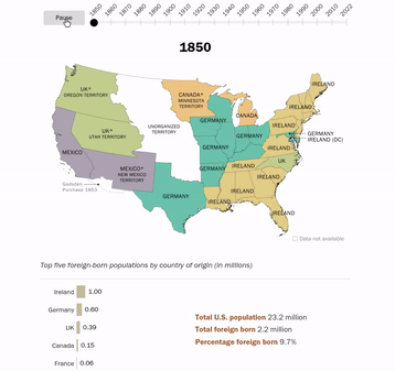
170 Years of American Immigration

animated map of America showing top country of birth among U.S. immigrants, by state since 1850

The Pew Research Center has analysed census data to map the changes in the immigrant population over the last 170 years. An animated map in How America’s source of immigrants has changed over time shows the top country of birth of immigrants in each state from every census since 1850 (except 1890 - the census data for this year was destroyed in a fire).

The animated map clearly illustrates the shifting waves of immigration to America over time. In the 19th Century most immigrants were from northern Europe. According to Pew from 1840 to 1889 "Germany, Ireland and the United Kingdom alone accounted for 70% of the new arrivals." Since 1990 the top country of birth of immigrants to the U.S. has been Mexico. In the last census in 2022 Mexico was the largest country of birth for immigrants in 29 different states.

According to the last census 10.6 million people in the United States were born in Mexico. The second top country for U.S. immigrants is India. 2.8 million Americans were born in India. The total U.S. population (in 2022) was 333.3 million. In terms of regions of the world, 50% of U.S. immigrants are from Latin America (Mexico alone accounting for 23%). 28% of immigrants are from Asia. While Europe, Canada and other North America countries combined contribute 12% to the U.S. population.