170 Years of American Immigration
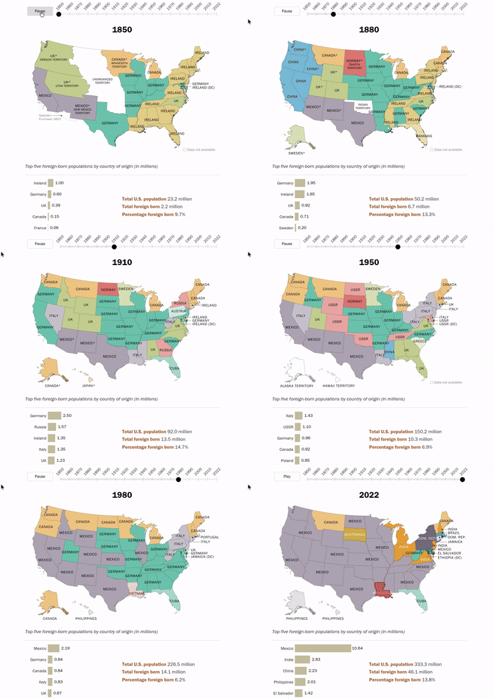
The Pew Research Center has analysed census data to map the changes in the immigrant population over the last 170 years. An animated map in How America’s source of immigrants has changed over time shows the top country of birth of immigrants in each state from every census since 1850 (except 1890 - the census data for this year was destroyed in a fire).
The animated map clearly illustrates the shifting waves of immigration to America over time. In the 19th Century most immigrants were from northern Europe. According to Pew from 1840 to 1889 "Germany, Ireland and the United Kingdom alone accounted for 70% of the new arrivals." Since 1990 the top country of birth of immigrants to the U.S. has been Mexico. In the last census in 2022 Mexico was the largest country of birth for immigrants in 29 different states.
According to the last census 10.6 million people in the United States were born in Mexico. The second top country for U.S. immigrants is India. 2.8 million Americans were born in India. The total U.S. population (in 2022) was 333.3 million. In terms of regions of the world, 50% of U.S. immigrants are from Latin America (Mexico alone accounting for 23%). 28% of immigrants are from Asia. While Europe, Canada and other North America countries combined contribute 12% to the U.S. population.


Comments