Tuesday, July 05, 2016

The Real Maps of Terrorism in Iraq


You may have seen a fake map of car bombs in Baghdad that has been floating around for the last two weeks. Datagraver did and decided to create a real map of Terrorism in Iraq using data from the Global Terrorism Database.

The map shows the locations and number of terrorism attacks in Iraq for the 10 years between 2006 and 2015. The scale of the circles on the map indicate the number of attacks which are assigend to that location in the GTD database.


In its recent history the Iraqi city of Ramadi has been occupied by the American military during the Iraq war, invaded by ISIL after the withdrawal of US and coalition forces, and then recaptured by Iraqi government forces with the help of US and coalition air strikes.

The result of all these 'liberations' has come at the cost of the city's devastation . Over 3,000 buildings and nearly 400 roads and bridges in the city have been destroyed. Hundreds of civilians have also lost their lives.

Associated Press has used satellite imagery from DigitalGlobe and photographs taken on the ground to map the destruction of Ramadi, largely as a result of ISIL sabotage but also from Iraqi and coalition air strikes.

Ramadi in Ruins includes an interactive map which allows you to view DigitalGlobe satellite imagery of the destruction in Ramadi. The map includes hundreds of markers showing the locations of damaged buildings, roads and bridges in the city. If you select a marker on the map you can view the DigitalGlobe satellite imagery of the destruction on the ground.

Ramadi in Ruins also contains a number of before and after satellite images of some of the significant damaged buildings. These before and after images allow you to swipe back and forth between satellite images taken before and after the ISIL devastation of the city.

The Wiggly Wobbly Elastic Map


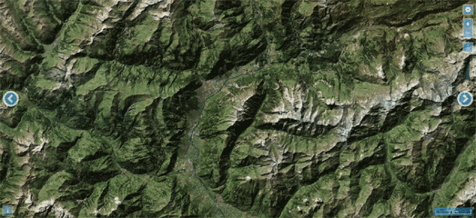
A screenshot of the Elastic Terrain Map really doesn't do this map justice. The magic of the Elastic Terrain Map can only be seen when you pan the map.

Wiggle the map and watch it wobble.

As you pan and move around the map different parts of the map move at different speeds based on the elevation data. The Elastic Terrain Map also now has a whole set of new features which allow you to customize the relief shading, adjust the elevation colors and adjust the direction and angles of shadows.

The Elastic Terrain Map also now includes an elastic terrain map of Mars.

One of my favorite new features on the Elastic Terrain Map allows you to adjust the elevation colors. This allows you, for example, to adjust the height at which snow appears on mountains. You could therefore use this feature to provide a terrain map which shows different colors during the different seasons of the years. Alternatively you could adjust the amount of snow shown on a mountain based on the latest snow reports.

The Elastic Terrain Map is licensed under GPL v3 and the project is available on GitHub.

Monday, July 04, 2016

The Global Migration Map


The Global Immigration Map visualizes the flow of people moving around the world. It uses data from the U.N. Population Division to show which countries people are moving to and from around the world.

The map is visually noisy and could benefit from providing an option to turn off the animated flow of yellow dots (each dot represents 1,000 people). However the large blue and red circles over each country do provide a great overview of the impact of migration on countries around the world (the blue circles indicate positive net migration and the red circles show negative net migration).

If you select these larger circles on the map you can view where immigrants to the country originate from. The red circles show where the most immigrants are from - the larger the circle the more immigration from that country. If you hover over a blue country circle you can view the total net migration.to the country. Hover over a red circle and you can view how many people have migrated to the initially selected country from that country.

The Foreign Born Population of Rome


Rome - The Foreign Resident Population is a dot map showing where the foreign born population of Rome live in the city. The map categorizes this foreign born population into five different groups, based on the continent of origin. These are Africa, America, Asia, Europe and Oceania.

Because of these general categories the map doesn't really reveal the areas of the city where different immigrant groups live. Most immigrant dot maps tend to be based on nationality and consequently often reveal that people from the same country background concentrate in specific neighborhoods or districts of cities. These patterns don't emerge in this map as each of the foreign born populations from each of the five continents seem to fairly evenly distributed throughout Rome.

What the map does reveal however is the relative proportion of the numbers of immigrants living in Rome from each continent. As you might expect Europe seems to be the continent where the largest proportion of Rome's foreign born population originate from. Immigrants from Oceania seem to make up the smallest proportion of Rome's foreign born population.

The Complete Map of Life


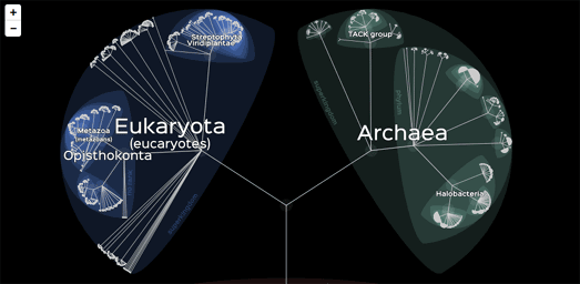
Lifemap is an interactive map which allows you to explore the tree of life. Using the map you can explore the taxonomic classification of over 800,000 different species.

The map works like other interactive maps - as you zoom in on the map more detail is revealed. With Lifemap this means that as you zoom in on a taxa the groups within that classification are revealed. In this way you can carry on zooming into the map and the tree of life until individual species are revealed.

Each node in Lifemap is clickable. As you zoom into the different taxonomic groups on the map you can click on a node to read its definition and to learn more about the taxa on Wikipedia.

The 'pro' version of Lifemap, provides an exhaustive National Center for Biotechnology Information taxonomy (more than 1.1 million taxa) and links to the NCBI webpage for each taxa.

Closing the Metro Map


Yesterday Madrid closed part of Line 1 of the Metro de Madrid. Between now and mid-November, 23 stations will be out of action as the oldest line on the metro is modernized. The Closure of Line 1 examines the affect of the closure on passengers, their alternative means of transport and the modernization work schedule.

The Closure of Line 1 includes two interactive maps. The first map in the article shows the number of people who live within a ten minute walk of each station and the average number of daily passengers at each station. The second map uses a Voronoi overlay to divide Madrid into regions based on the nearest Metro station. Each section is also colored to show the average distance to the station for passengers living in that area of Madrid.

As well as the two interactive maps The Closure of Line 1 includes two animated aerial maps showing the effect that extending Line 1 has had on two districts of the city. These maps show a series of animated aerial views taken after the new sections of the line were open. These aerial images show the development of the areas after the opening of the metro stations.

Sunday, July 03, 2016

Maps of the Week


This year is the centenary of the Battle of the Somme, the largest battle of World War I on the Western Front. It took place between 1 July and 18 November 1916 and more than a million men were wounded or killed.

The Living Legacies Engagement Centre at Queen's University Belfast has released a story map of the battle, looking in particular at the key events involving the Irish Raised Divisions (36th Ulster & 16th Irish). 4dSomme uses the Esri Story Map library to explore the history of the battle, the importance of field-surveyors & cartographers to the battle and the key events involving the Irish Raised Divisions.

This story map makes great use of modern 3d aerial maps of the River Somme overlaid with vintage military maps to plot the advances and retreats of the Irish Raised Divisions during the battle. Vintage photographs and Google Street View imagery are also used throughout to illustrate some of the important locations in the battle.

The final interactive map in 4dSomme allows you to view a number of the vintage military maps overlaid on top of a 3d map of the region. This map also allows you to overlay the changing positions of the British and German front lines on top of the vintage military maps.


Back in January Emy Analytics released the Building Heights in London map. They have now released a new interactive map which incredibly shows the heights of nearly all buildings in England.

Building Heights in England uses data from the Environment Agency's open LIDAR data to color building footprints in all of England by the height of each building. You can use the map's search function to zoom the map to any location in the country. You can then click on any building on the map to find out its exact height and its area size.

The Building Heights in England map also provides a statistical breakdown of building height data for England's top 25 urban areas. If you select one of these urban areas from the map menu you can view information in the map sidebar on the number of buildings in the area, the density of buildings and a histogram which shows a breakdown of all buildings in the area by height.


Esri has released a great cascading Story Map exploring the achievements of the geographer, naturalist and explorer Alexander von Humboldt. In Alexander von Humboldt's Whole Earth Vision Esri uses vintage maps, 3d maps and historical images to help explain the scope and importance of Humboldt's discoveries in South America.

The story map looks in particular at Humboldt's attempt to climb Ecuador's Chimborazo Mountain and his exploration of the Orinoco River. As you progress through the story map Humboldt's achievements, observations and contributions to science are illustrated with historical maps from the David Rumsey Collection, Humboldt's own diagrams and Esri's interactive maps.

The Esri story map of Humboldt's Whole Earth Vision concludes with a final section which explores the legacy of Humboldt's work and his influence on other scientists, writers and statesmen.

Saturday, July 02, 2016

New Walkabout & Neighbourhood Map Styles


Mapzen and Thuderforest have both released new map styles built upon OpenStreetMap data.

Mapzen's new Walkabout map style is designed specifically with walkers and hikers in mind. It emphasizes walking paths, hiking trails and outdoor attractions. These walking related features are further enhanced on the map by highlighting them at all levels of zoom.

Important to the design is a set of new map icons. Outdoor related icons are colored blue-green to help emphasize outdoor related locations over other points of interest on the map which use more muted grey colored icons.  These outdoor related icons are used on the map to draw attention to features like parks, beaches, ski resorts, campgrounds, picnic sites, restrooms, trailheads, peaks, waterfalls, dog parks, and outdoor supply stores.

Important to the Walkabout map style is detailed hill shading, which uses Mapzen's global elevation tiles.


Thunderforest's new Neighborhood map style is a general purpose map style which is designed to work particularly well when zoomed in on local areas.

Street labels are condensed in this new map style to show as many street names as possible. Clear place labels are used on an uncluttered background to ensure that these street labels and other location labels are easily legible on the map.

Friday, July 01, 2016

Talking Graffiti on Street View


Google's Street Art project features a wonderful audio guide to the graffiti of Buenos Aires in Argentina. The Talking Walls of Buenos Aires uses Google Maps Street View imagery to introduce you to some of the city's best street artists and their works of art.

The Talking Walls of Buenos Aires takes you on a guided tour around graffiti in three of the city's neighborhoods; Villa Crespo, Colegiales and Barracas. You can explore the artwork in each of the tours up close using Google Maps Street View. Each of the artworks also includes an audio guide, which provides information on the location, the street artist featured and the individual work of art.

The Google Street Art project is not confined to the street art of Argentina. As well as The Talking Walls of Buenos Aires exhibit, the site features tours of street art in locations all around the world.

Mapping the Battle of the Somme


Today marks the centenary of the Battle of the Somme, the largest battle of World War I on the Western Front. It took place between 1 July and 18 November 1916 and more than a million men were wounded or killed.

The Living Legacies Engagement Centre at Queen's University Belfast has released a story map of the battle, looking in particular at the key events involving the Irish Raised Divisions (36th Ulster & 16th Irish). 4dSomme uses the Esri Story Map library to explore the history of the battle, the importance of field-surveyors & cartographers to the battle and the key events involving the Irish Raised Divisions.

The story map makes great use of modern 3d aerial maps of the River Somme overlaid with vintage military maps to plot the advances and retreats of the Irish Raised Divisions during the battle. Vintage photographs and Google Street View imagery are also used throughout the site to illustrate some of the important locations in the battle.

The final interactive map in 4dSomme allows you to view a number of the vintage military maps overlaid on top of a 3d map of the region. This map also allows you to overlay the positions of the British and German front lines, at key dates, on top of the vintage military maps.


Rutland and the Battle of the Somme is a new interactive map which recounts the history of the Battle of the Somme and explains when, where and how the soldiers from Rutland county died. The map includes a timeline feature which recounts the progress of the battle in chronological order.

As you progress through the battle the map updates to show the front line of the battle as it stood at the beginning of every month. A small information window at the top of the map also provides brief updates on the progress of the battle.

Poppy shaped markers are added to the map by date to show when and where Rutland soldiers were killed. You can click on the markers to learn more about each individual soldier commemorated on the map. The red cross markers show where a soldier was severely injured, before dying later in hospital.