Monday, January 31, 2022

The Coldest Day of the Year

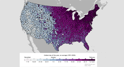
If you live in Pittsburgh then you might want to put on your winter woollies. Based on the average temperatures of the last 30 years today is likely to be the coldest day of the year in Pittsburgh, Pennsylvania. 

You can find out when your coldest day of the year occurs on average on NOAA's interactive map Coldest Day of the Year on Average. On this map weather stations across the United States are colored to show when on average in the year they have experienced their coldest day. These dates are calculated using data from the National Centers for Environmental Information (NCEI). The specific data used is the average low temperature for every day from 1991-2020. You can also click on individual weather stations on the map to view the exact date for the coldest day of the year on average at that location.

Just from looking at the screenshot of the map above you can see that the coldest day of the year normally occurs later in the season in the East than it does in the West of the country. This is partly due to when cold air from snow-covered areas of Canada is blown down into the East. In the Western half of the United States the coldest day usually occurs in December. In the Eastern half of the country the coldest day usually arrives in January or February.

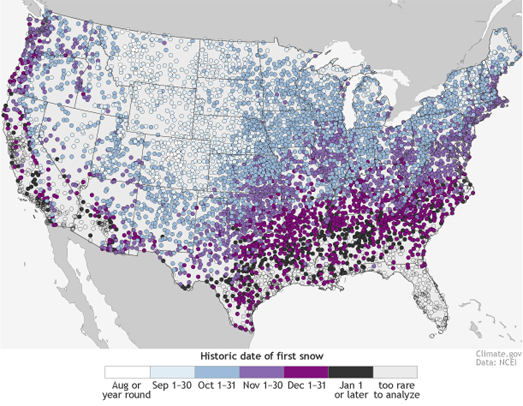
If you want to know when the first snow of the year is most likely to fall then you can refer to NOAA's handy interactive First Snow Map. This map provides a nationwide guide as to when you can expect to get the first snow of the winter. The map shows the date at your location when the chance of snow is at least 50%, based on historical weather records (1981-2010).  

Your latitude and altitude play the biggest role in determining when you are most likely to experience snow. On average the more northerly you are and the higher your altitude then the earlier you are likely to see snow.

If all this talk of snow and low temperatures leaves you feeling cold then you might want to look forward to when you can expect your hottest day of the year. NOAA's Warmest Day of the Year map shows the warmest day of the year on average across the United States based on temperature data from 1991-2020. In most of the country the hottest day normally occurs between mid-July and mid-August.

Saturday, January 29, 2022

How Africa Pays for Climate Change

Over the last year I've been noticing a trend in the focus of climate change visualizations. Instead of concentrating on how the climate is likely to change in the coming decades climate scientists have begun to focus more on how climate change is already impacting the Earth.Of course these impacts are being felt more keenly in many parts of the developing in world. In other words it is the countries who have historically been least responsible for contributing towards climate change who are now beginning to be adversely effected by global heating.

In Who Damages the Climate the Most and Who Bears the Consequences the German newspaper Tagesspiegel looks at the effects that climate change is already having on many African countries. The newspaper uses an interactive 3D globe to highlight some of the impacts of global heating already been seen in many countries, particularly in Africa.

Ten of the countries who will be worst hit by drought are in Africa. For example, right now in Kenya 2.4 million people are at risk of starvation as a result of a severe drought. When rain does come it often now comes all at once. For example while Kenya s experiencing extreme drought neighboring South Sudan has seen some of its worst flooding in the last 20 years. 

As you scroll through the Tagesspiegel article choropleth layers are added to the interactive globe to show the global risks from drought and from flooding. These choropleth layers clearly show the increased risks being faced by African countries compared to many countries in the so-called developed world. 

As you progress through the article the interactive globe is also used to show the CO2 consumption of individual countries. This helps to reveal that while Africa is beginning to see the worst effects of climate change it is is probably the continent which is contributing the least to its acceleration. For example a person in South Sudan on average causes 0.1 tons of CO2 emissions per year. In comparison the average American causes 14.2 tons of CO2 emissions each year. Once you look at the historical consumption of CO2 this inequality in the causation of climate change becomes even more glaringly obvious.

However despite being less responsible for climate change Africa will pay. According to the IPCC temperatures in many African countries will rise faster than the global average. Because the economies of many African countries rely on agriculture and tourism climate change is also likely to have a very severe impact on the economy of Africa. So not only is Africa beginning to be severely impacted by climate change it is also now being made even poorer by a crisis largely caused by the developed world.

Friday, January 28, 2022

The Map of All Human Knowledge

Open Syllabus Galaxy is an interactive map which allows you to search the 1,138,841 most frequently assigned texts in University syllabi. On the map university and college text books are organized spatially based on which books and articles are assigned together in the same courses. 

Open Syllabus is is a non-profit research organization that researches the syllabi of University and College subjects. As part of this analysis Open Syllabus uses machine learning and other techniques to collect the titles of texts and articles cited on reading lists in course syllabi.

Open Syllabus Galaxy maps over 1 million assigned college tests based on 'co-assignment patterns' (i.e. which tests are listed in the same syllabi). The interactive map plots over 1 million of the most frequently assigned texts in higher education. Individual texts are shown on the map using scaled colored circles. The colors of the circles relate to college subjects (which subject a text is most assigned in). Texts colored grey are interdisciplinary texts (these texts have <50% of assignments in any single subject). The scale of the circle markers are determined by the number of syllabi a text is listed in. Therefore the biggest circles show the texts which are on the most subject reading lists. 


The HathiTrust Digital Map is a similar interactive map which allows you to browse and explore the 14 million volumes in the HaithTrust's repository of digitized texts. The HathiTrust is a partnership of academic and research institutions which offers a collection of millions of titles digitized from libraries around the world.The HathiTrust Digital Map provides a visual interface with which you can navigate the books in the HaithiTrust digital library.

The Library of Congress Classification system categorizes books into different broad subjects and then by sub-classes within each of these subjects. The HathiTrust Digital Map uses an entirely different method of classification. On this interactive maps texts are organized by the similarity in the vocabulary of individual texts.

The interactive map has two distinct modes: 'Read' and 'Interact'. If you select 'Interact' you can zoom in and pan around the map. If you then select an individual dot on the map you can actually open the selected text on the HathiTrust Digital Library website. However if you select 'Read' you can learn more about the vocabulary similarity classification system used by the digital map.


An Ocean of Books is an interactive map of over 100,000 authors and 145,162 books. On this map every island is an author and every city is a book. If you search the interactive map for your favorite writers you can find other writers that you may enjoy based on how near they appear on the map to your favorites.

The size of an author's island on An Ocean of Books is determined by the amount written about them on the internet. The more times they are mentioned on the World Wide Web then the bigger their island on the map. The position of the islands and the proximity of authors to each other is determined by the number of connections between them on the internet. If two authors are mentioned in lots of the same web pages then the closer they will be on An Ocean of Books.

The connections between authors and therefore their proximity on the map is determined by a machine learning algorithm. If you select an author's name on the map then you can read a short biography. If you zoom in on an author's island then all the writer's books will appear as cities on the map. Click on a book's title and you can read a short introduction to the selected book.


TheLibraryMap uses the idea of fictional genres as its organizing principle in mapping books. TheLibraryMap is an interactive map of over 100,000 books which are organized based on 'the genre and topics of each book'. On the map individual books are colored by 'genre and topics'. 

Individual book markers on the TheLibraryMap are also sized differently. The size of a book marker is related to the number of 'user reviews' (TheLibraryMap is a participant in the Bookshop.org affiliate program so I assume this relates to user reviews on Bookshop.org).

Thursday, January 27, 2022

All the Maps at Once

The David Rumsey Historical Map Collection is one of the largest online collections of digitized vintage and historical maps. The collection includes over 100,000 digitized maps. Most of which you can explore as fully geo-referenced interactive maps.

This week, in a blog post entitled More Than Digital Copies: Maps That Interpret Maps, the David Rumsey Historical Map Collection is highlighting some of the amazing composite maps that it has created over the years. The David Rumsey Collection includes many atlases and map sheet collections in which large geographical areas have been mapped and then printed over many separate map pages. By geo-referencing all the separate map sheets in a collection and then overlaying them on an interactive map the David Rumsey Historical Map Collection is able to create one complete composite map from all the maps in a single collection.

Among my personal favorite composite maps highlighted in this week's blog post is an amazing interactive 3D globe of the moon. This interactive globe was created by making a composite map from 44 separate United States Air Force and NASA maps of the moon created in the 1960s from telescope observations and photographs of the moon.

The David Runsey blog post also links to a composite map of Urbano Monte's Planisphere. The David Rumsey Map Collection obtained one of only two manuscript copies of Urbano Monte's Planisphere in 2017. Monte's huge map is one of the earliest large complete maps of the world. 

The original manuscript map is in the form of a 60 sheet atlas. Urbano Monte intended for the sheets to be joined together to create one very large 10 foot map. The David Rumsey Map Collection has achieved this goal by digitizing all 60 sheets and creating a digital interactive map of Urbano Monte's Planisphere. Monte himself suggested that a central pivot be added to the center of the map so that users could rotate the map while exploring the atlas. The digital interactive version of the map does include a rotation button, which means you can now spin the map around its central pivot, just as Urbano Monte intended. 

The David Rumsey Historical Map Collection composite maps blog post also includes links to a composite map of Baron Haussmann's 1868 maps of Paris (showing how he planned to transform the French capital), a 360 degree view of Santiago, Chile (drawn in 1823) and a number of other amazing composite maps.

Wednesday, January 26, 2022

Lighting Up the World

Lights at Sea is a flashy interactive map which uses OpenStreetMap data to show the locations of lighthouses around the world. The map not only shows the locations of individual lighthouses but also shows the unique flash patterns and light colors which lighthouses use so that mariners can identify them and tell them apart from other lighthouses.

Most lighthouses have a unique 'daymark'. Each one is painted with a unique pattern which enable mariners to identify individual lighthouses during the day. These daymarks often consist of large colored painted stripes, diamonds or other patterns.At night these daymarks can't be seen, therefore lighthouses have unique light characteristics which enable ships to distinguish between different lighthouses in the same coastal areas. 

The Lights at Sea interactive map doesn't just show the location of individual lighthouses. Each lighthouse is also shown on the map using the real light color and flash pattern used by that lighthouse. The size of the lighthouse markers are even scaled to show the distance that each light is visible.The range of light emitted by a lighthouse is measured by how many nautical miles away it can be seen. In OSM the range of a lighthouse can be assigned using the tag 'seamark:light:range'. Lights at Sea uses this 'seamark:light:range' data to determine the size of each lighthouse's marker.


You could use just the lighthouse data from Lights at Sea to create a rough coastline map of Europe. However there appear to be less lighthouses or less lighthouses mapped in the rest of the world. It could be interesting to compare lighthouse density with global shipping traffic.

You can see on Lights at Sea that not all coastlines have lighthouses marked on OpenStreetMap. Many of these coastlines do have very busy shipping traffic. You can view most of the busiest shipping lanes around the world on Shipmap.org. Shipmap.org is an outstanding animated map that visualizes the movements of the global merchant shipping fleet over the course of one year.

If you compare the two maps it appears that Africa and the western coastline of South America are two areas with heavy marine traffic but less lighthouses. I'm not sure if this is due to a lack of data on OSM in these regions or if there hasn't been the same tradition of building lighthouses in these areas of the world.

Tuesday, January 25, 2022

Visualizing the Tonga Volcanic Eruption

Reuters has created a very impressive visualization showing the scale of the huge eruption of the Hunga Tonga-Hunga Ha'apai volcano.In How Big Was the Tonga Eruption? Reuters has overlaid satellite imagery of the eruption over a number of global locations so that the news agency's readers have a comparative scale by which to judge the sheer size of the eruption which has devastated the nearby island of Tonga. 

One hour after the eruption of the volcano the umbrella cloud measured around 640 km wide. Most of us are very poor at conceiving the scale of large numbers and find a distance such as 640 km hard to gauge. In order to provide a true sense of the scale of the eruption Reuters has created a number of visualizations showing the volcanic umbrella cloud on top of a number of well-known landmasses, including Florida, California, the UK, Spain and Israel.

The animated image of the eruption used by Reuters was created using imagery captured by the NOAA GOES-West satellite. If you want to create your own animations from satellite imagery there are a number of applications which can help you. For example the RAMMB/CIRA Slider allows you to view (and create animations from) satellite imagery from a number of different satellites in geostationary orbit above different locations around the world. 

You can also use Streamlit for Geospatial Applications to create timelapse animations from satellite imagery. Streamlit uses a simple interface which allows you to create animations for any location around the globe from Landsat & GOES satellite imagery.

Monday, January 24, 2022

The Sexist Streets of the World

189 roads in Zurich are named after famous individuals. Of the 189 roads in the city named after people 134 (or over 70%) are named for men. Only 55 streets in Zurich are named for women. You can explore for yourself all the streets named for people in Zurich on the EqualStreetNames.Zurich interactive map. 

Zurich is of course not the only city which likes to ignore women when giving names to roads. The EqualStreetNames project has now analyzed the inequality in street names in 41 cities around the world. This list includes San Francisco, Madrid, Brussels, and Berlin. If your city is not yet on the list you can remedy this by creating your own street name map using the EqualStreetNames City Template.


The Geochicas project has also been at the forefront of efforts around the world to reveal the under-representation of women in place-names. Their Las Calles de las Mujeres is an interactive map which reveals all the streets named for men and women in a number of cities in Spain, Italy, Argentina, Mexico, Bolivia, Cuba, Paraguay, Peru and Uruguay. 

Streetonomics has also created a series of interactive maps which allow you to explore and discover more about the people who have streets named after them in New York, Paris, Vienna and London. On these four interactive city maps all the streets which have been named for individuals are shown using different colors. You can click on any street on a city map to view who the street was named for and learn more about who that person was.

The Streetonomics individual maps for each city include a number of filters which allow you to explore which streets in the city have been named for men and which have been named for women. You can also explore which streets have been named for people from different periods in history, from different occupations, and by country of origin.

A number of other interactive mapping projects have also explored the sexist culture of naming streets in cities around the world:  

Street Names in Vienna visualizes all the streets named for men and women in the Austrian capital.
From Pythagoras to Amalia analyzes 5,400 Amsterdam street names 
Recognizing Women with Canadian Place Names
shows 500 locations in Canada named for women
Mapping Diversity mapping the male and female street names of Italy 

Saturday, January 22, 2022

The Global Rewilding Map

Last year the Haas Business School, with the help of 100k Trees 4 Humanity, planted 150 mature redwood trees on its Materials Recovery Facility in Richmond. The trees were planted in order to offset the 400 million pages of paper the school prints each year. The Haas Business School has decided to work on both reducing its overall printing total and to plant redwood trees in order to help sequester carbon and encourage biodiversity.

The Haas Redwood Tree Planting Project is just one of over 70,000 restoration projects featured on the Restor interactive map. Restor is an interactive map which tracks and maps projects around the world where communities are attempting to restore or conserve natural ecosystems. Conserving and restoring ecosystems is a crucial part of protecting and preserving biodiversity and can help in preventing further climate change. 

Using the interactive map you can discover what restoration projects are happening both near you and elsewhere around the world. As you explore on the interactive map the map sidebar automatically updates to show restoration projects taking place in the current map view. You can then click on these individual projects to learn more about the nature restoration being undertaken and to click through to visit the project's website (where available). 

The Restor interactive map also includes a 'global predictions' tool. If you use the 'draw an area' tool you can select an area of interest on the map. After drawing a polygon on the map and pressing the 'analyze area' button you can view an estimate of the amount of organic carbon which currently exists in the soil in this area and an estimate of how much could exist if the land is restored. You can also view breakdowns of the area's current biodiversity, types of environment and types of biodiversity.

Friday, January 21, 2022

Mapping the World's Infrastructure

The Open Infrastructure Map is an interactive map of the world's power, telecoms, gas, and oil infrastructure. The map uses data from OpenStreetMap to plot electricity power plants & power lines, oil, gas & petroleum pipelines, water pipelines, and telecom cables.

The Open Infrastructure Map includes five different layers. These layers allow you to turn on or off map data relating to 'Power', 'Solar Generation', 'Telecoms', 'Oil & Gas' and 'Water'. The electricity power lines shown are also color coded to show their levels of voltage. 

As you zoom in on the Open Infrastructure Map more detail is added to the map to show the locations of individual power stations. Different map symbols are used to indicate the different types of power plant (nuclear, oil, coal, gas, wind, solar etc). 

The Open Infrastructure Map also includes an interesting statistics facility. This allows you to view the amount of infrastructure mapped in different countries. For example Open Infrastructure Map has mapped 6,230 different power plants in the United States. Of these 763 are gas powered, 247 are coal powered and there are 62 nuclear power plants. The statistics given reflect only the infrastructure which has been mapped on OpenStreetMap. This data may be incomplete and the accuracy is only as good as the mapped data.


Gridfinder is an interactive map which visualizes the global electricity grid network based on night-light satellite imagery. The map predicts the existence of electricity network lines using evidence from night-time views of the Earth from space.

10% of the world's population does not have access to a reliable electricity supply. It is hoped that Gridfinder can be used to identify populations with poor access to electricity networks in order to help improve essential infrastructure and provide affordable and reliable energy.

The Gridfinder map shows the locations of known electricity lines using data from OpenStreetMap. The map also shows predicted electricity supply lines based on where lights can be seen at night from orbiting satellites. To predict the existence of these previously unmapped electricity supply lines the level of night-time light in satellite imagery is used to see where locations are most likely to be producing light from electricity. Where there is enough light to have been produced by an electricity network the map connects this to known electricity networks using an algorithm which follows roads and already known distribution lines.

You can read more about how night-time satellite imagery has been used to predict the world's electricity network on the research paper Predictive mapping of the global power system using open data.  

Every year Telegeography releases a map of the huge global network of undersea telecommunication cables which carry all our data around the world. Subsea cables carry telecommunication signals under the oceans, communicating information between different countries and regions of the world. In the 19th Century the first submarine cables were laid to carry telegraphy traffic. In the 21st Century submarine cables carry digital data, which includes telephone and Internet data.

The 2021 Submarine Cable Map from Telegeography shows 464 cables and 1,245 landing stations. The map also features lots of textual information, featuring both cable trivia and answers to FAQ's about cable suppliers, content providers, fiber etc. For example - did you know that there are now over 1.3 kilometers of underwater cables around the world (if they were laid end-to-end they could wrap around the world 30 times).

Thursday, January 20, 2022

The Cycling Stress Map

Earlier this month I reviewed the City of Boston's Bicycle Level of Traffic Stress interactive map. A map which rates every road in the American city based on the stress caused to cyclists from road traffic, the lack of bike lanes and other conflict factors. The Bici Stressat ed al Traffico interactive map is a little more ambitious, in that it has mapped the cycling stress levels on every single road in Italy.

The Bici Stressat ed al Traffico is an interactive map which rates and colors every Italian road based on the stress caused to cyclists from other road traffic and from the availability of cycling infrastructure. Every road on the map is given one of four ratings: 'Safe for Children', 'Low Stress', 'Moderate Stress' or 'High Stress'. Cyclists can use the interactive map legend to turn on or off the roads of different stress levels. So, for example, if you wanted to plan a pleasant bike ride you could just select to view all the roads rated Safe for Children or Low Stress.

The four different cycling stress ratings given to individual roads are based on both the levels of road traffic and the presence / absence of separated bike lanes. You can learn more about how each of the four ratings are defined on the BikeItaly GitHub page (in Italian). These ratings are apparently based on ratings defined by Bike Ottawa.