Mapping Cabs in NYC
Back in 2014 Chris Whong created an impressive interactive map using New York Taxi Data. Chris' map provided a great insight into the daily life of one New York taxi driver. The impressive amount of data released by the NYC Taxi & Limousine Commission however has other stories to tell about life and people in the Big Apple.
For example, Esri's John Nelson has created a story map looking at Yellow Cab trip data in New York City from July 2015 - June 2016. By mapping the data Nelson has been able to pick out how different New York boroughs use and pay for taxi cab journeys. He then looks at the underlying socio-economic data in those neighborhoods to see if they help explain the differences in how inhabitants of different New York neighborhoods use and pay for cabs.
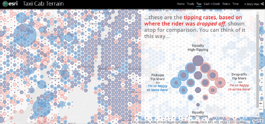
In Taxi Cab Terrain Esri has mapped out the locations where the most New York cab rides begin, the pick-up locations where cab drivers can expect the largest tips, where in the city passengers pay in cash & where they pay by credit, the number of passengers and the length of journeys.
Chris Whong's original map, NYC Taxis: A Day in the Life is a MapBox visualization of the journey of one New York taxi over the course of 24 hours. You can also view the NYC Taxi Holiday Visualization, which animates taxi journeys from New York's airports over the course of a month and half, and Hubcab, a mapped visualization of 170 million taxi trips over one year in New York.


Comments