Tuesday, November 30, 2021

Violent Conflicts in the Republic of Texas


In the early 19th Century Texas was one of the most diverse regions in the North American continent. It was home to a number of Native American tribes. It was also home to a large Mexican population and a growing number of illegal immigrants from the United States.

After the formation of the independent Republic of Texas in 1836 relations between Native Americans and Euro-Americans was often strained. The nationalist faction in the new republic led by Mirabeau B. Lamar, advocated for the expulsion of all Native Americans from Texas. Conversely some of the Native American tribes, such as the Comanches, opposed the new republic.

The University of Texas' Border Lands interactive map is an attempt to document and map the locations of the many incidents of conflict between Native Americans and Euro-Americans in Texas during the period from the creation of the First Mexican Republic to the outbreak of the U.S.-Mexico War (1821-1846). 

The interactive Border Lands map includes three main views. The Timeline view allows you to explore all the mapped sites of conflict by date. This timeline view includes a date control which allows you to filter the incidents shown on the map by date range. It also includes an animation view which adds all the sites of conflict to the map in chronological order. The Heat Map view provides a a visualization of the density of conflicts by location. This view provides an overview of which locations in Texas witnessed the most violent conflicts during the period 1821-1846. The Fatalities map view uses colored markers to visualize all the violent conflicts between Native Americans and Euro-Americans by the resulting number of deaths. 

You can gain a deeper insight into the indigenous tribes which were native to the area now known as Texas on the Native Land interactive map. Native Land is an interactive map attempting to show the locations of indigenous territories, languages and treaties around the world.If you zoom in on Texas on the Native Land map you can explore which Native American tribes and languages were indigenous to the area before the arrival of Europeans.

Monday, November 29, 2021

Mapping for Christmas

A necklace, earring, ring or brooch from Talia Sari's You Are Here jewelry range would make the perfect Christmas present for any cartophile in your life.Each item of You Are Here jewelry is custom made based on your chosen location. Just enter a location into the Mapbox powered wizard and Talia Sari can make you a custom item of jewlery using the street map of your favorite location.

Prices start at around $149 for a map necklace, ring or brooch and $171 for a pair of earrings.

If you have been wondering what to buy me for Christmas then might I suggest a 3D mini city model of London. MiniCityArt make 3D models of major global cities. Each model is 3D printed on an FDM 3D printer using biodegradable plastic. The models range in size from 8" to 54". Custom city models can also be made on request.

Prices start from $119.

The present of choice for every fashion conscious cartophile this Christmas is a wearable map. Splash Maps make wearable custom maps printed on weatherproof fabrics. The products available in the Splash Maps store include map face masks, scarfs, tablecloths and even shower curtains. Each Splash Maps product can be made from the map location of your choice.

A polyester-cotton London map face mask can be currently bought for just £3.25.

Of course if you are really struggling for Christmas present ideas then you can't go wrong with a printed map. Mapiful create beautiful map posters for any location on Earth. Using Mapiful's interactive map wizard you can select any location in the world, select whether you want a landscape or portrait orientated poster, choose a map size, and even change the map headings. The Mapiful creation tools also includes a number of different map style themes from which to choose.

Prices start from around $40.

Saturday, November 27, 2021

Sea View


Put on your virtual life-jacket. This weekend we are going kayaking around Puget Sound, exploring the marine waterways and basins of this Pacific Ocean inlet. There is no need to worry about the cold weather either, because you can now explore this beautiful stretch of water through the power of interactive panoramic Sea View.

The Puget Sound Nearshore Mapping Campaign has been busy capturing 360 degree panoramic imagery of the Puget Sound nearshore by kayaking around the 1,200 miles of this north-western inlet of the Pacific Ocean. Using EarthView's new interactive map you can explore Sea View imagery of the Seattle waterfront, the Port of Tacoma, Fish Trap Cove and many other locations from around the sound. 

The beautiful panoramic imagery provided by EarthView is only one result of the Puget Sound Nearshore Mapping Campaign. EarthView is actually mapping Puget Sound by kayak in order to create more accurate maps of the sound nearshore. Maps which they hope can then play an important role in helping to recover and protect the critically important natural habitats of Puget Sound.

The kayak being used to capture this panoramic imagery of Puget Sound is also equipped with a water quality meter that has been used to record water conditions along the nearshore. The kayak has also been used to record animal sightings on the Puget Sound nearshore.

If you are feeling particularly adventurous then you might also consider taking a virtual dive beneath the waves. The Catlin Seaview Survey has been capturing underwater 360 degree panoramic imagery from across the world for a number of years. Their Virtual Dives website allows you to explore some of this submarine Street View imagery from the coast of Indonesia, among the coral reefs of American Samoa, from the Great Barrier Reef, the Galapagos and from many other beautiful undersea locations from around the globe.

Friday, November 26, 2021

LiDAR Data Reveals Illegal Logging

LiDAR data has been used to suggest that the logging company VicForests has been carrying out illegal logging in the state of Victoria, Australia. ABC News has obtained high resolution LiDAR data of Victoria's state forest which has allowed researchers to map the underlying terrain. Loggers in Victoria are prohibited from logging on hills which are steeper than 30 degrees. Thanks to the new LiDAR data it is now possible to reveal that between 2004-2019 VicForests illegally logged over 65 hectares from slopes exceeding 30 degrees.

The trees in the forests of Victoria play an integral role in filtering the drinking water of the city of Melbourne. As water flows down the mountains of north-east of Melbourne the roots of the forest trees slow the water's progress. When slowed the water seeps into the ground, where it is then naturally filtered by the soil. This is one reason why it is illegal to log trees on the steep mountain slopes in the water catchment area.

ABC News' Lawless Loggers uses 3D maps to explain how the newly obtained LiDAR data has been used to model the Victoria terrain and reveal where VicForests has been logging on slopes with a higher gradient than 30 degrees. Environmental researchers analyzed 332 logged areas in the state. 331 of those areas had a slope of at least 30 degrees. 

Sixty percent of Melbourne's drinking water comes from the catchment area being logged by VicForests. That water is delivered to the city's residents with very little filtration. VicForests deny that they are involved in a widespread breach of Victoria's slope limits. The Office of the Conservation Regulator (OCR) is responsible for enforcing the state's logging laws. It has twice found VicForests guilty of illegal logging but on both occasions declined to take any regulatory action against the logging company.

Thursday, November 25, 2021

Navigating by Nose

We have all used our nose to navigate by. Like me I'm sure you have used your nose to find the nearest abattoir while taking the pigs to slaughter or in order to find your date's house next to the sewage plant. Which makes it rather odd than no-one has previously thought to use the nose as a way of navigating an interactive map.

The Earth-Nose Direction Game is a new fun map based game which requires you to navigate an interactive globe using your nose.Don't worry - you don't have to wipe your nose across your phone's touch-screen. This Earth-Nose Direction Game uses your device's video camera to read your head movements.

Once you agree to allow the Earth-Nose Direction Game to access your device's video camera a small circle will appear on the interactive globe. Your object is to navigate to that circle using head movements. Moving your head left or right is equivalent to swiping the globe right or left, while moving your head up or down navigates the globe down or up.

Each circle on the map contains a number of friends (the number of friends is determined by the city's population). If you manage to navigate to a circle those friends are added to your total and another circle is added to the map. 

I already have 15 million friends. I wonder how many you can get?

Wednesday, November 24, 2021

The Geography of a Dollar Bill

Every dollar bill in the United States is issued by one of the 12 Federal Reserve Banks (FRB). These FRB's are located in Boston, Richmond, Minneapolis, New York City, Atlanta, Kansas City, Philadelphia, Chicago, Dallas, Cleveland, St. Louis and San Francisco. Every single one dollar bill carries a seal which identifies at which one of the twelve FRBs it was issued. 

Excerpt of a note, showing the seal.
 Seal of the Richmond Federal Reserve Bank

Using the seal of the issuing bank it is possible to determine where a $1 originates. It is therefore possible to map the geographical journey of a dollar bill. As people travel around the United States they carry money from state to state. In this way a single dollar bill can end up traveling a long way around the country. In February 1976 S. Pignatello took a sample of $1 dollar bills spent in MacDonalds outlets in each of the twelve Federal Reserve Board districts. Using the identifying seal of each dollar he was able to create an origin/destination matrix, showing how many notes issued in each district were discovered in each of the 11 other districts.

Visionscarto has used the origin/destination table created by S. Pignatello to create a flow map showing the movement of dollar bills around the United States. The flow map in Routing Dollars visualizes how dollar bills move between the 12 Federal Reserve Bank regions. The colored circles indicate whether an individual FRB region is a 'source' (prints more money than they use) or a 'sink' (uses more notes than they print). The orange colored FRBs on the map are sources and the blue FRBs are sinks.

You can track the journeys of individual dollar bills on Where's George?. If you enter the serial number of a dollar bill into Where's George? you can begin to track its journey around the United States. By entering a serial number of a dollar bill and then marking the bill with the www.wheresgeorge.com URL you can find out where the bill travels (if other people who end up owning the bill log on to Where's George to update the note's journey).

For example on Where's George you can view a map of one $1 dollar bill which has traveled over 13,905 Miles in just 7 years. During this journey it has been to France and back. It has also visited Texas, Arizona, New Mexico, Las Vegas, South Dakota, Florida, Ohio, New York and Virginia.

Tuesday, November 23, 2021

The North Sea is Very Busy

Delft University of Technology has worked with Microsoft to map the huge amount of marine traffic off the coast of the Netherlands. In Crowds on the North Sea TU Delft takes a detailed look at this new map of North Sea marine traffic. 

As you scroll through Crowds on the North Sea the map zooms and pans to highlight and explore the different  types of shipping traffic active off the coast of the Netherlands. This includes large ferries used for shipping passengers to and from the Netherlands. The map also reveals the main routes taken by the fleets of container ships constantly sailing in and out of the huge Dutch commercial ports. The AIS tracks of dredging ships can also be seen as they work to keep the main shipping routes open for all other shipping traffic.

Of course the North Sea isn't only used for marine traffic. The sea is also home to wind turbine farms, sand extraction sites, communication cables and gas pipelines. The Crowds on the North Sea interactive map also shows where these other key infrastructure assets are housed in the very busy  North Sea. There are also plans to locate storage facilities for CO2 and to build artificial islands for housing & for an airport - in this already crowded and very active area of the North Sea off the coast of the Netherlands.

The area of the North Sea off the Belgium coast is also one of the busiest seas in the world. In fact Belgian territorial waters are so busy that the North Sea off the Belgian coast sees more marine traffic than both the Panama Canal and the Suez Canal. 

To help illustrate the huge amount of marine activity which takes place off the coast of Belgium the financial newspaper De Tijd created an animated map which visualizes 24 hours of marine traffic, using data from marinetraffic. On this animated map different colors are used to show four distinct types of marine vessel. In the story The North Sea is Teeming container ships are shown in yellow, the blue vessels are fishing boats, dredgers are shown in red and other types of ship are shown in gray. 

The North Sea off the Belgian coast is very shallow and contains many sandbanks. As you progress through De Tijd's story the navigable sea routes off the Belgian coast are added to the map. Look out for the red boats on the map which show the dredgers constantly working to keep these sea routes navigable.Keep scrolling and the dredging dumps, where the dredgers tip the sand and silt cleared from the sea routes, are also added to the map.

As well as the animated map showing 24 hours of marine activity 'The North Sea is Teeming' includes maps which show the major wind farms off the Belgian coast, the location of protected nature zones in the North Sea, and the locations of gas, electricity & telecommunication pipes & cables. Towards the end of De Tijd's story another map is used to show that underwater noise pollution in the North Sea is loudest off the Belgian Coast. With all this marine activity it is easy to understand why.

Monday, November 22, 2021

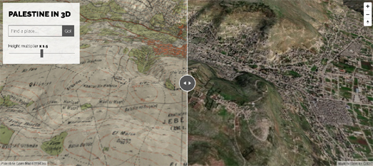
Viewing Vintage Maps in 3D

Palestine 3D allows you to explore 150 vintage maps overlaid on top of modern day elevation data. The maps date from the 1940's and were downloaded from Palestine Open Maps, which allows you to browse and search a detailed set of historic maps of Palestine dating from the period of the British Mandate of Palestine.

The Palestine 3D interactive map allows you to view historical maps of Palestine side-by-side with modern satellite imagery of Palestine. The map includes a height multiplier control which allows you to exaggerate the underlying elevation data to give you a clearer (although exaggerated) idea of the terrain. 

Palestine 3D uses deck.gl to overlay the vintage maps on top of the modern elevation data. You can explore (& fork) the code on the Palestine 3D GitHub page. 

You can also use Mapbox GL to overlay vintage / historical maps on top of a 3D terrain. Last year I created a little demo map which shows an 1833 map of Vesuvius draped over the terrain of Mount Vesuvius in Italy. Vintage Mapper allows you to view the map "Vesuvius Showing the Direction of the Streams of Lava in the Eruptions from 1631 AD. to 1831 A.D." on top of a 3D map of the volcano. This vintage map was taken from the David Rumsey Map Collection.

I've published my Vintage Mapper demo on Glitch. If you want to clone the map then you can do so on its Glitch page. All you have to do to adapt the map is add a new vintage map layer and change the Vintage Mapper's starting latitude and longitude. If you click on the 'Georeference' button on a vintage map in the David Rumsey Map Collection you can grab the URL for that map's map tiles. When the selected map opens in Georeferencer you need to sign-in and then click on the 'This Map' link. You can then click on the 'Get links' button to copy the URL for the map tiles.

If you open up Vintage Mapper on its Glitch page you will see that I have commented the code to show where the vintage map tiles URL should go. Just delete the URL for the Vesuvius map and paste in your own URL. All you need to do then is to change the latitude and longitude to center the map on your new vintage map tiles.

Saturday, November 20, 2021

Population Growth in Africa

Recent population studies have suggested that Africa will be the only continent experiencing population growth by the end of this century. Currently most of the world's most populated cities are in Asia. However by the end of this century it is predicted that over half of the world's largest cities will be in Africa.

The Washington Post has mapped out predictions of the world's 100 most populated cities in 2025 and in 2100. The 2025 map of the 100 most populated cities in Africa's Rising Cities shows that the largest urban populations are currently mostly concentrated in Asia, particularly in India and China. However the Post's map of the predicted 100 most populated cities in 2100 shows that Africa is set to become home to the world's largest metropolises. 

The Washington Post predicts that Lagos, Nigeria will become the most populated city in the world by the end of this century. It predicts that the city will have a population of 80m by 2100 (in comparison Tokyo currently has a population of nearly 14 million). The Post suggests that among other African cities expected to see explosive population growths over the course of this century are Khartoum (Sudan), Kinshasa (Congo), Mombasa (Kenya) and Abidjan (Ivory Coast). The article accompanying the map in Africa's Rising Cities goes on to explore some of the infrastructure challenges already being faced by these five African cities and the huge challenges that they will face in the coming years from their predicted population explosions.

Friday, November 19, 2021

The PDF Map Maker

This morning I created a printable map of a short Seattle walking route, taking in some of my favorite record shops and cafes.

I created the map using the excellent PDF Map Maker.Which means my map is now a handy PDF file, which I can e-mail to my friends, and which we can all print-out whenever we want to use it. 

PDF Map Maker is a handy tool for making PDF maps. The creation tools allows you to make maps using any of 9 different base map styles (including road maps, satellite, and light & dark styles). To create a PDF map all you have to do is zoom-in on the area you wish to map and press the 'Download Map' button. The PDF Map Maker will then create a PDF Map of the area you selected. It is that simple.

You can also add features to your map if your want. For example in my Seattle Walking Tour map I have added a route line and 6 lettered points (indicating the locations of record shops and cafes along the route). To add lines, points or polygons to your map you just need to upload a GeoJSON file containing your geographical data to PDF Map Maker.

To create my Seattle Walking Tour PDF map I used the online Vector GeoJSON creation tool to create a GeoJSON file of 6 points (showing record shops & cafes) in Seattle. I then used geojson.io to create the GeoJSON file for the walking route line.It was then just a simple matter of uploading the two GeoJSON files into the PDF Map Maker.

Thursday, November 18, 2021

Mapping Population Growth in America

Between 2010 and 2020 the number of people living in the U.S. grew by 22,703,743. Around half of that growth was provided by the rise in the Hispanic population, which grew by 23% during that decade. In the same ten year period the number of White Americans fell by over 5 million. The total number of White Americans dropping from 196,817,552 to 191,697,647.

You can explore how the population and the racial make-up of the population has changed in the last decade on Census Mapper 2020. The Census Mapper interactive map uses colored arrows to show population change down to the census tract level. Green arrows pointing up show where a local population has risen and brown arrows pointing down indicate a local fall in the population. 


Hispanic population change 2010-2020

The map sidebar allows you to explore national and local population changes for different racial groups. For example the map above shows how the Hispanic population had seen a nearly nationwide rise. Interestingly among the few counties to actually see a fall in the Hispanic population are a large number of counties in southern Texas, close to the border with Mexico.


White population change 2010-2020

Between 2010 and 2020 the White population of America was the only racial group to experience a significant fall in numbers. The Census Mapper interactive map shows that this is also a national trend, with the majority of counties across the U.S. seeing drops in the local White population.


You can also explore the racial mix of individual census tracts using maps created by CNN and Ben Schmidt. In August CNN used the 2020 census data to create a racial dot map of America. The interactive map in Race and ethnicity across the nation uses colored dots to visualize the population density and racial mix of every neighborhood in the country. Ben Schmidt's All of US is another interactive dot map which allows you to compare population data from the 2010 and 2020 US censuses.Ben's 'dot' map actually uses Wee People rather than dots to represent the U.S. population at the neighborhood level.

Wednesday, November 17, 2021

The Edge of All Life

There is a small cluster of gnarly Megallanic beeches on the island of Isla Hornos in the Cape Horn. These trees are the most southerly trees in the whole world.The cold air and extreme winds of Antarctica mean that no trees grow any further south than the beeches of Isla Horna. 

You can learn more about the southernmost and northernmost edges of other plant species on The Edges of (all) Life interactive map. This Esri Story Map, by Brian Bouma, uses data from iNaturalist to map the most northerly and southerly habitats of thousands of different plant species. Observing and mapping the edges of species ranges is important as it enables botanists to monitor how plant life is adapting to and responding to climate change around the world. 

As you scroll through The Edges of (all) Life you can view maps which show the geographical habitat range of the Lodgepole Pine and the Mountain Maple. You can also view interactive maps which show the northernmost and southernmost locations of over 19,000 other different plant species.

The Edges of (all) Life can also show you which plant species growing in your town or city are at the most northern or southern extents of their natural habitats. If you zoom in on a location on the map the red and blue dots show which local species are on the very edge of their geographical range. The blue dots are all the plant species which are living at their southernmost edge at your location. The red dots represent species which are living at their northernmost edge.


Garden Bougainvillea growing in San Francisco at the northernmost extent of its natural habitat

For example if you zoom in on San Francisco on the map you can see that the Western Bunchberry and the Canary Herb-Robert are among the local species living at the southernmost extent of their natural geographical range. Garden Bougainvillea and Volcanic Sorrel are some of the local plants which are living at the most northern extent of their range in San Francisco.

Tuesday, November 16, 2021

The Global Atlas of Human Sewage

Scientists from the University of California and Columbia University have released a new interactive map which visualizes the impact of human sewage on the world's coastlines. It is fairly well known that nitrogen from agricultural run-off (from fertilizers and livestock waste) contribute to harmful algae blooms which effect the amount of oxygen in rivers and along coastlines. This run-off is therefore very harmful to coastal species and ecosystems. What is less well known is that human waste also contributes around 40% of the total nitrogen contributed by agricultural run-off.

The interactive Global Wastewater Model map shows where human wastewater from 130,000 watersheds discharge nitrogen and pathogens into the sea across the world. The nutrients in human waste discharged into the oceans can create phytoplankton blooms. These algae blooms block sunlight and deprive water of oxygen. They can therefore suffocate sea life. The toxins produced by some algae blooms can also enter the food-chain, which then becomes harmful to human health. 

You can read more about the global wastewater model used to create the interactive map in the paper Mapping global inputs and impacts from human sewage in coastal ecosystems. The model uses global population data, data on national protein consumption, data on wastewater treatment facilities and global watershed locations to model where nitrogen effluent and pathogens are entering the world's oceans. The amount of nitrogen in human waste increases when the consumption of meat increases. The higher the level of consumption of protein from meat then the higher the levels of dangerous nitrogen in the wastewater.

Monday, November 15, 2021

How Big is Your CO2 Footprint?

CO2 is one of the biggest causes of global heating. Calculating our own individual CO2 output is very difficult, chiefly because a lot of our personal contributions to climate change come from our purchasing and consumption decisions - where the CO2 costs are largely hidden. However it is much easier to calculate our personal CO2 output from our transportation decisions.

Cars (and other motorized road traffic) are one of the major contributors to CO2 output. In Europe 30% of CO2 emissions are caused by transportation. 70% of that is caused by road traffic. If you live in Germany you can use Vislab's How far can I get with my CO₂ budget? interactive map to work out your own personal CO2 travel emissions. 

If you enter a German zip-code, the distance you travel each day and a mode of transport into Vislab's map you can then discover your personal CO2 emissions (in kg) from your personal travel decisions. The interactive map isn't entirely essential to the calculation but it does give you a visual guide as to how far you can travel in the distance that you entered into the map. 

If you don't live in Germany you can still estimate your personal CO2 output by just entering the distance you travel and using a random German zip-code address (the map has a button which will automatically randomize the address). The resulting map will not show your location but the CO2 emissions given should give you a rough idea as to your own personal daily CO2 output.

How far can I get with my CO₂ budget? also includes a calculator tool which can work out the CO2 cost of your last flight. For example my last flight was London to Amsterdam (taken over 30 years ago). This round-trip has a CO2 cost of 447.3 kg. The calculator informs me that if I had driven a similar distance as that flight my CO2 output would have been around 150 kg.

Saturday, November 13, 2021

How to Rig an Election

The Guardian newspaper has released a story map which visualizes & explains how the Republican Party is attempting to rig elections across the United States. Ten years ago the Republican Party launched its Project REDMAP initiative in an attempt to undermine American democracy. This plan involves taking control of state legislatures and then gerrymandering electoral districts in order to weaken the influence of the Democratic vote.

In These maps show how Republicans are blatantly rigging elections The Guardian maps out Republican Party attempts to gerrymander elections in North Carolina and Texas. The Guardian's maps carefully explain how the Republican Party are redrawing electoral district maps in order to weaken the influence of Democratic votes and the votes of Black and Latino Americans. 

Two ways in which Republicans are attempting to gerrymander electoral districts is by 'cracking' and 'packing'. Cracking involves diluting the voting power of Democratic votes by dividing them across a number of different districts. The goal here is to remove Democratic votes from districts where they might have an influence on the result and placing them in districts where they won't shift the result. For example in Texas some districts (such as TX-6) have been redrawn so that Latino voters from diverse Democratic voting urban districts have been moved into large rural districts with an overwhelming number of Republican voters.

Packing involves redrawing electoral district boundaries so that all potential Democrat voters are packed into one district. For example in Texas the new boundary of TX-32 pulls in large numbers of Democrat voters into one district.The result removes Democrat votes from neighboring districts and ensures that those districts are more likely to be won by Republican candidates. 


In Explaining the Most Bizarrely Shaped Districts in Texas’s Proposed Congressional Map the Texas Monthly shows how TX-33 is another electoral district where the Republican Party are attempting to "pack non-Anglo voters into one district". The bizarre shape of TX-33 is a glaringly blatant attempt to pack possible Democrat voters all into a single district - in the process making marginal neighboring Republican districts much less marginal.It is an attempt at vote packing which can be seen all over Texas' proposed new political map.

In How Texas Plans to Make its House Districts Even Redder the New York Times has also published an interactive map which shows the boundaries of all the proposed congressional districts in Texas and visualizes the 2020 Presidential vote margin in each precinct. By overlaying the vote margin on top of the proposed new electoral districts the NYT clearly shows where the Republican Party is trying to pack Democrat voters into as few districts as it possibly can. 

Fighting these gerrymandering attempts in the courts can take years. Which means that the Republican Party may well retake the House next year simply by cheating democracy.

Friday, November 12, 2021

True Crime Whodunit Maps

Reading's Rabble Theatre has created an interactive whodunit map game based on a real-life murder case. Who Killed Alfred Oliver? is a whodunit mystery which requires you to use a 1929 map of Reading in order to discover the killer of a tobacconist on Cross Street. The game is actually based on a real-life event in which Alfred Oliver was bludgeoned to death in his own tobacconist shop.

Using the map you can visit a number of locations around the Berkshire town and interact with a number of very suspicious suspects. If you click on any of the characters or the highlighted locations shown on the map you can listen to recordings made by some of the chief witnesses and suspects of Alfred Oliver's murder. If you listen to all the clues then you just might just be able to identify the killer. 

After exploring the map I have my own suspicions as to the true identity of Alfred's murderer. Unfortunately there doesn't appear to be any way to actually confirm if your detective work has led you to the real killer. The map does link to a radio version of the full story on BBC Sounds. However the BBC no longer allows you to listen to the story. So it isn't possible to discover if the radio play of Who Killed Alfred Oliver? actually resolves the crime.

It is possible that the identity of the real murderer in Who Killed Alfred Oliver? can't actually be solved from the clues in the game.The radio play and game are based on real-life events. In 1929 Alfred Oliver was really killed in his tobacconist shop in Reading. His killer was never found and the case remains officially open to this day. In the radio play, game and in real life the chief suspect was an American actor who was in Reading starring in a theatrical play. Although the actor, Philip Yale Drew, was never charged with the murder the coroner's enquiry into Alfred Oliver's death became a virtual trial of the American actor, who was named by several witnesses as being near Oliver's shop near the time of the murder.

Thursday, November 11, 2021

Lest We Forget

On the the eleventh hour of the eleventh day of the eleventh month of 1918 the First World War came to an end. Armistice Day is now commemorated every year on the 11th November to mark the signing of peace between the Allies and Germany. This armistice brought to an end a conflict in which it is estimated that over 21 million people died. 

It is hard to conceive now the sheer enormity of the human sacrifice which took place during World War I. One way that you can come close to understanding the devastation which the war caused to families around the world is by exploring the interactive map A Street Near You. Zoom in on your neighborhood on this map and you can view the locations of men & women who lived near you who lost their lives in the First World War. 

For example if I zoom in on my small street in East London I can see that A Street Near You memorializes the lives of ten young men who died on my street during the war. This includes two brothers, who lived in the house next door to mine, both of whom died in 1916, while serving in the Royal Horse Artillery.

1,589 men died serving in the Royal Horse Artillery. A Street Near You includes the option to search for casualties by regiment (and by cemetery). Whether you search A Street Near You by map or by regiment you can view details of each casualty of the war. These details include a photograph (where available), their full name and service number, the regiment in which they served and the date of their death. If you click through you can also view the individual soldier's entry on the website Every One Remembered.


 The Royal British Legion is working on commemorating every Commonwealth serviceman and woman who died in World War I. Every One Remembered allows you to commemorate relatives who died in the First World War or leave a commemoration for someone that hasn't yet been given a tribute.

Every One Remembered includes a Google Map showing the resting places of Commonwealth soldiers around the world. If you select an individual serviceman or woman from the map you can read details about their service and life. If you have information about a Commonwealth serviceman or woman who died in the war you can also add the information and photos of them to the Every One Remembered records.

Wednesday, November 10, 2021

Genealogy Mapping

It has been the Clarke family mission for the last 150 years to spread the 'Clarke' name across the length and breadth of this green & pleasant land. As you can tell from the map above it is a mission with which we have spectacularly failed.   

In the 1850s the surname 'Clarke' was largely concentrated in London, the Midlands and the North West of the UK. In 2016 the 'Clarke' family name was concentrated mainly in London, the Midlands and the North West.

I created the animated map above showing the concentration of the 'Clarke' surname over the last 150 years using the Consumer Data Research Unit's GBNames application. GBNames uses historical census data and modern consumer registers to show where where family names in Britain have been mostly concentrated since 1851. 

If you type a surname into GBNames you can view a map which allows you to see where that name has been most concentrated over the last 150 odd years (measured as where the population-weighted density of the surname is highest). As well as the animated map GBNames provides information on the individual parishes where the name has been historically most concentrated and the areas where the name is most concentrated today. It also provides you with an estimate of the probable ethnicity of the name and the number of people with that surname in each year in the CDRU's database. 

If you live in France then you can visualize the historical and geographical distribution of your surname on Geneanet. Enter a French family name into Geneanet and it will show you an interactive map showing the geographical distribution of that surname since 1500.

This map includes an interactive timeline control which allows you to view the geographic distribution of the surname for any selected date range. The map will also update to reveal the number of people with that surname for the selected dates. Beneath the map you can view a list of the municipalities with the most individuals with that surname and how many individuals with that name in each municipality. 

If you want to research the geographical distribution of surnames in other countries then you can use:

You can also explore the global distribution of your family name using Forebears. You can use Forebears to undertake a global search for your surname. If you enter a surname into Forebears it will tell you the meaning of your name and show you a map of the global distribution of your name. Beneath this generated map you can view a list showing the number of incidences of your surname recorded in each country around the world.

Tuesday, November 09, 2021

Daylight Saving Gripes


In the United States Daylight Saving ended last Sunday. Obviously you don't need a map to tell you that putting the clocks back by one hour every Fall is a despicable & sadistic form of torture. However if you want to really complain about the clock's changing you should refer to Andy Woodruff's Daylight Saving Time Gripe Assistant Tool.

The actual number of hours of daylight remain the same with or without Daylight Saving. However the time you get up in the morning will affect how many hours of daylight you see. If you are an early riser then putting the clocks back in the Fall will probably result in you being awake for all the hours of sunlight. If you are a late riser then the clocks going back means that you are likely to miss an hour of daylight during the winter months.

The Daylight Saving Time Gripe Assistant Tool is an interactive map which allows you to play around with a number of different settings to explore whether Daylight Saving suits your sleeping patterns. Using the map you can explore how the geography of sunrise and sunset is affected by Daylight Saving across the United States. If you enter the time that you would like sunrise or sunset to be then the map will show you where in the United States it is best to abolish or always keep Daylight Savings (and where it is best to keep the current system).

In the UK Daylight Saving time actually ended on the 31st October. If you live in Europe you can use Logan Williams' Daylight Saving Time Gripe Assistant Tool, Europe Edition. Logan has tweaked Andy's original Observable notebook so that it works with a map of Europe. Again to use the tool you just need to enter your favorite time for sunrise or sunset and the map will then show you where in Europe it is best to abolish or always keep Daylight Savings (and where it is best to keep the current system).

Monday, November 08, 2021

Rising Seas in the Pacific

Since 1993 the sea around the Pacific Islands has risen by an average of 7mm a year, which is more than double the global average. This means that global heating is already proving an existential threat to the Marshall Islands. 58,413 people live on the five islands and 29 coral atolls which make up the Marshall Islands. Due to the very low elevation of these islands the whole country is threatened by climate change and rising sea levels.

The World Bank's Adapting to rising sea levels in Marshall Islands uses Esri's storymap template to visualize how different levels of rising seas will affect the islands. The storymap looks at the impact that three different sea level rise intervals (0.5 meters, 1m, and 2m) would have on the coastal communities of the Marshall Islands. 

A sea level rise of only 1 meter rise will inundate 37% of the building stock in the capital city of Majuro. A 2 meter rise would see all of Majuro's buildings at risk of permanent inundation. The Marshall Islands are already experiencing more frequent flooding than historical averages and more intense cyclonic storms. 

The World Bank's storymap explores different adaption pathways which could be taken by the Marshall Islands in response to rising sea levels. These pathways include relatively benign measures such as building sea walls and revetments. However at the extreme level these pathways include relocation and migration to other areas of the world. The World Bank says that out-migration from the Marshall Islands is already occurring - mainly for economic reasons. However climate induced migration could become the adaption pathway of last resort for the islanders.

If you want to know how rising sea levels could affect other locations across the world  you can use Climate Central's Coastal Risk Screening Tool. This interactive map allows you to see which areas around the globe are most threatened by sea level rise and coastal flooding. The map uses coastal elevation data with the latest projections for future flood levels to model how rising seas will impact coastal communities.

Saturday, November 06, 2021

Map Asteroids

Readers of a certain age may remember the Atari video game Asteroids. Asteroids was one of the most successfully computer games of the 1980's, the golden age of the arcade.

The object of Asteroids was to control a spaceship while avoiding and destroying asteroids. If (and inevitably when) an asteroid managed to hit your ship you lost a life. 

Asteroids was of course a classic game which deserves a permanent place in the arcade Hall of Fame. However how much better would Asteroids be if you could shoot maps rather than asteroids? Well now you can find out with OSM Map Asteroids

Stefano Bovio's Map Asteroids is a fun homage to the classic Asteroids game. In this game, however, instead of Asteroids you have to avoid building outlines taken from OpenStreetMap (from Lucca, Toscana). If you want to play Map Asteroids then you might find these keyboard controls useful.

Keyboards controls:

A : rotate left
D: rotate right 
W: move 

spacebar: fire
mouse: rotate view

Map Asteroids has collision detection. If a building hits your spaceship it will flash red.However, you do seem to have an unlimited number of lives. Which is lucky for me as I find in almost impossible to avoid the flying buildings of Lucca.

Friday, November 05, 2021

Why Europe's Gas Prices are Rising

In the last year gas prices in Europe have risen more than 500%. This has led to the collapse of a number of energy suppliers and, more importantly, to huge increases to household energy bills. Gas supplies across Europe are also at such low levels that a cold winter could see governments having to cut supplies to both industry and households. 

In How Does Europe Get its Gas the Financial Times explores Europe's gas pipeline infrastructure and explains some of the reasons behind the current supply crisis. One of the main problems is that Europe has a huge demand for natural gas and relies on importing most of it from outside of the European Union. 

Much of Europe's gas is supplied from Russia, which makes it very susceptible to the political maneuvers of Vladimir Putin. Currently it is believed that Putin is limiting the supply of gas to Europe in order to pressure the EU into approving a new gas pipeline into the continent. Russia has built a pipeline, Nord Stream 2, which runs at the bottom of the Baltic Sea from Russia to Germany. However Germany has yet to approve its use. Many believe that Putin is restricting gas supplies to Europe in an attempt to force Germany to approve the operation of the new Baltic Sea pipeline. 

Elsewhere Europe's gas supplies are facing challenges both from dwindling domestic supplies and from political problems in North Africa. All of these gas supply problems have left European politicians praying for a mild winter.

The Financial Times uses a Mapbox Storymap to visualize Europe's gas supply infrastructure and to highlight why this infrastructure is facing a huge supply problem. The Mapbox Storymap template is a popular method for individuals and organizations to create interactive mapped narratives. It is a relatively easy and quick way to create visualizations and stories which involve geographical elements.

Thursday, November 04, 2021

America Votes to Drown Florida

China and the United States have refused to sign up to halting new coal production. At the COP26 climate summit 40 countries from around the world have agreed to halt all investment in new coal power generation. Coal is the biggest contributor to global heating. By refusing to agree to move away from coal power China and the USA have effectively decided to condemn the whole world to irreversible climate change. 

Here is what that decision will mean for U.S. and Chinese cities:

New Orleans

Rising sea levels will result in New Orleans becoming an island in the Gulf Coast. The central districts of the city may avoid being submerged but the rest of New Orleans will be lost to the sea. All that will remain of New Orleans is a small island effectively cut-off from the U.S. mainland. 

Miami

At least some of New Orleans will remain above water. Sea level rise will mean that all of southern Florida, including Miami and the Everglades, will sit at the bottom of the ocean. 

New York

Rising seas will also drown much of New York. Manhattan's famous skyline will probably become even more dramatic, as the city's imposing skyscrapers will now emerge out of the significantly enlarged Hudson and East Rivers.

Hong Kong

A water level of 9.6 meters above the high tide line would result in huge areas of Hong Kong lying below the water line. The Yau Tsim Mong and Kowloon City districts will be almost completely submerged and all other coastal districts will face major flooding.

Shanghai

Shanghai will not be so lucky. All of the land alongside the Yangtze Estuary will be submerged by rising seas. The entire 26.32 million people currently living in Shanghai will have to move somewhere inland. As will the 10.72 million living in Suzhou, the 3 million people living in Nantong, Changzhou's 12,400,000 population and the 3.5 million in Wuxi.


These maps were all taken from Climate Central's Coastal Risk Screening Tool. This interactive map allows you to see which areas around the world are most threatened by sea level rise and coastal flooding. The map uses coastal elevation data with the latest projections for future flood levels to model how rising seas will impact coastal communities. 

The sea level projections used in Climate Central's model are taken from the UN's IPCC 6th Assessment Report (AR6). You can view the report's sea level projection data on NASA's interactive map, the NASA Sea Level Projection Tool.

Wednesday, November 03, 2021

Poison in the Air

ProPublica has released a new interactive map which identifies where industrial facilities are increasing the cancer risks of nearby populations by releasing toxic air pollution into the environment. According to ProPublica's analysis of EPA data around a quarter of a million Americans are being exposed to polluted emissions from industrial plants. Air pollution which is increasing their risks of developing cancer.

ProPublica has a long history of mapping Environmental Protection Agency data to expose how and where corporations and government agencies are releasing dangerous levels of pollution. In 2017 ProPublica released an interactive map, Open Burns, Ill Winds, showing locations where the military use open burn sites to dispose of hazardous material, at a potentially huge cost to the health of people living nearby. In 2019, in Louisiana Toxic Air, ProPublica revealed the locations of chemical plants in 'Cancer Alley' (along the Mississippi) and visualized the concentrations of toxic chemicals detected in the state.

ProPublica's latest map, The Most Detailed Map of Cancer-Causing Industrial Air Pollution in the U.S., identifies toxic pollution hot-spots and allows you to investigate the levels of air pollution in your own neighborhood. If you enter your address into the map you can discover how far the nearest toxic air pollution hot-spot to your home is located. You can then click on that hot-spot to view a detailed breakdown of the health risks that it contains.

ProPublica's map colors locations based on the estimated excess lifetime cancer risk from industrial sources. It reveals the incremental lifetime cancer risk of locations based on industrial air pollution levels and identifies the locations of the facilities which are releasing that toxic pollution into the environment.

Tuesday, November 02, 2021

Mapping the History of Architecture

Timeline Travel is an interactive mapping portal which has been designed to visualize the architectural history of individual towns and cities. Currently the site allows you to explore the development of Byzantine and Ottoman architecture in Istanbul, late Classic/Byzantine architecture in the Italian city of Ravenna, and the history of Renaissance architecture in Rome.

Each city's individual architectural history consists of an interactive timeline synchronized to an interactive map. The timeline shows the building date of each of the featured buildings and each building's location is shown on the interactive map. If you select a building from either the timeline or the map then an information window opens providing details on the selected building's construction date, architectural style and its significance in the city's architectural history. 

Each Timeline Travel map also includes filter and search controls which help you to explore the architectural gems featured on the map and timeline. The filter controls can be used to search for buildings of a particular type or architectural style. The filter controls can also be used to search for architectural details. For example it can be used to highlight buildings with domes or buildings with mosaics. The search function can be used to search for buildings by individual architects, repairers or patrons. The search function can also be used to search for buildings built during a selected date range or architectural period.

Registered users can use Timeline Travel to make their own architectural history maps for any town or city of their choosing.

Monday, November 01, 2021

Video Map Your Routes

GPX Maps, from Map Channels, is an easy to use application for creating your own animated maps of a GPX route. If you have a GPX file of a walking route, a bike ride or a car drive then you can simply upload the file to GPX Maps and it will create your very own animated interactive map presentation. 

If you have a video and a GPX file of a route then you can create something even more special - an animated map of your route which is synchronized to the video of the route.To add a video to your map you just need to upload it to YouTube and grab its video ID. GPX Maps will even add an elevation chart if you want - synchronized to both your route and your video.  

You can get a good idea of what is possible with GPX Maps from the animated GIF above. You can also see a demo animated GPX route map synchronized to a video and elevation chart on the GPX Maps homepage. 

If you create your own animated video route map with GPX Maps you can view and share the map on Map Channels. You can also add your GPX Map to any webpage simply by cutting and pasting the embed code provided by Map Channels. You can also host the map yourself simply by downloading the files from Map Channels. No API key is required for GPX Maps as it uses the Leaflet,js mapping API.

All Points in California

For my first entry in the #30DayMapChallenge I have created a map of all natural landmarks in California called 'Point'.

My California Points map uses a terrain map style so that you can get a sense of the location of the state's mountain ranges and the Central Valley. I have also color-coded all the place-names on the map by their elevation. The darker blue place-names have the highest elevations and the lightest blue colored place-names have the lowest elevations. 

As you can see from the map there seems to be quite a strong correlation between height and place-names called 'Point'. Most natural features with a place-name including the word 'Point' appear to be located either in the Coast mountain range or in the Sierra Nevada range. There don't appear to be many natural features containing the name 'Point' in California's Central Valley. Just by looking at the color of all the Points on the map you can probably see that the highest Points are in the Sierra Nevada range. The coastal Points seem to have on average a lower elevation than those in the Sierra Nevada mountains.

To create my map I retrieved all natural features called Point in California from OpenStreetMap. I got this data by running this query in Overpass Turbo. I exported the place-name data from Overpass Turbo as a GeoJSON file. I then uploaded this data into Mapbox Studio and styled the place-names by their elevation. 

Using different hues of blue for the place-names isn't ideal. The result is that the place-name labels can be a little hard to read on the map. Another idea I had was to use Mapbox's 3D terrain to give a sense of the elevation of each point. Here is a map with California Points in 3D. I think this looks a little better. If I had more time I would use Jonni Walker's tutorial Outdoor Cartography Textual Labeling in Studio to add a white line to each place-name label. If I uploaded a number of vertical lines of different lengths I could probably show elevation height on the 3D map using longer and shorter white lines beneath each place-name label.

#30DayMapChallenge

The #30DayMapChallenge is an annual event in which cartographers and data visualization experts attempt to create a map each day for a month. Each day's map is based on a different theme.

Themes for the maps. See more below.

You can learn more about the different themes for each day during this year's #30DayMapChallenge on the project's GitHub page. The key is to have fun. As the introduction to the #30DayMapChallenge says, 

"There are no restrictions on the tools, technologies or the data you use in your maps. Doing less than 30 is also fine (doing all 30 is really hard!)."