100 Years of Climate Data
The European Climate Assessment & Dataset project records data for more than 15,000 weather stations across Europe. This data includes historical temperature and precipitation records dating back as far as the 19th Century. The data provides comprehensive evidence of how climate change has contributed to extreme rises in temperature across the whole of Europe.
The Climate ECAD Map uses this ECAD historical weather data to map the extent of this climate change at locations across Europe. On the map individual weather stations are colored to show how temperatures have changed over time. You can hover over individual stations to learn exactly how many degrees the temperature has risen at that location above the historical mean.
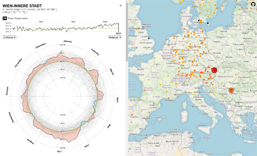
You can select individual weather stations on the map to explore the historical temperature and precipitation data for that location in more detail. Click on a station on the map and you can view radial charts visualizing mean temperatures and precipitation totals for all twelve months of the year. If you hover over the radial chart you can view the difference between the 2022 records for each day and the historical mean.
The graph above each radial chart plots the mean temperature or total precipitation for each year for which there are records at the selected weather station. If you select a year on this line graph the radial chart will show every day's weather record for that year plotted against the historical average. On the chart increases above the historical average are colored red and temperatures below the average are colored blue. So, for example, on the screenshot above you can see how temperatures in Vienna last year were far above the historical average for nearly the whole year. Only for a few days in April and May of last year did Vienna record temperatures which fell below the average historical temperature for the time of year.


Comments