Friday, May 17, 2024

Segregation in the U.S.

US map with counties colored to show the levels of school segregation
Stanford University's Segregation Explorer visualizes the levels of segregation between schools and school districts in the United States. Developed by the Educational Opportunity Project at Stanford University, this new interactive map shows the levels of segregation across various regions, including states, metropolitan areas, school districts, and neighborhoods.

The new map includes school segregation data for the last thirty years. This temporal data shows that white-black segregation in schools in the United States has actually increased by 35 percent since 1991. Some of the most segregated counties highlighted by the Segregation Explorer are found in large urban districts. For instance, three large urban school districts – LAUSD, Philadelphia and New York City - show high levels of racial and economic segregation within their schools. These areas exhibit significant disparities in racial and economic compositions between schools, reflecting broader national trends of increased segregation over the past few decades.

The Segregation Explorer primarily focuses on racial and ethnic segregation, providing insights into how different racial and ethnic groups are distributed across various geographic areas. The map allows users to explore school segregation at state, county and school district levels, and view segregation trends over time since 1991.
US map showing the 100 most segregated neighboring school districts

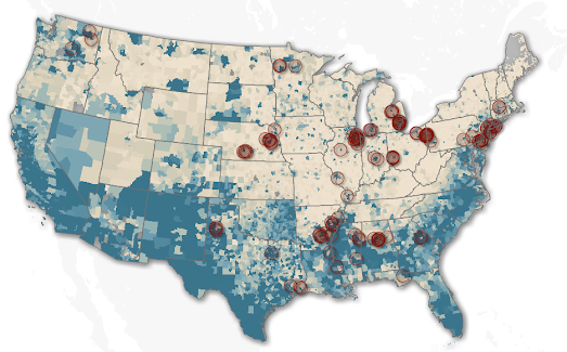
Earlier this year the think tank New America also released an interactive map which visualizes school district segregation by race and poverty levels. The Crossing the Line map identifies the 100 most racially segregated neighboring school districts and the 100 most segregated neighboring school districts by school-age poverty rates. It highlights those areas in the USA which have the starkest segregated school districts by race and by poverty level.

According to the New America data Birmingham, Alabama has some of the most segregated school district borders in the country. Birmingham City School District and Mountain Brook City School District are the two neighboring districts which have the starkest racial segregation in the USA, based on the 'percentage of students of color enrolled'. These two school districts are also the fifth most segregated by the school age poverty rates in each district.

New America argues that because of America's long history of racist housing segregation there is now a marked trend of lower property values in 'communities of color'. Because school funding is usually dependent on the levels of local property taxes school districts in areas with lower property values can spend less per student than those in more affluent areas. According to New America on average the "districts serving more students of color collect $2,222.70 less in local revenue per pupil than the predominately white districts". 

No comments: