Skip to main content
Search
Search This Blog
Maps Mania
Posts
Showing posts from May, 2022
Show all
May 31, 2022
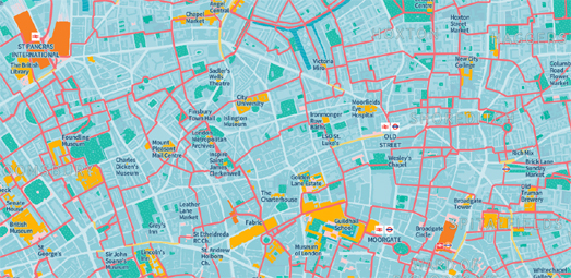
Using Mapshaper to Shape Maps
May 30, 2022
Footways and Slow Ways
May 28, 2022
The Highway Exits of Massachusetts
May 27, 2022
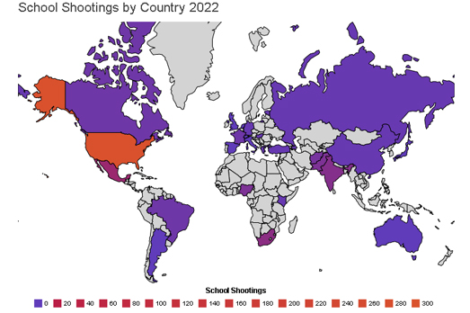
America's Mass Shooting Problem
May 26, 2022
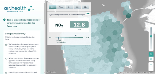
Polluting the Poor in San Francisco
May 24, 2022
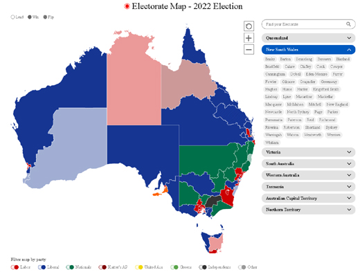
Australian Election Maps
May 24, 2022
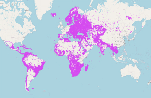
Downloading Microsoft's Building Footprints
May 20, 2022
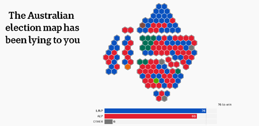
How Election Maps Lie
May 19, 2022
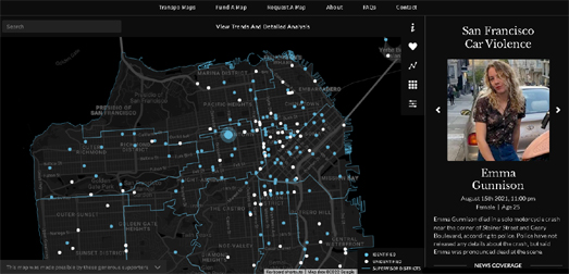
The Deadly Streets of San Francisco
May 18, 2022
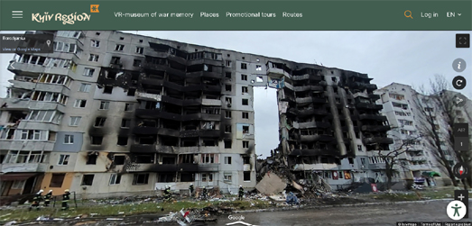
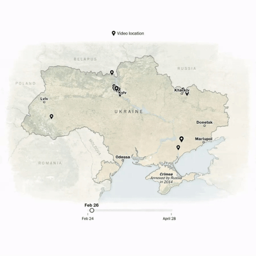
Street View of War
May 17, 2022
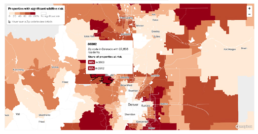
Mapping Fire & Flood Risk
May 16, 2022
Geo Sentences
May 15, 2022
A Super Blood Moon Lunar Eclipse
May 13, 2022
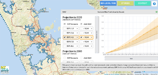
Mapping Rising Seas
May 13, 2022
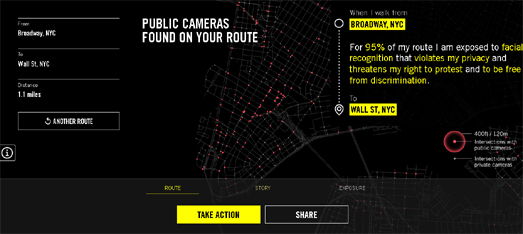
The NYPD is Spying on You
May 12, 2022
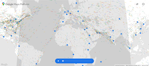
24 Hours of Global Flight Traffic
May 11, 2022
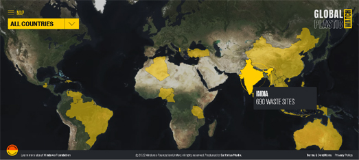
Global Plastic Watch
May 10, 2022
Exposing the Horrors of War
May 09, 2022
A Still Life Map of the World
May 08, 2022
Population By Latitude and Longitude
May 06, 2022
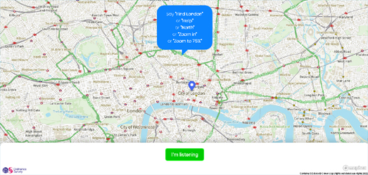
Voice Controlled Maps
May 04, 2022
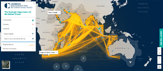
The Importance of the Indian Ocean
May 02, 2022
Madagascator & Mexicator
Newer Posts
Older Posts
Home