Income Inequality in Your Town
Perhaps the biggest political issue of our time is the ever increasing rise in income inequality. In the United States the gap between the rich and everyone else has been growing for the last thirty years. Esri has created a new interactive map which allows you to explore how this inequality of income distribution plays out in towns and cities across America.
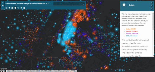
Esri's Predominant Income Range by Households map shows how much money people are earning in each census tract in the United States. The map uses income data from the 5-year American Community Survey in 2016 to show the income range of the most people in each tract. Using the map you can explore the reality of income inequality in your local neighborhoods.
While exploring the map you might spot patterns which recur in states, cities and communities across the country. For example you should be able to spot the income divide between many metro and rural areas. In college towns you might see low income student-dominated neighborhoods surrounded by wealthier neighborhoods.
The map reveals that a number of cities, such as Philadelphia, Seattle and Houston have a thriving downtown core. While cities such as Detroit and Cleveland have urban centers which are struggling or dying.


Comments