Manifest Destiny Mapping

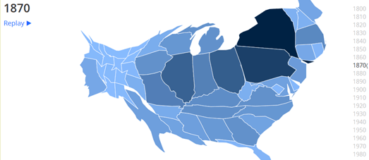
In general I'm not a huge fan of cartograms. The distortion of an area on a map by the size of the data usually just ends up confusing my simple brain. However I do like this animated cartogram showing US Population Trends Over The Last 220 Years.
This map shows the size the population in every U.S. state for every decade since 1790. As the animated cartogram plays you can clearly see the general migration westward over the centuries in the United States.

Another neat visualization of the westward migration in the U.S. is this map from the US Census Bureau. This animated map shows where the mean center of the population has been for each U.S. census from 1790 to 2010.
The Mean Center of Population for the United States 1790 to 2010 shows how the mean center of population in the US has shifted westward in the last 220 years from Kent County, Maryland to Texas County, Missouri.


Comments