Mapping the Polar Heat Cap
Kenneth Feld of Cartoblography has published his list of his Favourite Maps 2021. His selection of some of the best maps of the past year includes Greg Fiske's visualization of the Polar Heat Cap for the Woodwell Climate Research Center.
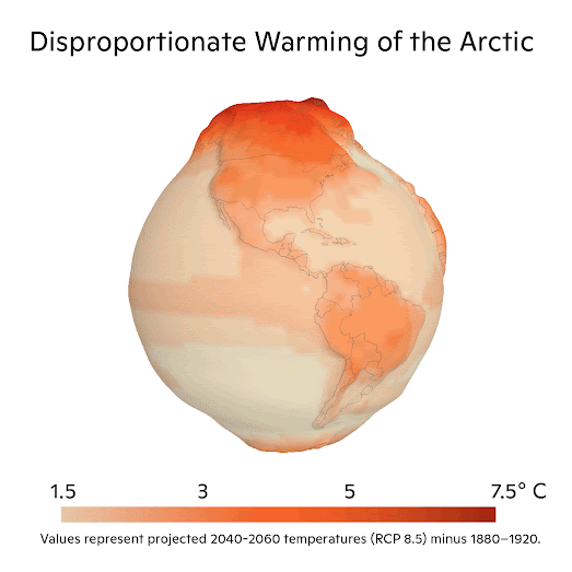
Update: Greg has now released an interactive version of his Warming of the Arctic by 2060 map. This interactive version of his polar heat cap visualization uses the Esri mapping platform to show the disproportionate warming of the Arctic compared to the global average.
In Understanding the global threat of a rapidly warming Arctic the center explains how Arctic regions are warming at a much faster rate than the global average. Greg's distorted 3D globe uses elevation to visualize the disproportionate effect of climate change on the Arctic compared to the rest of the world. On this globe elevation visualizes projected global temperatures in 2040-2060.
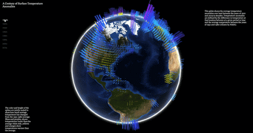
Temperatures in the Arctic have already warmed at a faster rate than the global average. This can be seen on Aodhan Sweeney's visualization of A Century of Surface Temperature Anomalies. Sweeney's webGL globe uses NASA GISTEMP v4 data to show how temperatures on Earth have changed over the past century.
On Aodhan's interactive globe height bars are used to show global temperatures. Again the use of a 3D globe provides a very effective visualization of the Polar Heat Cap. The red height bars on this webGL globe clearly show how the Arctic is already warming at a faster rate than in most other regions around the world.
The Maps Mania round-up of the best Maps of the Year 2021 is also out now!


Comments