Land Doesn't Vote
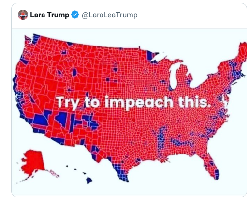
After nearly every U.S. election a Republican will produce a map of the USA with electoral districts colored to show the winning party. This map is normally accompanied by a claim that the Unied States is a majority Republican country. Democrats will then reply with the traditional response, 'Land doesn't vote. People do.'
The problem with using a traditional geographic map to visualize election results is that they can be misleading, giving much more visual weight to large rural electoral districts at the expense of smaller urban districts. Instead cartographers and data visualization practitioners will often use cartograms to visualize election results in order to show all electoral districts as equally sized and shaped. However cartograms by their very nature diverge from traditional maps and therefore can be confusing for users.
Data analytics company Jetpack.AI has developed a cartogram of the 2022 U.S. House Elections in which the states keep their geographical integrity and in which electoral districts are also roughly equally sized. The result is a map which is still geographically recognizable and which doesn't visually skew the importance of the largest rural districts at the expense of the geographically smaller but more densely populated districts.
You can discover how Jetpack.AI created their new 'non-contiguous cartogram' election map on A better U.S. house election results map. This tutorial includes an interactive demo map which allows you to switch between the new cartogram map and a traditional map of the 2022 House Election results (as shown in the little GIF above).
The tutorial also includes an explanation of the steps taken to create a map which retains a lot of geographical integrity but still portrays all electoral districts in roughly equal sizes. In brief this involves dividing each state by randomly distributing a large number of points in a state and then clustering these points by the number of electoral districts in the state. The centoids of each of these clusters is then calculated and, finally, a voronoi diagram is created of the state based on the centroid of these electoral districts. The result is a map of the state which is roughly divided into a number of roughly equally sized areas (the number of areas being equal to the number of the House electoral districts in the state).


Comments