Skip to main content
Search
Search This Blog
Maps Mania
Posts
Showing posts from April, 2023
Show all
April 28, 2023
The Noisiest Cities in America
April 28, 2023
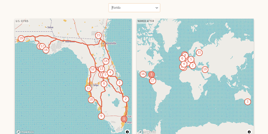
Traveling without a Passport
April 27, 2023
Google Updates Satellite Imagery of Ukraine
April 26, 2023
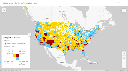
US Car Fatality Hotspots
April 25, 2023
The World is Getting Hotter
April 24, 2023
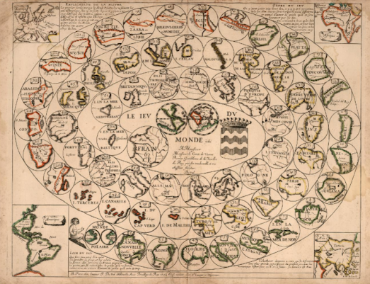
The Game of the World
April 22, 2023
AI Map Markers
April 20, 2023
The Map of Reddit Now Has Street View
April 20, 2023
The History of the Ordnance Survey
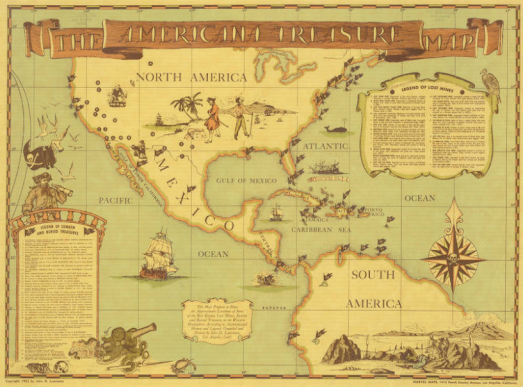
April 19, 2023
The American Treasure Map
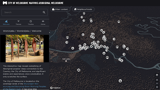
April 18, 2023
Mapping Aboriginal Melbourne
April 15, 2023
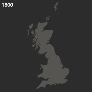
US Level 0
April 14, 2023
Population Stripes
April 13, 2023
The Fifty-three Stations of the Tokaido
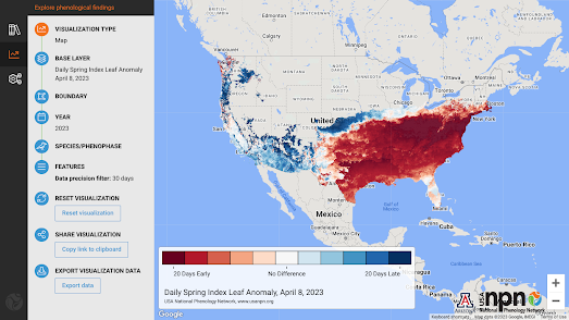
April 12, 2023
Did Spring Come Early This Year?
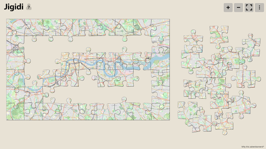
April 11, 2023
Mapsaws - Jigsaws Made from Maps
April 10, 2023
Mapping Global Water Shortages
April 08, 2023
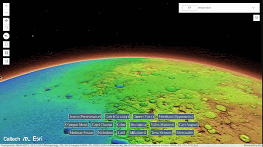
Caltech's New Map of Mars
April 07, 2023
Artificial Maps
April 06, 2023
Dot Maps of the Chicago Mayoral Race
April 05, 2023
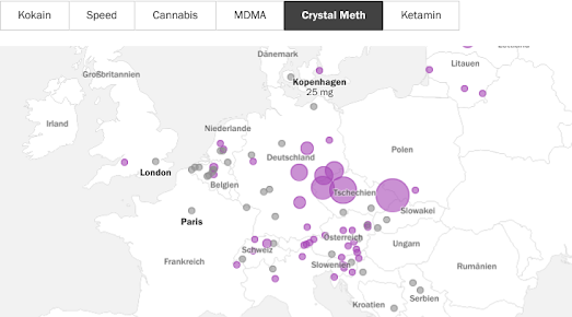
The Drug Map of Europe
April 04, 2023
Is Ukraine's War our War?
April 03, 2023
Who has the Best Cellular Data Speeds?
April 01, 2023
The 100 Most Boring People in America
Newer Posts
Older Posts
Home