
Nicholas Lambert has created an excellent demonstration of how easy it is to lie with maps. His interactive visualization of France's national strike allows you to customize the appearance of the turnout based on your own political persuasion. The map helps to underline the truth that design choices made when creating data visualizations can have profound effects on the messages that they ultimately convey.
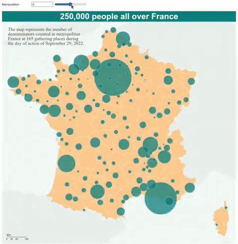
How to Lie With Maps is an interactive map which visualizes the number of demonstrators who turned out in towns across France on 29th September during a national strike by workers. The map includes one simple user control which allows you to adjust the size of the map's proportional symbols. These proportional symbols represent the numbers of demonstrators attending at each location.
By adjusting the scale used to size the proportional symbols it is very easy to adjust the story of the national strike. For example the 40,000 demonstrators reported in Paris can be represented by a huge circle over the French capital if you want to suggest that the demonstration was a huge success. Alternatively, if you want to suggest that the day of action was a failure you could instead use a very tiny circle to represent the 40,000 Parisian demonstrators.
To help emphasise that data visualization design choices can be very ideological Nicholas's interactive map even changes the map heading when you adjust the size of the proportional symbols. Choose big circles and the map heading reads 'A Successful Day for the Unions!' Choose tiny circles and the heading instead reads 'The Big Failure'.
No comments:
Post a Comment