Mapping the Transatlantic Slave Ships
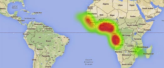
The Trans Atlantic Slave Trade Visualization uses data from the Trans-Atlantic Slave Trade Database to map 35,000 slaving voyages from 1500 to 1870. The visualization essentially consists of three animated heat-maps, showing the cumulative frequency of slave ships' points of departure, the principal ports where slaves were purchased and the principal ports where the slaves were sold.
The animation for each map is started when you press the 'Animate' button. As the animation plays a cumulative heat-map appears on the map to reveal the pattern of slave voyages over time. For example, the map of slave voyage departures reveals how Portugal and Spain's early dominance of the transatlantic slave trade was quickly overtaken by the emergence of British slave traders.


Comments