
In 2008 Ushahidi, the map reporting system, was my Map of the Year. Since then Ushaidi has gone on to become an essential mapping tool for hundreds of groups and communities around the world. My favourite map of 2009 was probably #UKSnow. Ben Marsh's map of Tweets mentioning snow is still hugely popular (you just need to check out the activity on the map this week to see how it has grabbed the imagination of so many people).
Here then is my (very personal) pick of 2010:
BBC Dimensions
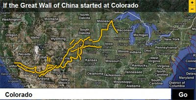
The BBC Dimensions site is probably my favourite Google Maps project of the year. The site lets you overlay historical landmarks and events over other locations on a Google Map, for example the screenshot above shows the Great Wall of China as it would look if it was in the USA.
The idea itself isn't new. Ifitweremyhome.com and Paul Rademacher's How Big is the Gulf of Mexico Oil Spill? both produced comparative maps before BBC Dimensions. However the scope of BBC Dimensions is truly impressive. The site has a vast range of important places, events and things, which you can overlay onto a map of where you are.
Historypin
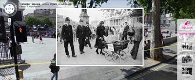
I could be showing my patriotism here but another Google Map from UK developers pushes the BBC Dimensions site close as my favourite map of the year.
HistoryPin overlays (mainly historical) photographs on top of Street View. If you haven't checked out this map before you should definitely give it a look. I promise you hours of fun.
CommonSpace
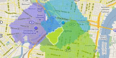
If you live in Philadelphia you should definitely let CommonSpace try to find you a great night out for you and your friends. CommonSpace lets you add multiple starting points to a Google Map and then finds things to do in areas that are convenient for you and your friends.
Essentially the map finds the most convenient location for a group of friends to meet (based on distance) and suggests possible venues based on your preferences.
PhilaPlace
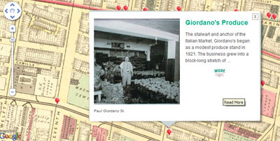
Philadelphia was also blessed this year with the incredible PhilaPlace. PhilaPlace is an interactive website, created by the Historical Society of Pennsylvania, that connects stories to places across time in Philadelphia’s neighborhoods. The map includes an incredible wealth of information about Pennsylvania's past told through first person memories, videos and photographs.
Going the Distance - The Wall Street Journal
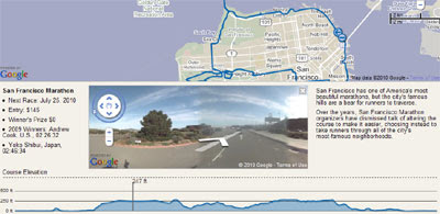
The Wall Street Journal have created an impressive site that maps the New York, San Francisco, Boston and Chicago marathon routes. Each route includes Street View and elevation charts.
Mapping America: Every City, Every Block
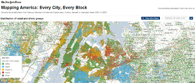
A special mention must go to the New York Times. As well as this awesome map of the Census Bureau's American Community Survey the New York Times this year also created a number of other great Google Maps. A Peek Into Netflix Queues, NY Times Best Places to Go in 2010 and Tracking Taxi Flow are just three of the other Google Maps produced by the NY Times that caught my eye this year.
I'm sure I've overlooked many other great Google Maps produced this year. So what have I missed? Feel free to post your favorite maps of 2010 in the comments below.
________________
3 comments:
Keir, what a great collection! Thanks for all you've done over the last year to highlight such awesome maps! Your curation is an inspiration and is so much fun to read.
Another great collection...we appreciate all that you do on Land Surveyors United. http://landsurveyorsunited.com
its a big YES we really appreciate your blog..,
Post a Comment