How Safe is this Street?
One of the most interesting uses of Google Maps Street View imagery has been by MIT. MIT's Place Pulse project is a crowd-sourced experiment examining people's perceptions of different urban environments. The project aims to quantitatively recognize which areas of a city are perceived as wealthy, modern, safe, lively, active, unique, central, adaptable or family friendly based on how people respond to Street View images of the city.
MIT has now taken the the safety rankings for 3,000 street images from New York and Boston and created an algorithm to automatically create a perceived safety rating for Street View images. Using the Place Pulse scores MIT assigned attributes to features present in the images, associated with the image's textures, colors and shapes. They then used machine learning to associate image features with scores of perceived safety. MIT can then use the resulting algorithm to predict the perceived safety of a new image. They can therefore give any Street View image a 'StreetScore' based on the results of the Place Pulse survey.
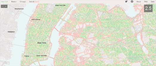
StreetScore has now released a number of maps showing areas of perceived safety in New York, Boston, Chicago and Detroit. Using Street View images of the city StreetScore assesses the perceived safety of locations throughout the city. Green dots on the map represent the areas which StreetScore has assigned as having a high perceived safety rating and the red dots are the locations with a low perceived rating score.
The data of the StreetScores for Boston and New York is available for download. It is provided in two comma separated CSV files. The CSV files have three fields: latitude, longitude and q-score.
There is a lot more you could do with this data. I'd love to see a StreetScore map with a crime heat-map layer. This would provide a nice way to see how closely the perceptions of street safety in the MIT analysis matches up to crimes on the ground.
One of the things missing from the Streetscore map is the ability to view the Street View images of the locations. Therefore another idea would be to create a Google Map of the data and include the option to click on the map and view the actual Street View.

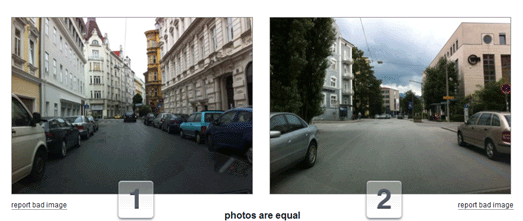
One of the things which intrigued me when browsing the map was what did the Street Views actually look like for the locations with high and low streetscores. To get some idea I downloaded the Boston StreetScore file and quickly threw together this little site showing the top 9 perceived safest locations and the top 9 perceived least safe locations in Boston. The site uses the Google Street View Image API to show still images of the locations.
In the original survey MIT only showed a 90 degree view of each location. The q-scores for the Boston and New York data doesn't include the 'yaw' data to indicate which part of the 360 degree panorama was actually used in the survey. I therefore just used a random direction in the Street Views I've shown.
One thing that quickly becomes apparent (see the screenshot above) is that the presence of trees seems to be a major factor in the MIT algorithm for assessing the safest perceived streets.


Comments