The Maps of the Week

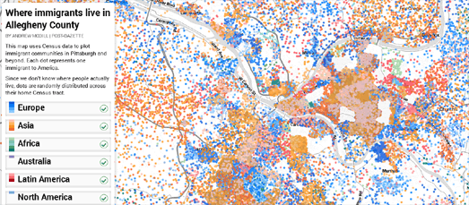
Where Immigrants Live in Allegheny County is a scatterplot map of where Pittsburgh's immigrant communities live in the city.
Each dot on the map represents one Pittsburgh resident. The dots are colored to show the area of the world where each citizen was born. The scatterplot points can be filtered by region of origin to reveal the areas of the city favored by different immigrant communities. For example, selecting just immigrants of Australian descent reveals that many Australian immigrants have chosen to live in the area to the west of Bird Park.
The map was created with Mapbox and Leaflet.js. The scatterplot layer was created in QGIS using census data. If you are interested in learning more about how the map was created Databurgh has published a helpful tutorial on Building a Scatterplot Map in QGIS and TileMill.

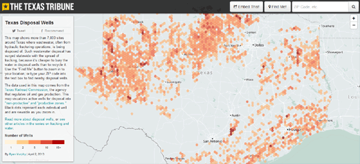
The Texas Tribune has published a map showing the location of disposal wells where waste-water, often from hydraulic fracturing sites, is being disposed of in the state. Texas Disposal Wells visualizes the location of 7,000 disposal wells in Texas.
The map uses hexagonal binning to highlight the number of wells within an area.. You can zoom in on the map to view the location of the individual wells.
The Texas Tribune uses the Mapbox platform. Mapbox has written a nice tutorial on how to use hexagonal binning with Mapbox created maps. Binning: an Alternative to Pointmaps explains how the free and open source QuantumGIS tool can be used to create a hexagon density layer, which you can then overlay on top of a Mapbox map.

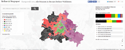
Newspapers responded to last week's European elections with a number of election maps of the results. The map that I was most impressed with was by the Berliner Morgenpost. Europawahl 2014 Alle Stimmen in den 529 Berliner Wahlkiezen is a map showing the results of the European elections in each of Berlin's 529 election districts.
The map provides a simple visualization of the overall winners in each electoral district in Berlin by shading each district with the color of the winning party. If you click on an electoral district on the map you can view a breakdown of the results for each party and you can also compare the 2014 results with the votes cast in the district in the 2009 European Elections.
The visualization also uses an effective polygon knockout effect to highlight Berlin on the map. If you want to recreate this effect with Google Maps you can use Vasile Cotovanu's polygon masking wizard Geomask. Using Geomask it is possible to create a doughnut type polygon which only shows the map through the hole in the doughnut polygon. The effect of using Geomask is to highlight the relevant area on the map and mask the rest of the map.
Another effective design element of the map is that when you click on an electoral district on the map a line is drawn from the district to the results in the map sidebar. It appears that the Berliner Morgenpost had discovered a neat method for drawing a polyline from the map to a static element outside the map.


Comments