Visualizing Half a Million Dead

The Johns Hopkins Covid-19 Dashboard is currently reporting that there have been 498,897 deaths from the coronavirus in the United States. As the USA approaches the terrible milestone of half a million deaths from Covid-19 data journalists have been given the morbid task of thinking about how best to visualize the dreadful impact that the pandemic has had on American lives.
One common response to the problem of visualizing the scale of half a million people is to turn to familiar geographical comparisons. For example the Washington Post in 500,000 dead, a number almost too large to grasp explains that it would require 9,804 buses to carry 500,000 people. It then shows how long a caravan of 9,804 buses would stretch by mapping the distances between different cities (for example 9,804 buses would stretch from Philadelphia to New York).
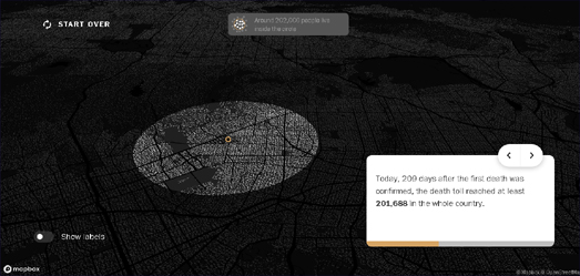
This isn't the first time that the Washington Post has relied on its readers' geographical knowledge in order to try to visualize the scale of Covid-19 deaths in the United States. In September the newspaper created an interactive map which allowed Americans to visualize what 200,000 deaths would look like if they occurred in their town.
In What if all covid‑19 deaths in the United States had happened in your neighborhood? the Post showed the scale of 200,000 people in relation to readers' local populations. Enter an address into the WaPo's interactive map and it will draw a circle around your home showing the extent where 201,688 people live.

In less than five months the number of deaths from Covid-19 has more than doubled (from 200,000 in September to half a million in February). Yesterday's New York Times front page carried a simple graphic which effectively visualized the timeline of those half a million deaths since the start of the pandemic.
The Times' graphic shows 500,000 dots (one for every death). The points are plotted chronologically from the top of the page to the bottom. The first dot at the top of the page represents the first death from Covid-19 in the United States on 29th Feb last year. The density of the dots at the bottom of this timeline provide a clear picture of how the death rate from Covid-19 has accelerated since the beginning of January of this year.
A version of yesterday's Times front page was originally posted online in late January. You can see this graphic in the story How 450,000 Coronavirus Deaths Added Up.
The death rate from Covid-19 is now falling in the U.S. and with more and more people being vaccinated the end of this crisis may now be in sight. However the Times' graphic clearly shows that it isn't over yet and there remains a clear need to stay vigilant against the dangers of catching Covid-19.


Comments