Color Schemes for Maps
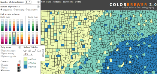
When I need to visualize data on a map I nearly always use ColorBrewer to help me use an appropriate color scheme. Cynthia Brewer's ColorBrewer is an online tool to help cartographers choose good color schemes for their maps. The tool helps you to think about what type of data you are visualizing and what would be an appropriate color scheme.
The tool includes three types of color scheme, sequential, diverging and qualitative. You simply need to choose which scheme best fits your data, choose the number of classes in your data and then choose a multi-hue or single color palette range. As you make your design decisions you can automatically see the scheme being applied to a sample map.

Whether you should choose a sequential, diverging or qualitative color scheme depends on the type of data you are visualizing. if you want some help on what type of color scheme you should use then you can now refer to Lisa Rost's new data visualization guide Which color scale to use when visualizing data. This four part guide provides expert advice on which type of color scheme to use with what kind of data.
Lisa Rost's four part guide explains the difference between the different types of color scheme you can use to visualize data. It provides advice on when you should use a qualitative color scheme and when you should use a quantitative scheme; when you should use sequential or diverging color schemes; and when you should use classed or unclassed color schemes.


Comments