Monday, August 31, 2015
Mapping a Game of Basketball
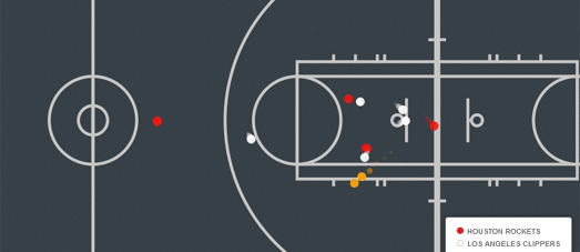
NBA Movement is an animated map which plots a passage of play during the Clippers vs Rockets game on May 12th, 2015.
The map uses data from stats.nba.com. Savvas Tjortjoglou has written up a nice tutorial explaining how you can extract the data from play by play movement animations at stats.nba.com. Jorge Sanz has used this tutorial to get the data for the Clippers vs Rockets game.
The data has been mapped and animated using CartoDB's Torque library. The result is a neat animated map which tracks the players of both teams and the ball during one passage of play during the game.
Player heatmaps are very popular in lots of different sports. In the NBA shooting heatmaps can be used to reveal the individual shooting patterns of different players, showing where they are most dangerous on the court. 2014-15 NBA Regular Season : Field Goal Shooting Patterns is a CartoDB map that shows the shooting heatmaps of five players during the 2014-15 season.
Using the map you can view and compare the shooting heatmaps of Stephen Curry, Anthony Davis, James Harden, LaMarcus Aldridge and LeBron James.
It is also possible to use CartoDB's Torque library to create animated heatmaps. For example, this CartoDB Referee Map is an animated heatmap of one soccer referee's movements during a soccer game. The map uses CartoDB's Torque library to animate the referee's movements over the ninety minutes of the match. If you pause the animation and move the timeline to the beginning of the game you can see the full GPS track of the referee over the ninety minutes without the heatmap layer.
Mapping Uber in New York
FiveThirtyEight has published data on over 4.5 million Uber pickups in New York City from April to September 2014. The data also includes data on 10 other for-hire vehicle companies.
Bill Morris has used the data to create an animated map of Uber pickups for the week beginning April 1st 2014. One week of Uber Pickups in 15 Seconds uses CartoDB's Torque engine to visualize the patterns of pickups by time and day. The timeline shows the day currently being visualized on the map but not the time of day. However you can spot a significant drop in pickups at certain times every day. My guess is that this drop-off in pickups is during the very early hours of each morning.
Bill's map shows the temporal patterns in Uber pick-ups in New York City. Another map, by Mapbox's Eric Fischer, shows the geographical distribution of the pickups for the whole six months worth of data. Uber NYC Pickups, Apr-Sep 2014 provides a dot density view of all Uber pickups across the city.
Both maps are great initial visualizations of the data obtained by FiveThirtyEight. It will be interesting to see what other maps are created with this data. For example, I'd like to see Eric's map with some New York demographic data layers. It would be interesting to see if there is any correlation between the number of pickups and the average income levels in a neighborhood.
Another interesting visualization would be a comparison of the Uber pickups data with the yellow taxi data for the same six months. The NYC Taxi & Limousine Commission has released the data for all completed yellow taxi and green cab trips between January 1, 2014 and June 30, 2015, so it is possible to make a map with both sets of data.
Patterns of Longitude
Enter your address into A Place to Departure and you can create your very own work of art. The artwork that you create is a pattern generated from your latitude and longitude. This means that no-one else in the whole world will have the same pattern as you.
A Place to Departure is an experiment in creating Location Based Generative Art. The main focus of this art project was the creation of two art installations, one in Beijing, China, and the other in Sao Paulo, Brazil. The installations consisted of a large interactive glass screen placed in each city. When a person touched the glass screen in Beijing or Sao Paulo the glass screen in the other city would vibrate at the equivalent point on the glass.
The result was that people in either city could feel the interactions of people on the other side of the world.
The glass screens were accompanied by patterns made from wood. These patterns were created by algorithms based on the geographic coordinates of where the installations were located. The A Place to Departure website includes a Google Map which allows you to create your own location based pattern by simply typing in an address.
Labels:
Art
Saturday, August 29, 2015
Mapping New York's Homeless
I'm not sure what to make about this crowd-sourced map of New York's homeless citizens. The NYC Map the Homeless app encourages people to take photos of homeless people in New York City and share the results on the NYC Map the Homeless Google Map.
A few weeks ago Google banned a map of refugee centers in Germany because it was seen as encouraging attacks on migrants in the country. I assume that the creators of this homeless spotting app don't want to encourage attacks on homeless people in New York. However I do find it slightly disturbing that they are encouraging people to take photos of the homeless. This seems unnecessarily degrading for those forced to live on the streets and potentially dangerous for those taking the pictures.
NYC Map the Homeless argue that the data gathered will help the 'authorities ... quickly identify locations of concern and act in a timely manner'. I'd like to think that there are better ways to help the homeless of New York than this app.
Friday, August 28, 2015
Mapping LA's 20 Year Mobility Plan
The Los Angeles City Council has released a new Mobility Plan designed to decrease the use of cars and improve conditions for the city's cyclists and pedestrians. The plan includes hundreds of miles of new bike lanes, bus lanes and other road redesigns.
The LA Times has mapped out proposals in the plan so that you can see the affect on the city's roads. The How will L.A.'s transit overhaul affect you? map shows the proposed bike lanes, dedicated bus lanes and streets where the council plans to restrict parking.
You can search the map by location. You can also filter the results on the map to view changes which will affect cycling, buses and parking.
Labels:
Los Angeles,
transit,
USA
Mapping UK Immigration Levels
Yesterday the UK government released figures showing that net migration (the balance between immigration and emigration) in the last year has reached its highest ever level of 330,000.
1 in 8 UK residents were born overseas. In my neighborhood in East London over half the population was born outside the UK. Four other London boroughs also have populations where over 50% of the residents were born overseas.
The Office of National Statistics has released an interactive map which allows you to view the percentage of the population in each local authority area who were born outside the UK. The What are migration levels like in your area? map uses data from the 2014 Population Survey to present a choropleth view of migrant levels in each local authority area.
You can search the map by Local Authority area. If you mouse-over an area on the map you can view the percentage of the population who were born overseas.
Thursday, August 27, 2015
Mapping the Gentrification of San Francisco
UC Berkeley, in collaboration with researchers at UCLA, have released a new interactive map to visualize and predict where gentrification and displacement is happening in the San Francisco Bay Area. The map shows that more than half of low-income households in the San Francisco Bay Area live in "neighborhoods at risk of or already experiencing displacement and gentrification pressures".
The UCB Urban Displacement Project Map uses data from the census, various other sources and the project's own research. The initial map view visualizes the projects own 'Displacement Typologies' showing the San Francisco Bay Area neighborhoods undergoing displacement and gentrification.
The map also includes a number of other data layers which allow you to explore San Francisco demographic data, changes in house and rental prices, employment density, income levels and the proportion of renter households.
Labels:
census,
San Francisco,
USA
Mapping the Illegal Trade in Elephant Tusks
National Geographic hid GPS trackers inside artificial elephant tusks in order to track the trade routes used in the illegal smuggling of ivory. Tracking the Illegal Tusk Trade maps the journey of the artificial tusks from the south east of the Central African Republic to Ed Daein in Sudan.
The tusks were transported 592 miles in total. At their latest known location the temperature sensors in the tusks suggest they are now being held inside a building or buried beneath the ground.
As well as showing the route taken by the smugglers of the artificial tusks this National Geographic interactive includes maps of elephant poaching hotspots in Africa, the trade routes used by the smugglers and the main locations where the tusks are exported from Africa to Asia.
Labels:
animal tracking
Wednesday, August 26, 2015
Ten Years After Katrina
Ten years after Hurricane Katrina struck new Orleans, Esri has released a Story Map which examines the effect of the hurricane on the city and how the city has attempted to rebuild itself.
Katrina +10 includes six main sections; The Katrina Diaspora, Flooding, Physical Damage, Population Shift, Steady Restoration and Neighborhood Reference Map. The 'Flooding' and 'Physical Damage' sections allow you to view maps of the flooding caused by the hurricane and the huge number of buildings in the city which were tagged for demolition in the city after the disaster.
The Katrina Diaspora section shows where the one million displaced Louisiana residents moved to after the hurricane devastated the city. The Population Shift visualizes the effect of this evacuation on each New Orleans neighborhood.
The Steady Restoration section of the map uses postal data to show the percentage of homes in each neighborhood now receiving mail.
In an article entitled, Is New Orleans in danger of turning into a modern-day Atlantis?, The Guardian newspaper places Hurricane Katrina into the context of over a century of engineering projects which are causing the Louisiana wetlands to disappear and which result in New Orleans being more susceptible to flooding.
The article includes historical aerial imagery and maps which show the historical loss of the wetlands and the projected 1,750 square miles that Lousiana is expected to lose in the next 50 years. Louisiana is currently losing a football field of land every 48 minutes.
Using historical aerial imagery from NASA and USGS, ProPublica has put together an impressive interactive mapped visualization of the effect of climate change and oil & gas exploration on the state of Louisiana.
Southern Louisiana is losing 16 square miles a year to the Gulf of Mexico. At the heart of ProPublica's map, Losing Ground, is a series of timeline visualizations of historical aerial imagery. These timelines allow you to observe the loss of land in Louisiana by comparing present day aerial imagery with aerial imagery going back to the 1930's.
For example, here is the area of Venice and West Bay as it looked in 1932:
Here's how the same area looks today:
Accompanying the aerial imagery are a series of interviews of people living and working in the affected areas. These interviews are supported by audio files and photos. In combination the audio, photos, interviews and aerial imagery of Louisiana's land loss provide a powerful report into this ongoing environmental disaster.
Labels:
environment,
New Orleans,
USA,
weather
Mapping Worldwide Fossil Finds
The PBDB Navigator is an interactive map which allows you to explore worldwide fossil discoveries by location, time and taxonomy. The map provides a really easy to use navigational tool to browse the global Paleobiology Database.
Each dot on the map represents a collection of fossils. If you select a dot on the map you can view detailed information on the fossil collection number, number of occurrences, the time period, the location and the reference of where these occurrences came from.
Beneath the map is a geological timeline which allows you to filter the map by a specific geologic time period. If you select a time period from the timeline the timeline will zoom in to the selected timescale. You can now select a time period to filter the map to only show fossil records from your chosen geologic time.
You can also use the 'paleogeography' button in the main map menu to change the map view from the modern world map to a paleo continental map for your selected geologic time.
You can also search the fossil records by specific organism using the 'taxa browser' button in the map menu. This allows you to filter the records by taxonomic name. For example you could search for the genus 'Canis' to show only Canis fossils on the map.
You can combine the taxonomy and geologic time filters to search for specific species fossils within a defined time period. For example, you could select the genus 'Canis' from the taxonomic filter and the period 'Cenozoic' from the geologic timeline to view a map of all the Canis fossils found around the world from the Cenozoic period.
Labels:
history maps
Tuesday, August 25, 2015
Mapping Worldwide Trade
The Globe of Economic Complexity visualizes 15 trillion dollars of world trade on an interactive WebGL 3d globe. Using the globe you can explore the export markets of countries around the world and the international trade of different products.
Every pixel on the map represents $100m of exports of a different product. The color of each dot represents a different industry. Select a country on the globe and the map shows the country's top ten trade partners.
You can also use the globe to explore the worldwide trade in the different sectors of industry. Select a sector of industry using the menu running along the bottom of the globe and you can view the countries which trade in this product and the volume of that trade in each country.
Labels:
economics
Monday, August 24, 2015
The Westerly Migratory Pattern of the USA
In every census since 1790 the mean center of American population has moved westward. In 1790 the most populated cities in the U.S. were all on the East Coast. By the 2010 census seven of the ten largest cities were located in the Sun Belt region of the south and west.
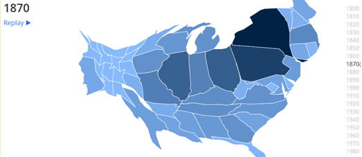
Perhaps one of the best mapped illustrations of this westwards shift in the U.S. is this animated cartogram. In general I'm not a huge fan of cartograms but this animated cartogram, showing US Population Trends Over The Last 220 Years, perfectly visualizes how the mean center of the U.S. population has continually moved in a westerly direction.
The map shows the size the population in every U.S. state for every decade since 1790. The animated cartogram clearly shows the general westward migratory pattern of the American people over the last 200 years.
Another neat visualization of the westward migration in the U.S. is this map from the US Census Bureau. This animated map shows where the mean center of the population has been for each U.S. census from 1790 to 2010.
The Mean Center of Population for the United States 1790 to 2010 shows how the mean center of population in the US has shifted westward in the last 220 years from Kent County, Maryland to Texas County, Missouri.
This shift is not only evident in the westerly moving mean center of population in the U.S. but also in the list of the largest populated cities generated from each U.S. census. Josh Mahar has created an interactive map showing the top 10 U.S. cities by population in every census since 1790.
Using the Historical Look At America's Largest Cities map you can view the top ten most populated cities in each decade. The map sidebar also shows the population for each of the top ten cities in each census. If you turn on the annotations you can also find out a little more about the changing populations in the mapped cities.
Last week I released a very similar map called Shifting Cities. In essence my map visualizes the same data used in Josh's map. Both maps show how the most populated cities in the U.S. are increasingly likely to be found in the west and south of the country. However Josh's map is better than mine. His annotations are more detailed than the notes on my map. I also like the fact that Josh has used scaled map markers to show the relative population size of each city shown on the map.
Adult Coloring Maps
Apparently adult coloring books are very popular now. In fact, at the time of writing, four of Amazon's top twenty best selling books of 2015 are adult coloring books.
Due to the popularity of this new craze the UK's Ordnance Survey has released a number of black and white maps which you can download and color to your heart's content. The Ordnance Survey Blog has created 11 maps (available as PDF files) which you can print out and then spend hours coloring-in.
Unfortunately your choice of maps on the OS blog is limited to a only a few UK towns and cities. If you want to color a map of your own location then you could use this Pencil map, which allows you to print out a map of anywhere in the world.
My advice is to download a Pencil map of your neighborhood and color in your neighbors' houses using the 'Charles Booth' coloring scheme. At the end of the Nineteenth Century Charles Booth created a poverty map of London. Booth colored in houses on his map of London based on the income and social class of its inhabitants.
You could use Booth's color scheme to create a colorful map which illustrates just what you think about your neighbors. Use black to color in the houses of your neighbors who you think are 'vicious or semi-criminal'. Use a dark blue color to show those in 'chronic want'. Red can be used for the 'well-to-do' and yellow for the 'wealthy'.
When you have completed your map be sure to add your name in bold clear letters. Then photocopy the map and post it up around the neighborhood so that everyone can enjoy your handicraft.
Sunday, August 23, 2015
Mapping Dengue Outbreaks in Singapore
Outbreak is a Google Map tracking dengue outbreaks in Singapore using official government data from the Singapore National Environment Agency.
The map includes two key features. The calendar function allows you to view historical dengue clusters since May 2013. Select a date from the calendar and you can view a heat-map of dengue outbreaks for the chosen date.
The second key feature of the map allows you to view the dengue incidence history of any location marked on the map. If you click on a dengue location marker you can learn more about the dengue cluster indicated on the map for your selected date. In addition if you click on the address link in the information window you can learn more about the number of dengue outbreaks that have occurred at that location over time.
The Maps of the Week
Malfideleco was probably the most talked about map this week. However I think its popularity was more to do with the interest in the Ashley Madison hack rather than the quality of the map. Therefore let's quickly move on to the real maps of the week.
EcoWest has released two interactive maps which allow you to explore 15 years of drought data and 34 years of precipitation data. The Tracking US Drought Severity map visualizes the weekly drought designations from the U.S. Drought Monitor from the beginning of the 20th Century. Select a date from the timeline beneath the map and you can view a heat-map of the drought conditions during that week.
The second map, Rain and Snow in the U.S. Since 1981, shows the total monthly rain and snowfall totals across the country. You can use the timeline beneath the map to choose a date and view a heat-map of precipitation levels for the selected month. This time the timeline includes a graph which shows the total rainfall for each month since 1981.
Websites which allow you to directly compare the sizes of two or more different countries have always been a popular way to use interactive map libraries. OverlayMaps, MAPfrappe, My Life Elsewhere, Mapmerizer and If It Were My Home? are five good examples of apps which allow you to compare one location directly with another on an interactive map.
The True Size of ... is a welcome addition to this growing list of country comparison maps. This map allows you to overlay the outlines of any countries on top of another country on a Google Map. You can type any country or state into the search box to add its shape to the map. You can then drag the shape around the map to compare its size to any other country on the map.
The True Size of ... map makes use of the Google Maps API's geodesic property for draggable polygons. This means that when you drag a country around on the map the polygon shape resizes as you move north or south on the map, compensating in part for the distortions in Google Maps' Web Mercator projection.
There didn't seem to be much interest in my own Shifting Cites map this week. Therefore it is decidedly dodgy that it makes it to this week's Maps of the Week list. I suspect there is some sort of bias involved.
Since the early years of the United States there has been a gradual westward shift in the mean center of population. In 1790 the most populated cities in the U.S. were all on the East Coast. In the 2010 census seven of the ten largest cities were located in the Sun Belt region of the south and west.
Shifting Cities shows the top ten most populated U.S. cities for every decade since 1790. The map also shows the mean center of population in the USA for each decade.
Labels:
Sunday Best
Saturday, August 22, 2015
Chicago's Disappearing White Working Class
In Chicago it is possible to identify neighborhoods where low-income Latinos live
and neighborhoods where low-income African-Americans live. However it isn't as easy to pinpoint neighborhoods with a high concentration of the white working class.
Chicago's WBEZ91.5 has mapped data from the last four U.S. censuses to explore the phenomenon of the disappearing white working class in the city. For example in 1980 the census shows two neighboring census tracts with concentrated white poverty. This neighborhood contained a strip of West Madison, known as Skid Row, which was home to many single-room occupancy hotels. By 1990 much of this area had been redeveloped and the tracts no longer had such a high concentration of the white working class.
The Where are Chicago's poor white neighborhoods? map allows you to view the census tracts with a high concentration of Latinos, African-Americans and Whites for the 2010, 2000, 1990 and 1980 censuses. The 2010 map shows that while there are still a number of census tracts with concentrated Latino and African-American poverty there are no tracts left with concentrated White poverty.
So where have Chicago's white working class gone? In an accompanying article WBEZ91.5 poses this question to a number of experts and gives their answers.
Friday, August 21, 2015
Improving Melbourne's Metro Map
Places by Metro is a new project from the City Science research group at Monash University in Australia designed to help you find local businesses within an easy walking distance of any metro station.
Travelers on the Melbourne Metro can use the map to find bars, restaurants or cafes within a set distance's walk from any station. Users can select a station from the Metro map and select either 'bar', 'restaurant' and cafe. They can also set how far they are prepared to walk.
The map then uses the Google Places API to list the highest rated venues within walking distance. If you select a suggested venue from the map sidebar you can view the venue's address, opening hours and read reviews of the venue. You can even click through to view walking directions to the venue on Google Maps.
Labels:
Australia,
Google Places,
Melbourne,
transit
Smoking vs Air Pollution - Mapped
Breathing in the polluted air of Los Angeles (based on the last hour's air quality) is equivalent to living for half a year with a smoker.
Vivergy's new Share My Air map allows you to view the current air quality for U.S. and Canadian cities. The markers on the map give a general guide to the last hour's air quality at each location. If you select a marker on the map you can read some easy to understand comparisons of the effect of the current air quality on your health.
The air quality is compared to sharing a car with a smoker, living with a smoker and to a number of cigarettes smoked per year. If you click on a marker you can also see the same comparisons based on the last day's air quality, the last months or the last six months.
For example, the air quality in San Francisco over the last six months is equivalent to spending 17 minutes in a car with a smoker each day. If the air quality of the last 6 months is consistent all year then living in San Francisco will be equivalent to smoking 4 cigarettes per year or living for 2 months of the year with a smoker.
Labels:
Canada,
environment,
health,
USA
Where Tourists in Spain Spend their Money
The Spanish banking group BBVA has teamed up with Vizzuality to map out how tourists spend their money in Spain. The Footprints of Spain’s tourists in Summer 2014 map uses anonymized credit card transaction data to show when and where tourists in Spain spend their holiday money.
The visualization includes an animated heat-map which shows the volume of spending across Spain over time. I guess the map therefore also provides a fairly accurate guide as to the most popular tourist destinations in Spain.
A small inset map allows you to select from a number of cities and regions to view a top 5 list of countries. Tourists from these countries spend the most money at the selected destination. Another mapped visualization allows you to select a country to see where tourists from that country most visit in Spain. It also appears to show their movements around the country.
If you select the 'trends' tab you can also see how tourists from each country spend their money. This section allows you to select a category, such as hotels, bars & restaurants, transportation etc, and view a chart of which country's tourists spend the most in that category. You can also select an individual country to view a breakdown of how tourists from that country spend their money. For example, tourists from the USA spend 28% of their holiday money in restaurants while in Spain.
Thursday, August 20, 2015
The San Francisco Movie Map
Yesterday I watched the Rise of the Planet of the Apes for the first time. I did like the monkeys but I have to say I was more impressed by the San Francisco locations used in the film. If only there was a way to discover the exact locations used in the film.
Filmed in San Francisco maps all the locations in San Francisco used in movies since January 2013. The map is based on all the film permits issued by the San Francisco Film Office between January 2013 and August 2015.
You can search the map by location simply by clicking on the markers on the map. Alternatively you can use the list in the map sidebar to find a film by name and then view all the San Francisco film locations used in that film on the map. Each film includes a brief note on the scene location. You can even click through to view the original filming permission issued by the San Francisco Film Office.
Unfortunately the Rise of the Planet of Apes was filmed too long ago to make it on to this map. I guess I'll never find out the name of that huge red bridge used in the film.
Labels:
moviemaps,
San Francisco,
USA
The Biggest U.S. Cities by Decade
Since the early years of the United States there has been a gradual westward shift in the mean center of population. In 1790 the most populated cities in the U.S. were all on the East Coast. In the 2010 census seven of the ten largest cities were located in the Sun Belt region of the south and west.
A few weeks ago I saw a really interesting animated GIF, posted to Reddit, which mapped the top ten cities by population by decade in the United States. You can view the map, by Reddit user Eudaimonics, here. Being an animated GIF means that you can't interact with the map. I really wanted to play with the map so I decided to create my own interactive map of the same data.
Shifting Cites shows the top ten most populated U.S. cities for every decade since 1790. The map also shows the mean center of population in the USA for each decade. The data for the map comes from each U.S.census as listed on these two Wikipedia articles; Largest cities in the United States by population by decade & Mean center of the U.S. population.
To create the map I made extensive use of the Leaflet mapping library's Layer Groups feature to group cities by decade. The map then simply uses an HTML5 range slider control to load the markers onto the map by the relevant decade.
When you select a decade from the slider control the blue markers show the location of the top ten most populated cities and the red marker shows the mean center of the population. The left hand side panel also updates to show a numbered list of the top ten cities for the selected decade. The small window in the top right-hand corner of the map also updates to provide more general information on the patterns of population movement being shown on the map.
Ashley Madison Users Mapped
Malfideleco (Esperanto for infidelity) is a global map showing the number of Ashley Madison users around the world. Ashley Madison is a dating website which is marketed towards people who are married or in a committed relationship and who are looking to have an 'affair'. The site has been in the news over the last couple of months because hackers have managed to steal all of the customer data.
The Malfideleco map shows the distribution of Ashley Madison users around the world. The user distribution layer partly resembles a population density map for the countries with a high number of Ashley Madison members. This is because the map just places a marker on every large urban area with a number of members. However you can click on a location's marker to view the number of Ashley Madison members living in that town or city. The layer also provides a neat overview of the countries where the Ashley Madison website has been popular.
What is more interesting to me is the male to female ratio layer. This layer colors the markers on the map red or yellow to show locations with more than 85% male members (red) and areas with less than 85% male members (yellow). India stands out on the map as the country with the highest percentage of female users. In contrast European countries all seem to have an overwhelmingly higher proportion of male users.
Flashpoint, the web security specialists, have released a static map which they say visualizes a heat map of "individuals accessing a data dump allegedly stolen from AshleyMadison.com".
I've no idea who these 'individuals' are. They could be hackers looking to exploit the data, Ashley Madison users trying to find out whether their names are on the list or suspicious spouses checking to see if their partner's names appear on the hacked data.
There does seem to be some correlation between the two maps, which might indicate where worried users are checking the hacked data for their own names.
Interworks has created a United States map of Ashley Madison Users by ZIP Code. A lot of people have been pointing out that the Malfideleco map looks like a population density map. The Interworks map overcomes this problem by ranking each zip-code area by per capita use, showing the percentage of users of the total population in each zip code area.
Interworks have noticed a pattern on the East Coast and in Chicago where there seems to be a very high percentage of Ashley Madison users in urban commercial centers. They believe this is due to Ashley Madison users in these areas using their offices and not their homes as their billing address.
Wednesday, August 19, 2015
The True Size of Africa
Websites which allow you to directly compare the sizes of two or more different countries have always been a popular way to use interactive map libraries. OverlayMaps, MAPfrappe, My Life Elsewhere, Mapmerizer and If It Were My Home? are five good examples of apps which allow you to compare one location directly with another on an interactive map.
The True Size of ... is a welcome addition to the growing list of country comparison maps. This map allows you to overlay the outlines of any countries on top of another country on a Google Map. You can type any country or state into the search box to add its shape to the map. You can then drag the shape around the map to compare its size to any other country on the map.
The name 'True Size of ...' is a bit of misnomer as there will always be some distortions when using a two dimensional map. However The True Size of ... map does use the Google Maps API geodesic property for draggable polygons. This means that when you drag a country around on the map the polygon shape does resize as you move north or south on the map, compensating in part for the distortions in Google Maps' Web Mercator projection.
Mapping Human Pathology
Pathobin is an on-line repository where pathologists can publish and share their pathology images.
Pathology images uploaded to Pathobin can be viewed by anyone using the Leaflet.js mapping library.
You can browse for pathology images on Pathobin using the 'Recent Images' gallery on the site's homepage or from the site index. When you select an image to view on Pathobin a Leaflet map of the pathogen opens. Using the usual Leaflet navigation controls you can pan and zoom the map to view the image in close-up detail.
There has been a long tradition of using JavaScript mapping libraries to map the human body. One of the first examples was the NYU School of Medicine Virtual Microscope.
Created by the NYU School of Medicine the Virtual Microscope uses the Google Maps API to display and navigate scanned slides of microscopic images. Students and faculty members who are logged into the school's Learning Management System can even add markers to the slides to annotate and comment on slide features.
The University of New South Wales is also following in this tradition by using the Google Maps API to create maps of human tissue down to the individual cell. You can already explore the first map of human hip tissue.
This Google Map allows you to explore images captured with a scanning electron microscope. Creating map tiles from the electron microscope images allows the university to create an interactive map of the hip tissue. The result is this Google Map which allows researchers to pan and zoom into details in the microscope images, just as you can with any interactive map.
The Genome Projector is a searchable database browser that uses the Google Maps API to provide a zoomable user interface for molecular biology. The Genome Projector currently contains four views, the Genome map, the Plasmid map, the Pathway map, and DNA walk.
The Genome Projector says that "In molecular biology, looking at reactions and behaviors of specific molecular components in microscopic levels is important. ... Therefore, researchers need a scalable point of view, having access to all of the microscopic, macroscopic, and mesoscopic levels of biological knowledge. Moreover, biological data is highly multi-dimensional by nature, and understanding of the data requires multiple views, layers, or projections ..."
Labels:
health
Rude Britannia
It's easy to get confused when asking for directions in the UK. If someone tells you to take 'Bell End up Butthole Lane' they could be giving you real directions. Alternatively they might be inviting you home for a night of x-rated fun.
Back in the Middle Ages it was fairly common for streets to be named after the main economic activity taking place along them. The result was that many roads ended up with names which can seem rather offensive to our modern sensibilities.
For example, many towns and cities in the UK had streets named 'Gropecunt Lane'. These streets are believed to have been named for the prostitution taking place there. Unfortunately over the years all the Gropecunt Lanes in the UK have been replaced with less innocuous names, such as Grape Lane.
Fortunately however some rudely named streets still exist. You can see some of them on Rude Streets. Rude Streets is a Street View slideshow which takes you on a panoramic tour of some of the UK's most interestingly named streets.
If you want to create your own map of rude place names then you can download a GeoJSON file of rude locations from the Vaguely Rude Places GitHub page.
The Vaguely Rude Places Map is a faithful compendium and atlas of rude place names around the world. The map allows you to view the location of numerous rude sounding place names, such as the famous town of Fucking in Austria.
You might also like the Talking Rude Map. The map animates through some of the more NSFW place names around the world and reads the names out loud. To hear the map talking you will probably need to use the Chrome browser.
Tuesday, August 18, 2015
The Population Map of Australia
The Guardian has created a map of Australian Population Density. In fact they have created three different maps of Australian population per square kilometre based on data from the 2011 census. The three maps all show the same data, one just shows the population data, one includes a log scale and the other includes transparency and place names.
The map reveals some interesting patterns about Australia's population. For example it clearly shows that the densest populated areas are mainly in the south and south-east of the country. The densest populated areas also tend to be on the coast. However you can still see wide urban sprawl stretching in land from certain cities, such as around Melbourne and Brisbane.
Solar Panel Mapping
Project Sunroof can help you decide if it is a good idea to install solar panels on your roof. This new map tool from Google calculates how much sunlight your roof is likely to receive throughout the year and therefore help you make a more informed decision about whether to install solar panels.
Enter an address into Project Sunroof and you can view an estimate of how many hours of sunlight your roof receives per year, the square feet you have available for solar panels and the estimated net savings you could make.
At the moment Project Sunroof only works if you live in the Francisco Bay Area, Fresno or Boston. However this map tool is not exactly a new idea from Google and there are other options available. For example, if you live in Cambridge, Massachusetts, then you can try the Mapdwell Solar System map to find out how much electricity can be produced from solar photovoltaic (PV) systems.
If you live in Australia then you can use the Live Solar Potential Map. The Live Solar Potential Map allows home owners in a number of Australian cities to estimate the potential of roofs for electricity generation from PV. If you zoom in on the map you can draw around the outline of your roof and view an estimation of the likely power that could be generated from solar panels and the energy bill savings that could be made.
Labels:
environment,
USA
Mapping 30 Years of Weather
EcoWest has released two interactive maps which allow you to explore 15 years of drought data and 34 years of precipitation data.
The Tracking US Drought Severity map visualizes the weekly drought designations from the U.S. Drought Monitor from the beginning of the 20th Century. Select a date from the timeline beneath the map and you can view a heat-map of the drought conditions during that week.
The timeline includes a graph showing the proportion of drought over time for the location selected on the map.
Rain and Snow in the U.S. Since 1981 is a map showing the total monthly rain and snowfall totals across the country. Again you can use the timeline beneath the map to choose a date and view a heat-map of precipitation levels for the selected month. This time the timeline includes a graph which show the total rainfall for each month since 1981.
Why Your Street Has That Name
Paristique: L'histoire de nos rues is a Google Map which allows you to discover the origins of all Paris street names. The map uses data from the City of Paris' Open Data website to explain the etymology of roads and streets in the center of Paris.
To discover the origins of a Paris road name you just need to select a marker on the map. Finding the correct marker for a road can be a little difficult. The map would work much better if selectable polygons were overlaid on each road on the map but that would obviously be a much more data intensive.
Noah Veltman's History of San Francisco Place Names was the original place name etymological map. The History of San Francisco Place Names is a fascinating insight into the history of the names behind San Francisco's landmarks and streets.
Click on any of the streets or landmarks, marked in blue on the map, and you can find out who it was named after or where the name originally came from.
Streets of London is a map of the City of London which allows you to discover the etymological history of London road names. Click on a highlighted road on the map and you can find out why the selected road is called what it is and where its name originally came from.
You can use the map menu in the top right-hand corner of the map to filter the streets shown on the map by category. The categories include street names named after people, streets with religious derivations etc.
Famostrato - Personajes históricos de las calles de Madrid is a map which explains the origins of street names in the Spanish capital which have been named after important or famous individuals.
If you click on one of the colored streets on the map of Madrid an information window opens providing a link to the Spanish Wikipedia article of the person whom the selected street was named for.
Straßenkrieg is a fascinating map revealing the history behind the many Berlin street names which have a military connection. The map highlights Berlin streets which have been named after battles, important military leaders or German army regiments.
All the military connected roads are highlighted on the map with colored lines. The colors indicate the historical period associated with the road's name, e.g. Prussian, the Weimar Republic, National Socialism or post-WWII. If you select a road on the map you can read a brief explanation of the military relevance of the road's name and click-through to read a more detailed account of the person or battle memorialized.
Democracy Street is a UK map, partly sponsored by the UK parliament, which is attempting to map the influence of democratic history on the country's place-names. Using the map you can discover which streets in your neighborhood have been named after a politician or someone else who has been important in some way to the country's democratic history.
Streets and roads named after an individual important to UK democracy are shown on the map in yellow. These streets are further highlighted on the map by a larger white circle lighting up the underlying Stamen toner map tiles. If you select a yellow marked road on the map you can learn a little more about the person whom the road was named after.
Subscribe to:
Posts (Atom)