How Gerrymandered is Your District?
The United States is one of only a few democratic countries that allow politicians to play a major role in redistricting. Most countries appoint an independent commission to handle how political districts should be defined. It is almost as if the American system was designed to encourage gerrymandering.
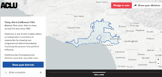
The ACLU's What the District map allows you to explore how your election district has changed over time by showing you how your local district boundary has changed since the 1950's. The way congressional districts are drawn can determine who wins elections. You can see how much your district has been redrawn over time by entering your address into the ACLU map. What the District will then show you when and how your district has been redrawn over time. It will also inform you about who has the power to redraw your district.

The Washington Post has created an interactive map which allows you to see how gerrymandered your election district actually is. It does this by giving a gerrymandered score for each congressional district in the United States.
The Washington Post has determined the gerrymandered score of each district based on the "ratio of the district area to the area of a circle with the same perimeter". This is because districts which follow a regular shape tend to be more compact and have therefore been less gerrymandered. Districts which have a lot of squiggles and offshoots score highly because they tend to have been more gerrymandered.
The How Gerrymandered is your Congressional District? map colors each congressional district based on this gerrymandered score. You can mouse-over each district on the map to view its gerrymandered score, the state average score and the name & party of the district's representative. You can also read a little more about how the scores were determined and which states have the most gerrymandered districts in the Post's article on America's Most Gerrymandered Congressional Districts.

PlanScore has also mapped the level of gerrymandering in all 50 states in the USA. PlanScore includes a comprehensive historical dataset of partisan gerrymandering, so you can examine the history of gerrymandering in each state and which political parties the districts have been gerrymandered to support.
The PlanScore choropleth map shows the level of gerrymandering in each state for both the U.S. House and State House elections. The darker the red or blue colors on the map then the more skewed the districts are towards the represented political party. If you select a state on the map you can view a more detailed report on the partisan bias in that state and how that compares to the level of gerrymandering in other states.
PlanScore has also developed a scoring service which allows you to test how fair or gerrymandered new district plans are. To use this service you just need to upload a shapefile or GeoJSON file of a district plan. PlanScore will then reveal the levels of the plan’s underlying partisan skew, showing how much the plan has been gerrymandered.

The uneven spread of electors per state in the United States means that if you live in Wyoming your vote is worth 3.52 times more than a voter in Florida.. Wyoming has more votes in the Electoral College per registered voter than any other state.
What's Your Vote Worth is an interactive story map which explores the history of America's voting system, the right to vote and how voter representation is skewed under the present system and map. The story map includes a choropleth view of how much one vote is worth in each state compared to Wyoming. For example, it takes 3.19 voters in California or 3.4 voters in Pennsylvania to equal one Wyoming voter.
After exploring the uneven voting power of different Americans What's Your Vote Worth goes on to examine how gerrymandering is used to skew your vote even more. It looks at examples of gerrymandering in a number of states. In particular it looks at examples where voting district boundaries have been redrawn to 'pack' or 'crack' votes. Packing involves redrawing boundaries so that you pack voters who tend to vote for a particular party into one district. Cracking involves diluting like minded voters into many different districts.
Petrichor GeoViz Studio examines the issues behind their interactive map in more detail in an article called What Your Personal Geography Means to Your Voting Power.

FiveThirtyEight, as part of its Gerrymandering Project, has had a go at redrawing America's voting districts for themselves. In the Atlas of Redistricting FiveThirtyEight has created a number of new congressional maps, each designed with a different goal in mind.
These alternative congressional maps show how voting districts could be redrawn in order to favor Republicans, to favor Democrats, to promote proportionally partisan representation and to maximize the number of majority-minority districts.


Comments