Skip to main content
Search
Search This Blog
Maps Mania
Posts
Showing posts from June, 2022
Show all
June 30, 2022
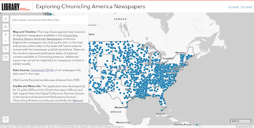
Mapping Vintage Newspapers
June 29, 2022
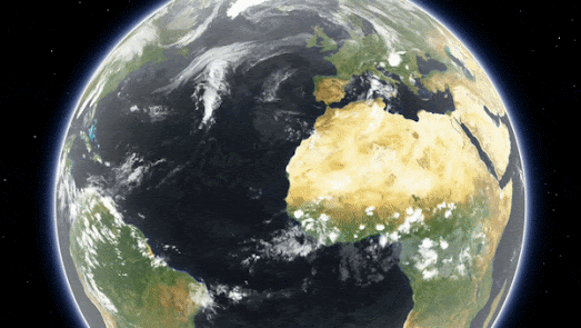
Introducing Mapbox Globe View
June 28, 2022
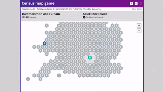
Game of Populations
June 28, 2022
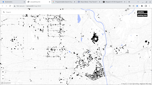
They Paved Paradise
June 27, 2022
Explore the Pyramids of Meroë
June 27, 2022
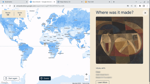
GoeGuessr for Art
June 25, 2022
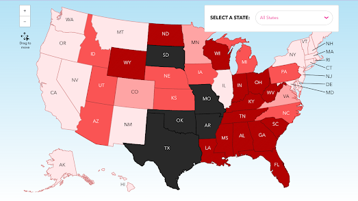
Where is Abortion Illegal?
June 24, 2022
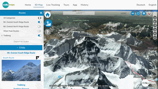
Climb Mount Everest in 3D
June 23, 2022
A Brief History of Time & Space
June 23, 2022
The Drunken Spider Crawl
June 22, 2022
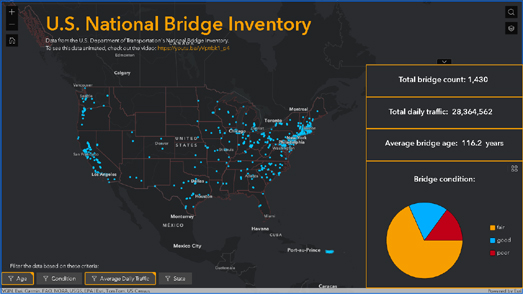
Brooklyn Bridge is Falling Down
June 21, 2022
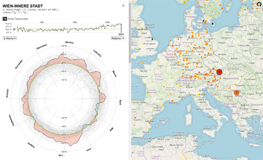
100 Years of Climate Data
June 20, 2022
Mapping the French Election
June 18, 2022
Backup Ukraine
June 17, 2022
Cool Off with a Climate Stripe Fan!
June 16, 2022
Comparing Map Projections
June 15, 2022
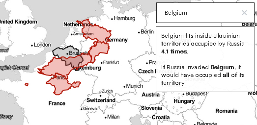
How Big is Occupied Ukraine?
June 14, 2022
URL Map
June 13, 2022
Data Spiders
June 13, 2022
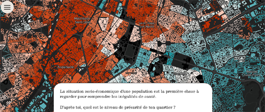
The Poor & Poor Health in Brussels
June 10, 2022
Wheat, War & Famine
June 09, 2022
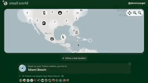
The Map of Your Twitter Friends
June 09, 2022
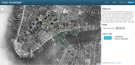
Scratch & Sniff New York
June 08, 2022
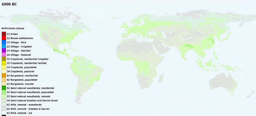
The Sound of 6,000 Years of Deforestation
June 07, 2022
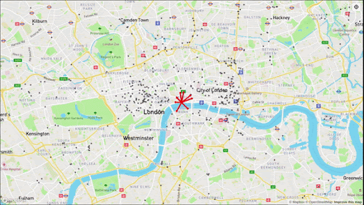
The Noise of the City
Newer Posts
Older Posts
Home