The Fabulous Joy Plot Map Maker
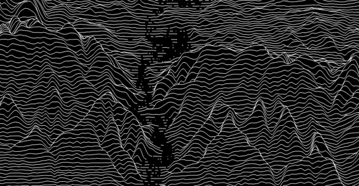
The Arun Valley in the South Downs National Park, England
Peak Map is a fantastic interactive map which can create a joy-plot map for any location on Earth. To create your own joy-plot map you just need to center Peak Map on your chosen location and a very artistic elevation profile will be generated automatically by this brilliant map.
Joy-plots (or ridgeline plots as they are sometimes called) are inspired by Joy Division's famous album cover for their Unknown Pleasures record. Since the 1970's the Peter Saville designed cover for Unknown Pleasures has become an iconic image. The original cover was inspired by a visualization of the radio waves emitted by a pulsar, which was published in the Cambridge Encyclopaedia of Astronomy. In data science a visualization which is inspired by this radio waves graph is often called a 'joy-plot' in acknowledgement of the iconic album cover. Over the years a number of maps have used ridgeline plots or joy-plots to visualize different types of data, often to show population density or to visualize elevation.
Peak Map includes a number of options which allow you to change the appearance of your generated joy-plot. The automatic setting draws black lines on a white background but you can choose your own background and line colors (my example above flips the default to show white lines on a black background). You can also change the height scale and smoothness of the elevation lines on your joy plot map and even reduce the joy plot map's opacity to reveal a labelled map beneath.
You can view some examples of joyplots being used to visualize mapped data on Maps Will Tear Us Apart Again.


Comments