Saturday, October 31, 2020

AI Time Travel

One of my favorite interactive maps of all time is Geneve 1850. In the nineteenth century Swiss architect Auguste Magnin created an amazing 3D model of the walled city of Geneva. This physical 3D model is usually on display at the Maison Tavel in Geneva. However an interactive online map of the model was also created - called Geneve 1850 (I'm not sure if the map still works as it requires Flash and I no longer have a browser which supports Flash).

There is something truly special about being able to walk around a 3D map of a city as it looked in the past. I spent hours wandering around 19th Century Geneva on Geneve 1850. 

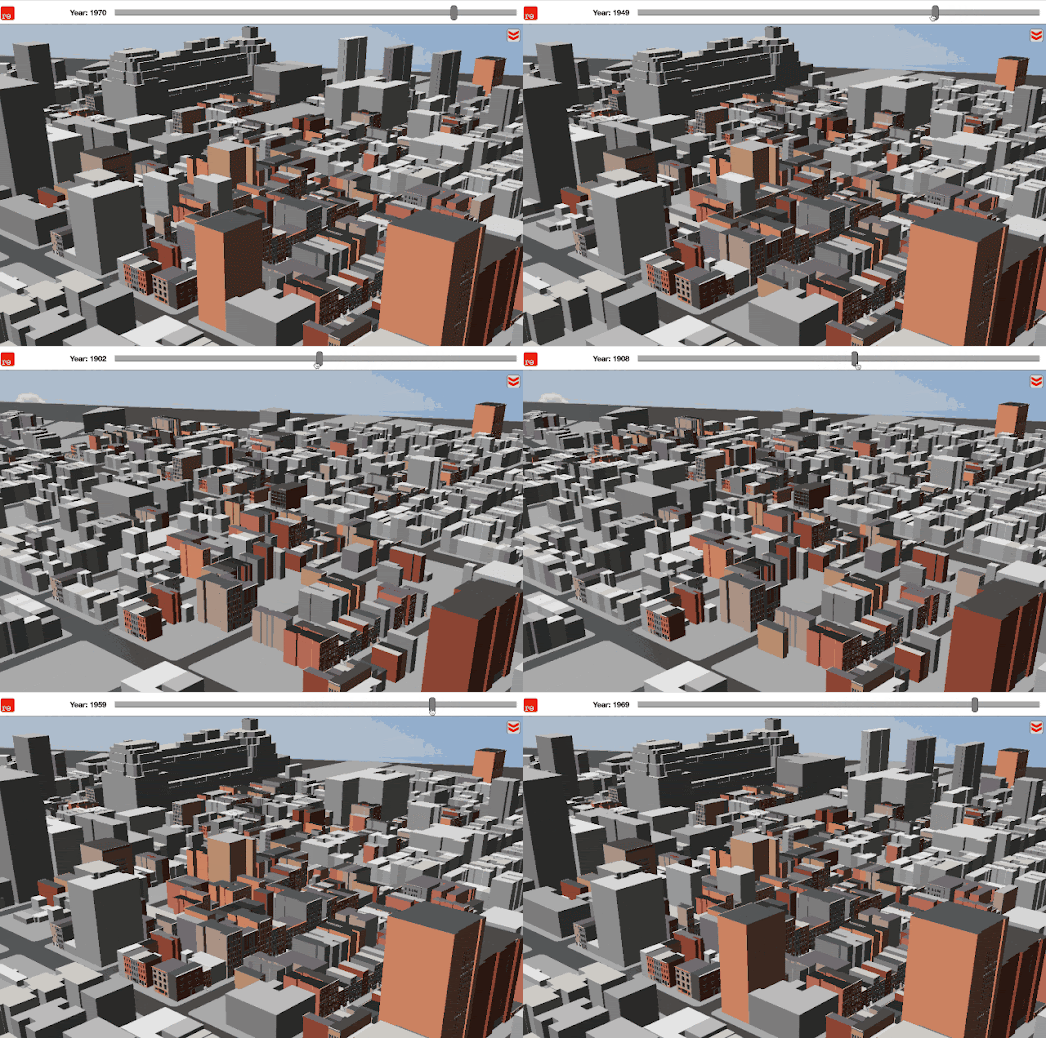
Now, thanks to Google, it is possible to build your own historical 3D map for any town or city in the world. Google has launched a browser-based mapping platform, called rǝ, which can recreate 3D maps of towns and cities as they would have appeared in the past. The platform uses historical vintage maps and vintage photographs to reconstruct towns and cities as they would have appeared at a particular time in their history. By creating a series of 3D maps of a city at different periods during its development rǝ can show how cities have changed over time.


a screenshot of the incredible Geneve 1850

The interactive map currently allows you to explore 3D maps of U.S. towns and cities over time. Using the map timeline you can select to view the historical map of a city for any year since 1800. Click on the '3D' button and you can walk around the city, as it looked in the past, in glorious 3D. 

Google has open-sourced the tools which have been used to create rǝ. Which means if your town or city is not already on rǝ then you can create your own 3D historical map instead. Google Research's Kartta Labs tools allow you to take vintage maps of a location and to reconstruct a 3D map of the location from this original historical map. 

Essentially Karrta Labs uses Map Warper to allow you to geo-rectify a vintage, historical map. It then allows you to trace over the geo-rectified vintage map to create a digital map of the original. This traced data is then turned into a vector map, which can then be displayed using the Kartta interactive map platform. Allowing you to walk around your vintage map in three dimensions.

Friday, October 30, 2020

The UCLA Hate Crime Map

The UCLA American Indian Studies Center has released a new interactive map to help track the growing numbers of hate crimes across the United States. The map also visualizes incidents of hate crimes which have been reported in newspapers, by ProPublica and the Stop AAPI Hate Reporting Center.

The Hate Crime Map shows the number of hate crimes in each state. If you select a state on the map you can view a breakdown of the types of hate crime reported in that state (race, religion, gender/sexuality or miscellaneous). If you click on a bar in the bar chart visualization you can view the incidents broken down even further (with a pie chart). Click on a slice in this pie chart and you can view a list of the reported hate crimes with links to the original source.

If you click on the 'Report Incident' link above the map you can report a hate crime to the map by answering a few questions. 

Every year the Justice Department reports data on hate crimes carried out against individuals because of their race, religion, ethnicity, sexual orientation, disability, gender or gender identity. The Anti-Defamation League's Hate Crime Map uses this data to show incidents of hate crime across the United States over time. 

If you select the 'Hate Crime Data' tab on the Hate Crime Map you can view which cities (with a population over 100,000) have reported hate crimes for any year since 2004. The blue dots indicate those cities which have reported hate crimes for the selected year.


The SPLC's interactive Hate Map tracks the growing number of hate groups now operating in the United States. The map uses colored markers to indicate the category of each hate group shown on the map. If you select a marker on the map you can click-through to learn more about what this type of hate group believes and how they operate. 

In 2019 the SPLC tracked 940 hate groups operating in the United States.

The Color of Covid


In the United States 21.1% of all fatalities from COVID-19 have been Black. This is despite the fact that Black Americans make up just 12.3% of the total population. In Chicago 72% of Covid deaths have been Black residents. Black Americans make up just 30% of Chicago's population. It is clear that for whatever reason Covid-19 is a virus which in the United States disproportionately effects Black citizens.

The Color of Covid is a dot density map showing the locations of Covid victims in Chicago. On the map every dot is colored to show the race of the Covid victim.The Color of Covid is therefore a powerful mapped visualization of how Covid-19 is disproportionately effecting the Black community in Chicago. 

However to be truly useful I can't help thinking that this map needs a lot more data.Ever since the disproportionate number of Black Americans falling victim to Covid-19 was first noticed people have been struggling to understand why. Among the most convincing theories are that Black Americans are less likely to be able to work from home, are less able to take sick leave, have to rely more on public transport and are more likely to be working in poorly ventilated workplaces. 

If the Color of Covid map included data on the racial mix of Chicago neighborhoods and on average incomes we might be able to explore some of these theories. For example this data might help us to understand if black Americans living in poorer neighborhoods are being effected disproportionately more from Covid-19 than Black Americans living in the city's richer neighborhoods?

Thursday, October 29, 2020

The First Map of the Election

Bloomberg has published what could well be the first map of the 2020 U.S. Election. At the time of writing, far from the Biden landslide I was expecting, the map shows that the Presidential election couldn't be closer. Both candidates at the moment have exactly 0 votes.

Although the map is yet to show any interesting results it is still interesting in itself. The Bloomberg 2020 Presidential Election Results map includes a cartogram view. On this cartogram map each state is represented by a number of squares. The number of squares equates to the number of electoral college votes each state has. For example Alabama is made up of nine squares on the map because it has nine electoral college votes. 

Presumably as the results begin to come in Bloomberg will be coloring these square blue or red depending on the votes cast for each candidate. The Bloomberg election results map also includes a more traditional map view - where each state will be colored to reflect the winning candidate. The map will also allow you to view the latest results for the senate, house and governors elections.

If you can't wait a few more days until the actual election then you can explore the likely results yourself on the popular 270 to Win interactive map. Using the 270 to Win map you can create your own 2020 election forecast. 

You can color states on the 270 to Win interactive map to reflect the candidate who you predict will win the state. As you color individual states on the map the results will update to show how many electoral votes each candidate has under your prediction. As you complete the whole map the results will eventually show which candidate reaches the magic 270 electoral votes which will decide the election. 

How Many Countries Do You Know?

It is time once again to test your geographical knowledge with yet another fun map based quiz. Can You Guess the Country is a simple geography quiz, which requires you to name countries as they are shown on an interactive map. 

In this map game you are shown the outlines of a series of countries on an interactive map. All you have to do is select the correct country shown from a multiple-choice list of five countries. Can You Guess the Country is made a little more difficult by using Mapbox's bearing option to rotate the map. This means that each country is shown without north being at the top. Most of us are most used to seeing countries mapped with north at the top of the map - so rotating a country's orientation on the map can make it a little harder to recognize. 

Can You Guess the Country also makes clever use of map masking to mask out all of the map except for the country in the current quiz question. 

Can You Guess the Country was developed using a template developed for the Guess the Geography map game. Guess the Geography is also a fun map game to play. However Guess the Geography is UK based - it can therefore be very difficult to play if you aren't familiar with the different administrative geographies of the United Kingdom. 

Wednesday, October 28, 2020

The Future U.S. Climate Explorer

Climate Explorer is a new online tool which has been designed to show how the climate in the USA in projected to change over the course of the 21st century. The website is a joint project from NOAA and the University of North Carolina Asheville. The Climate Explorer uses historical climate data and two different climate change models to show how the climate is likely to change in every county in the United States.

Climate Explorer allows users to view maps of observed and projected climate variables for every county in the contiguous United States. It allows you to explore how climate variables, such as temperature and precipitation, are predicted to change using two distinct future climate models. One of these models projects climate change in a future where significant attempts have been made to reduce global emissions of heat-trapping gases. The other shows how the climate is projected to change if the rate of global emissions continues to rise.

The 'Maps' section of the Climate Explorer allows you to view before and after interactive maps of a number of different climate variables. For example you can view the current average temperature across the United States side-by-side with the predicted average temperatures for the year 2090 - in order to see how temperatures will rise due to global heating. Other climate variables which you can see mapped include the number of extreme heat days and precipitation levels. 

If you select a county on the map you can also explore charts of the different climate variables to see how the localized climate could change during the course of this century under the two different future climate projections used by the Climate Explorer. 

Topographical Search Maps


Waves of Interest is a new project visualizing the hidden patterns in Google search data. The site allows you to explore which political issues have been most searched during election years and which states have shown the most interest in each issue during every election year.

In order to track the geographical interest in different political issues Waves of Interest has created a really interesting topographical map visualization. This timeline topographical map allows you to see which political interests have trended in which states during each U.S. election year. In essence these are political issue heat maps which have been designed to resemble topographical maps.

Each of the political issue heat maps includes a timeline control which allows you to view a heat map, showing which states have searched the topic the most, during each election year. You can therefore use this timeline control to explore how the interest in a political issue has shifted geographically over time.

The Waves of Interest topographical maps are visually striking. Interestingly these heat maps don't show any underlying geographical map. Instead they rely on state place-name labels to visualize the geography. The size of these labels are also used to show which states have shown the most interest in a political issue in a particluar election year (the bigger a state's place-name label the higher the search level).

Tuesday, October 27, 2020

Biden Wins the Presidential Donations Race

In The Two America's Financing the Trump and Biden Campaigns the New York Times has mapped out where in America the two presidential challengers have raised the most money. Since Joe Biden announced Kamala Harris as his running mate the Democratic challenger has raised almost twice as much money in political donations as Donald Trump. You can see where in the USA each of the Presidential hopefuls has raised the most money on the NYT's interactive map. 

The NYT's political donations map suffers from the same problem which plagues many U.S. election maps. This is - it exaggerates the support of the Republican party. Biden has out-raised Trump in densely populated urban centers and in suburban areas. Conversely Trump has raised more money in larger but less densely populated rural areas. Consequently although Biden has raised almost twice as much money as Trump the huge red areas on the map tend to distort Trump's overall level of support. 

The NYT's main takeaway from the political donations data is that Trump has alienated and lost the support of the white educated class (those who tend to have most money and make the most political donations). Donald Trump is still raising money in "smaller, down-scale, slower-growing rural counties". Unfortunately for him his support is strongest in those groups with the least money to spend on political donations - namely the white rural poor.

If you know where America's most densely packed urban centers and where the country's rural counties are located on a map then the NYT's map does successfully show this demographic split in the political donations being made to the two Presidential candidates. However that means that the map does require quite a high level of geographical literacy to be properly understood. 

Where the map is much more useful is in providing information on how much money each candidate has raised in each county. Click on the map and you can view the exact amount of money raised by Trump and Biden in the selected county.

The Map the Italians Stole

At the beginning of the 16th Century nautical knowledge was power. During the 15th and 16th Centuries the Portuguese were at the forefront of this knowledge, leading the way in overseas exploration and in establishing mercantile trade routes. 

Among the many notable Portuguese explorers of this time was Vasco da Gama, who in 1498 was the first European to reach India by sea. Just two years later, in 1500, Pedro Álvares Cabral became the first European to discover Brazil and then, just a few years later again, Ferdinand Magellan completed the first circumnavigation of the Earth. 

One of the most important tasks of all these overseas expeditions was to create accurate nautical charts. During this period Portuguese cartographers were completing enormous master charts mapping coastlines, prevailing winds and important trading knowledge. To protect this important knowledge these maps were deemed state secrets. State secrets which other countries were desperate to steal.

One map which was successfully stolen was the Cantino Planisphere. In fact the map is now known for the spy, Alberto Cantino, who successfully 'acquired' the map from the Portuguese for the Duke of Ferrara (Ferrara was a city-state in northern Italy). 

The Cantino Planisphere is now owned by the Biblioteca Estense in Modena, Italy and you can explore an interactive version of the map for yourself using the library's new Digital Collections website. The Cantino Planisphere is a remarkable map for many reasons. The map includes a depiction of the Brazilian coastline, which Cabral had only just discovered. The map also includes knowledge gained from Vasco de Gama's voyage to India and Columbus’s voyages to the West Indies.

The Cantino Planisphere also includes the recently decided Tordesillas Line. In 1494 (at the Treaty of Tordesillas) Portugal and Spain agreed to divide the newly discovered lands across the Atlantic between themselves. The line, about halfway between the Cape Verde islands and the West Indies, divided what would belong to Portugal (everything east of the line) and the lands which would belong to Spain (everything west of the line).

The new Digital Collections of the Biblioteca Estense includes lots of other vintage maps - including the Carta Catalana, a medieval mappamundi, dating from the 15th Century.

Monday, October 26, 2020

How Much Tax Does Your Neighbor Pay?

Earlier this month The Bay Area Property Tax Map was released to show how much property tax is paid by individual buildings in the Bay Area. Using the map everyone can see how much property tax is paid by every single building. Therefore home owners can use the map to see how their property tax compares to the amount paid by their immediate neighbors.

In California property taxes are determined by a property's value. This seems like an entirely fair way to determine the level of property taxes. However California also has Proposition 13, which means that a property's assessed value is frozen at the moment of purchase. The result of Proposition 13 is that people living in some of the Bay Area's richest neighborhoods have their property tax subsidized by everybody else.

You can find out how much property tax subsidy your neighbors receive on The Tax Fairness Project's interactive map. This map shows the property tax subsidies received by each property in the Bay Area as a result of Prop 13. A property's subsidy is defined as the difference between the actual tax paid and the tax that should be due if the property was assessed at market value.

On this map you can see where property taxes are being subsidized the most. These tend to be areas where property values have sky rocketed compared to other neighborhoods. Of course the areas where property values have risen the most tend to be in already affluent neighborhoods. Those Californians unfortunate enough to live in poorer neighborhoods tend not to live in properties which have seen the same level of increase in value. Which means that the poorest Californians tend to receive the lowest amount of property tax subsidy, while their richer neighbors receive the most.

Global Air Pollution Maps

Plume Labs' World Air Map is a real-time map of air pollution around the world. The map is driven by data from Flow personal air pollution sensors and from other recognized sources of air quality.

The World Air Map updates every 15 minutes showing air pollution levels around the world recorded by Plume Labs' distributed air quality sensors. Zoom in on a city on the World Air Map and you can view a street-by-street visualization of local air pollution levels. The map also includes a link to view a weekly or monthly forecast of air pollution levels in the chosen city. 

Air pollution causes 1 in 8 deaths worldwide. Which is why Greenpeace has mapped out the world's most polluted hot-spots.


A cluster of coal fired power plants in Mpumalanga in South Africa are responsible for the world's worst air pollution hot-spot. Europe's largest hot-spot is around the Niederaussem coal plant in Germany. This is closely followed by London's air pollution hot-spot caused by car emissions.

Greenpeace used satellite imagery from 1 June and 31 August 2018 to determine NO2 levels around the world. The worst NO2 levels can be found almost exclusively around coal fired power plants and locations with heavy car traffic or other transport.

Greenpeace's NO2 Hotspots interactive map shows you where the worst levels of NO2 air pollution can be found around the world. The map also includes a layer which allows you to view the locations of coal, oil and gas fired power plants. This allows you to see for yourself where pollution hot-spots correlate to the location of power plants.  


Berkeley Earth calculates that 1.6 million people in China alone die from air pollution every year. Berkeley Earth is a non-profit organization who are investigating evidence of climate change. As part of that task they have released a real-time map of air pollution around the world. 

The Real-time Map of Air Pollution shows real-time information on particulate matter air pollution less than 2.5 microns in diameter (PM2.5). The data for the Berkeley Earth air pollution map comes from thousands of surface monitoring stations across the globe. The map typically shows data from about two hours behind real-time. As you will probably see when looking at the map large areas of China and India typically experience dangerous levels of air pollution. If you hover over an area on the map you can read an assessment of the current air pollution conditions at that location.

Saturday, October 24, 2020

McBroken

Here is an interactive map that you probably never knew that you needed. McBroken can tell you before you leave home whether the ice cream machine at your local McDonalds restaurant is working or is currently broken.

Every 30 minutes McBroken tries to order an ice cream from every McDonald's outlet in the United States. If an ice cream can't be added to the shopping cart then the map assumes the ice cream machine at the restaurant is broken. The results of all this furious ice cream ordering is the McBroken interactive map.

On the map all McDonald's restaurants with a working ice cream machine are shown with a green marker. Red markers show all the restaurants where it looks like the ice cream machine is broken. The map also provides some statistics on the national and local status of McDonald's ice cream machines. At the time of writing 7.5% of restaurants have broken ice cream machines. People in Phoenix are in the worst ice cream predicament. Over 13% of McDonald's restaurant in the city have broken ice cream machines.

Citites Without Light Pollution

There are lots of interactive maps which use NASA's 'Black Marble' or 'Night Lights' satellite imagery. to show the effects of light pollution around the world. NASA's composite Black Marble map of satellite images showing the Earth at night reveals how electric lighting in cities around the world contributes to the global problem of light pollution. 

The Light Pollution Map is just one of the many interactive maps which use this satellite imagery to show how human populations around the world contribute to light pollution. One of the problems with all this light pollution is that it makes it difficult for astronomers to view the night sky from Earth. The Light Pollution Map is very good at showing you where light pollution is located around the world. It isn't quite so good at showing you the effect of that light pollution on your ability to view the stars.

Clear Night Sky however does a very good job at visualizing what urban citizens around the world are missing because of light pollution. In Clear Night Sky the star mapping website Under Lucky Stars has taken 27 night-time photos of cities around the world and 'reimagined' them to show you how they would look if they were free from light pollution. 

On each of these 27 city views you can drag a slider to compare how each city's skyline looks at night (with the effects of light pollution) with how each city would look without the pollution blocking your view of the stars. I think you will have to agree that all these cities look so much more beautiful when you can see the stars shining above. 

Friday, October 23, 2020

Half of All Americans Live Here

One of the perennial favorite map themes on the MapPorn subreddit are maps purportedly showing where half a country's population lives. Due to the fact that most people live in cities it is possible to create seemingly interesting maps showing that a large majority of people in a country live in a very small area of the country. It seems that some people are perpetually surprised that one result of urbanization and high population densities in cities is that last swathes of rural areas consequently have low populations. 

It turns out that you can make these maps a lot more interesting by making them interactive. Albert Zhang's County Counting to Specified Proportion is an interesting map which allows you to see where different proportions of Americans live. Change the percentage of the total population you want to see mapped and Zhang's interactive map updates to show the lowest number of counties where that percentage of the population lives.


If you set the percentage to a low number you can see that the places with the highest densities are the country's biggest cities - many of them situated on the east and west coasts. According to the map 50% of the country's population lives on less than 5% of its land. Set the population percentage to a high number and the Great Plains stands out on the map as the area with the lowest density of people. Although the map now looks very crowded that actual amount of populated land is relatively small. In fact 90% of the U.S. population lives on just 25% of the country's land.

The Global Emissions Map


The Historical Global Emissions Map visualizes carbon dioxide emissions around the world from 1750 to 2010. The map shows a gridded view of CO2 emissions weighted by the human population over time. This timeline view of the world's CO2 emissions provides a fascinating glimpse into the spread of the industrial revolution around the world and the staggering impact it has had on the world's environment.

Using the map timeline you can see how industrial revolutions in countries around the world have contributed to the huge growth in global CO2 emissions. Starting in 1750 we can see that there were negligible amounts of carbon dioxide being emitted around the world. However by 1809 the United Kingdom was emitting 33 metric tonnes of CO2. 

The birth of the Industrial Revolution in the United Kingdom led to a huge rise in the burning of fossil-fuels. The development of industrial manufacturing resulted in pollution and the beginning of the process which would kick-start global warming. 

In 1806 the United Kingdom was responsible for 94% of the world's carbon dioxide emissions. However other countries around the world were not too far behind. Using the map's timeline we can see that just 41 years later, in 1850 the UK's share of CO2 emissions had fallen to 62%, as the USA, France and Germany had begun their own industrial revolutions. 

It would take more than 50 years for the United States to overtake the United Kingdom in the amount of CO2 emitted per person. In 1906 the United States emitted 12 tCO2 per cap to the UK's 11. By this time the United States was now responsible for 41% of the world's CO2 emissions and the UK's share had fallen to 18%.

If we fast forward a century the United States total share of the world's CO2 emissions has halved to 20% and China (22%) has become the world's largest CO2 polluter. Although in terms of per capita emissions the USA still leads the way, with 19 tonnes of CO2 being emitted per person - more than double the per capita emissions of nearly every other country in the world.

Thursday, October 22, 2020

Climate Change & the California Wildfires

The Washington Post has created a powerful and emotive mapped visualization of the huge devastating wildfires which have destroyed 4.1 million acres of land in California this year. In How Escalating Climate Change Fuels California's Infernos the Washington Post shows the devastation caused by wildfire in one Californian town and then zooms out to show the extent of the devastation across the whole state.

The article starts with a zoomed in satellite view of the school in Berry Creek, California. A school destroyed by the North Complex Fire. As you scroll down the page you zoom out from the school to see the devastation caused by the fire in the whole town. Continue scrolling and the satellite view continues to zoom out to show the whole massive extent of the North Complex Fire.  

Starting from one particular school and one small town and then zooming out to show the whole extent of the fire is a clever way to show how the California wildfires have destroyed the lives of thousands of Americans this year. 

After this long zoom out the WaPo then proceeds to show how California's wildfires are being intensified by global heating. Now as you scroll down the page an animated heat layer shows how August's record breaking heatwaves resulted in highly combustible vegetation and a very high vapor pressure deficit (the amount of water in the air). In August California also experienced record cold, dry air fanned by relentless winds.

The combination of record temperatures, a high vapor pressure deficit and cold, dry winds created a perfect storm for the creation and spreading of fire across California. Five of California’s six biggest recorded wildfires happened this year. As climate change accelerates in the coming decades this level of wildfire is likely to become the new normal. Well actually it won't - because of continuing global heating the wildfire levels in California will become even worse in the coming years.

Earth's Climate from Space

The European Space Agency has released a new online platform to provide and visualize climate data gathered from the agency's satellites and space missions. ESA's Climate from Space platform uses interactive 3D globes, 2D maps and charts and graphs to visualize how the Earth's climate works and how climate change is leading to some drastic changes to the world's weather.

Climate from Space consists of two main sections - Stories and Data. The Stories section of Climate from Space provides a number of guided explanations of some of the global phenomena that drive the Earth's climate. This collection of stories also include investigations into how climate change is effecting the polar ice caps and contributing to biodiversity & habitat loss. 

The Data section of Climate from Space allows users to visualize ESA climate data on an interactive 3D globe or on a 2D map. These data layers include visualizations of CO2, methane, ozone and both northern and southern sea ice. You can select to view any of the available climate data layers on top of either a 3D  globe or a 2D map. It is also possible to select two different data layers and compare them side by side on two separate globes or maps. 

Wednesday, October 21, 2020

The 2020 Bolivia Election Map

Elecciones 2020 is an interactive map showing the results of Sunday's presidential election in Bolivia. In the election the left-wing Mas party manged to win an overall majority, meaning that Luis Arce will become the country's next President.

Polling Stations on the map are colored to show the winning candidate. The blue colored markers show where Luis Arce, the Movimiento al Socialismo (Mas) candidate won the most votes. The other colors represent where the right-wing parties gained the most votes. The size of the markers appear to reflect the number of citizens who voted at each polling station.

The convincing win by Mas in Sunday's election is quite a turn around in fortunes for the party. Less than a year ago, in November 2019, Evo Morales was overthrown in a right-wing military coup. The coup, supported by the USA, proved to be disastrous for the country and the right-wing evangelical President Jeanine Áñez has been widely criticized for her handling of the country's Covid-19 response. 

Under Morales the Mas party had reduced poverty in the country from 60% to 35%. This had been brought about partly through the quasi-nationalism of the country's natural gas companies. A move which managed to vastly increase Bolivia's state revenues.   

The Mas party's support for the poor seems to have been repaid during the 2020 election. What is apparent from the map is that although Mas managed to win a landslide majority in the Bolivian election the party is most popular in the western poorer part of the country. According to the map Mas appears to be less popular in the richer eastern part of Bolivia. Many of the richer provinces in east Bolivia are home to the eastern cambas (European-descended Bolivians) - many of whom seem to still support the country's right-wing parties. However Mas has huge support among the majority indigenous population. 

Mapping the View from Mount Washington

In 1902 the Boston and Maine Railroad published an interesting map which shows the view from Mount Washington in New Hampshire. 

The Birds-eye view from summit of Mt. Washington; White Mountains, New Hampshire numbers all the mountains surrounding Mount Washington and identifies each of them in corresponding lists in each of the map's four corners. What is most interesting about the map is its 360-degree panoramic perspective. The mountain summit and the railroad station are positioned at the center of the map. The surrounding topography is then distorted and wrapped around this central view. 

If you held the map in your hands at the top of Mount Washington and rotated the map to reflect your direction of view you could then easily identify each of the mountains in your current vista. Unfortunately it isn't always so easy to rotate your computer's monitor. Which can make the map a little difficult to read online. 

Luckily however John Nelson and Jinnan Zhang have created a Rotating Bird's Eye View From Mount Washington map. Open up this interactive version of the Boston and Maine Railroad's map and you can rotate the map using your mouse's scroll-wheel. As you scroll the map rotates around its center so now you don't have to keep turning your monitor upside down. 

New York Has a New Subway Map

The New York Subway has a new interactive map. The new MTA Live Subway Map was developed by the digital agency Work & Co and the Transit Innovation Partnership to create a subway map which includes live data and even shows the network's trains in real-time. 

It is fair to say that reactions to the new map have so far been mixed. Those from a graphic design background seem to think that the map is a wonderful compromise between a diagrammatic and geographical transit map - while those from a cartography background appear to think that the result is an unholy mess. 

Transit maps usually have to make compromises between the simplicity of a schematic network diagram and the underlying real world geography. The new MTA Live Subway Map has attempted to actually marry a diagram with a geographical map. The main criticism of the new map is that while the MTA stations are in the correct positions on the geographical base map the MTA lines between these stations subsequently ignore the geographical reality of that base map. Lines therefore end up taking imaginary routes between stations (even through and across what appear to be new imaginary tunnels and bridges).

Where the map does work well is in providing real-time information on train arrival time, line availability (lines currently down are grayed out on the map) and even the real-time position of trains. Click on a station on the map and you can discover not only when the next trains are due but even how many elevators are currently in operation.

Tuesday, October 20, 2020

Life is Getting Better - Maps Are Not!


Writing this blog can be a depressing experience. Sometimes it feels like I'm just writing about a series of maps illustrating catastrophic climate change, global disasters or just another election of an extreme right-wing demagogue. 

Therefore writing about a Guardian article on how life is getting better should cheer me up - but it doesn't.

In The maps that show life is slowly getting better The Guardian has created a series of maps to illustrate recent global improvements in life expectancy, improving education and the shrinking digital divide. These examples about how life is getting better are taken from the book 'Terra Incognita: 100 Maps to Survive the Next 100 years' by Ian Goldin and Robert Muggah. This book uses EarthTime's mapping platform to "illuminate the most pressing issues of our time."

The reason why these good news stories don't cheer me up is because the maps are so bad. To illustrate some of the ways that life is getting better The Guardian has created a series of before & after comparison maps. All these maps use screenshots from Carnegie Mellon University's EarthTime - with an overlay control which allows you to swipe between the before and after views.

The Guardian article starts with a eulogy to maps and their ability to inform and empower. Not these maps! 

The Guardian's decision to use static images of interactive maps just seems perverse. They have removed all the functionality of the original interactive maps and gained very little in return. If you are going to use static screenshots of an interactive map, you should at least crop out the zoom buttons. Your users probably won't then get confused by what appear to be buttons but which really aren't. Also if you are overlaying one map on top of another and allowing users to swipe between them then you should probably take a little care in making sure that the two maps are properly aligned. When they aren't aligned swiping between them just looks incredibly janky.

I don't know if life is getting better. I do know that The Guardian's maps are not. 

Berlin Airport in 3D


The Berlin Brandenburg Airport will finally open at the end of this month. The airport was meant to open nine years ago - in 2011. However a series of successive delays has led to its opening being pushed back time and time again.If you want to know more about why the construction of the airport was so slow the you should read Der Tagesspiegel's Why it Took 14 Years to Build.

To explain the delays Tagesspielgel could simply have listed all the problems that cropped up during the construction of the airport. That would have been the easiest approach to take. However Tagesspiegel went in another direction and instead created an amazing 3D map of the entire airport. A map that is so detailed that it is possible to fly inside individual terminals, travel along corridors and zoom-in on individual parts of the building in order to illustrate the areas actually responsible for the construction delays. 

Why it Took 14 Years to Build contains a level of excessive detailed mapping that we rarely see in the fast moving mainstream media. I think only the New York Times has created the same level of detailed 3D mapping in news reporting. In Reconstructing Journalistic Scenes in 3D you can explore a couple of superb examples of 3D mapping created by the NYT.

In this article you can explore a New York loft apartment and a Haiti shanty town in immersive 3D. In these two 3D tours you can see how the NYT is using photogrammetry to create narrated 'scrollytelling' like tours around a 3D scene. Both Tagesspiegel and the NYT have found a way of combining scrollytelling with 3D mapping to create truly amazing immersive illustrated news stories.

Monday, October 19, 2020

The World's Most Winding Roads

I'm sure that many motorists and motorcyclists would agree that the most interesting roads to drive on are those that curve and twist, while the most boring roads are those which are long and straight and with very little deviation. If you agree and want to know where the most curvy roads can be found near you then you need Curvature, an interactive map that color-codes the world's roads by how many curves they have. 

The amount of curvature of individual roads is determined using OpenStreetMap data. Individual roads are divided into sections and the radius of curvature at every segment of road is calculated. Then the lengths of the most curvy segments are added together to get a total distance spent cornering.

You can also search for the world's most twisting roads on tortuOSMity. tortuOSMity also uses OpenStreetMap data to calculate the relative straightness of roads. The curvature of roads on this map is worked out using the tortuOSMity formula, where "curviness is defined as the average quotient between road length and end-to-end beeline distance of each osm way tagged as a highway"

Exploring both maps I have come to the conclusion that the world's most interesting roads are in mountainous areas and the most boring roads are in areas which are very flat. Both maps seem to show that elevation plays a big part in determining the straightness of roads. On both maps the most bendy roads seem to be in mountainous areas and the straightest roads appear to be mostly on fairly level terrain. This makes sense as you would expect mountain roads to contain a lot of switchbacks and relatively few straight sections.

Via: WeeklyOSM

Saturday, October 17, 2020

How to Win an Election

It turns out that stopping an epidemic and saving people's lives is very popular with voters. At least that might be one interpretation of the 2020 New Zealand election. 

Yesterday the New Zealand Labour Party, led by Prime Minister Jacinda Ardern, won a landslide victory in the country's general election. At the time of writing the Labour Party even has a chance of winning an unprecedented overall majority, something that hasn't happened in the country since New Zealand introduced a Mixed Member Proportional representation electoral system in 1996.

You can view the results of yesterday's election on the New Zealand Herald's interactive map. In How New Zealand's New Parliament Looks the newspaper has published an electoral grid map which represents each electoral area as a colored square.

On this map each electoral area is represented by a square colored to show the party of the candidate currently winning the vote count (red squares for Labour, blue for the National Party and green squares for the Green Party). The color of the top left-hand corner of a square shows which party won the seat in 2017. If you click on a square you can view the number of votes cast for each candidate and for each party.

Friday, October 16, 2020

Roman Pompeii in Virtual Reality

The Réunion des Musées Nationaux – Grand Palais (Rmn-GP) in Paris has created a Virtual Reality video which allows you to explore a villa and garden in Pompeii, as it would have looked before the town was buried under volcanic ash and pumice during the eruption of Mount Vesuvius in AD 79.

The House in the Garden of Pompeii provides a 360 degree view of a real Roman house & garden in Pompeii. This VR experience shows you what the house looks like today and how it would have looked over 2,000 years ago, before the eruption of Vesuvius. The House in the Garden not only shows you an interior view of the house it also shows you how the house's garden appears today and how it would have appeared to its Roman owners before it was buried in ash.

Don't worry if you don't own a VR headset. You can still view the YouTube video and rotate the video to explore all 360 degrees of the Roman house and gardens even without a headset.

The Expo Pompeii exhibition at the Rmn-GP includes a restored statue of Livia. You can view this statue in your own living room using the exhibitions Livia AR application. Visit Livia AR on your mobile phone or tablet and you can discover what it looks like to have a full-size statue of a Roman woman standing in your home. 

Here are a few more virtual museum tours which you might enjoy:

The Uffizi Galleries Virtual Tour - one of the greatest collections of Renaissance art in the world
The Metropolitan Museum of Art - includes a number of virtual exhibitions
The National Gallery - London's National Gallery has a number of virtual tours
The Rijksmuseum Masterpieces Up Close - a virtual tour of the museum's Gallery of Honour
The Sistine Chapel Virtual Tour - explore the Sistine Chapel and Michelangelo's astonishing ceiling
The Smithsonian National Museum of Natural Museum - has created a number of virtual tours
The Stonehenge Virtual Tour - places you in the center of this mysterious pre-historic monument
Beijing Palace Museum - explore the museum's galleries and the amazing buildings of the Forbidden City
Buckingham Palace - take a virtual tour around the Queen's favorite pad 

Mapping Cholera in Amsterdam, Soho & Leeds

John Snow's map of cholera victims in Soho during the 1854 cholera outbreak helped to prove that cholera is spread by contaminated water and not by air. The cholera outbreak in London however was just one outbreak among many across Europe in the 19th Century. In the Netherlands for example there were major outbreaks of cholera in 1859 and again in 1866.

In Amsterdam alone 1,149 people were killed in the 1866 epidemic. In 1860 the Dutch Journal of Medicine published a report on the spread of cholera in the 1859 epidemic in Amsterdam. This report included data on all the cholera victims in the city. The recorded data included information on the addresses where each victim died, the date of death and even in which part of the house each victim died.

Kolerkaart has used the data from the 1860 Dutch Journal of Medicine report to map the 1859 cholera outbreak in Amsterdam using modern mapping technology. Kolerkaart includes a number of interactive maps which show how the outbreak developed over time, the number of cholera deaths in each neighborhood of the city and the number of deaths recorded in different parts of the house. These modern maps of the 1859 cholera outbreak reveal, among other things, that a relatively large number of people died in the outer ring of the city. The lasck of data on the location of pumps and water sources however mean that Kolerkaart is unable to prove a direct connection between contaminated water and the spread of cholera in Amsterdam.

Mapping cholera deaths was common even before John Snow's map of the 1854 Soho outbreak. For example Robert Baker's Sanitary Map of the Town of Leeds plotted the locations of deaths during the 1832 cholera epidemic in the Yorkshire town. Although Baker never made a direct link between cholera and contaminated water in his report to the Leeds Board of Health, Baker noted that "the disease was worst in those parts of the town where there is often an entire want of sewage, drainage and paving". 

In developing his theory that cholera was transmitted by water rather than air Snow was able to use the detailed statistics recorded by Dr William Farr. In 1838 Farr, a qualified doctor, was appointed to the General Register Office. This was the government department responsible for recording births, deaths and marriages in the UK. In his role at the General Register Office Farr was able to introduce a system which recorded causes of death. This data could then be used to look for geographical, environmental and occupational patterns in death rates and different diseases.

It was partly Snow's use of these death rate statistics which led him to believe that cholera was caused by germs which were transmitted by water. William Farr was impressed with Snow's germ theory of cholera being transmitted by water. However Farr himself believed that cholera was more commonly transmitted by air (the miasma theory). He even developed his own theory based on the idea that deadly miasmata are greater at lower than higher elevations. In his 'Report on the mortality of cholera in England 1848-49' Farr's detailed analysis of the distribution of cholera deaths in London actually established an apparent link between the rate of cholera deaths and elevation.

In this map from the report the red numbers 'denote the elevation in feet above the Trinity Highwater Mark' (image from the Wellcome Collection). Farr believed that the link between elevation and cholera was further evidence for the miasma theory. In 1854 Farr was a member of the Scientific Committee for Scientific Enquiries in Relation to the Cholera Epidemic of 1854. A committee which rejected John Snow's Broad Street pump analysis. The report concluded that "on the whole of evidence, it seems impossible to doubt that the influences, which determine in mass the geographical distribution of cholera in London, belong less to the water than to the air."


William Farr however was finally persuaded of Snow's germ theory of cholera and its waterborne transmission. In 1866 Farr himself wrote a report, which included detailed analysis of death statistics, to show that water and not air transmission was the most important cause of cholera. 

Thursday, October 15, 2020

The Bay Area Property Tax Map

The Bay Area Property Tax Map shows how much property tax is paid by individual buildings in the Bay Area. Using the map everyone can see how much property tax is paid by every single building and home owners can see how their property tax compares to the amount paid by their neighbors.

The red markers on the map show the properties which are within the highest 10% in the current map view. The green markers show the properties which are within the lowest 10% in the current view. Yellow markers show clusters of properties. You can click on the yellow markers to see all the individual property taxes paid within that building. If you click on a property's marker on the map you can view the building's address, its exact yearly tax assessment and click on a link which will take you to the property's tax records page. 

The Bay Area Property Tax Map's GitHub page includes instructions on how you can add missing county data to the map from a county's property tax website.

Do You Live in a 15 Minute City?

In the last six months I have not traveled outside of East London. I do not own a car and at the moment I am reluctant to use public transport. Consequently my world has become a lot smaller. Luckily, however, I live in a '15 minute city'. Which means that all my essential needs can be accessed in 15 minutes from my home by foot or by bike.

The concept of the 15 Minute City was developed by Professor Carlos Moreno of the Sorbonne. The idea of the 15 Minute City is a new approach to city planning which wants to make urban living more liveable and sustainable by ensuring that all the essential needs of individuals can be accessed without having to get in a car or use public transport. The importance of this concept has become more apparent to many people during the current global epidemic.

The essential needs of individuals include such things as grocery stores, health care, cultural attractions, transit stops, educational facilities and leisure activities. You can answer the question Do you live in a “15-minute” city? by using HERE's new interactive map. Enter your address or zip-code into the map and it will show you all the Groceries, Medical Facilities, Cultural Sites, Educational Facilities, Transit Stops and Leisure Facilities within a 15 minute walk of your home. The map will also tell you if your address qualifies as a 15 Minute City or not

Currently Do you live in 15-minute city? only appears to work for addresses in the USA.

Wednesday, October 14, 2020

The Indigenous People's 'Cessions' Maps

During the 1890s and 1900s government clerks were tasked with researching the history of the land transfer treaties by which the indigenous people of the United States lost their land. These treaties were referred to as 'cessions'. The government clerks tasked with researching these cessions drew up hundreds of maps which visualized the boundaries of each treaty. 

You can explore these cession maps on the new IDA Treaties Explorer. The IDA Treaties Explorer is a project by the Museum of Indian Arts and Culture, Santa Fe and the National Archives Foundation. The Explorer allows you to browse and read the treaties made with native nations from 1722 to 1869 which are now in the US National Archives. The IDA Treaties Explorer also allows you to view the digitized cessions maps of these treaty boundaries. 

If you enter your zip-code or state into the IDA Treaties Explorer interactive map you can view the cessions maps for your area. Click on one of the cession maps from your selected area and you can see a list of the cession treaties which are covered by the map. Click on a treaty and you can view the cession number, the indigenous tribes named in the treaty and the official names of those tribes as they are known today.


The result of these land transfer treaties were disastrous for indigenous people. The vast scale of this disaster can be seen on the Invasion of America interactive map. The Invasion of America is a map of all the Native American land cessions between 1776 and 1887. During this period the United States seized over 1.5 billion acres from the indigenous people of the USA.

The Invasion of America map includes a powerful animated timeline feature which allows you to view how the United States grew westwards by seizing Native American land through treaties and executive orders. This animated map, showing how the United States managed in a little over one hundred years to take nearly all Native American land, is a very powerful visualization of how the West was truly won stolen. 

The Second Wave is Coming

This animated map shows the arrival of a huge second wave of coronavirus cases in Europe. Over the summer most European countries appeared to have managed to get a grip on the virus. Although a second wave was expected most countries were hoping that if it did come it would come in the winter - and not at the start of autumn.

The map above can be explored in more detail at Corona Status Europe. The animated map provided by Corona Status Europe allows you to view a timeline of the number of positive test results (per 100,000 people) across European regions since the beginning of February. If you press play on this animated map you can view how the virus swept across Europe during March and April. In May and June most countries in Europe managed to get the virus under control. However since August the virus has begun to gain ground in most European countries.

The second wave of coronavirus has most definitely arrived in Europe. 

The data visualized on the Corona Status Europe map comes from Covid-19 Open Data and the European Commission's Joint Research Centre.

Tuesday, October 13, 2020

120 Years of Earthquakes


Eruptions, Earthquakes, & Emissions is an animated interactive map which visualizes volcanic eruptions and earthquakes around the world since 1960. The map also shows volcanic gas emissions since 1978 - which was the first year when satellites began monitoring SO2 emissions. 

This animated interactive map from the Smithsonian Institution's Global Volcanism Program includes a timeline of volcanic and earthquake activity across the whole world. Using the timeline you can explore earthquakes and eruptions around the world for any year since 1960. If you press play on the map you can watch all this activty animated on the map over time. This animation of global volcanic and earthquake activity clearly reveals the so called 'Ring of Fire' around the Pacific Ocean.

More than 75% of the world's volcanoes and around 90% of earthquakes occur in and around the basin of the Pacific Ocean. This area is commonly called the Ring of Fire. The reason for all this seismic activity in the Ring of Fire is the presence of converging tectonic plates.

The Ring of Fire can be clearly seen in ResourceWatch's Global Earthquake Hazard Frequency and Distribution map. This interactive map visualizes all earthquake activity around the world, from 1976 to 2002, exceeding 4.5 on the Richter scale. The map shows that there was a lot of seismic activity on both sides of the Pacific Ocean during this period.

The Pacific Ring of Fire can also be clearly seen on John Nelson's Seismic Illumination. This map uses historical earthquake data going back to 1898 to show how earthquake activity can reveal the Earth's tectonic plates. By concentrating on the Pacific Ring of Fire the map is able to show how continental drift causes seismic activity where the Earth's tectonic plates grind beneath each other. 


This converging of tectonic plates can also cause volcanoes. National Geographics' How Volcanoes Threaten Millions is a fascinating exploration of the active volcanoes found around the 25,000-mile-long Ring of Fire. The article includes an animated illustration of how tectonic plates collide and create volcanoes.

The article is illustrated with a beautiful exaggerated relief map of the volcanoes and the population centers that they threaten in Indonesia. None of these volcanoes are actually in the National Geographic list of the top six life threatening volcanoes on the Ring of Fire. This list maps and names the six volcanoes that National Geographic believe are most likely to threaten humans. For each of these volcanoes the magazine gives its last eruption date and the number of people who live within 60 miles of the volcano.

30 Years of German Reunification

30 years ago, after the fall of the Berlin Wall, East and West Germany was reunified and became one country again. Back in 1990 there were large differences in the average incomes and life expectancy of people living in the former East and West Germany. After 30 years of reunification many of these economic and demographic differences have disappeared. However some of the inequalities between the two areas have proved more persistent.

The national German Mapping Agency and the Institute for Population Research has released 30 Years of German Unity & Diversity, which maps the demographic and economic developments in Germany since reunification. Using a series of interactive maps 30 Years of German Unity and Diversity visualizes a number of different demographic and economic metrics. 

These maps reveal that the differences in life expectancy between East and West 30 years ago have now largely disappeared. Immediately after reunification there was a relatively large flow of young Germans moving from East to West Germany. 30 years later the movements of young people between West and East has also more or less equalized. 

You can also explore German demographic and economic data on a Berliner Morgenpost map. The Berliner Morgenpost has decided to celebrate the reunification of Germany by allowing you to divide Germany into two again - and compare data between your two halves.

30 years of German unity - East West? North South? Or completely different? is a clever interactive map which allows you to divide Germany in two. Using the interactive map you can draw a line anywhere across Germany to divide the country into two separate sections. Once you have divided the country in two you can view a number of choropleth maps showing how the two divided sections compare - using a number of different social, economic and demographic metrics. 

These metrics include the difference in life expectancy between your two divided sections, the average age, the gender pay gap and even the number of Olympic medals. The map includes three pre-cut views which allow you to view the differences between the old East Germany and West Germany, the difference between South and North Germany and the region of Bavaria and the rest of Germany.

Monday, October 12, 2020

Mapping Voter Suppression

See Say 2020 is a new interactive map which anyone can use to report attempts to suppress votes in the 2020 U.S. Presidential Election. There have been many reports already of people being obstructed when trying to vote in the 2020 election. The See Say 2020 map provides a simple way for voters to report incidents of voter suppression and also provides journalists and voting rights groups with real-time crowd-source information on attempts to obstruct the 2020 U.S. election.

If you witness or experience attempts to suppress votes you can use See Say 2020 to report the incident. Reporting voting suppression or obstacles to voting just involves completing a short form, with the location, time and the nature of the incident. All reports of voter suppression will then appear on the See Say 2020 Map. Reports of voter suppression reported on Twitter are also being monitored. The See Say 2020 map therefore also includes reports of obstacles to voting which have been reported on social media. 

On the interactive map reported attempts at obstructing the ballot are color coded by the type of incident. Blue markers on the map indicate long lines at a polling station. Yellow markers show where people have reported voter intimidation. Red markers indicate absentee ballot issues and brown markers show reports of voter check-in issues.