Mapping the Growth of America
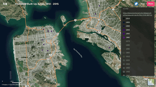
This animated map shows the growth of built-up areas in San Francisco from 1860-1930. It visualizes the rapid growth of the city following the California gold rush in the second half of the 19th Century.
This animated GIF was made using the interactive map Historical Built-Up Areas, 1810 - 2015. This amazing map uses data from the HISDAC-US: Historical Settlement Data Compilation for the United States to show built-up areas in the whole United States for every decade from 1810.
Using the map's timeline you can select to view the built-up areas for any decade since 1810 or view any combination of decades. You can therefore use the map to view the historical development of individual cities or the whole of the United States over time. Zoom in on an individual city (such as San Francisco) and you can explore how and when the city developed.
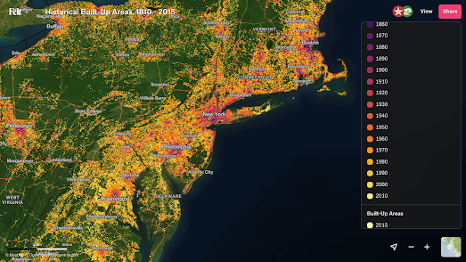
Each decade's data is color coded so if you select to view every decade's built-up area layer you can still see the chronological development of an area's buildings. For example if you zoom-in on the Northeast Corridor from Washington D.C. to Boston you can see that the suburban areas between the major cities appear as a yellowy-orange on the map, indicating that they were mainly developed in the second half of the 20th Century.
If you wish to view a city's development in higher resolution then you might have luck exploring the maps listed under the building age label on Maps Mania, which show historical developments in cities at the individual building level.


Comments