Beyond the Rainbow - Colors for Maps

Carto has unveiled a set of custom color schemes for visualizing data on Carto's interactive maps. These color schemes have been optimized for online interactive maps, CARTO basemaps and thematic maps that have been made with Carto's data mapping application - Builder.
Carto's different color schemes can be used with sequential, diverging, or qualitative data. You can view the palettes for Carto's sequential color schemes, diverging color schemes and qualitative color schemes at CartoColors. You can see these schemes in action on example interactive maps on the Carto blog post Data Driven Color Schemes.
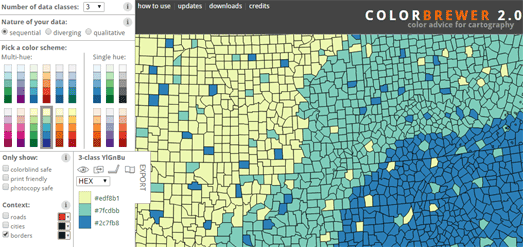
Cynthia Brewer's ColorBrewer is an online tool to help cartographers choose good color schemes for their maps. The tool helps you to think about the type of data you are visualizing and the appropriate color scheme to use for visualizing that data.
The tool includes three types of color scheme, sequential, diverging and qualitative. You simply need to choose which scheme best fits your data, choose the number of classes in your data and then choose a multi-hue or single color palette range. As you make your design decisions you can automatically see the scheme being applied to a sample map.
When making your choice of color scheme it is worth reading the advice provided (using the information button) about when to use a sequential, diverging or qualitative color scheme with your data.

If you plan to use ColorBrewer with a Leaflet map you might want to also check out ClassyBrew. ClassyBrew is a tool which uses ColorBrewer theory to help you choose a color scheme for your data and even generates the code to create a Leaflet map.
Like ColorBrewer you can choose whether your data is sequential, diverging and qualitative and then view how your choice of color scheme looks on a demonstration map.


Comments