Tuesday, February 28, 2017
New York in 3D
New York is the city where construction never sleeps. If you want to keep track of the endless pace of new builds in Lower Manhattan you can use Downtown Alliance's new 3D map which tracks the urban landscape in the area of New York below Chambers Street.
LM3D maps all current and future developments in Lower Manhattan. It also allows you to analyse building use within the area, as it visualizes all residential, office, and hotel properties in the neighborhood, as well as restaurants, retailers, transit and open space sites.
At the heart of LM3D is a Cesium powered 3D map of New York based on OpenStreetMap data. All the buildings on the map are interactive. You can select a building on the map to view details on the building's square footage, construction date, floor count and building use. The map menu also allows you to analyze Lower Manhattan's buildings in a variety of ways, including the option to filter the buildings of Lower Manhattan by land use.
Travel Time New York
Travelling between Manhattan and Brooklyn is going to get harder. In 2019 the MTA plans to close the L train's East River tunnel for 18 months. This will affect the journeys of thousands of travelers in New York every day.
2019 might seem like a long time away but it's not too early for Google's Sidewalk Labs to start planning for the disruption. They have teamed up with Transportation Alternatives to release a new interactive map which shows how your journey might be affected when there are no L train stops in Manhattan.
The NYC Transit Explorer allows you to plan and view travel times and routes across New York's five boroughs. The map is really useful for planning any journey on New York's transit network. However it is far more than just a simple journey planner. As well as showing you how to get from A to B on the MTA the NYC Transit Explorer can also be used to view how long it would take to get anywere in the city from any location.
Click on any location on the map and a colored overlay will show you how long it will take you to travel anywhere in the city on the public transit network. It also allows you to adjust the settings to see how long your journey times would take at different departure times, with different maximum walking distances and with different transfer & mode preferences.
The NYC Transit Explorer isn't only useful for planning how you might travel when the East River tunnel closes. The map has the option to include the L train if you want to see your best route while the tunnel is still open.
Monday, February 27, 2017
Harriet Tubman - An American Hero
Harriet Tubman is an American hero. She escaped from slavery in 1849. She then went on to use the Underground Railroad to personally help around seventy other people escape from slavery. During the American Civil War she also worked as a scout, spy and nurse for the United States Army.
Ron Stodghill in Harriet Tubman's Path to Freedom examines the extraordinary life of Harriet Tubman. In this New York Times article Stodghill travels through Maryland's Eastern Shore. He uses the journey to visit some of the locations important in Harriet Tubman's life and to tell the story of how she managed to escape from slavery and go on to free other slaves. He also visits some of the other locations in the area that played an important role in the Underground Railroad.
Harriet Tubman's Path to Freedom uses a simple story map format to show the locations in Stodghill's journey through the places important to Harriet Tubman's life. As you progress through the article the background map updates to show the locations visited by Stodghill and flashing markers help to highlight these locations on the map.
Also See:
Visualizing Emancipation - a map of slavery’s end during the American Civil War.
The Jamaican Slave Revolt Map - mapping Tacky's Rebellion and its brutal suppression by the British Army
The Atlantic Slave Trade in Two Minutes - an animated map of the Transatlantic Slave Trade Database
The Spread of U.S. Slavery - mapping the population of slaves at county level in the USA from 1790–1860.
Where's Everyone Moving?
In the UK when people move house they often give their new address to the post office. This enables the Royal Mail to redirect any mail posted to their old address to their new home. It also means that the post office has a lot of data about where people move from and where they move to in the UK.
The Royal Mail has used data from over a million of these redirection applications to create the Redirection Moving Map. The Redirection Moving Map allows you to enter any UK postcode and view a map showing where people have moved to in the UK from that address. It also allows you to see where people who have moved to that address have moved from.
On top of the map you can also view a few overall statistics about the total number of moves in and out of the postcode area. This includes the average distance moved to and from the area, the shortest distance moved, the greatest distance moved and the total number of house moves.
Friday, February 24, 2017
Sounds of the City - Mixing Desk
You can become your own urban DJ and remix the sounds of the world's cities on the Soundcities Herd Above the Noise map. This map lets you play and remix sound recordings captured in thousands of different urban landscapes around the globe.
Soundcities – Herd Above The Noise uses the Sound Cities extensive database of geo-tagged sound recordings to take you on an animated audio tour of the cities of the world. What's more using the map you can remix the thousands of found sounds and field recordings from around the world to create your own global city soundscape.
Herd Above the Noise can be controlled by selecting sounds from the markers on the map or by selecting from the two overlaid word clouds (locations and categories of sound). Alternatively you can just sit back and listen to the map in 'auto' mode. If you don't interact with the map then Herd Above the Noise will automatically take you on a journey around the world mixing together random sound recordings from random cities as you travel across the globe.
If you want to you can also become a natural soundscape DJ by remixing the natural sounds recorded around the world by the Global Biodiversity Information Facility.
GBIF Soundscape uses sound recordings from the Global Biodiversity Information Facility website to reconstruct the natural soundscapes of different regions around the world. Using the GBIF Soundscape map you can create your own mix of bird and frog sound recordings.
Select a region from the map and you can listen to a mix of all the bird and frog sounds which have been added to the GBIF data records at that location. At each location you can listen to all the recordings playing at once or create your own mix from the available recordings. You can also click on the 'random' button to listen to a random mix from a location's sound recordings.
Thursday, February 23, 2017
How Immigrants Boost the Economy
The New American Economy has mapped the contributions of immigrants in all 435 Congressional districts, the 55 largest U.S. metro areas and all 50 states. The map provides information on the tax contributions made by immigrant workers and data on their spending power and contributions to entrepreneurship and the general workforce.
If you select a location on the Map the Impact interactive map you can view details on the number of immigrant residents in the area and the amount of taxes paid by immigrants and their combined spending power.
For each area selected on the map you can also click-through to view more detailed information on the benefits that immigration provides at that location. This includes detailed demographic data about immigrant residents, their contributions to the different employment sectors and the amount of taxes paid by immigrants.
The Broken Bridges of Madison County
The 2015 National Bridge Inventory shows that more than 130,000 bridges in the USA are structurally deficient or functionally obsolete. The Washington Post has released an interactive map, How many structurally deficient bridges are in your county?, which shows the state of bridges in every country in the country. The map also allows you to view the inspection results for every classified bridge in your county.
The map at the top of article provides a choropleth view showing the number of structurally deficient bridges in each county. If you select a county on the map an interactive map of the county will load below the choropleth map. The county map shows all the classified bridges in the county and the number of bridges which have been classified as structurally deficient or functionally obsolete. You can also select any bridge's marker on the map to view its individual classification in the 2015 National Bridge Inventory.
Wednesday, February 22, 2017
Mapping the Internment of Japanese Americans
February 19th was the 75th anniversary of the executive order authorizing the internment of Japanese Americans. During the Second World War over 120,000 Japanese Americans were placed in concentration camps in the United States.
Esri has manually digitized the archival records of the War Relocation Authority, the civilian body that oversaw the relocation and incarceration of Japanese Americans, to create a Story Map which examines how America imprisoned its own citizens in the 1940's. Justice Deferred explores the contributions made by Japanese Americans to American life before World War II. It then maps out how the largest Japanese American communities in Los Angeles, San Francisco and Portland, Oregon and Seattle were forcibly removed from their homes and placed in one of ten concentration camps.
Justice Deferred is however more than just a series of maps showing how Japanese Americans were incarcerated during the Second World War. It also examines the personal stories of some of the effected Americans and the legacy of the internment program on Japanese Americans and for the USA itself.
Tuesday, February 21, 2017
Travel Time Location Search
TravelTime is a new location search engine which allows you to find places by travel time. It allows you to find locations by the amount of time it will take to walk, cycle, drive or get public transport to.
If you share your location with TravelTime you can view an isochrone map showing you how far you can travel in a set amount of time. For example you can select to view where you could walk within 15 minutes. But that's not all. TravelTime also allows you to search for venues and points of interest within your allocated travel time. So, for example, you can ask TravelTime to show you all the coffee shops within 15 minutes walk of your current location.
TravelTime isn't finished yet. It also allows you to add other locations to the map and search the travel times from the new location as well. This means that you can add a friend's location to the map and search for coffee shops within a 15 minutes walk of their location. You can then see the locations on the map where your 15 walk area overlaps with the 15 minute walk area of your friend. You can also see where all the coffee shops are that both you and your friend can reach within 15 minutes. Any of these could be a great place for you and your friend to arrange to meet.
The Aged in Spain Live Mainly on the Plain
The over 65's make up the majority of the population in 10 percent of census areas in Spain. Many of these neighborhoods with an aged population are in rural areas, such as Galicia and along the Mediterranean Coast. However it isn't true to say that the old in Spain live mainly on the plain. Many cities, like Burgos, Leon, Salamanca and Valladolid also have a high number of retirees living in the city center.
One of the key revelations in El Confidencial's interactive map What is the most common age of your neighbors? is that city centers in Spain tend to be populated by older residents and Millennials. Young families in Spain tend to live in the suburbs of cities where property prices are cheaper. Neighborhoods in city centers tend to be more popular with both Millennials and the elderly.
Each census tract on El Confiencial's map is colored according to the age group which is the most populous in that area. Using the interactive map you can select any census tract in Spain to see which age group is the most populous in that neighborhood.
Monday, February 20, 2017
Powered by Wind
This US Wind Turbine Industry map provides an overview of the location and capacity of wind farms in the USA. The map plots the location of individual wind turbines across the country, colored by manufacturer.
The links at the top of the map allow you to quickly zoom the map to the largest wind farms in the USA. When you zoom in on a wind farm the inset information window updates to show the capacity of the wind farm and the name of the owner. A list of all the wind turbine manufactures is shown to the right of the map. You can select individual wind turbine manufacturers from this list to add or remove them from the map.
The data for the map is from Scientific Data. It is from March 2014 so is almost three years old.
The United Kingdom generates a higher percentage of its electricity from offshore wind farms than any other country. You can view the current output of the UK's offshore wind farms on this Offshore Wind Electricity Map.
The map shows the locations of the UK's offshore wind farms. Each wind farm is represented on the map by a scaled animated wind turbine marker. The size of the marker represents the scale of the current output from each wind farm. If you select a marker on the map you can view the name of the wind farm and its current output in megawatts.
The map sidebar shows a dashboard reading of the share of the UK's electricity currently being generated by offshore wind. If you select a marker on the map the dashboard updates to show the operator of the selected wind farm, the site capacity, the number of turbines and the type of turbines.
The History of American Cities
The National Trust for Historic Preservation provides information on the building age and historic monuments of American cities. Their Atlas of ReUrbanism includes a series of interactive map which visualize a host of historical information about a number of American cities. The maps include information on the relative building age of city neighborhoods, the location of nationally registered historic places, historic & cultural monuments and historic districts.
So far interactive maps and fact sheets are available for ten cities. By the summer 50 cities will be available in the Atlas. Each city map provides a visualization of a city's National Trust 'Character Score'. The Character Score of city neighborhoods is based on the median age of buildings, the diversity of the age of buildings and the size of buildings in the neighborhood.
The Character Score layer provides an overview of where the city's older districts are located. The Cultural Resources tab on each city interactive map allows you to add other historic information to the city map. These layers include information on the location of listed buildings, historical monuments and nationally & locally registered districts.
Sunday, February 19, 2017
The 2016 Global Light Pollution Map
The Light Pollution Map allows you to see how human populations around the world effect our ability to see the stars at night. The light pollution map was created by stitching together cloud free night time satellite imagery of the Earth.
Using the map you can get a reasonable sense of where humans live around the globe. In the USA you can make out the major urban centers in the east of the country and along the west coast. In Egypt you can clearly make out the river Nile due to the concentration of urban areas along the Nile valley.
However the Light Pollution Map obviously isn't a population map. For example North Korea appears dark on the map because of the lack of power in the country (although North Korea contradicts this western view of the country and claims the reason for the absence of light is because 'the essence of society is not on flashy lights').
Saturday, February 18, 2017
The Internet Shutdown Tracker
In India the government uses blanket internet shutdowns to try to curb violence and unrest in conflict ridden areas. The state believes that these bans on internet access are important preventative measures to stop the spread of violence.
Opponents of these internet shutdowns argue that because India has a flourishing digital economy such indeterminate denials of access to the internet cause businesses and the economy as a whole to suffer needless losses. The bans also effect the ability of journalists to report the news in crisis situations and can cause stress to people trying to contact friends and families. There is also the worry that the power to impose internet shutdowns can be used by the government to stifle legitimate opposition.
The Software Freedom Law Centre are trying to track the Indian government's use of internet shutdowns. One way in which they disseminate this information is through the Internet Shutdown Tracker interactive map. The map shows locations across India where the government has shutdown the internet.
The map also includes a breakdown of the number of internet shutdowns imposed by year. This tracker shows that in 2016 the government vastly increased the number of times it resorted to restricting access to the internet.
Friday, February 17, 2017
How to Add a Walking Time Layer to a Map
An isochrone layer shows travel times on a map. It can be used to show how long it will take to travel from one location to other locations on a map. For example it can be used to visualize how far you can walk within different periods of time from a given location.
If you want to add a walking time layer to an interactive map then you can use walkshed.js. Walkshed.js is an opensource JavaScript library for adding a simple walking times layer to an interactive map. You can view walkshed.js in action on this interactive map. If you click anywhere on the map a walking time isochrone layer is instantly added to the map, showing how far you can walk from that location in incremental periods of time.
The walking times are calculated on the client side in the browser, so the map works very quickly. Essentially walkshed.js works by analyzing the OpenStreetMap data in the map layer. It assigns friction values to the map data to work out how easy it is to walk at each location. For example water, railways and interstate highways are given a high friction score because they are very hard to walk across. Conversely a park is given a low friction score because it would be easier to walk through.
If you want more information about how walkshed.js works then this YouTube video, Walkshed.js: Measuring Walkability with Client-side Raster Processing, provides a detailed account of how walkshed.js calculates walking times in the browser.
Thursday, February 16, 2017
Make America Hate Again
In the last year the number of anti-Muslim hate groups in America grew from 34 to 101. According to the Southern Poverty Law Center the overall rise of hate groups is a direct result of the 'incendiary rhetoric' used by Donald Trump. In its annual census of extremist groups the SPLC claims that "Trump’s run for office electrified the radical right, which saw in him a champion of the idea that America is fundamentally a white man’s country".
The SPLC's interactive Hate Map tracks the growing number of hate groups operating in the United States. The map uses colored markers to indicate the category of each hate group shown on the map. If you select a marker on the map you can click-through to learn more about what this type of hate group believes and how they operate.
Donald Trump was asked just yesterday, by an Israeli journalist, how he planned to address rising anti-Semitism in America. He responded by saying,
"Well, I just want to say that we are, you know, very honored by the victory that we had -- 316 electoral college votes. We were not supposed to crack 220. You know that, right? There was no way to 221, but then they said there's no way to 270. And there's tremendous enthusiasm out there".I think that this is a convoluted way of saying that the President believes in 'self-love not hate'. Maybe if we all love ourselves as much as Donald Trump loves himself there would be little room left for hate in the world.
A less favorable interpretation of Trump's answer might be that he has no intention to address the growing number of hate groups and hate crimes in America.
Wednesday, February 15, 2017
Commuting in DC
The District of Columbia's Department of Transport has released a comprehensive visualization of commuting, congestion and transportation in the nation's capital. District Mobility: Multimodal Transportation in the District is divided into a number of different stories, examining different aspects of the transportation system’s congestion, reliability, and accessibility.
Each of the stories are accompanied by interactive maps which help to illustrate the city's busiest and most reliable roads and public transit routes. The maps and the stories do a good job in providing an overview of how the city's transportation networks operate and how they are used.
However this report is probably not the best place to go if you want to explore the city's transportation data in detail yourself. The lack of place labels on the map means that you need to have a good knowledge of Washington's geography and roads to read the maps/ Also very few of the map overlays are interactive so you can;t drill down to view the actual data displayed, This is partially offset on some of the maps by markers highlighting the busiest intersections and stops in the city.
Glasgow on the Run
The Urban Big Data Centre has released an interactive map visualizing cycling and running data in the Scottish city of Glasgow, The map uses data from users of the Strava running and cycling tracking application to show the most popular places for cycling and jogging.
Glasgow in Motion allows you to select either cycling or running / walking and view an animated map showing the most popular routes used by Strava users. As the animated timeline plays you can observe not only the most popular places for cycling & running in the city but also the most busy hours of the day and days of the week, The map also includes weather data so you can observe how different weather conditions effect the popularity of cycling and running.
It is interesting to see how cycling and running activity changes through the course of a day and on different days of the week. For example this time element allows you to observe popular commuting routes for cyclists. However the map doesn't include an option to view a heatmapvisualization of the overall data in one go. This would provide an interesting overview of the most popular cycling and running locations in the city for all Strava users.
Tuesday, February 14, 2017
Mapping Endangered Species
The International Union for Conservation of Nature and Natural Resources's Red List of Threatened Species is a comprehensive database of animal and plant species which are at risk of extinction around the world.
The IUCN Red List website allows you to search for specific animals or plants and view an interactive map showing where the species still exists in the wild and any protected areas provided for the species. For example this map visualizes the remaining range of the leopard. The map highlights areas where the leopard is still extant (shaded yellow) and the areas where the leopard once ranged but is now extinct (shown in red).
You can use the IUCN Red List search bar to view interactive maps showing the range of any threatened species. You can search for a species using either its common or scientific name.
What is Missing? is a global map and timeline of animal species around the world that have either become or are in danger of becoming extinct. What is Missing? includes both a global map and a timeline view of these animal species. In both the map and timeline view you can select any of the individual markers to learn more about the individual endangered or extinct animal species.
What is Missing? includes a number of videos and stories providing information about some of the planet's most endangered species. It also includes information about actions that you can take as an individual to help protect endangered animals, prevent habitat loss and reduce emissions.
Monday, February 13, 2017
The Greatest Diplomatic Network in the World
The USA operates hundreds of embassies and consulates across the globe. In fact the USA has the most extensive diplomatic network of all the countries in the world. When you combine this vast network with a President with the charm, attention span and interpersonal skills of Donald Trump you can see how it could be used to make America great again.
The Lowy Institute's Global Diplomacy Index ranks the diplomatic networks of all the countries in the G20 and OECD. The index ranks each of these 42 countries based on factors such as the number of embassies and consulates each country operates across the globe.
The Global Diplomacy Index Network Map allows you to view the diplomacy ranking of each of the 42 countries featured and to view the diplomatic networks of each country. If you select a country on the map you can see the locations of its diplomatic missions in each country across the globe.
The yellow dots on the map show cities around the world where G20 or OECD nations have diplomatic posts. Click on a city's dot and lines connect to the city showing every G20 or OECD country with a diplomatic post in the city.
Saturday, February 11, 2017
Mapping Canada's Population
Earlier this week the first data from the 2016 Canadian census was released. The first data from last year's census covers population and dwelling counts. You can view how population has changed in the Toronto region on this Population Change in the Greater Golden Horseshoe, 2011-2016 interactive map.
The map shows how the population has changed in each census tract region between the 2011 and 2016 censuses. If you hover over a census tract on the map you can view the percentage of the negative or positive population change in the tract. You can also view the population totals for the tract from the 2011 and 2016 census returns.
The City of Toronto itself grew by 116,511 people since the last census. If you are interested in the population totals for other Canadian locations you can view the 2016 census population data for the whole country on Census Mapper.
For example this Population Density map shows the population counts for each census tract in Canada. If you select a tract on the map you can view the 2016 census returns for the total population, the number of dwellings and the number of households. If you are interested in the population change in your area then you can check out this Absolute Population Change map, which shows which tracts have seen a growth or decline in population since the 2011 census.
Friday, February 10, 2017
Around the World in 3,305 Frames
To celebrate the 12th birthday of Google Maps Matteo Archondis created this awesome animated tour of Google Maps. The video consists of 3,305 screenshots of the world as seen on Google Maps.
If you want to create your own animated tour then you can use the Ecolapse Street View movie maker. Ecolapse is a nice extension of the Hyperlapse library created by Teehan+Lax (Hyperlapse itself unfortunately seems to no longer exist - although the source code for Hyperlapse is still available on Github). Using Ecolapse you can create an animated Street View drive with a very clever overhead 'small world' effect. Ecolapse distorts the Google Street View imagery to portray an overhead view rather than the normal Google Maps landscape view.
You can create your own animated Ecolapse tour simply by dropping two map markers onto a Google Map. When the animation is created you have the option to pause the animation, zoom in and out of the Street View and use your keyboard arrow keys to scroll through the route frame by frame.
Thursday, February 09, 2017
Playing with Map Styles
If you like your maps with a little style your options just got wider. Mapzen has released a new browser based map style editor. Tangram Play is a real-time tool for editing Tangram map styles directly in your browser.
Tangram Play is split into two main areas the map and the map editor. You can adjust the style of any of the map layers directly in the map editor and all the changes you make to the style will be instantly shown in the map pane. The editor includes color pickers in the map editing pane which enables you to simply select the colors you want for different elements on the map from the pop-up color picker.
When you are happy with your map style you can save your style. You can then share the style with others by getting a shareable link to your styled map. If you want to use the style in your Tangram maps you can grab the JavaScript code which you can then use with your Mapzen account.
Mapbox GL also has its own browser based map style editor. Mapbox Studio. Mapbox Studio gives you complete control over the design of your Mapbox created maps. It allows you to define the colors of map layers, change the size & fonts of map labels and even add & style your own data on the map.
Mapbox Studio is probably the most complete browser based style editor for interactive maps. It currently gives you the option to customize the look and feel of more map features than other map style editors. The ability to add and style data to the base map also means that you have control not only of the look of your base map but of your completed map visualization of geographical data.
The Google Maps API also allows you to change the colors of different map elements and to define which map elements are visible on your finished map. To start creating your own custom map styles for Google Maps you can use the Google Maps APIs Styling Wizard. The wizard allows you to quickly adjust the number of labels, landmarks and roads that are visible on the map. It also contains a number of pre-designed themes, such as the vintage and night-time map styles.
If you want to change the look of your map style even further just click on the 'more options' button. This will allow you to control which feature types you wish to display in your style and allow you to change their appearance on the map.
You can learn more about custom map styles in the Google Maps API documentation for Android, iOS and JavaScript.
The Geography of the Beatles
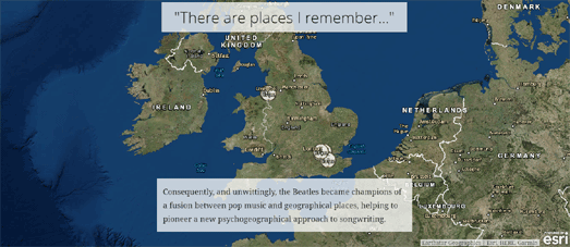
Penny Lane / Strawberry Fields Forever is an Esri Story Map exploring the importance of psychogeography in the music of the Beatles. In particular it examines the geography of the 'most important single ever', the double 'A' side record Penny Lane - Strawberry Fields.
As you scroll through this Story Map you discover the importance of a sense of place to the music of the Beatles and how the band influenced other 60's artists to write about locations important to their lives.
The Story Map explores some of the other geographical locations important in the lives of the Beatles and in their music. In particular however the map zooms in on two locations in Liverpool, Penny Lane and Strawberry Fields, and discusses the significance of these two locations to the childhoods of Paul McCartney and John Lennon.
Wednesday, February 08, 2017
Stunning Earth in 3D
You can now explore the world in stunning 3D on a new Mapbox and three.js powered map. Terra allows you to view some of the world's most beautiful geological sites on a WebGL 3D map.
Terra drapes Mapbox's satellite imagery over the platform's elevation data to create a 3D map of the world. The map includes a small inset map which provides quick links to some interesting locations around the world, such as Ayers Rock or the Grand Canyon. You can of course explore the world yourself by panning and zooming the large 3D map or clicking on a location in the smaller inset map.
You can learn more about how the map was created on the Mapbox Blog.
Tuesday, February 07, 2017
Mapping a Galaxy Far, Far Away
Using Mapbox GL to simulate the opening credits of Star Wars is maybe not the most obvious application of an interactive mapping library. It is good fun though.
May the Fourth be With You is an animated map which uses a few of Mapbox GL's capabilities to create an accurate rendition of the scrolling text seen in the opening credits of the Star Wars films. The map simply uses Mapbox GL's pitch function to provide an oblique view of the map and text. The stars have been added to the map in Mapbox Studio by simply adding a star-field image as a fill in the water layer.
Once you've viewed the opening credits I'm sure you'll want to explore the Star Wars universe a little further. You can do that with the Star Wars Galaxy, a huge 3d WebGL map of the entire fictional galaxy from George Lucas' series of Star Wars films.
This 3d map of the Star Wars Galaxy was sketched out in ArcMap and can be viewed using the Esri CityEngine. Using the map you can explore the Star Wars galaxy in 3d, visiting all the major planets and even the Death Star!
When the map loads you should press the play button in the bottom left-hand corner of the map to set out on a tour of the whole galaxy and the major planets. You can also navigate to individual planets using the menu that runs along the bottom of the map. If you get lost in your travels around the galaxy you can use the search option to search for individual planets by name.
Monday, February 06, 2017
The Changing Face of New York
The wealth gap is growing in New York. The middle-class is shrinking while lower income and higher income groups are both growing. This is just one of the findings from a detailed report from the Citizens Housing and Planning Council exploring how New York neighborhoods have changed in the ten years from 2000 to 2010.
You can read the full report Making Neighborhoods - Understanding New York Transitions 2000-2010 (PDF) or a shorter summary (PDF) of the report's findings.
The data from the study is also available to view on the CHPC Making Neighborhoods interactive map. Using the map you can explore for yourself the changing demographics of New York neighborhoods. By selecting a neighborhood on the map you can view how the neighborhood has changed over the ten years in key demographic areas, such as race, age, foreign birth, household type, education level and poverty.
The key at the bottom of the map explores the 16 different socio-economic types identified by the report. The key is interactive. This means that you can view where these different types of New York groups live in the city on the map when you hover over a color on the map key.
Putting News on the Map
Unfiltered.news is an interesting way to explore what news stories are currently being reported in countries around the world. At the heart of Unfiltered.news is an interactive cartogram visualizing the top news stories being reported in each country.
The map shows the top 100 news stories from Google News for each country on the map. If you select a country's circle on the map the top news stories from the country will load in the map sidebar and the topics will appear in the circle.
The size of the words indicate the number of times the topic has been mentioned in the news. If you select a topic from the map the news stories relating to that topic will then appear in the map sidebar. A timeline will also appear which allows you to explore the news trends for that topic over time.
Heatmap News also uses the Google News API. As the name suggests Heatmap News provides a visual heat map of locations around the world which are currently in the news.
The heatmap overlay provides a visual guide as to where news stories are currently breaking around the world. You can also click on countries on the map to read the latest news stories from that country listed on Google News. Perhaps the most useful feature in Heatmap News is the 'Date' filter. This allows you to search for news stories by date as well as location. This can be useful if you want to research which news stories were happening at different locations on specific dates.
If you don't like your news filtered by Google then you can always go direct to the websites of newspapers around the world. Newspaper Map is an interactive map which provides links to thousands of daily newspapers across the globe.
Individual newspapers are located on the map using colored map markers. The colors of the markers indicate the language that the paper is published in. If you click on the markers you can find a link to the newspaper's website and a link to read the paper via Google Translate.
The US News Map from Georgia Tech allows you to search for keywords in historical American newspapers and then view the results across space and time. The map searches for words in the Library of Congress' database of historical newspapers which includes American newspapers from 1836 to 1922 (a database of more than 10 million newspaper pages).
The application is an amazing resource for visualizing the frequency that words or names appeared in American newspapers over this period. The map helps visualize where newspapers were writing about any given subject and how interest in that subject might have changed over time.
Sunday, February 05, 2017
Route Planning for Wheelchair Users
AccessMap is a new trip planning tool designed specifically for users with limited mobility. If you are a wheelchair user or you have problems with steep hills, raised curbs or bad sidewalk conditions then AccessMap can help provide you with directions that will try to route you around any mobility barriers.
Sidewalks on AccessMap are colored to show the degree of incline. Construction projects which might impact on sidewalk mobility are also marked on the map with small yellow circles. AccessMap therefore provides a great visual guide to sidewalk mobility. However AccessMap also includes a route planning option that can provide you with directions that try to avoid any major mobility problems.
To get directions on AccessMap you simply need to right-click on the map to set your starting point and destination. AccessMap will then suggest a route that avoids major inclines, construction projects and the absence of curb ramps. Any points along the route with potential mobility issues are colored red. You can click on any red warnings on the route to see what the mobility issue is at that location.
Currently AccessMap is only available in Seattle but there are plans to extend coverage to other locations.
Wheelmap is an interactive map dedicated to showing the locations of wheelchair-accessible public venues. Wheelmap uses three colors of markers to indicate the accessibility of venues, a green marker means the venue is wheelchair accessible, orange means it is partially accessible and red means that the venue is not accessible to wheelchair users.
Wheelmap is a crowd-sourced project which means that anybody can add information to the map. The grey markers on the map indicate venues that Wheelmap has no information about. If you have information about the venue's accessibility to wheelchair visitors you can simply click on the marker and select whether it is wheelchair, accessible, partially accessible or not accessible. Wheelmap is also available in a large number of different languages so can be used by people around the world.
In France Accessible.net provides a French Google Map of wheelchair accessible venues. The site's searchable map includes categorized accessible venues, including restaurants, hotels, museums etc. When you select a venue's marker on the map you can click through to view information on wheelchair accessibility and whether the venue provides support for hearing and visually impaired visitors.
Saturday, February 04, 2017
Mapping Canada's Greatest Songs
Canadian Geographic are celebrating Canada's 150th birthday with a map of great Canadian songs. The Great Canadian Song Map features songs about Canada on an interactive Google Map.
On July 1, 1867 the colonies of Canada (Ontario and Quebec), Nova Scotia and New Brunswick were united as the 'Dominion of Canada'. The Canadian Geographic map celebrates the occasion by featuring YouTube videos of songs by Canadian artists such as Neil Young and the Barenaked Ladies.
At the moment the map isn't exactly full of great Canadian music. However you can help populate the map by posting your favorite songs about Canada to Facebook or Twitter with the hashtag #CanadaSongs.
Friday, February 03, 2017
The Global Terrorism Maps
15,976 people around the world died in terrorist attacks last year. If you watch the news in the 'developed' world you might be under the impression that most deaths from terrorism occur in the West. However Esri's 2016 Terrorist Attacks map clearly shows that the Middle East and Northern & Central Africa are the areas worst affected by terrorism
The same global distribution of terrorist attacks seems to be continuing into 2017. The 2017 Terrorist Attacks map has only one month of data so far but still reports 860 fatalities from 147 separate terrorist attacks.
You can view the global distribution of terrorism over a longer timescale on the Global Terrorism Casualties map. This interactive map from David Johnson shows the location of terrorist attacks over 44 years, from 1970 to 2013.
The concentration of attacks in Northern Ireland, Pakistan, Afghanistan, Algeria, El Salvador and in other countries helps to emphasize some of the most political troubled locations around the world in the last half-century. The dots on the map for each terrorist incident are sized by the number of causalities.
The Global Terrorism Casualties map uses data from the Global Terrorism Database, an open-source database of terrorist attacks around the world from 1970 through 2015.
The Global Terrorism Database has a number of static heatmaps showing the concentration and intensity of terrorist attacks around the world over the last 45 years and for individual years. You can of course use the data to create your own interactive maps of terrorist attacks around the world.
Thursday, February 02, 2017
Mapping Air Pollution in 3D
London's major roads become towering infernos of unbreathable air on this 3D map of air pollution in the capital. The London Atmospheric Emissions in 3D interactive map plots the Greater London Authority's projected NO2 emissions for the year 2020.
Using the map you can view the locations in London with the worst projected air pollution. The map includes a few quick links to some of the most polluted locations in the city, such as the Dartford Crossing (on London's M25 orbital motorway) and around Heathrow Airport. The map also includes a search option so you can quickly find other London locations on the map.
The data for the map comes from the London Datastore. The 3d visualization of this data was made possible using Mapbox GL's extrude property.
Mapping the Crisis in the NHS
The continual under funding of the English National Health Service under this Conservative government has led to the British Red Cross calling the current situation affecting the NHS a 'humanitarian crisis'.
The NHS Crisis Tracker is a Google Map which shows you the percentage of people waiting more than four hours to be seen in hospital Accident & Emergency wards in each postcode area in England. If you enter your postcode into the map you can view the percentage of patients waiting more than four hours and the total NHS funding gap in the area.
The map was created by the campaign group 38 Degrees. The group is using the map to petition the government for more funding for the NHS. The NHS Crisis Tracker map also shows the number of people in each postcode area who have signed the 38 Degrees petition.
The UK government's 'Fair Funding' reforms for schools means that education in the UK is also facing a crisis. The 'Fair Funding' reforms have been designed to cut the money that the government gives to schools and means that in real terms 92% of UK schools will see cuts in their funding. You can find out which of your local schools will lose out and by how much on this new interactive map.
The National Union of Teachers and the Association of Teachers and Lecturers has released the School Cuts interactive map. Using the map you can find out how much your local schools will suffer under the government's new funding regime. Enter your postcode and local schools will be shown on the map using '+' and '-' markers. The '+' markers show schools that will see an increase in funding. The '-' markers show schools that will experience cuts in real terms (you are unlikely to see a '+' marker on the map).
If you select a school on the map you can find out how much money that school is losing. You can also view how much money that is per pupil and how many teachers could be lost (based on the average teacher's salary).
Wednesday, February 01, 2017
The United Megaregions of America
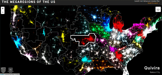
Garrett Dash Nelson and Alasdair Rae have identified 50 regions of the United States based on distinct separate labor markets. The new identified megaregions of the United States were determined by analyzing over 4,000,000 commuter journeys.
You can view the results of this analysis of commuter journeys in the USA on the Megaregions of the United States interactive map. The map shows the borders of the identified megaregions. It also shows the commuter journeys which determined the shape of each of these new megaregions. If you hover over any of the megaregions on the map you can view the name that Nelson & Rae has given the megaregion and the name of the major city at the center of its distinct interconnected labor market.
The map is powered by the Leaflet.js mapping library. The data itself was made into slippy map tiles by using QTiles, a QGIS plugin for creating raster map tiles for interactive maps.