Zap-Map - UK
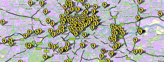
Next Greencar has released a Google Map of electric car charging points in the UK.
Three types of charging point are currently used in the UK and the map shows all three. 'Slow', 'Fast' and 'Rapid' charging points are clearly displayed using a different coloured map marker for each type.
The map includes a search option that lets you find charge points near a particular location.
PlugShare
I guess one of the biggest problems for an owner of an electric car is where to plug it in. PlugShare is an iPhone application for electric vehicles that can help drivers find places to charge their batteries.
The application uses Google Maps to show the nearby paid charging stations and also locations where you can recharge for free. The application itself is free from the App Store and looks like a must have app for any owners of electric vehicles.
ChargeMap - France
ChargeMap can show you the location of charging stations for electric cars in France. The application is available for iPhones, Android and from the desktop.
If you enter your current location into the desktop application ChargeMap will show you the nearest charging stations on a Google Map. Your location is shown by a red marker on the map and the charge stations are indicated by blue markers.
Each charge station includes information about the distance from your current location, the number of charge points available and its exact address.
_____________
Thursday, June 30, 2011
Mapping the Detention of Migrants
The Global Detention Project is carrying out research into how countries around the world detain migrants. They examine how countries detain on administrative (as opposed to criminal) grounds asylum seekers and irregular immigrants until they can be deported, their identities established, or their claims adjudicated.
As part of the project a number of Google Maps have been created that show the location of detention institutions in different countries around the world. For example, in the U.S. 961 sites used for detention, either directly owned by or under contract with the federal government, have been mapped using the Google Maps API.
Global Detention Project
_____________
Create Your Own Animated Google Map
Animaps lets you create your own animated maps. You could use the application to create an animated map of a journey you have taken, or to show how a bike / yacht race progressed or even to show the progress of armies in a famous battle.
With Animaps you can quickly animate, map markers, polylines or polygons. To get a true idea of what is possible with Animaps you should check out this showcase map that includes many of the application's features.
As well as the animation features you can add photographs and video, that will appear (and play) at the points you say in your animated map. An example of this feature in action can be seen in this animated map of a cycling trip to Asia that includes a number of photographs taken along the journey.
Animaps
_____________
Labels:
creation tools
Wednesday, June 29, 2011
More Birds Eye View
Dodger Stadium, LA
Not content with pushing out the biggest update to Street View Google Maps has today also received a lot more aerial view (or Bird's Eye view) imagery.
The full list of the new additions to Google Maps' aerial view is; Anaheim, CA. Jacksonville, FL. Tampa, FL. North Las Vegas, NV. Los Angeles, CA. Downey, CA. La Chaux de Fonds, CH. Visalia, CA. Corona, CA. Meadowlake, NM. Continental Ranch, AZ .Picture Rocks, AZ. Greater Sun Center, FL, Bastrop, TX. Martinez, CA. Paradise Valley, AZ. West New Orleans, LA. Fentress, VA.
Aerial View Map
This Aerial View map includes some of the amazing aerial views that can be found on Google Maps. The map includes some pretty stunning imagery from Venice, Rome, the USA and South Africa.
Via: Google LatLong
_____________
Labels:
aerial view
World of Fourcraft on Google Maps
Why settle for being the Mayor of Macy's when you can be the King of New York?
World of Fourcraft is a clever new Google Maps based game that turns your foursquare check-ins into a giant game of Risk. If you live in New York you can sign in with your foursquare account and then swear your allegiance to one of the city's boroughs.
After you have chosen a team every time you check-in with foursquare in New York you add one of your armies to that neighborhood. If your team places the most armies in a neighborhood you win that area for your borough.
World of Fourcraft
Via: Mashable
_____________
Labels:
FourSquare,
games,
New York,
USA
Street View Lands in the Isle of Man
Peel Castle, Isle of Map
Google Street View has now been launched on the Isle of Man and Jersey.
Updated imagery has also been added in thirteen countries; Denmark, Ireland, Italy, Spain, Netherlands, Norway, Sweden, Romania, South Africa, Taiwan, Japan, the United States, and the United Kingdom.
Google say that this is their biggest update to Street View yet.
Mont Orgueil, Jersey
Hat-tip: Google Sightseeing & Street View Funny & Google LatLong
_____________
Labels:
Street View
The World's Population on Google Maps
City Population is busy mapping the population sizes of all the world's major conurbations.
City Population lists the populations of all countries and the major cities and agglomerations of each country. The site uses Google Maps to show the major cities and their populations.
For each country you can select to view counties, states or administrative regions on a Google Map. The map shows the major municipalities in the region. If you click on a city you can then view the population history of the selected city for the last 20 years.
City Population
_____________
Tuesday, June 28, 2011
Google Maps Redesigned & Google+
It has been a busy day of announcements from Google. As well as launching a new social network Google has unveiled a new design for Google Maps.
The Google+ Project was launched today with a nice use of the Google Maps API to showcase whats on offer from the new social network.
The demo page is a map created from a custom image with the addition of a number of map markers to showcase the many features of Google+. The use of a custom information window with embedded videos helps contribute to the very clean design of the demo page.
Talking of design - Google Maps also has a shiny new look. One of the major changes is that information windows no longer have rounded corners.
Changes have also been made to the search area (now grey) and the map sidebar. Have a look at the new design and tell us what you think in the comments.
Via: Google LatLong
_____________
Google Maps of the 2010 U.S. Census
The New York Times, The Washington Post, The Chicago Tribune, The LA Times and The Texas Tribune have all been busy mapping the 2010 U.S. census.
These newspapers have all provided great map based visualisations of the census on a regional basis. Now, however, the U.S. Census Bureau has released its own Google Map that lets you visualise the data for anywhere in the country.
Or, at least, it eventually will, as the map isn't quite complete yet. The Census Bureau are adding data to the map on a state-by-state basis so you might be one of the unlucky ones whose data hasn't been added yet.
The maps provide details about race and Hispanic groups, age, sex and housing status by census tract, census block group and and census block. Just enter your address into the map to discover if your neighborhood has been added.
2010 Census Interactive Population
_____________
Labels:
census
How Far Can You Fly with Google Maps?
Hungarian Airline Malev has a nice flight finder tool that allows you to select an airport, the amount of money that you are willing to pay and then view on Google Maps destinations that you can afford on your budget.
The travel finder is very easy to use. You can just click on any of the mapped airports to set them as the airport that you wish to fly from. You can set the amount of money you are prepared to pay using the slide control. When you press enter all the destinations that you can afford with Malev Hungarian Airlines are shown on the map (with the cost of flight).
You can even book your flight directly from the map.
Malev Travel Planner
_________________
Mornington Crescent on Google Maps
Mornington Crescent is a turn-based strategy game which, in its simplest form, can be picked up quite quickly but does take years to truly master. The rules of Mornington Crescent can appear very confusing when you first start playing the game. The almost infinite number of rule variations, such as "Trumpington's Variations" or "Tudor Court Rules", means that even seasoned players often get confused.
As an aide to novice players I have created this animated map of one particular notorious game when a novice player managed to beat two of the game's most famous players.
The game itself was recorded and luckily someone has uploaded it to YouTube. All you have to do is load the webpage and the video will start playing automatically. When the game begins the map will animate to show each of the players' moves.
If you want to learn more about the game then NF Stovold’s book 'Mornington Crescent: Rules and Origins' comes highly recommended.
Mornington Crescent
_________________
Labels:
Video
Monday, June 27, 2011
Make Your Own History Map
Weaving History from the Open Knowledge Foundation lets you create your own history maps with a little help from the Simile Timeline and Google Maps.
The Simile Timeline widget has long been a favourite tool for Google Maps developers who want to create maps about historic events. The programming skills required for both the timeline widget and the Google Maps API however does create a barrier for anyone who hasn't got the necessary knowledge of javascript.
With Weaving History you can create your own historical timeline and map without any programming skills. To create a new timeline map you just need to start a new 'thread' on Weaving History and add some relevant 'factlets'.
When adding factlets you can just add the URL of a Wikipedia article and the factlet is added automatically. As you add factlets to your thread they are automatically added to your thread. It is as easy as that.
Add a few factlets to a thread and you soon have your own historical timeline map.
Weaving History
_________________
Labels:
history maps,
Timeline
Mapping Diabetes on Google Maps
TuAnalyze is an app for recording and sharing measures of diabetes. The app is jointly developed by Children's Hospital Boston and TuDiabetes.org.
TuAnalyze uses Google Maps to map haemoglobin A1c, which is an indirect measure of diabetes management. The map shows user recordings of A1c in each U.S. state and in a number of other countries. Each state and country is shaded to reflect the average A1c levels.
TuAnalyze - TuDiabetes
_________________
Labels:
health
Planes, Trams & Automobiles
NextBus's real-time transit map of San Francisco lets you view the live position of the city's historic cable cars.
You can select to view any of the cable car lines in San Francisco and view the cable cars moving on a Google Map in real-time. Each of the cable cars is represented by it's own map marker. Each marker displays the unique livery of the selected cable car.
From the map sidebar you can select which routes you wish to view. You can also click on individual stops on the map to view real-time arrival predictions for that stop.
NextBus
Mibazaar has created a Google Map that allows you to view Twitter messages posted from a number of U.S. and international airports.
Using the map you can view real-time messages from Twitter users as they land or arrive at the selected airports. The U.S. airports include Chicago, Atlanta, New York (JFK), San Francisco, Los Angeles, Boston and Detroit. You can also view Tweets from London Heathrow, Amsterdam and Cairo.
Airport Tweets Mapped
In the UK the Royal Automobile Club is using Google Maps to show the range of offers and discounts available to its members. The offers include discounts on car products and services, on hotel stays and at restaurants.
To find discounts and deals near a location simply enter a postcode. You can also refine the deals and offers shown on the map using the map key.
RAC Members Offers
_________________
Sunday, June 26, 2011
The Google Maps Apps of the Week
Hurtigruten: Minute by Minute
Norwegian Public Service broadcaster NRK this week live broadcasted the voyage of the cruise liner Hurtigruten around the Norway coastline for 134 hours. As well as amazing live footage you could follow the position of the cruise liner on a real-time Google Map.
The cruise is now over but you can still view video of the event. If you click on any of the red dots on the ship's track on the map you can replay the video for that section of the voyage.
New Zealand 100% Pure
Tourism New Zealand has implemented a very clever and striking website using Google Maps in conjunction with a series of related background images.
As you use scroll through the New Zealand 100% Pure website the background images change to create some impressive effects. The scrolling images are used to create animated clouds moving across still landscape images or to provide a narrative, for examples as the people portrayed in the images move around.
The effect of the scrolling images is hard to explain, so you really need to see it yourself on the 100% Pure website. When you visit the page notice how the Google Maps inset changes as you scroll the page to reflect the location of the current background image shown on the page.
Map Icons Collection
This one isn't a map but if you are a map developer you will want to permanently bookmark this website.
I rarely make a Google Map without using map markers from the Map Icons Collection. The collection has more than 600 free icons which you can use as map markers with the Google Maps API, which means you can nearly always find a marker that fits the purpose and design of your map.
The collection has previously been hosted on Google Projects but now has its very own website. With the new website comes two cool new features, styles and custom colors. The custom colors feature allows you to change the color of any map marker to fit the style of your map and website. The style feature lets you choose from seven different style of marker, including iPhone, gradient and classic.
_________________
Labels:
Sunday Best
Saturday, June 25, 2011
An Asian in New York
The latest U.S. census has revealed that for the first time the number of Asians in New York has topped one million. This means that now nearly 1 in 8 New Yorkers are Asian.
This Google Map from the New York Times shows the distribution of the Asian population in New York by country of origin. You can refine the data shown on the map by country and you can also view the New York Times' summary of a number of districts via the links in the sidebar.
Asians in New York City
_________________
A Seasonally Adjusted Google Map
Ottawa Pastoral has created a very nice looking Google Map to quickly find outdoor spaces of play based on your current location in Ottawa and the time of the year.
The map shows the location of outdoor spaces where you can play various sports, however, the locations shown vary according to the time of year. In the summer baseball, basketball, lawn bowling, soccer, tennis and volleyball locations are shown. If you change the map to other seasons then other sports are displayed. For example, in winter the markers change to show where you can skate and sled.
As well as showing different sports depending on the season the map also changes colour to match the season. The circular border of the map displays as an appropriate chilly blue in winter, green in spring, yellow in summer and red in the fall.
Ottawa Pastoral
_________________
Labels:
Canada
Friday, June 24, 2011
HTML5 Elevation with Google Maps
Vizzuality, the Spanish developers of some of the coolest Google Maps apps, has created a Google Map that allows you to view all the world's mountain ranges.
The map uses an HTML5 canvas overlay to visualise elevation data worldwide. The map includes a slider that allows you to adjust the elevation above sea level that is shown on the map.
If you set the slider to 0 metres then most of the world's land is shaded on the map. If you drag the slider up to 5400 meters then suddenly the Himalayas look very lonely.
Visual Raster
_________________
Labels:
canvas. html5,
ElevationService
Scrolling Backgrounds with Google Map
Tourism New Zealand has implemented a very clever and striking website using Google Maps in conjunction with a series of related background images.
As you use scroll through the New Zealand 100% Pure website the background images change to create some impressive effects. The scrolling images are used to create animated clouds moving across still landscape images or to provide a narrative, for examples as the people portrayed in the images move around.
The effect of the scrolling images is hard to explain, so you really need to see it yourself on the 100% Pure website. When you visit the page notice how the Google Maps inset changes as you scroll the page to reflect the location of the current background image shown on the page.
New Zealand 100% Pure
_________________
Labels:
New Zealand,
tourism
A Google Maps Trading Game
A Map of the Floating City is an interesting looking new game that has created its own game world with the help of Google Maps.
You can sign up for the game with Twitter or Facebook and you are then given your own ship, which will magically appear on the Google Map. The main objective of the the game is to trade with other players in order to move your ship forward on the map.
When you have a trade accepted you get to move your trading partner north on the map. If you accept a trade from another player then your ship gets to move.
This game does require a little patience. The game requires responses from other players so it is obviously never going to be an all out action game. You'll need to make your trade offers and then come back later to see if they have been accepted.
A Map of the Floating City
_________________
Labels:
games
Friday Fun with Google Maps
Bill Guffey's Street View Paintings
Artist Bill Guffey paints scenes captured by the Google Maps Street View car. This scene from Jonesport, Maine has already been sold but if you like the look of his work Bill's website has many more of his paintings available for sale.
Street View by Tim Mincin
In this song comedian Tim Minchin takes a more negative look at Google Maps Street View.
Stealth Iconography: The Google Maps Pin
In this essay writer Rob Walker argues that the Google Maps marker has become an iconic design. He looks at how the Google Maps marker has been appropriated into unexpected settings, for example, into other designs and into many art projects.
_________________
Labels:
Friday Fun
Thursday, June 23, 2011
Hunting Nazi Gold with Google Maps
German hacking group No Name Crew earlier this month managed to hack the website of the far-right German political party the NPD. Someone has used the data to create a Google Map that lists the full names and addresses of 400 donors to the NPD.
The map contains a legend that says that it "might contain some errors..", which obviously does raise concerns that someone completely unrelated to the NPD could end up being targeted by a user of the map. I've therefore decided to not link directly to the map itself.
In 1998 the BNP, a far right group in the UK, similarly had its members' list hacked. A UK map developer also created a Google Map of the political party's members.
The map developer quickly took the map down, after realising that innocent people might end up being attacked. Instead he created a heat map of the UK, that didn't show individual addresses, but instead gave an overview of where in the country support for the BNP was stronger.
A similar approach from the German hackers or the creator of the NPD map would provide an interesting map of where support for the NPD is concentrated, without causing any risk to people's safety.
Via: taz.de
_________________
Labels:
Germany
London Bus Planners on Google Maps
There are around 7,000 red buses in London transporting passengers on over 700 different routes. BusIt London is a bus route planner that can help you navigate London's extensive bus network.
To plan a route just click on the Google Map to select your start and end points, or use the search box to find locations. BusIt London will then display your route on the map. If more than one route is available you can select from the alternatives given.
The sidebar explains where to catch your bus and which number bus you should get on. If you need to change buses on your route the stops where you need to change are also displayed in the sidebar.
BusIt London
Also See
_________________
Wave Height & Direction with Google Maps
Meteo Mari e Venti
I think this is the first real-time wave height map that has been featured on Google Maps Mania. Meteo Mari e Venti is a Google Map that shows wave and wind height and direction predictions for the Mediterranean Sea.
There are four map views available on Meteo Mari e Venti, wave height and direction, period and wave direction, wind at 10m and wind gusts. Each of the maps show the current weather conditions. You can also view the forecasts for the next 120 hours using the buttons above the map.
_________________
Deaths in Afghanistan by U.S. State
Afghanistan Casualties and Deaths by U.S. State
The Guardian has used Fusion Tables to create a map to show the number of casualties and deaths suffered by each U.S. state in the ten years of the war in Afghanistan.
The map lets you click on the map to view the details of deaths and casualties for the selected state. It is also possible to view a heat map for a number of different data sets.
The drop-down menu at the top of the map allows you to select the data for the number of soldiers killed in action, killed not in action, wounded in action and deaths as a percentage of state population.
_________________
The Angling Trust's Google Map Campaign
Cormorant Watch
The UK's Angling Trust, has launched a new web site for anglers to record sightings of cormorants, goosanders and mergansers throughout the UK. The new site uses Google Maps to record user sightings of the birds in the UK.
The birds are having a major affect on UK fish stocks and the aim of the map is to gather data to help persuade the UK government of the need for action to protect fisheries. The map has been launched to coincide with the start of the coarse fishing season on rivers.
Anglers can record sightings and activity of cormorants anywhere in the UK, directly onto the map. Users can also use the map to view details of each recorded cormorant sighting and watch the real picture of cormorant predation in UK waters build up week by week.
_________________
Labels:
environment,
sports,
UK
Wednesday, June 22, 2011
Custom Satellite View with Google Maps
Cartagen Warping Tool
The Google Maps API v3 has a great feature that lets you take and add your own Custom Street Views to Google Maps. Unfortunately it doesn't have a similar feature to add your own aerial imagery.
Step forward then Cartagen Warping Tool.
This tool allows you to upload your own aerial imagery and place it on top of Google Maps. The application includes tools that allow you to rotate and scale your images to fit the underlying map tiles.
In the unlikely event that you can't afford your own satellite you could always try and create aerial imagery with a kite or a remote controlled helicopter.
OK, the Google Maps API v3 actually does have a feature that allows you to add your own aerial imagery. You can use the Ground Overlay feature to place imagery on top of Google Maps. Using Ground Overlays though does mean that you will need to rotate and scale your own images.
_________________
Labels:
creation tools
The World's Architecture on Google Maps
ArchMaps
ArchMaps is a Spanish language site that uses Google Maps and Street View to show the locations of great works of architecture.
ArchMaps has a very useful tagging system so that you can search for buildings by the name of the architect, by location, by date and by architectural style. Each building listed on ArchMaps can be viewed on Google Maps and, where available, can also be viewed in Street View.
World Architecture Map (WAM)
The World Architecture Map is a database of architectural information that uses Google Maps to show the locations of architectural interesting buildings around the world. It is possible to search for buildings on WAM by location, building type, architectural style or by tags.
Searching by location it is possible to view architectural maps for individual cities or by country. If you click on a building's map marker you can click through to a dedicated page about the building containing information, links and Flickr photographs.
_________________
Labels:
architecture
600 Free Google Map Markers
Map Icons Collection
I rarely make a Google Map without using map markers from the Map Icons Collection. The collection has more than 600 free icons which you can use as map markers with the Google Maps API, which means you can nearly always find a marker that fits the purpose and design of your map.
The collection has previously been hosted on Google Projects but now has its very own website. With the new website comes two cool new features, styles and custom colors.
The custom colors feature allows you to change the color of any map marker to fit the style of your map and website. The style feature lets you choose from seven different style of marker, including iPhone, gradient and classic.
If you are a Google Maps API developer then bookmark this collection now!
Via: Le Technology du LAC
_________________
Labels:
creation tools
Global Warming on Google Maps
Climate Hot Map
The Union of Concerned Scientists has created this Google Map to show the probable effects of global warming around the world. The map is accompanied by a Climate Hot Map Scavenger Hunt, which if you complete successfully gives you a chance to win a trip for two to the Rio Cachoeira Natural Reserve in Brazil.
The map explores the effect of climate change on people, the environment, the oceans, ecosystems and the temperature. You can select to explore any of these categories on the map using the menu at the bottom of the map.
The scavenger hunt questions can be found here. Entries must be in by the end of July.
_________________
Labels:
environment
Tuesday, June 21, 2011
Some Solstice Sun with Google Maps
The Photographer's Ephemeris
The Photographer's Ephemeris is a free sun and moon planning tool for outdoor photography. The application is available as a free download for the desktop (Adobe AIR required) or as an iPad app.
The application uses Google Maps to show sunrise and sunset times and indicates the current direction of the sun based on your location. The application includes some really advanced features, including automatic time zone and elevation detection, correction for atmospheric refraction and height above the horizon.
Photographers can use this invaluable tool to plan the best times that they should visit a location to get the best light for the shot required.
SunCalc
SunCalc is a great Google Maps based tool for finding the position of the sun and the sunrise and sunset times for any location on the Earth. The application auto-detects your current location but you also can drag the marker or use the search function to move to a different location.
A really great feature on this app is the time of day slider. The slider lets you view the position of the sun for any time during the day. You can even change the date to see the sun's position at different times of the year.
I can see this map being very useful for photographers, who may want to know the sun's position at different locations and at different times of the day. I also think this is a great tool for house buyers, who can check out when gardens and different rooms in a house will get direct sunlight.
_________________
Labels:
photomapping
Australian Ash Cloud on Google Maps
Planefinder.net
The ash cloud created by the eruption of the Puyehue volcano in Chile continues to cause huge disruption to plane flights in Australia. Real-time flight tracking website planefinder.net is using Google Maps to show the location of the ash cloud as it drifts around the southern hemisphere.
The ash cloud is predicted to linger over south-east Australia for some time, causing widespread disruption to flights in and out of Sydney and Melbourne. At the time of writing the planefinder.net map shows a few flights in and out of south-east Australian airports but nowhere near the flight activity that can be seen in and around Perth.
_________________
How to Create Indoor Shopping Mall Maps
Google I/O App for Android
For the Google I/O conference this year Google created a pretty cool Android App that included a number of features, including a schedule, details about the sessions, buzz about I/O via a real-time search stream and a conference map.
Google has now open-sourced the code for the app. If you want to create a similar app for a conference you can download the code and adapt it to suit your needs.
One of my favourite presentations from Google I/O this year was Map Your Business Inside Out by Brendan Kenny and Chris Broadfoot of Google. Essentially in the presentation Brendan and Chris demonstrated how the Google Maps API can be used to create indoor maps for large conference centers or shopping malls.
You can view the presentation in full in this video:
In the presentation Brendan and Chris explain how you can attach floor-plan overlays to a Google Map, how you can label the floor-plan and how you can develop custom Street Views for your map.
If you are interested in creating your own indoor map then you might find these resources useful:
_________________
Labels:
retail
Monday, June 20, 2011
Jewish Chicago on Google Maps
Stories of Jewish Chicago
The Spertus Institute of Jewish Studies is holding an eight-part exhibit that explores the Chicago Jewish experience. As part of the exhibit the Institute is creating the Greater Chicago Jewish Memory Map.
Visitors are being asked to contribute their own personal stories of Chicago Jewish life to a Google Map of the Chicago area. You can read the submitted stories on the Stories of Jewish Chicago page. Each of the stories is accompanied by a Google Map showing the location talked about by the visitor.
Eventually all the stories will also be added to the Greater Chicago Jewish Memory Map (currently blank).
Also See
- The Jew Map - this map shows the locations of important landmarks in Jewish history from the Red Sea to Katz' Delicatessen in New York
- Jewish Women on the Map - a guide to physical landmarks in Jewish women’s history
The Mapping Event of the Month
Hurtigruten: Minute by Minute
This is incredible and pretty mesmerising!
Norwegian Public Service broadcaster NRK are live broadcasting the voyage of the cruise liner Hurtigruten around the Norway coastline for 134 hours. As well as amazing live footage you can follow the position of the cruise liner on a real-time Google Map.
No money seems to have been spared for this live broadcast from the Hurtigruten. There seems to be a large number of cameras being used with some excellent editing between the various live views. There is also a pretty cool soundtrack, with the occasional addition of live commentary.
The event is obviously a big thing in Norway. Whilst I've been watching the voyage this morning nearly every house that has been passed has had the owners out front waving flags at the passing ship.
What makes this event unmissable however is the incredible Norwegian scenery which should be viewable for nearly the whole 134 hours, due to the broadcast being timed to coincide with the summer solstice and the Midnight Sun.
The map itself is also incredible. You can add layers of photos and videos of the cruise from a drop down menu. You can also click on the small circles on the ship's track to change from the live broadcast to watch a replay of the footage from the selected location.
There may well be no more posts on Google Maps Mania today ... as I don't think I'll be able to tear myself away from watching this.
Hat-tip: Ogle Earth
________________
The Sophisticutted Guide to Punning Cuts
I Won't Cut My Hair
There is an unwritten law that says if you open a new hair salon then you have to give it a silly name, preferably using some kind of pun.
In an effort to prove that this is a universal unwritten law microformats.dk has created this worldwide map of hairdressers and hair salons. The map includes many fine examples of punning titles, such as Hairway to Heaven, Clip Joint, Sophisticuts, Hair Today and Streaks Ahead.
There is a serious point to the map as it provides an example of how you can use the OpenStreetMap API to provide data for a Google Map application. For this map of hair salons microformats.dk has selected 500 of the over 20,000 hairdressers in the Open Street Map database.
________________
Labels:
retail
Sunday, June 19, 2011
Google Maps Mania's Apps of the Week
Mini Maps on Facebook
The most retweeted map on Google Maps Mania this week was definitely this racing game from Mini.
Mini Maps is a great driving game for Facebook that lets you race anywhere in the world on Google Maps. You can race on tracks created by other players, competing against the best track times or even race against others by inviting your Facebook friends to play.
Alternatively you can create your own tracks, set the best time and challenge others to try and beat you.
WorkSnug
If you are tired of working out of coffee shops then you might want to give WorkSnug a go. WorkSnug uses Google Maps to show you your nearest workspaces with WiFi access.
To find your nearest workspace you just need to enter your location. The results will show you the nearest coffee shops with WiFi but will also show you nearby libraries and other communal spaces where you can work.
If you click on a mapped workspace you can click through to read details about the venue, which includes information about the availability of power, refreshments and the noise levels.
Cooler Planet: Solar Energy Installation Map
Cooler Planet has created an animated time-line with Google Maps to show the progress of solar installations in California from 1999 through to 2011.
Using data from Go Solar California Statistics the map lets you view time-lines of 'total installs', 'total watts', 'watts per install' and 'total carbon saved'. It is fascinating using the map to view how solar power installations have blossomed in California over the last decade.
TripsQ
TripsQ is a data visualisation application that aims to help people make full use of the data that they have generated through Foursquare. It uses all the data you have gathered while travelling, by turning your check-ins at airports into useful travel statistics.
Everyone who uses Foursquare can easily sign in to tripsQ and visualise their trips and travel itineraries. TripsQ also provides users with detailed statistics on the distance they’ve travelled, the amount of CO² they’ve produced during each trip and other information about their travels.
________________
Labels:
Sunday Best
Subscribe to:
Posts (Atom)