Skip to main content
Search
Search This Blog
Maps Mania
Posts
Showing posts from June, 2014
Show all
June 30, 2014
The Non-Independence Day Map
June 30, 2014
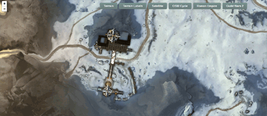
Leaflet Map Tile Layers
June 30, 2014
24 Hours of Global Happiness
June 30, 2014
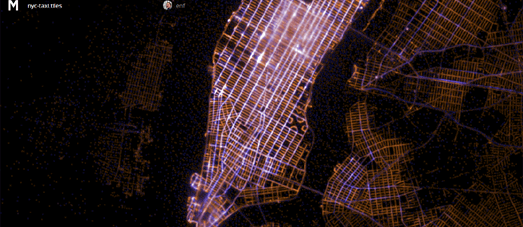
Where the World Runs
June 29, 2014
The Maps of the Week
June 29, 2014
OpenStreetMap Worldwide Coverage
June 28, 2014
43,634 Street View Houses in Detroit
June 28, 2014
Mapping Well-Being
June 27, 2014
Create Flickr & Google Location History Timeline
June 27, 2014
First World War Trench Maps
June 27, 2014
How WWI Changed the Map of Europe
June 27, 2014
The Ever Changing Map of Europe
June 26, 2014
The Top Ten Torque Maps - With No Football
June 26, 2014
Outdoor Swimming in Berlin
June 26, 2014
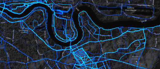
Reel-Time Traffic
June 25, 2014
Interactive Transit Maps
June 25, 2014
The Road to the Sun
June 25, 2014
If you want to be happy move to Rutland
June 24, 2014
A Gorgeous Novel Map
June 24, 2014
Gender Mapping
June 24, 2014
Neon Lights on the Map
June 23, 2014
Neon Maps
June 23, 2014
Crime on the New York Subway & in DC
June 23, 2014
More 3d Building Maps
June 22, 2014
The Maps of the Week
June 21, 2014
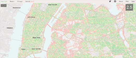
How safe is New York?
June 20, 2014
Jogging Around the World
June 20, 2014
Urban Renewal in New York
June 20, 2014
Mapping Global Child Mortality Rates
Newer Posts
Older Posts
Home