A World with Wide Borders
We are all used to choropleth maps being employed as a way to visualize the socio-economic performance of countries around the world. Choropleth maps are a great way to provide a global picture of different socio-economic indicators. They can effectively provide an overview of which countries are performing better and which countries are struggling within a particular socio-economic indicator.
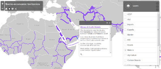
Socio-Economic Tectonics however employs a different method to visualize socio-economic indicators which, instead of providing an overview, highlights the areas of the world where there are glaring dissimilarities in socio-economic performance between neighboring countries.
Country borders are used on the map to show socio-economic differences between adjoining countries. These differences are represented graphically on the map by the width of country borders. The wider the border between two countries then the bigger the difference in the selected socio-economic indicator.
Twenty different indicators in all can be viewed on the map, organized into five categories: economy, disease and death, people and environment, technology and health. If you click on a country border you can discover the actual dissimilarity ratio between the two neighboring countries for the selected indicator.
Obviously if you want to provide a global overview of a geographical dataset you would probably decide to use a choropleth map. However socio-economic tectonics is a great way to visualize the differences between neighboring countries. Of course, there is no reason why you couldn't employ both visualization methods on the same map.
Comments