The Magnificent Maps of the Week
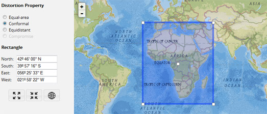
If you want a little help deciding which map projection you should use for your current map project then you should use this map Projection Wizard. The Projection Wizard was a clear winner this week with readers of Maps Mania. It was both the most read post and the most shared on social media.
This Projection Wizard allows you to select the extent of the map view which you are working with by outlining the area on a Leaflet map. Once you've highlighted your map bounds you can choose a distortion property (Equal-area, Conformal, Equidistant or Compromise).
The Projection Wizard will then suggest which map projection you should use depending on the extent and the distortion property of the map. The suggested projections are based on 'A Guide to Selecting Map Projections' by the Cartography and Geovisualization Group at Oregon State University.
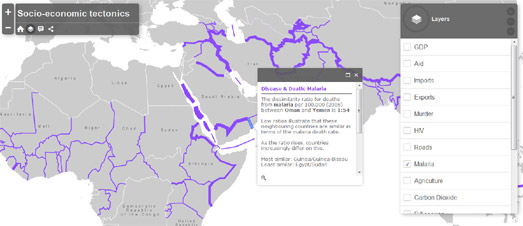
This week I was also impressed with CartoNerd's method for highlighting large socio-economic differences between geographical neighbors.
We are all used to choropleth maps being employed as a way to visualize the socio-economic performance of countries around the world. Choropleth maps are a great way to provide a global picture of different socio-economic indicators. They can effectively provide an overview of which countries are performing better and which countries are struggling within a particular socio-economic indicator.
Socio-Economic Tectonics however employs a different method to visualize socio-economic indicators which, instead of providing an overview, highlights the areas of the world where there are glaring dissimilarities in socio-economic performance between neighboring countries. Country borders are used on the map to show socio-economic differences between adjoining countries. These differences are represented graphically on the map by the width of country borders. The wider the border between two countries then the bigger the difference in the selected socio-economic indicator.

I do like it when developers use online mapping libraries to create interactive image maps. One of the best non-cartographic uses of the Google Maps API is this Interactive Metabolic Pathways Map.
A metabolic pathway is a series of chemical reactions occurring within a cell. Each metabolic pathway consists of a series of biochemical reactions that are connected by their intermediates. The Interactive Metabolic Pathways Map allows you to explore all the metabolites, enzymes, and selected pathways.
What is particularly impressive about this image map of the metabolic pathways is that it is fully interactive and searchable. You can select any of the carbohydrates, amino acids, lipids or purines & pyrimidines on the pathways map to learn more about its role in the metabolic pathway. You can also search for any of the features by name to quickly locate them on the map.


Comments