Mapping the Transatlantic Slave Ships
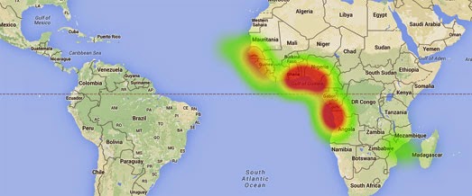
Earlier this year Professor Adam Rothman and Matt Burdumy of Georgetown University created a series of heat-maps using data from the Transatlantic Slave Trade Database to visualize 35,000 slaving voyages (from 1500 to 1870).
Their visualization of the Transatlantic Slave Trade Database consists of three animated heat-maps showing the cumulative frequency of slave ship points of departure, the principal ports where slaves were purchased and the principal ports where the slaves were sold.
During the animation on each map a cumulative heat-map appears, revealing the pattern of slave voyages over time. For example, the map of slave voyage departures reveals how Portugal and Spain's early dominance of the transatlantic slave trade was quickly overtaken by the emergence of British slave traders.
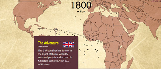
Slate has now also created a mapped visualization of the Transatlantic Slave Trade Database. Slate's Atlantic Slave Trade in Two Minutes animates the actual journeys of the slave ship journeys over 315 years.
The map visualizes the scale of the transatlantic slave trade over the centuries. It also reveals the patterns of the trade routes used and the destinations of the slave ships. The size of the ships on the map are scaled to represent the number of slaves on board. You can also click on each ship to find out which country's flag it sailed under and more about its role in the slave trade.


Comments