Thursday, May 31, 2012
Modern Land Art on Google Maps
The Museum of Contemporary Art (MOCA) is currently holding an exhibition on Land art, "capturing the simultaneous impulse emergent in the 1960s to use the earth as an artistic medium and to locate works in remote sites far from familiar art contexts". The exhibition runs until September 3rd.
Even if you can't get to MOCA to view the exhibition then you can still view an accompanying interactive application that maps key artworks in the exhibition. Ends of the Earth: Land Art to 1974 uses Google Maps and Google Street View to pinpoint the original locations of the featured artworks.
For each artwork it is possible to view a satellite image, or a Street View image where available, of the artwork's location. It is also possible to view a photograph of the work of art in situ overlaid on top of the Google Map or Street View.
Introducing Google World Wonders
World Wonders is a new project from Google that allows you to take a virtual trip around 132 of the World's most famous historical and cultural sites. The sites includes historically important locations, such as Stonehenge and Pompeii and also natural wonders, such as the sandy dunes of Australia’s Shark Bay and the rock domes of Yosemite National Park.
Google World Wonders uses Google Maps, Google Street View and Google Earth 3d models to explore these 132 historical locations. Each location also includes YouTube videos and photographs from Getty Images. Information about each location is also provided by the UNESCO World Heritage Centre.
Google World Wonders also includes a great Education section with downloadable resources for history and geography students and guides for primary and secondary school teachers.
Via: Google: Official Blog
Brazillian Real-Estate on Google Maps
These days I rarely get excited by real-estate maps but I do love Epungo. This Brazilian real-estate map truly is a thing of beauty.
The map includes a radial and polygon search tool that allows the user to closely define the area that they wish to search for properties. The search results can also be refined by using the slide controls to define the price, number of rooms and the floor area.
None of these features are exactly new to real-estate maps but Epungo has brought them together in one gorgeous package. I also really like the step-by-step walk-through of the search tools that the site offers when you first load the map.
Wednesday, May 30, 2012
The Geography of Incarceration
Josh Begley, a graduate student studying Interactive Telecommunications at New York University has created a website showing the satellite images of correctional facilities in the U.S.. The page shows the satellite images of around 700 U.S. prisons (which is about 14% of the total number of prisons).
Prison Map is a great resource for anyone who is interested in the geography of incarceration. For example it would be interesting to analyse the images to see how many of the prison buildings were influenced by Jeremy Bentham's Panopticon designs.
Josh used the Google Static Maps API with a little self-written hack to save each map tile as an image file.
To find the locations of the prisons Josh used Prisoners of the Census' Correctional Facility Locator 2010, which allows you to search for and view on Google Maps all correctional facilities counted in the 2010 Census.
Italian Prisoner Deaths on Google Maps
Italian journalist Jacopo Ottaviani (twitter.com/jackottaviani) has been investigating the deaths of prisoners within the Italian justice system. You can read Jacopo's report in Il Fatto Quotidiano (Italian) or in the Guardian (English).
Using a Google Map Jacopo has plotted nearly a thousand prisoner deaths from 2002 until 2012. At different zoom levels you can view pie charts on the map showing the percentages of the causes of death in that region. The figures show that over half of the deaths in Italian prisons are the result of suicide.
In the Guardian Jacopo explains how he created the map. The "Data was scraped using ScraperWiki and refined with Google Refine; the resultant tables were merged using Google Fusion and finally visualised through Batchgeo."
Tuesday, May 29, 2012
New 45° Imagery for 26 Cities
Wawel Royal Castle, Kraków
Google Maps has new 45° imagery for 16 U.S. and 10 international locations, including the first 45° imagery for Poland and Ireland.
The full list of updated cities:
US: Albany, GA (outskirts); Atascocita, TX; Clarksville, TN; Columbia, MO; Corpus Christi, TX; Fayetteville, NC; Fort Collins, CO; Fort Smith, AR; Greensboro, NC; Jackson, TN; Lafayette, LA; Plaquemine, LA; Pueblo, CO; Santa Fe, NM; Texarkana, AR; Tyler, TX
International: Bern, Switzerland; Cracow, Poland; Dublin, Ireland; Gdansk, Poland; Lugo, Spain; Ourense, Spain; Poznan, Poland; Warsaw, Poland; Wroclaw, Poland; Zurich, Switzerland
You can check out some of my favorite 45° views in this Aerial View Slideshow.
Via: Google Lat Long
The 2011 Canadian Census on Google Maps
More data from the 2011 Canadian Census was released today. Global News has acted quickly to update its 2011 Census Google Maps, in particular adding new data about sex and age.
Global News has created census maps for a large number of Canadian cities. The new data allows users to explore the median age in different neighbourhoods, find out which areas are getting older and which areas have the most men or women
Video Tracking with Google Maps
Ubipix allows anyone with a smartphone to capture, tag, upload and share video or photo collections and view the submissions on a Google Map.
Using the Ubipix application on your phone allows you to capture video alongside a GPS track. Once you have captured your video (or photographs) you can view and share the video on the Ubipix website. The video is automatically synchronised with a Google Map, so as you watch a video you can also view the location of the camera and its direction during the video's capture.
Below the video and the Google Map you can also view other data, such as the speed and distance travelled whilst shooting the video.
Creating Heat Maps with the Google Maps API
HeatmapTool is a service for easily creating heat maps with the Google Maps API.
To create a heat map with HeatmapTool the user simply needs a comma separated values file (CSV) of their location data. The tool includes a number of options to customise the colors used, the size of the spot radius and the opacity of the heat map overlay.
The free version of HeatmapTool allows the user to create heat maps with up to 100 data points and allows for 500 hits per day.
Monday, May 28, 2012
Rebuilding L'Aquila with Google Maps
In 2009 an earthquake in the Italian city of L'Aquila caused the death of 308 people and damaged many of the town's historically important buildings. Noi L'Aquila is a Google Map developed by Google in partnership with the City of L'Aquila, the ANFE (Associazione Nazionale Famiglie Emigrati), the University of L'Aquila and the architect Barnaby Gunning.
The map aims to capture the memories of the citizens of L'Aquila and help speed up the reconstruction of the city. It provides a means for the town's inhabitants to record their memories of the town and at the same time to inspire the future of L'Aquila visualising its reconstruction with 3D models.
Users of the map can submit photographs and videos to a Google Map and also contribute text about their memories of locations throughout the town. The map also includes an option to view the town with the Google Earth browser plug-in. In the Inspire the Future section of the site users can contribute 3d models to help visualise and shape the reconstruction of the town.
German Bike Routes on Google Maps
Naviki is a German bike route application. The application uses Google Maps with OpenStreetMap cycling route data to help cyclists find the shortest or most cycle friendly route between two locations.
Users just need to add a starting location and a destination and select whether they want the shortest or the most bike friendly route. The bike friendly route takes into consideration altitudes and congestion in calculating a route optimised for cyclists.
The calculated route is displayed on a Google Map alongside an elevation profile and details such as the distance of the route and an estimated time for the journey. The waypoints of the calculated route can also be downloaded for GPS units.
Amsterdam Soil Quality on Google Maps
The Amsterdam City Council Planning Department has used the Google Maps API to provide a map of the city's soil quality.
Bodemkwaliteit Amsterdam displays a number of different zones in Amsterdam, demarcated by soil quality. The map can therefore be used to determine the potential re-use of excavated soil, from the location of its excavation. The different zones on the map are color-coded by type of soil. The green and blue zones on the map indicate cleaner soil and the red zones indicate heavily contaminated soil.
Sunday, May 27, 2012
The Google Maps of the Week
Over the last couple of years there has been a number of clever promotional campaigns by companies using the Google Maps API (often taking advantage of Google Maps Street View imagery). Two of my favorite maps featured on Google Maps Mania this week were from Toyota and Moët & Chandon.
Both companies have managed to create campaigns with Google Maps that reflect some of the core values associated with their products and at the same time create interactions with potential customers.
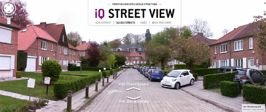
Toyota has come up with one of the best Google Maps based promotional campaigns yet. To help promote the car the company are driving a Toyota IQ around with a 360 degree panoramic camera rig strapped to the roof. They are then capturing Street View images and filling in all the blanks on Google Maps.
The campaign, currently running in Belgium, allows anyone to report a street that doesn't have Street View on the Toyota IQ - Street View Google Map. The Toyota IQ then travels to the street, captures the Street View images and adds them to their Toyota IQ map.
If you can't afford to whisk the love of your life off for a romantic weekend in Paris you could try sending her a romantically tagged Street View image from the city instead. You never know it just might work.
Tag Your Love in the Streets is a nice Street View based promotional campaign by Moët & Chandon. Using the application you can select a Street View image from anywhere in the world and then add your own message. You can add text to the image and decorate the scene with a number of romantically themes images, such as flowers, hearts or a bottle of champagne.
The island of Sumatra in Indonesia has lost almost 50% of its tropical rainforest in the last 35 years. The World Wildlife Fund, Eyes on the Forest and Google Earth Outreach have joined forces to create a Google Map of land cover, land use, and land users in Sumatra.
Eyes on the Forest: Sumatra allows users to explore data about the island's conservation values, forest diversity and wildlife. The aim of the map is to increase transparency about the threats to the Sumatran environment and identify the drivers of deforestation and habitat destruction.
It is possible to view a number of data layers on the map, including the dwindling rainforest cover over the last 35 years, wildlife ranges, protected areas and natural carbon stores.
Saturday, May 26, 2012
Vintage Film on Google Maps
I've added a few more archive videos to my Street View application There and Then. The app allows you to watch historical films embedded on a Google Maps Street View image of the same scene, as it looks today.
If you like this sort of thing you should also check out Historypin, which now also includes a few early film scenes, dotted in amongst all the user submitted historical photographs.
Friday, May 25, 2012
Drive the Indianapolis 800 in Street View
Google has added Street View imagery for the Indianapolis Motor Speedway. You can use the link above to visit the track on Google Maps.
However, for those too lazy to click the forward button 200 times, I've quickly put together an animated lap of the track. Check out the animation and make sure you press the 'speed x2' button for the full racing effect.
Via: Google Lat Long
Monitoring Water Points with Google Maps
Water for People is a Google Maps reporting system used to monitor and record data from tens of thousands of water points around the world.
Using smartphones community members, partners and volunteers are able to report the status of water points and whether a project is up and running, broken, or on the verge of disrepair and requiring maintenance.
Markers on the map are color-coded to instantly show if a water point has a high, medium, basic or no service.
Friday Fun with Google Maps
Street View Funny created this compilation video of over 850 funny Google Street Views posted on the site over the last few years.
Google has created a nice Street View Galleries Collection for those looking for a little virtual stroll around the world's art.
Here's a little clue about how long Google took to capture the Street View imagery in Estonia. This road in Tartu has different Street View imagery depending on which side of the road you drop the pegman icon.
One side of the road shows you Estonia in winter. Travel over the road and suddenly it's summer.
Thursday, May 24, 2012
BioFuel Resources on Google Maps
The National Renewable Energy Laboratory (NREL) has created a BioFuels Atlas using the Google Maps API. The map shows the locations of biomass resources in the U.S..
Using the map it is possible to view overlays of bioenergy and brownfield sites, distribution infrastructure, and power plants. The 'State View' option allows the user to zoom in on a selected state and view a summary of traditional and bioenergy infrastructure in the state beneath the map.
The map also includes an analysis tool that allows the user to select a point on the map and convert the biomass resources within a specified area into potential biofuel production.
Telling Stories with Google Maps
Meograph is an interesting new narrative tool for telling stories with the Google Earth browser plug-in and Google Maps.
The application is currently in beta testing (you can apply for beta testing access). However, even if you can't yet create your own Meographs yet, you can browse the demo stories already created.
A good example is the Meograph created to explore the Trayvon Martin shooting. The demo uses the Google Earth plug-in to show the locations in the case and includes a narrated explanation of the story and embedded photographs and YouTube videos.
Meograph stories include playback controls to pause, rewind and fast forward the narrative, "More context" buttons to explore more details about any element of the narrative and options to view the locations with Google Maps rather than the default Google Earth view.
The Street Views of San Francisco
The Streets of the Invisibles is an experimental film that uses sound from the 1970's TV series the Streets of San Francisco with images taken from Google Maps, Google Street View and Google Earth.
Wednesday, May 23, 2012
Climb Every Mountain with Google Maps
The Guardian newspaper has published a visualisation by data scientist Robert Mundigi exploring the world's 50 highest peaks.
Climb Every Mountain features a clickable (non Google) map of the 50 summits that is synchronised with a Google Map to show the satellite images of each mountain. The visualisation also features data about each mountain's prominence and elevation.
All the different data panels in the visualisation are interlinked so that the Google Map always displays the mountain whose data is currently being explored.
Songs from Strangely Isolated Places
The Places Series is a Google Map of songs inspired by isolated locations. Using the map you can select a marker and listen to the song inspired by that location.
The information windows are particularly attractive on this map and allow the user to listen to the mapped music tracks directly from the map. It is also possible to filter the tracks displayed on the map by genre and by artist.
Toyota are Filling in the Street View Blanks
Toyoto has come up with one of the best Google Maps based promotional campaigns yet. To help promote the car the company are driving an IQ around with a 360 degree panoramic camera rig strapped to the roof. They are then capturing Street View images and filling in all the blanks on Google Maps.
The campaign, currently running in Belgium, allows anyone to report a street that doesn't have Street View on the Toyota IQ - Street View Google Map. The Toyota IQ then travels to the street, captures the Street View images and adds them to the map.
The purple map markers with white dots indicate the streets that the Toyota IQ has visited. If you click on a marker you can then visit the street using the Toyota custom Street Views.
The Sumatran Rainforest on Google Maps
The island of Sumatra in Indonesia has lost almost 50% of its tropical rainforest in the last 35 years. The World Wildlife Fund, Eyes on the Forest and Google Earth Outreach have joined forces to create a Google Map of land cover, land use, and land users in Sumatra.
Eyes on the Forest: Sumatra allows users to explore data about the island's conservation values, forest diversity and wildlife. The aim of the map is to increase transparency about the threats to the Sumatran environment and identify the drivers of deforestation and habitat destruction.
It is possible to view a number of data layers on the map, including the dwindling rainforest cover over the last 35 years, wildlife ranges, protected areas and natural carbon stores.
Tuesday, May 22, 2012
Google Maps Eating Raspberry Pi
UK school student Ryan Walmsley had a little time to kill whilst he was waiting for the delivery of his Raspberry Pi so he decided to create a Google Map of Raspberry Pi owners.
The Raspberry Pi Map shows the rough location of Raspberry Pi owners who have already added themselves to the map. The map is only a day old and already shows over 400 Pi owners. 20,000 Raspberry Pis have been delivered so far so there are a lot of other Pi owners out there who can add themselves to the map.
The Raspberry Pi is a credit-card sized computer that plugs into your TV and a keyboard and costs just $25.
Tag Your Love with Google Maps Street View
If you can't afford to whisk the love of your life off for a romantic weekend in Paris you could try sending her a romantically tagged Street View image from the city instead. You never know it just might work.
Tag Your Love in the Streets is a nice Street View based promotional campaign by Moët & Chandon. Using the application you can select a Street View image from anywhere in the world and then add your own message. You can add text to the image and decorate the scene with a number of romantically themes images, such as flowers, hearts or a bottle of champagne.
When you have completed your message you can share it on Facebook, Twitter or directly e-mail a link to your romantic scene.
Also See
Tiffany & Co - Love is Everywhere - share your favourite romantic locations with this app from Tiffany & Co
American Legislation on Google Maps
Where a Bill Becomes Law is a fun and educational application for exploring the status of U.S. legislation.
Users of the map can search for legislation using the Google Maps themed search box. Bills that match the search term are then listed in the map sidebar. Selecting an individual bill will bring up its data, including sponsor information, a list of titles, the official summary, and the series of steps that constitute the bill's legislative history.
Clicking on a step in the the bill's legislative history will show the corresponding path on the map. The developers of Where a Bill Becomes Law say that the map location is provided to help demonstrate that legislative decisions are made in real buildings in the real world.
Monday, May 21, 2012
Street View Imagined Landscapes
Today I came across this, which immediately made me think of this which in turn gave me the idea for this - Street View Art.
Essentially in this little Street View project I've embedded Street View images inside other (different) Street View images to create new imaginary landscapes. So far I've created just ten new landscapes using different Street View images from around the world.
My plan is to create more imagined landscapes when I have the time and turn the application into a slideshow, which will automatically play through each image in turn.
Mapping with Drones - Part Two
There are now quite a few cheap(ish) solutions for capturing aerial imagery with balloons, kites or UAV's (see this Mapping with Drones post).
Pix4d's low altitude aerial imagery software can help turn captured aerial imagery into a full 3d map of an area. The Pix4UAV showcase demonstrates a number of example Google Maps displaying aerial imagery captured by different UAVs and processed by Pix4UAV.
This is impressive in itself but Pix4D can also generate 3d images from the 2d aerial imagery. Check out the video below to see how Pix4d can create 3d models from aerial photographs.
Bike Lane Offenders on Google Maps
<
From the same brains behind Uncivil Servants, the crowd-sourced Google Map for reporting illegal parking in New York, comes this map for reporting illegal car parking in bike lanes.
MyBikeLane is a map reporting system for reporting vehicles parked illegally in bike lanes. The system is active in a large number of cities around the world. To report a car with MyBikeLane the user just needs to take a photo of the offending vehicle and jot down its license plate number.
The MyBikeLane map for each city shows the location of all the submitted reports. The map sidebar provides a league table of the worst offending vehicles in the city. The licence plate number of the most reported cars are listed in descending order in the sidebar.
Sunday, May 20, 2012
The Google Maps of the Week
The Map Developers Award for Innovation this week must go to The Twin Cities Storm Ready Map, an interesting Google Map showing the time-line of a simulated tornado storm hitting Minneapolis–Saint Paul.
The map, created by Minneapolis Public Radio, shows the likely effects of a tornado hitting the Twin Cities and features a really clever time-line control. To navigate through the time-line of the simulated storm the map user just needs to use the browser scrollbar.
As the user scrolls down on the page the Google Map stays stationary in position on the page but the time-line progresses and the scrollbar even initiates events on the map. To achieve this effect the map uses the Waypoints jQuery plugin.
The most shared post on Google Maps Mania this week was the new Made in NY map of New York's digital industry. The map shows the locations of over 500 homegrown startups, investors and coworking spaces across the city.
As well as showing the extent of New York's tech industry, the map can also help you find a position in Silicon Alley. Those companies that currently have positions available are indicated with a 'We are hiring' link in the map sidebar.
Derek Eder's Searchable Map Template with Google Fusion Tables is a free, open source tool that can help you create a searchable, filterable Google Map from a Fusion Table.
The template can create a Google Map pulling in data from any Fusion Table. It includes a number of features, including, an address search (with variable radius), geolocation (automatically center the map on the user's location), results count (using the Google's Fusion Tables API) and the ability to easily add additional search filters (checkboxes, sliders, etc).
Derek Eder's website includes a number of maps created with the template. These include Derek's own maps, mainly centred on Chicago and lots of maps created by others with the template.
Saturday, May 19, 2012
F..king Advice from Google Maps
The 'Where Should I F..ckin Go' franchise is expanding. In December we saw the launch of Where the F..k Should I Go for a Drink?, a simply Google Maps based app that gives users useful, if slightly rude, advice about where they should go for a drink.
Now you can also get advice on nearby places to eat with Where the F..k Should I go to Eat?. The swearing nomenclature may be a bit of a gimmick but the application is actually very useful. The simple design and no frills approach actually works perfectly on a smart-phone.
If you are out and about and you want some quick advice about a nearby bar or restaurant then this app is perfect. It shows you a nearby restaurant and even shows you on a Google Map how to get there from your current location. If you don't like the restaurant suggested you can quickly move on to the app's next suggestion.
Friday, May 18, 2012
2012 Solar Eclipse Maps
The HeyWhatsThat: Eclipses Map uses two synchronised Google Earth maps to show the path of this Sunday's solar eclipse.
One map shows the path of the solar eclipse on a map of the Earth and the other map displays a planisphere showing the path of the moon across the face of the sun. If you press the play button you can watch an animation of the eclipse as it will be seen from anywhere along the path.
If you can't manage to get to a location that gives you a view of the full solar eclipse you can use the application to find out if you can view a partial eclipse from your location. Just drag the purple square on the left hand map to a location to observe what the eclipse will look like from that location.
The NASA 2012 Solar Eclipse Map uses Google Maps to also show the path of the solar eclipse.
You can lick anywhere on the map to mark a position and calculate the eclipse times from that location. For example, in San Francisco you can view a partial eclipse starting at 5.16 pm.
Toxic Waters on Google Maps
The New York Times Water Pollution Map is a Google Map of over 200,000 facilities in the U.S. which have permits to discharge pollutants.
Users can search the map by state. Each state map shows at a glance all the polluting facilities. The blue markers on the map indicate facilities that have not violated their permits and the orange markers show the facilities that have one or more violations.
If you click on a map marker details about the selected facility are displayed beneath the map, including information about violations, fines charged and enforcement actions.
Thursday, May 17, 2012
An Interactive Street View Campus Tour
The Rochester Institute of Technology Street View Tour is a nice narrated tour of the RIT campus using Google Maps Street View images captured by the Street View trike.
The tour provides a narrated guide to ten different areas across the Rochester campus. Each stop on the tour also features videos, pictures, and social media streams about each location.
The tour was created with Popcorn.js, an HTML5 javascript library for creating time-based interactive media. Another nice Google Maps tour created with Popcorn.js is History in These Streets, a virtual recreation of the Black Panther Legacy tour that the Huey P. Newton Foundation conducts in West Oakland.
Hat-tip: Street View Funny
2012 London Olympics Torch Relay Maps
The Olympic flame is today being handed to the organisers of the London Games at a ceremony in Athens. The flame will arrive in the UK on Friday before it starts on an 8,000 mile journey, in a 70-day relay, to arrive at the Olympic Park in Stratford, London in time for the start of the 2012 London Olympics.
Follow the Flame with Figures is a Google Map and calendar of the Olympic torch's route around the UK, created by the UK's Office for National Statistics. The map shows the route that the torch relay will take and includes a calendar function to see where the torch will be on a particular date. The map includes a postcode search function to find out where and when the relay will pass a particular location.
The map also includes data from the Office for National Statistics. Users can click on every stop on the map and find out some key statistics for that area, such as unemployment, population etc.
The Official 2012 London Olympics website has a Bing Map of the Olympic Torch Relay Route.
The official map allows users to zoom in to see the detail of the route street-by-street. It includes a postcode search function to find out where and when the Flame will be near a location. You can also use the map to find the locations of evening celebrations, which take place at the end of almost every day of the relay.
Tripline has about three pages of animated localised maps that its users have created of the torch relay route through their neighbourhoods and towns.
There are too many maps to list them all. If you want to know if someone has created a map for a particular area just click on the Tripline link above, which will take you to the search results page for 'Olympic Torch Relay'.
Revolutionary Scrollbar Map Control
The Twin Cities Storm Ready Map is an interesting Google Map showing the time-line of a simulated tornado storm hitting Minneapolis–Saint Paul.
The map, created by Minneapolis Public Radio, shows the likely effects of a tornado hitting the Twin Cities. The simulated effects of the storm are partly based on asking people along the path of the simulated tornado what their preparations for a storm are.
The map itself features a really clever time-line control. To navigate through the time-line the map user just needs to use the browser scrollbar. As the user scrolls down on the page the Google Map stays stationary in position on the page but the sidebar scrolls down the time-line and the map updates to show the scenario for that part of the simulated storm.
This is the first time I've seen the browser scrollbar used to control a Google Map. Somehow I don't think it will be the last, as it is a very effective method for presenting a time-line on a Google Map.
Wednesday, May 16, 2012
Silicon Alley & Roundabout on Google Maps
Made in NY is a Google Map of New York's digital industry. The map shows the locations of over 500 homegrown startups, investors and coworking spaces across the city.
It is possible to refine the companies shown on the map by 'Digital Companies', 'Investors' and 'Coworking / Incubator Spaces'. As well as their locations being displayed on the map the companies are also listed in the map sidebar.
If you are currently looking for work in New York's tech industry then check out the companies listed in the sidebar. Those companies that currently have positions available are indicated with a 'We are hiring' link.
Tech City Map is a visually striking Google Map of the technology companies and startups in east London.
The map shows the locations of London's silicon roundabout area. The 'show networks' option on the map allows users to visualise the connections between the over 800 companies. If you click on an individual map marker there is also an option to view the latest Tweets from the selected tech company.
Isometric Maps of the World
Edushi has been creating interactive isometric maps of Chinese cities for a number of years. They have now created maps for all the major Chinese cities.
You can find links to all the Chinese city maps on the Edushi website. The links are all in Chinese. Here are some quick links to view the maps for Honk Kong, Beijing and Shanghai.
Youcity has created similar isometric maps for New York and San Francisco.
The Reykjavik Center Map is a gorgeous hand drawn isometric map of the Icelandic capital. The map includes a number of map markers which give the user information about landmarks in the city.
OpenStreetMap Isometric 3D Maps is a series of isometric maps built on OpenStreetMap map tiles. The maps have been created with open source software (links to the code on github are provided).
These isometric maps are not as visually effective as the other examples but this is an interesting open source project built on open source map tiles. I'm sure that developers will build on this platform and create more attractive isometric building models in the future.