3D Hexagonal Cartograms

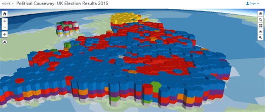
After last years' UK election many of the best mapped visualizations of the results used 2d hexagon grid maps. Esri has now taken this a stage further by adding an extra dimension to create a 3d hexagonal cartogram of the 2015 UK election results.
Political districts are usually based on equal population areas and not on equal geographical areas. The result of this is that densely populated urban areas traditionally have more election districts by area than less populated rural areas.
This can present a problem when visualizing election results using a traditional choropleth map, For example, in the UK the Conservative Party traditionally performs better in rural areas and the Labour Party gets more votes in inner cities. Therefore if you color election districts on a map based on the winner in each district you tend to present a picture of the UK where most of the country appears to have voted Conservative - even if the election result is actually much closer.
Hexagon grid maps help to overcome this problem by ignoring the geographical size of each election district and presenting each district as an equally sized hexagon. Geographically accuracy is therefore partly sacrificed in favor of a more accurate representation of the number of election districts won by each political party.
The Political Causeway - UK Election Results, created by Esri's Kenneth Field, overlays a 3d hexagonal cartogram on top of a 3d map of the UK. The main advantage of using 3d cartograms is that the map can not only show the winners in each election district but can also represent voter turnout and the percentage of votes won by each party.
On the map four layers of stacked hexagons show the number of votes cast for each political party. The height of each hexagon represents voter turnout. The winner of each district appears on top of the stack and the colors represent the political parties.
The disadvantage of such an approach is that you can only really see all four stacked hexagons in election districts around the edge of the map. In election districts that appear in the middle of the country you can only see the top stack. The map overcomes this problem by allowing you to turn each of the four layers in the stack on & off. The map also allows you to view the election results as nested, proportional symbols. This allows you to view the map as a more traditional 2D hexagonal cartogram, from above.


Comments