Friday, September 30, 2016
Mapping the Aliens
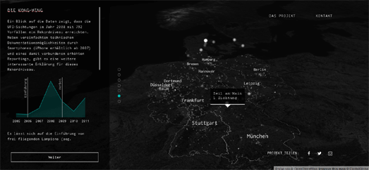
Germany has a growing problem with illegal aliens (the kind that come from outer space). Since 1945 almost 9,700 UFOs have been spotted in Germany. The number of these sightings has increased significantly since 2007.
Im Land der Untertassen shows all UFO sightings in Germany from 1945 to 2016, reported to the German Society for UFO Research (DEGUFO). The map provides a number of map views analyzing different aspects of the UFO sighting data. For example, the map shows how the number of sightings is closely related to population density. Im Land der Untertassen speculates that this might be down to the number of people in cities. It may also be due to the closeness to artificial light sources and different types of air traffic.
The map also explores a number of locations away from high urban populations that have recorded high numbers of UFO sightings. Im Land der Untertassen believes that the huge spike in UFO sightings since 2007 could be due to the rise in mobile telephones with built-in cameras.
The UFO Sightings Map plots over 90,000 reports of UFO sightings since 1905 in the USA. The map uses data from the National UFO Reporting Center.
UFO sightings are shown on the map using scaled map markers. The size of each marker relates to the number of eye witnesses. If you select a marker on the map you can actually read the witness reports. Many of the reports are accompanied by videos or pictures recorded by the eye witnesses.
For a number of years UFO Stalker has been using the Google Maps API to show the locations of the latest UFO reports to MUFON (the Mutual UFO Network).
The map includes a number of filters, which allow you to filter the aliens on the map by date and the type of close encounter. If you click on a map marker you can read the event details of the reported sighting. It is also possible to search the map by location and date and view the latest reports in list format.
Misty Mountain Mapping
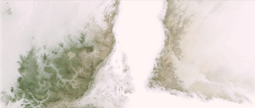
Misty Mountains is an interesting Esri Story map explaining how a nice mist effect can be created on digital maps by adjusting the opacity levels of elevation data.
To achieve this mist effect lower elevated areas on a Digital Elevation Model are made more opaque and higher elevated areas are made more transparent. The result is that fog or mist appears to be rolling along the valley floors of your map.
The Misty Mountains Story Map goes into more detail about how you can achieve this effect by using a gradient opacity level on your elevation data in ArcGIS Pro. It also include a number of example maps of the effect applied to different mountain ranges around the world.
The Story Map also includes an animated example of a Norwegian mountain range where the mist appears to start on the valley floor and roll upwards to cover the whole of the mountains.
You could use a similar technique to give the appearance of snow levels creeping down a mountain range as winter progresses. To do this you would just need to reverse your opacity / transparency gradient, so that higher elevations are made more opaque and lower lever are made more transparent on the map. You could then increase the transparency of the lower elevated areas on your DEM over time to give the appearance of snow cover creeping lower down mountains over the winter.
Thursday, September 29, 2016
The Street Sounds of San Francisco
What are the distinctive sounds of San Francisco? The SF Bay Area Sound Map might be able to answer that question with its interactive Google Map documenting and presenting the sonic experiences of the city and surrounding areas.
Using the map you can listen to sound recordings captured at locations throughout the Bay Area, from the wailing sirens of San Francisco's early warning system to the cries of 'hot chocolate' & the cheers of the crowd at a Giants game.
To listen to the contributed sounds you just need to click on a marker on the map. You can filter the sound recordings shown on the map by city, tags and by the date the sound was recorded. If you log-in to the map with a Google account you can even add your own recorded sounds to the map.
Check out the Sound Maps tag on Maps Mania for more maps of soundscapes, accent & dialect recordings and the sounds of nature around the world.
Mapping 18th Century London
In the Eighteenth Century 'Grub Street' in London became the home to a concentration of impoverished writers, aspiring poets and low-brow publishers & booksellers. The literary occupants of Grub Street tended to work at the margins of London's journalistic and literary scene. Hence 'working in Grub Street' has become a pejorative phrase used against writers or 'hacks' who work for hire and are prepared to prostitute their art for profit.
The Grub Street Project is attempting to document and map London's literary and publishing scene in the 17th & 18th Centuries. As part of this project it has created a number of interactive vintage maps of London. These maps are then being used to show the locations important to London's emerging publishing & literary scenes and their associated trades.
So far the Grub Street Project has created a number of interactive versions of original 18th Century maps. At the moment Strype's 1720 Plan of the City of London, Westminster & Southwark is the only map which contains a number of layers which can be overlaid on the map. Strype's 1720 map includes layers showing the locations of coffee houses, taverns & inns and a place index providing information about London's 18th century roads and streets.
Locating London's Past is another superb tool for exploring Eighteenth Century London life. The site uses John Rocque’s 1746 map of London as the basis for exploring many aspects of London life during the Seventeenth and Eighteenth Century.
The data sets that can be viewed on the map include records of Old Bailey Proceedings, coroner's records, historical directories, plague deaths, archaeology finds and much more. The interactive map includes the option to switch between Roque's 1746 map and Google's modern map of London.
Wednesday, September 28, 2016
The Blocked Arteries of America's Roads
Metrocosm has created an interesting animated map of 24 hours worth of traffic on the U.S. Interstate Highway System. The US Highway Map visualizes an average day's traffic on the highways by hour of the day.
The simple visual metaphor used in this map is that the U.S. Interstate Highway System resembles the human circulatory system. As the map plays through an average day's traffic you can observe how the arteries become blocked at times of high road usage.
The data for the map is from the Department of Transportation. The map itself was custom made in WebGL with a little help from Three.js and D3.js. The map is actually in 3d so, if you want, you can rotate the map by left clicking on the map and dragging it around. You can also use your mouse's scroll wheel to zoom in & out on the map.
Play the 2016 Ryder Cup on Street View
If you can't wait until Friday for the 2016 Ryder Cup to begin then you might want to whet your appetite by exploring the complete Hazeltine National golf course in Street View.
Google Maps, Ubilabs and Turner Sports have collaborated to create a truly impressive immersive tour of the course. The Hazeltine Explorer provides you with a first hand experience of all 18 holes of the Hazeltine National and allows you to virtually explore the tees, fairways and greens on Google Maps Street View.
You can use the Hazeltine Explorer Google Map, showing a satellite view of the course, to navigate to any hole on the course. Click on a hole number on the map and you can explore the hole, from tee to green, using Google's 360 degree panoramic imagery. The Hazeltine Explorer also includes a video flyover and a short description of all 18 holes. There is also an audio guide to each hole, with a few tips on how the Ryder Cup players might approach playing each hole.
Tuesday, September 27, 2016
The Great Smoky Mountains Species Map
The Great Smoky Mountains National Park is home to over 1,800 different plant and animal species. You can now view where the park's different animals and parks live on a new interactive map of the park.
The Great Smoky Mountains National Park Species Mapper allows anyone to view the distribution of plant and animal life in the park. It provides a tool for park managers to protect life in the park and assess the impact of different species on other life in the the park. It also provides a handy tool for visitors to explore what they might see when they visit the park.
You can use the drop-down menu to select a species to view on the map. You can also select to compare the distribution of the selected species with one or two other plants or animals. Alternatively you can choose to compare your selected species with other species which share a similar distribution in the park.
Mapping Global Air Pollution
Air pollution causes 1 in 8 deaths worldwide. To help fight this invisible killer the World Health Organization has launched the BreatheLife campaign. The campaign advocates key changes that governments around the world can take to reduce sources of climate-harmful air pollutants.
The World Health Organization's Global Ambient Air Pollution map shows the levels of pollution across the globe. The map displays the average annual atmospheric particulate matter levels throughout most of the world. The data used is from the WHO Global Urban Ambient Air Pollution Database, which covers 3000 cities in 103 different countries.
The Global Ambient Air Pollution map helps highlight the fact that air pollution most effects those living in low and middle income countries. However 56% of cities in high-income countries also don't meet the WHO air quality guidelines. Even in high-income countries Urban air pollution levels tend to be higher in low and middle-income cities and in the poorer neighborhoods of high-income cities.
Monday, September 26, 2016
The Underground Sound of America
Underground Sound is a series of four interactive maps exploring some of the lesser known music venues in San Francisco, Los Angeles, Chicago and New York City.
Choose any of the four cities and you can discover some of the best local music venues, as chosen by Mic. The location of each venue is displayed on a custom styled Google Map. If you select a venue from the map you can view details about the club in the map sidebar, including a brief description of the club, its address, website and a link to a review of the club on Mic.
35,000 Marathon Runners Mapped
Over 35,000 people completed yesterday's Berlin Marathon. You can see how every one of those competitors fared in an animated map of the race, created by the Berliner Morgenpost.
The Berlin Marathon 2016 map animates every single runner in the Berlin Marathon on top of a map of the race's route. As the animation plays out you can watch all 35,827 of the athletes as they complete the course.
Buttons at the bottom of the map allow you to filter the runners shown on the map by gender. You can also filter the runners shown on the map by the home town of each competitor. So, for example, if you want to see how the 23 runners from San Francisco fared in this year's Berlin marathon you just need to type 'San Francisco' into the map search box. The runners from San Francisco will then be highlighted on the map. The average time of all the runners from San Francisco will also be displayed on the map.
The animated map of the Berlin Marathon 2016 was created using the PixiJS HTML5 engine.
Time Travel Around the World
OldAms is a new website which allows you to view thousands of vintage photographs of Amsterdam on an interactive map of the city. The map geo-locates old photographs of Amsterdam from the Amsterdam City Archives.
OldAms includes a slide control which allows you to filter the photographs displayed on the map by year. This allows you to set a date range for the age of the photographs you wish to view on the map. When you select a marker on the map thumbnails of the selected image(s) are shown in the map sidebar. You can then click on these thumbnails to view a larger version of the vintage photo.
OldAms is inspired by the OldSF website. OldSF is an interactive map which allows you to browse historical photos from the San Francisco Public Library collection. OpenSFHistory has also created an interactive map of over 100,000 vintage photos of San Francisco from the Western Neighborhoods Project.
The same team behind OldSF also created OldNYC, OldNYC is a Google Map locating 80,000 historical photographs of New York from the wonderful Digital Collections of the New York Public Library.
In London you can use the Collage map to browse over 250,000 images of the city from the collections of the London Metropolitan Archives and Guildhall Art Gallery.
You can also step back in time in Norway using the Tids Maskinen (Time Machine) map. This Google Map allows you to browse vintage photos of Norway by location and date.
If your home town isn't featured in any of the above maps then you should try the Historypin map. Historypin is perhaps the most well known map of vintage photographs.
This map archive allows anyone to add historical photographs to an ever growing map of vintage photos from around the world. Because Historypin allows anyone to add historical photos to their collection they have thousands of vintage images of locations across the globe.
Sunday, September 25, 2016
The Maps of the Week
The Berliner Morgenpost is a creator of consistently great mapped visualizations. Their map of last week's Berlin election is another superb example of how spatial data can be presented and analysed on an interactive map.
The 2016 Berlin Election map shows the election results in every electoral ward in the city. If you click on a party name in the map legend you can also see the ten districts where that party got its highest share of the the vote. For example, if you click on 'AfD' you can see that the anti-immigration party got its biggest share of the vote in seats which were in the old East Germany.
You can view the Berliner Morgenpost's analysis of the vote by using the links running along the bottom of the map. The 'Rechtruck' link, for example, shows a choropleth view of the AfD's vote share across the capital. This shows that the party actually performed reasonably well across the whole city and only failed to get below 5% of the vote in 33 of the 653 electoral areas.
This week also saw the release of a new travel time interactive map, from Urbica, called Galton. The map can help you discover how far you can walk or drive in ten minutes within major cities around the world.
To find out how far you can walk or drive in ten or twenty minutes you just need to move the black dot on the map to the starting point of your journey. The dark blue area will then show you how far you can walk (or drive) in ten minutes. While the light blue area shows where you could walk in twenty minutes.
The travel time algorithm used by Galton uses the Open Source Routing Machine with OpenStreetMap map data to work out the travel time distances. The project code of Galton is open and available on GitHub. You can also learn more about Galton and how it was developed on the Urbica blog.
Dark Sky provide hyper-local weather information with its iOS and Android apps. It also provides a desktop weather map which includes a seven day forecast of weather conditions around the world.
The Dark Sky Weather Map provides the option to view global weather conditions on an interactive 3d globe. The map includes a number of different weather layers which allow you to view a seven day forecast of temperature, precipitation and wind speed around the world.
The Dark Sky 3d weather visualization uses OpenLayers with the Cesium WebGL 3d globe engine. The Dark Sky Weather Map also includes an option to embed the weather map and 3d globe on your own website or blog.
Saturday, September 24, 2016
Mapping Gentrification in New York
Earlier this year the NYU Furman Center released a report into Gentrification in New York City (PDF). The report examines how increasing rents and stagnating incomes have contributed to the gentrification of nearly two-thirds of the city's previously low-income neighborhoods.
The result of this gentrification of New York is that many residents are paying more in housing than they can easily afford. The Association for Neighborhoods and Housing Development has decided to help raise awareness of "where residential tenants may be facing significant displacement pressures and where affordable apartments are most threatened across New York City".
The association's Displacement Project Alert Map provides a building by building assessment of where residential tenants may be facing significant displacement pressures. Individual residential buildings are color coded on the map to show the displacement risk level for residents living there.
The DAP map provides a number of displacement risk level scores for New York residential buildings. These risk scores are based on the loss of rent regulated units, the volume of Department of Buildings work permits and the level of property sales tax. The map also provides a combined score for each building based on these multiple combined risks of displacement.
Friday, September 23, 2016
The Car Shaming Map
Every cyclist knows the dangers of cars parked selfishly in bike lanes. They have all also experienced the frustration from knowing that there is nothing that you can do about it. Except if you live in New York.
A new website allows New York cyclists to publicly shame car drivers who park in bike lanes. carsinbikelanes.nyc allows anyone to submit photos of cars obstructing bike lanes. It then displays the photos of the offending vehicles on an interactive map. It also prominently displays the licence plates of the obstructive cars.
If you don't live in New York then you could always fork the project on GitHub and set up your own crowd-sourced traffic violation reporting map in your own city or town.
Weather Forecasts in 3D
Dark Sky provide hyper-local weather information with its iOS and Android apps. It also provides a desktop weather map which includes a seven day forecast of weather conditions around the world.
The Dark Sky Weather Map provides the option to view global weather conditions on an interactive 3d globe. The map includes a number of different weather layers which allow you to view a seven day forecast of temperature, precipitation and wind speed around the world.
The Dark Sky 3d weather visualization uses OpenLayers with the Cesium WebGL 3d globe engine. The Dark Sky Weather Map also includes an option to embed the weather map and 3d globe on your own website or blog.
You can also view animated wind direction and temperature forecasts on a 3d globe, courtesy of MeteoEarth. The MeteoEarth 3d globe provides worldwide temperature, precipitation, cloud cover, wind and air pressure forecasts using data from the European Centre for Medium-Range Weather Forecasts.
Like Dark Sky, MeteoEarth also includes a 'Map Builder' tool which allows you to embed a 3d weather map on your own website. The Map Builder tool allows you to select the types of weather data and the size of map you want to embed and then provides you with the HTML code to insert the map on your website or blog.
Thursday, September 22, 2016
Free Styling with Mapbox, Google & Maputnik
Google has extended custom map styles to the Google Maps APIs for iOS and Android. This means that you can now use the same custom map style across different platforms.
The Google Maps API allows you to change the colors of different map element and to define which map elements are visible. To start creating your own custom map style you can play with the new Google Maps APIs Styling Wizard. The wizard allows you to quickly adjust the number of labels, landmarks and roads that are visible on the map. It also contains a number of pre-designed themes, such as the vintage and night-time map styles.
If you want to change the look of your map style even further just click on the 'more options' button. This will allow you to control which feature types you wish to display in your style and allow you to change their appearance on the map.
You can learn more about custom map styles in the Google Maps API documentation for Android, iOS and JavaScript.
The Google Maps API doesn't have as many styling features as Mapbox Studio. In particular Google still doesn't allow you to change the fonts of map labels. An option that Mapbox Studio has had from the start. Choosing and adding your own fonts for place-labels really does allow you to create distinctive custom map styles. The new Mapbox Studio dataset editor also allows you to add and customize the look of your own map data directly within the same styling browser interface.
If Mapbox Studio feels too proprietary for your needs, and you want to create and serve your own custom map tiles, then you might want to support Maputnik. Maputnik is a new browser based map styling editor for creating custom Mapbox GL styles.
The Maputnik editor is very similar in design and use to Mapbox Studio but is open source and will run on your own desktop computer. The editor allows you to add and control the visibility of a range of map elements and define their colors.
To add your Maputnik created custom map style to a map you just need to download the Maputnik generated JSON style document. You can then use the style by pointing to the JSON file from your Mapbox GL maps.
Maputnik is currently running a Kickstarter campaign to raise funds to develop the project further. You can also view the current project code for Maputnik on GitHub.
Where could you walk in ten minutes?
Urbica has released a new travel time interactive map called Galton. The map can help you discover how far you can walk or drive in ten minute increments in major cities around the world.
To find out how far you can walk or drive in ten or twenty minutes you just need to move the black dot on the map to the starting point of your journey. The dark blue area will then show you how far you can walk (or drive) in ten minutes. While the light blue area shows where you could walk in twenty minutes.
The travel time algorithm used by Galton uses the Open Source Routing Machine with OpenStreetMap map data to work out the travel time distances. The project code of Galton is open and available on GitHub. You can also learn more about Galton and how it was developed on the Urbica blog.
Wednesday, September 21, 2016
Mapping China's Foreign Investment
Over the last month there has been a sudden surge of interactive maps exploring China's growing influence as a global super power.
In One Belt, One Road the Financial Times mapped some of the huge infrastructure projects China has undertaken to connect central Asia with the rest of the world. In Chinese Aid in the Pacific the Lowy Institute has mapped Chinese aid projects in the Pacific islands region. The Center for Strategic & International Studies has also mapped China's territorial and maritime claims in the South China Sea.
The New York Times has now mapped China's overseas investments from 2005-2013. The World According to China features a series of maps showing where and how much China has invested in other countries.
The maps show how Chinese investment has grown substantially since 2005. They also show how China has invested heavily in politically sensitive countries such as North Korea and Myanmar, countries western investors tend to avoid. China has also invested heavily in resource rich countries in Africa and the Middle East, with 'autocratic governments and struggling economies.
The result of this investment is that China has locked up many important oil and construction contracts in countries where Western governments would like to see economic reform and improving environmental standards. Thus making it harder for the west to push for political reforms in these countries.
America's Contaminated Drinking Water Map
In 1993 Erin Brockovich brought litigation against the Pacific Gas and Electric Company for the contamination of drinking water with hexavalent chromium in the California town of Hinkley. The case led to the largest settlement ever paid in a direct-action lawsuit.
In 2016 the drinking water of two-thirds of Americans is contaminated with the same carcinogenic chemical. The Environmental Working Group has released an interactive map which allows you to find out the levels of Chromium-6 contamination in community water utilities across the United States. The EWG's Chemical Taints in Tap Water map provides a choropleth map view of the average levels of contamination found in community water utility tests at the individual county level.
If you select a county on the map you can discover the number of water systems in the county which have tested positive for chromium-6 and the number of samples which tested positive. You can also view details on the average level of chromium-6 discovered. As a guide to reading these levels you might want to consider that California has a public health goal of a maximum of 0.02 parts per billion of chromium-6 in drinking water.
Tuesday, September 20, 2016
Mapping Germany's Power Sources
By 2020 Germany wants 18% of its energy to come from renewable sources. By the same date it wants to cut emissions by 40%. To achieve this goal Germany needs to drastically reduce its reliance on coal and oil fueled power.
Carbon Brief's Power Sources in Germany is an interactive map which visualizes Germany’s electricity generating capacity. The map allows you to view the power sources and capacity of Germany's power plants.
You can use the map menu to filter the electricity generating plants by type. This allows you to view the distribution of different power sources and view the total amount of energy produced by each type of power source. For example, if you select wind power from the menu, you can see that it currently contributes 44,983 MW of Germany's 191,153 MW of power. You can also see on the map how wind power is concentrated in the north of the country, particularly along the North Sea coast.
Connecting the Arctic
The Arctic Sensor Web Platform is an interactive map of real-time sensors across the Arctic. The map allows anyone to access real-time information about current weather conditions throughout the polar region.
The sensor readings can be accessed simply by clicking the markers on the map. Each sensor provides information on the current weather conditions, for example the temperature, wind speed, precipitation and visibility. The map menu allows you to filter the sensors shown on the map by country.
The Arctic Sensor Web Platform uses the Arctic Web Map, an Arctic specific web mapping tool, consisting of an Arctic-focused tile server, and a Leaflet-based client library. The Arctic Web Map uses a Lambert Azimuthal Equal-Area view of the North Pole region. This means that the North Pole on the Arctic Web Map is not as distorted as it is in a Mercator projection, as used by Google Maps, OpenStreetMap and other popular web maps.
Monday, September 19, 2016
The 68 Stations of Montreal
CBC Radio Canada has carried out an analysis of the people who live around every one of Montreal's 68 metro stations. Les 68 Stations de Métro de Montréal allows you to view a range of different demographic and economic data about the population living around each station.
The interactive map at the top of the page allows you to select from a number of different filters to view data such as the immigrant population, the individual & family income and the number of residents who have been to university. Each of these data sets are represented on map by scaled circular markers over each station. The colors of the circles are determined by the line's color on the Montreal Metro map.
There is a good analysis of the differences in the populations on each subway line and around different stations beneath the map. This analysis takes the form of a story map. I particularly like how all the place-names in this text are colored by line and how, if you hover over a place-name in the text, its location is also highlighted on the map.
10 Downing Street on Street View
You can now take a walk around 10 Downing Street on Google Street View. 10 Downing Street is the headquarters of Her Majesty's Government. It has also traditionally served as the home of British Prime Ministers.
10 Downing Street uses the same technology as Dr Who's Tardis and is therefore actually a lot bigger than it appears from the outside. So to help you navigate around the home of the British government here are some quick links to some of the many rooms in 10 Downing Street.
First (ground) Floor
Entrance Hall
The Pillard Room
The Terracotta Room
The White Drawing Room
The Main Staircase
Second Floor
Small Dining Room (Breakfast Room)
State Dining Room
Third Floor
Cabinet Room
The Study
You can also tour the White House on Street View. Here is a guide containing some quick links to some of the White House's most famous rooms on Google Maps Street View.
Mapping Berlin's Election
Yesterday voters in Berlin went to the polls in the 2016 Berlin state election. Angela Merkel's centre-right Christian Democratic Union (CDU) party achieved its lowest ever result in Berlin. getting just 17.5% of the vote. The anti-immigration Alternative für Deutschland (AfD) party achieved a frightening 14.1%. The Social Democrats (SPD) got the most votes of any party, with 21.6% of the vote.
The Berliner Morgenpost's 2016 Berlin Election map allows you to see how each party performed in every election seat. Each electoral area on the map is colored to represent the political party that got the highest share of the vote.
If you click on a party name in the map legend you can also see the ten districts where the party got its highest share of the the vote. For example, if you click on 'AfD' you can see that the anti-immigration party got its biggest share of the vote in seats which were in the old East Germany.
You can view the Berliner Morgenpost's analysis of the vote by using the links running along the bottom of the map. The 'Rechtruck' link, for example, shows a choropleth view of the AfD's vote share across the capital. This shows that the party performed reasonably well across the city and only failed to get below 5% of the vote in 33 of the 653 electoral areas.
Sunday, September 18, 2016
Maps of the Week
Bath Strava Metro 2015 is a very impressive mapped visualization of Strava cycling data in the city of Bath. One of the most impressive aspects of this map is the number of options it provides to explore all aspects of the data, and what this reveals about cycling in the city.
The map allows you to explore the roads with the most and least cycling traffic. If you zoom in on the map numbers appear which reveal the total number of cyclists recorded on each section of the city's roads. If you click on the numbers you can view more details about cycling traffic on this section of road, such as the number of cyclists traveling in each direction, and the average speed of cyclists (in both directions).
You can learn more about the map and how it was made on the Bath: Hacked blog.
China is busy building the infrastructure to connect central Asia with the rest of the world. In One Belt, One Road the Financial Times explores some of the construction projects being designed to transport people and goods within the region and further afield.
The map uses the Mapbox GL story map template to scroll and pan a map of the region to show the various railway lines, roads and gas pipelines that have already been constructed or are in the process of being built. These construction projects include gas pipelines between China and Central Asia, the China to Pakistan highway and new high speed rail lines throughout the region.
The European Space Agency's Star Mapper is a map of 59,921 stars from the Hipparcos Catalogue. ESA's Hipparcos undertook the first space mission entirely dedicated to astronomy. During its mission Hipparcos measured the position, motion and distance of more than 100,000 stars.
One cool feature of the Star Mapper is the 'Motion' animation. If you select the Motion option you can view an animation of the stars moving across the night sky, in 1,000 year increments. You can also select the rewind button to observe how the stars appeared in the night sky in the past.
Saturday, September 17, 2016
The Building History Map
The Survey of London Whitechapel has released a fascinating interactive map which allows you to learn more about the histories of Whitechapel's buildings. The map allows you to click on any building in this East End neighborhood to learn about when the building was constructed and how it has been used.
Over the last few years there has been a big trend to map the age of buildings in cities around the world. The Survey of London map has taken this concept to the next level by mapping not just the age of buildings but also the individual histories of each Whitechapel building, including details of how each building has been used over time.
If you click on a building footprint on the map a small information window appears showing a picture of the building, its year of construction and a link to the building's full history. For example if you select the building outline of the Whitechapel Bell Foundry on the map you will see that it was built in the 1740's. If you click on the 'Read More' link you will discover that the business has been making bells at this address since the 16th Century and it is ‘Britain’s oldest manufacturing company’.
Each building on the map also includes a button to 'Add Content'. This button allows local people to add historical details, photos or memories of the building to the map.
The Survey of London Whitechapel map includes a number of different base map layers. This allows you to view the building footprints on top of a modern OS map of the neighborhood or on a vintage 1746 map of London or on top of an 1873 Ordnance Survey map.
Friday, September 16, 2016
Tracking Global Fishing
A new interactive map from Oceana, SkyTruth and Google allows anyone to track the activities of fishing vessels across the world in real-time. Global Fishing Watch aims to help monitor global fishing and protect fish stocks around the world which are threatened by over-fishing, illegal fishing and habitat destruction.
The Global Fishing Watch Google Map tracks over 35,000 commercial fishing vessels around the world in near real-time. It also includes historical data on fishing vessel activity from January 1, 2012 until the present day. The near real-time activity and the historical data will hopefully deter illegal fishing and allow fishing managers to understand and manage fishing activity in their waters.
Global Fishing Watch uses the Automatic Identification System (AIS), the tracking system used on ships to identify vessels and to track their position, course, and speed.
Some commercial fishing fleets are managing to illegally flout international and national fishing quota regulations by transferring fish at sea to large 'reefers', large commercial vessels which receive and freeze the fish before transporting them to other destinations. In this way the fishing ships are able to avoid detection of their over-fishing by local fishing authorities.
ODI has used data from FishSpektrum to map the suspicious movements of 35 reefers in western African waters in 2013. Western Africa's Missing Fish uses CartoDB's Torque library to animate the tracks of these 35 commercial vessels.
Each of these animated maps is accompanied by a brief 'Tracking History', which explains the reefer's activity and why this is thought to be suspicious. Details about where the ship is registered, its type and its carrying capacity is also provided.
Cycling in Bath
Bath Strava Metro 2015 is a very impressive mapped visualization of Strava data collected from cyclists in the UK city of Bath during 2015. The map includes a number of data layers which allow you to explore different aspects of cycling activity in Bath, such as the most & least popular roads for cyclists.
The 'Layers' menu in the map sidebar provides a number of options to turn on & off map features, such as roads, building footprints, water and rail. It also allows you to filter the data shown on the map by the amount of cycling traffic. You can therefore use this filter to only show the roads which have a high amount of cycling traffic. Alternatively you could use the filter to view only the city's roads which are unpopular with Strava cyclists (those with the least cycling traffic).
If you zoom in on the map you can see numbers on the map which reveal the total number of cyclists recorded on that section of road. If you click on the numbers on the map you can view more details about cycling traffic on this section of road, such as the number of cyclists traveling in each direction, and the average speed of cyclists (in both directions).
You can learn more about the map and how it was made on the Bath: Hacked blog.
Thursday, September 15, 2016
China's New Silk Roads
China is busy building the infrastructure to connect central Asia with the rest of the world. In One Belt, One Road the Financial Times explores some of the construction projects being designed to transport people and goods within the region and further afield.
The map uses the Mapbox GL story map template to scroll and pan a map of the region to show the various railway lines, roads and gas pipelines that have already been constructed or are in the process of being built. These construction projects include gas pipelines between China and Central Asia, the China to Pakistan highway and new high speed railways throughout the region.
Back in 2013 the New York Times created its own story map template to take you on a journey along one of China's railway lines, following the route of the old Silk Road.
Riding the New Silk Road follows the modern train route using a vertical scrolling map. The map is illustrated with photos and videos from one section of the modern route. As you scroll down the page you travel south along a strip map of the route. Animated polylines connect important locations on the route to the illustrative media in the map sidebar.
Attack of the Hamster Zombies
Esri's Story Map Cascade template just got a bunch of new features. The new features make it easier for you to find & use images in your Cascade maps, manipulate and position images within your Story Maps and use color to format narrative text and captions. Story Map Cascade also now has an autoplay option, which allows your story maps to play automatically without the need for user interactions.
The new option to add color to the narrative text and captions is demonstrated in an example story map which explores the recent Outbreak of Killer Zombie Hamsters. This map documents how the walking rodent dead have managed to spread throughout the USA.
The map tells the story of how a lone zombie hamster was able to disguise itself as the hairpiece of a Republican presidential candidate. How it was then able to use the candidate's campaign trail to infect attendees at events across the country, turning them into frothing, primitive creatures with a propensity to attack the living.
However - don't be alarmed! Those infected by the zombie hamsters are easily identified by their irrational and violent behavior. Besides, the CHDC (the Center for Hamster Disease Control and Prevention), is fighting to contain the zombie hamster hordes. They predict that the battle to restore normality to the country will be over by the end of November.
Of course Esri's Zombie Hamster map is a work of fiction. The map is only a neat demonstration of how adding color to text & captions in your Cascade maps can be used to provide legends within the narrative to the data displayed on your map visualizations.
Bird Migrations Around the Globe
The Globe of Bird Migration is a mapped visualization of the migratory paths of 11 different species of birds around the world. The simplified migratory paths of each of the 11 bird species are animated on a 3d globe over the course of twelve months.
You can select to view the path of any of the 11 species using the menu on the left of the globe. When you select a species from the list you can view a few details about the birds' estimated population and conservation status. You can also discover where it breeds and winters and how far the species migrates.
Each bird species' migratory path is animated on the 3d globe. The breeding areas of the selected species is shaded on the globe. The wintering grounds of the species is also shaded on the map. If you press play on the globe timeline you can view the bird migrating back and forth from its breeding and wintering grounds over the course of the year.
The 3d globe was custom coded for the visualization using the Unity WebGL engine and 3DS Max.
Wednesday, September 14, 2016
How the Police Track Ordinary Citizens
When the police chat to an innocent citizen on the street or speak to someone that they believe may be acting suspiciously they complete field interview or contact cards to document the encounter. One result of this practice is that citizens who have never broken the law are documented in police databases. This data can then be used to keep a record of their movements, habits and acquaintances.
The Post & Chronicle used freedom of information requests to access this data from the Charleston, North Charleston and Mount Pleasant Police Departments. They discovered that the Charleston Police Department’s database for field contacts has records of 35,000 people, or about a quarter of the city’s population.
The Post & Chronicle has mapped the field contacts data of the Charleston police. The Watched map shows the location of each encounter logged by the police as a white dot. The lines on the map connect the white dots of citizens who have been entered into the database more than once.
If you select a dot on the map you can isolate an individual's data on the map. For example, in the screenshot above, you can see the entries of citizen 'ID 3110'. This person has had their details taken by the police 415 times. The mapped visualization of this data gives a good idea of how the police can use this data to build up a picture of a citizen's movements and other habits.
Map to the Stars
The European Space Agency's Star Mapper is a map of 59,921 stars from the Hipparcos Catalogue. ESA's Hipparcos undertook the first space mission entirely dedicated to astronomy. During its mission Hipparcos measured the position, motion and distance of more than 100,000 stars.
One cool feature of the Star Mapper is the 'Motion' animation. If you select the Motion option you can view an animation of the stars moving across the night sky, in 1,000 year increments. You can also select the rewind button to observe how the stars appeared in the night sky in the past (again in 1,000 year increments).
Star Mapper also allows you to turn on or off the names of stars and the constellations on the map. You can also switch between a stereographic amd 3d map projection.
Tuesday, September 13, 2016
America Doesn't Swing Any More
The Guardian believes that politics in the United States has become so polarized that the number of swing states is becoming less and less. Historically a large number of states were likely to switch between Republican and Democratic presidential candidates from one election year to the next.
In 1980 Ronald Reagan won 44 of 50 states, with 17 states switching political allegiance since the previous election, swinging from Democrat to Republican. At the last election, in 2012, just 2 states voted differently to how they voted in 2008.
In Swing States: How Changes in the Political Landscape Benefit Trump the Guardian argues that the polarization of U.S. politics over recent years means that states are now less likely to switch between political parties from one election year to the next. They have visualized this trend with an interactive map and timeline.
The purpose of the Guardian's map is to visualize how the number of swing states has fallen over time. Which the interactive map does very effectively. The swing states for each year are shown using the visual metaphor of the state polygons actually spinning around and changing color. In other words the states actually swing on the map.
The number of states which have swung in each election year is shown using a simple stacked column chart placed on top of the dates. Reading the charts from right to left, in chronological order, it is easy to see at a glance that the Guardian's premise appears to be correct. Since 1964 the number of swing states in each election year has generally fallen.
Toronto's Air Pollution Map
The INHALE - Fresh Air Finder is a new interactive map showing air pollution readings in Toronto. Using the map you can view details of air quality measurements in Toronto neighborhoods.
The data for the map comes from a team of volunteers, wearing mobile air particulate monitoring equipment to measure air quality throughout the city. You can find out more about the mobile monitoring equipment used in the project on the INHALE Air Monitoring FAQS page,
The colors on the map represent the average readings collected in that area. The most polluted areas are shown in red. You can click on a colored area on the map to view more information on the sampled readings taken at that location.
You can view air pollution in the rest of the world on the World Air Quality Index and the Plume Report global maps. Both of these interactive maps provide near real-time air pollution readings at locations around the world.
The Octocat Map
Last year Esri created an interactive map showing the percentage of GitHub users in UK cities. You can now view a map showing the popularity of GitHub around the world.
Where is GitHub most popular in the UK shows the percentage of the population using GitHub in different UK cities. What I most liked about this UK map was the use of scaled Octocat map markers to visualize the percentage of the population who are GitHub users in each city.
The new GitHub Map also uses the wonderful Octocat logo as map markers. It has also used a few other incarnations of Octocat to show the differences in the percentage of users in each city around the world.
Using the map you can view the number of GitHub users in cities around the world. The map shows the number of users in each city as a percentage of the city's population. If you click on a city's Octocat logo you can view the city's population, the number of GitHub users in the city and the percentage of the population who are GitHub users.
Monday, September 12, 2016
Fall Foliage Maps
As summer fades into Autumn in the northern hemisphere it's time for the return of the annual Fall Foliage Prediction Map. This map from Smoky Mountains predicts the best time to experience Fall across the United States.
The map includes a timeline which allows you to to view the national Fall colors by week from August until the middle of November. The colors on the map provide a handy guide to the Fall colors you can expect at any location during the whole of Autumn.
The Fall Foliage Prediction Map is accompanied by some interesting explanations of why leaves change color in the Fall and why the leaves fall in Autumn.
If you want to find out the best time to view the Fall colors in your area you could try the Weather Channel's Fall Foliage Peak Times map. This map is color coded to show the dates of peak Fall foliage throughout the USA.